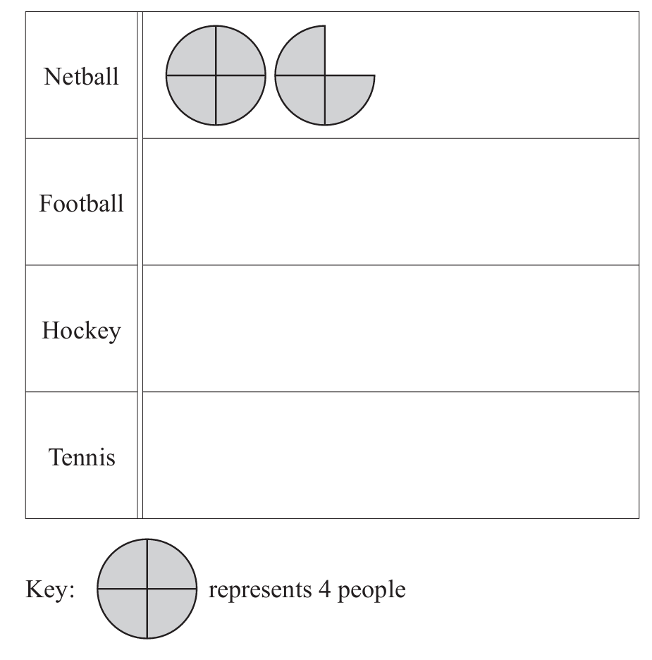
Home / CIE iGCSE Maths C9.4 Statistical charts and diagrams Exam Style Practice Questions- Paper 1

CIE iGCSE Maths C9.4 Statistical charts and diagrams Exam Style Practice Questions- Paper 1

CIE iGCSE Maths C9.4 Statistical charts and diagrams Exam Style Practice Questions- Paper 1

Question

A delivery driver records the number of pizzas she delivers each month for one year.

(a) Complete the stem-and-leaf diagram.


(b) Find the median.

▶️Answer/Explanation

>(a)

(b) 46

split the numbers into stems (tens digits) and leaves (ones digits). 

  • 20s: 22, 28
  • 30s: 36, 39
  • 40s: 41, 44, 48, 49
  • 50s: 52, 54, 57, 57

(b)

To find the median, order the data

$
22, 28, 36, 39, 41, 44, 48, 49, 52, 54, 57, 57
$

There are 12 data points, so the median is the average of the 6th and 7th values

$
\frac{44 + 48}{2} = \frac{92}{2} = 46
$

Question

Sarah records the number of people who play golf on each of 14 days.


(a) Complete the stem-and-leaf diagram.

(b) Find the median.

▶️Answer/Explanation

(a)

(b) 61

The data:
28, 46, 54, 71, 70, 65, 49, 50, 64, 77, 68, 72, 45, 58

Arranged in order:

$
28, 45, 46, 49, 50, 54, 58, 64, 65, 68, 70, 71, 72, 77
$

(b)

there are 14 numbers, the median is the average of the 7th and 8th values.

The 7th number is 58, and the 8th number is 64.

$
\text{Median} = \frac{58 + 64}{2} = \frac{122}{2} = 61
$

Question

The table shows how 45 students each travel to college.

This information can be displayed in a pie chart.
(a) Show that the sector angle for students who walk is 160°.

(b) Calculate the sector angle for students who travel by bus.

(c) Complete the pie chart and label the sectors.

Answer/Explanation

(a)\(\frac{20}{45}\times 360[=160]\)

(b) 144

(c)Pie chart with at least 2 correct
sectors and at least 2 sectors
correctly labelled. 

 Question

The scatter diagram shows the rainfall and the average temperature in a city for the month of June, over a period of 10 years.

(a) What type of correlation does this scatter diagram show?

Answer/Explanation

Ans: Negative

(b) Describe the relationship between the rainfall and the average temperature.

Answer/Explanation

Ans: More rain [suggests] lower temperature oe

Question

Amir looks at adverts for the same model of car.
The scatter diagram shows the age and price of each car.

(a) What type of correlation is shown on the scatter diagram?

Answer/Explanation

Ans: Negative

(b) Draw a line of best fit on the scatter diagram.

Answer/Explanation

Ans: Single ruled line of best fit

(c) Use your line of best fit to estimate the price of a car that is 8 years old.

Answer/Explanation

Ans: $ 4000 to 5100 

Question

 The scatter diagram shows the prices of houses for sale and their distances from the city centre.

(a) What type of correlation is shown in this scatter diagram?
(b) Brad wants to live as close to the city centre as possible.
He has a maximum of $500000 to spend on one of these houses.
How close to the city centre can he live?
…………………. km
(c) (i) Draw a line of best fit on the scatter diagram.

(ii) Estimate the price of a house that is 14km from the city centre.
$ ……………………………………………

Answer/Explanation

Ans:

(a) Negative
(b) 4
(c) (i) Ruled line of best fir
(ii) 250 000 to 380 000

Scroll to Top