Variation in Statistics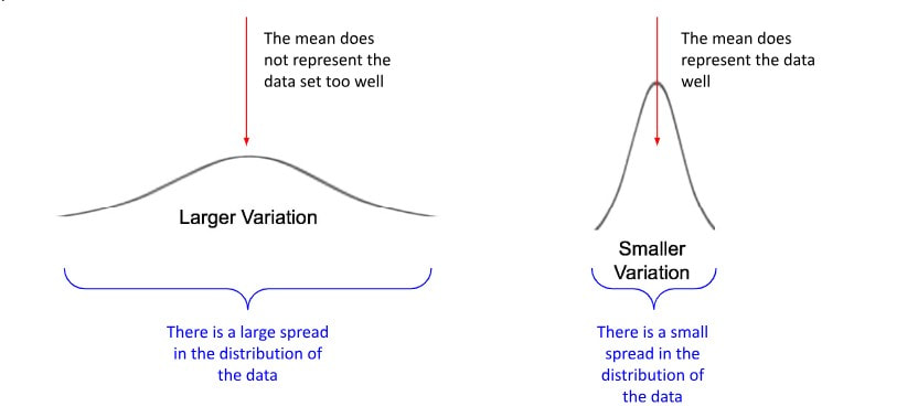
Variation describes how much individual data values differ from each other and from the mean.
Sources of Variation:
- Natural Variation: Normal differences found in real-world data (e.g., no two apples weigh exactly the same).
- Measurement Variation: Differences caused by errors in measuring tools or human error.
- Sampling Variation: Differences that arise when taking multiple random samples from the same population.
Measures of Variation:
- Range: \( \text{Range} = \text{Maximum} – \text{Minimum} \)
- Variance: \( s^2 = \dfrac{\sum (x_i – \bar{x})^2}{n-1} \)
- Standard Deviation: \( s = \sqrt{s^2} \)
- Interquartile Range (IQR): \( \text{IQR} = Q_3 – Q_1 \)
Example:
- Two classes both have an average test score of 70.
- Class A scores range from 68 to 72 → low variation.
- Class B scores range from 40 to 100 → high variation.
Uncertainty in Statistics
Uncertainty reflects the fact that statistical results and predictions are not exact, since they rely on samples and involve randomness.
Sources of Uncertainty:
- Sampling Error: Difference between a sample statistic and the true population parameter.
- Measurement Error: Errors in recording or measuring data values.
- Randomness: Unpredictability in outcomes of random processes.
Quantifying Uncertainty:
- Confidence Intervals: A range of plausible values, e.g., \( \hat{p} \pm z^\ast \sqrt{\dfrac{\hat{p}(1-\hat{p})}{n}} \)
- Margin of Error: The \( z^\ast \sqrt{\dfrac{\hat{p}(1-\hat{p})}{n}} \) term in a confidence interval.
- Probability: Expresses uncertainty about an event on a 0–1 scale.
Example:
- A survey estimates \( 55\% \) of people support a policy, with a \( \pm 3\% \) margin of error.
- The true population proportion is likely between \( 52\% \) and \( 58\% \).
- The uncertainty exists because only a sample was surveyed, not the whole population.
Example:
A researcher compares the mean test scores of two groups of students. The observed difference is 4 marks. How would you decide whether this difference is due to random variation or a genuine effect?
▶️ Answer/Explanation
Step 1: Ask whether the difference is due to random variation (chance differences between groups) or a genuine effect (teaching method, resources, etc.).
Step 2: Carry out a statistical test (e.g. two-sample t-test).
Step 3: If the p-value is less than 0.05, we conclude the difference is statistically significant, though still with some chance of error.
Final Point: Even if significant, the conclusion is uncertain because random variation can never be ruled out completely.
Example:
Two classes both have an average test score of 70. In Class A, the scores are tightly clustered between 68 and 72. In Class B, the scores spread widely from 40 to 100. How do we interpret this difference in variation?
▶️ Answer/Explanation
Step 1: Calculate the range. For Class A, \( 72 – 68 = 4 \). For Class B, \( 100 – 40 = 60 \).
Step 2: Compare the standard deviation. Class A will have a very small \( s \), while Class B will have a much larger \( s \).
Step 3: Conclude that Class A’s scores show low variation (students perform similarly), while Class B’s scores show high variation (students perform very differently).
Final Point: Variation tells us about the consistency of data, even if averages are the same.
Example:
A poll estimates that 55% of voters support a new policy, with a margin of error of ±3%. How can we express the uncertainty in this estimate?
▶️ Answer/Explanation
Step 1: Use the margin of error. The plausible range is \( 55\% \pm 3\% \), or between 52% and 58%.
Step 2: Recognize that the result is uncertain because it is based on a sample, not the whole population.
Step 3: Interpret this as a confidence interval — we are reasonably confident (usually 95%) that the true population proportion lies in this range.
Final Point: Uncertainty means that statistical conclusions are never exact; they always carry some risk of error.
One-Variable Data:
One-variable data (also called univariate data) refers to data that consists of observations on only a single characteristic or attribute. Each individual or subject contributes one piece of information.
Examples: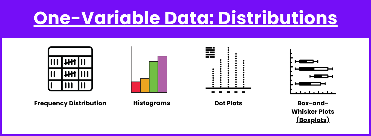
- Heights of students in a class
- Number of siblings per person
- Daily high temperatures in a city
- Scores on a math test
Ways to Represent One-Variable Data:
- Dotplot: Places a dot above a number line for each observation.
- Histogram: Bars represent frequency of values within intervals.
- Boxplot: Displays median, quartiles, and potential outliers.
- Stem-and-Leaf Plot: Preserves actual data values while showing distribution.
Measures of Center:
- Mean (Sample Mean): \(\displaystyle \bar{x} = \dfrac{\sum x_i}{n}\)
where \(x_i\) are data values and \(n\) is the number of observations. - Mean (Population Mean): \(\displaystyle \mu = \dfrac{\sum x_i}{N}\)
- Median: Middle value when ordered.
If \(n\) is odd → middle observation.
If \(n\) is even → average of the two middle observations. - Mode: Most frequently occurring value (no formula).
Variation (Spread):
Variation describes how much the data values differ from one another. A dataset with high variation is widely spread out, while a dataset with low variation is clustered closely around the center.
Measures of Variation:
- Range: \(\displaystyle \text{Range} = \text{Maximum} – \text{Minimum}\)
- Interquartile Range (IQR): \(\displaystyle IQR = Q_3 – Q_1\)
- Variance (Sample): \(\displaystyle s^2 = \dfrac{\sum (x_i – \bar{x})^2}{n-1}\)
- Variance (Population): \(\displaystyle \sigma^2 = \dfrac{\sum (x_i – \mu)^2}{N}\)
- Standard Deviation (Sample): \(\displaystyle s = \sqrt{\dfrac{\sum (x_i – \bar{x})^2}{n-1}}\)
- Standard Deviation (Population): \(\displaystyle \sigma = \sqrt{\dfrac{\sum (x_i – \mu)^2}{N}}\)
Other Important Definitions: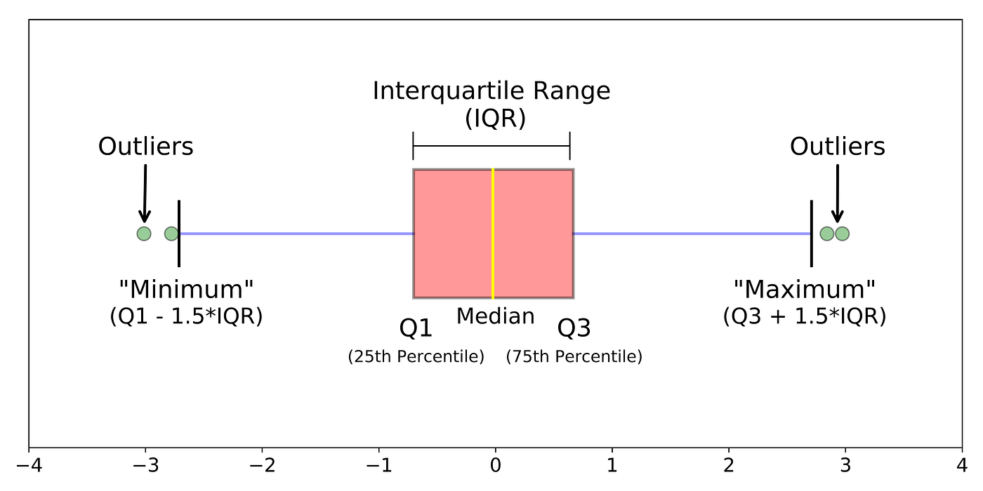
- Quartiles: Values that divide ordered data into four equal parts.
\(Q_1\) = 25th percentile, \(Q_2\) = 50th percentile (median), \(Q_3\) = 75th percentile. - Percentiles: A value below which a given percentage of data falls.
- Outlier Rule (1.5 × IQR Rule): An observation is considered an outlier if: \(\displaystyle x < Q_1 – 1.5 \times IQR \quad \text{or} \quad x > Q_3 + 1.5 \times IQR\)
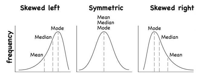
- Distribution Shape:
- Symmetric (mean ≈ median)
- Skewed Right (long right tail, mean > median)
- Skewed Left (long left tail, mean < median)
- Uniform (all values equally likely)
Why Variation Matters:
- Two datasets may have the same mean but very different spreads.
- Variation helps in identifying consistency versus unpredictability.
- In statistics, understanding spread is as important as knowing the center.
Example:
The number of hours 12 students spent on homework last week was recorded:
3, 5, 8, 6, 4, 10, 7, 12, 2, 9, 11, 5
(a) Calculate the mean and median number of hours.
(b) Calculate the range and standard deviation (rounded to one decimal place).
(c) Describe the distribution of the data in terms of SOCS (Shape, Outliers, Center, Spread). Be sure to comment in context of “homework hours.”
▶️ Answer/Explanation
(a) Mean = 6.8 hours, Median = 6.5 hours.
(b) Range = 12 − 2 = 10 hours, Standard deviation ≈ 2.9 hours.
(c) The data are roughly symmetric, with center around 6.5–7 hours, spread about 3 hours. No obvious outliers. Most students spent between 5 and 10 hours on homework.
Example:
In a survey, the resting heart rates (in beats per minute) of 15 athletes were recorded. The five-number summary is given below:
Min = 48, Q1 = 54, Median = 60, Q3 = 65, Max = 72
(a) Compute the interquartile range (IQR).
(b) Are there any potential outliers according to the 1.5 × IQR rule?
(c) Write one question a researcher might ask based on this data, and explain how the data helps answer it.
▶️ Answer/Explanation
(a) IQR = Q3 − Q1 = 65 − 54 = 11 bpm.
(b) Outlier fences: Lower fence = 54 − 1.5(11) = 37.5 Upper fence = 65 + 1.5(11) = 81.5 No values fall outside these fences → no outliers.
(c) Example research question: “What is the typical resting heart rate for athletes?” The data suggest the typical value is about 60 bpm, with most rates between 54 and 65 bpm.