Presenting Raw Statistical Data
Tables of Raw Data
- Data is listed as collected (unordered or ordered).
- Advantages: Shows complete detail, no information lost.
- Disadvantages: Hard to interpret, no quick visual summary.
Frequency Tables
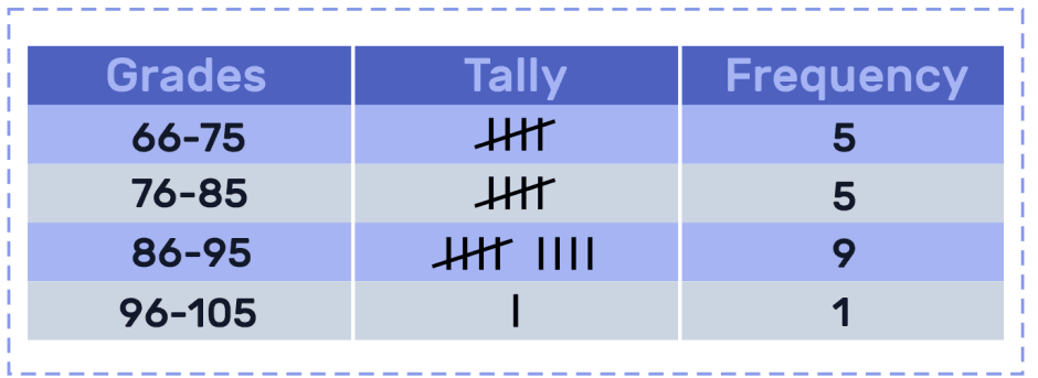
- Data grouped into intervals or classes, with frequencies shown.
- Advantages: Makes large data sets manageable, suitable for further analysis (e.g., histograms).
- Disadvantages: Loses some precision due to grouping, may hide patterns.
Bar Charts
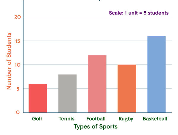
- Used for categorical or discrete data, with bars representing frequencies.
- Advantages: Easy to understand, compares categories clearly.
- Disadvantages: Not suitable for continuous data, can be misleading if bar widths not uniform.
Pie Charts
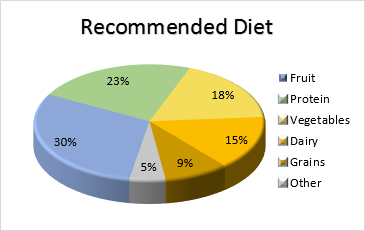
- Circle divided into sectors representing proportions of categories.
- Advantages: Effective for showing proportions visually.
- Disadvantages: Not precise for comparing close values, not effective with many categories.
Scatter Diagrams
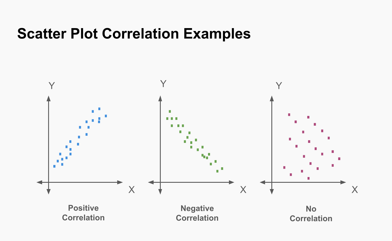
- Plots pairs of data points to show correlation.
- Advantages: Useful for identifying trends and relationships.
- Disadvantages: Does not summarise distribution, hard to interpret with large datasets.
Example:
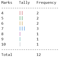
A teacher records the marks (out of 10) for 12 students: 4, 7, 6, 5, 9, 4, 7, 8, 6, 5, 10, 7. Present the data in a frequency table.
▶️ Answer/Explanation
Marks: 4, 5, 6, 7, 8, 9, 10
Frequencies: 2, 2, 2, 3, 1, 1, 1
This frequency table makes it easier to see that the most common mark is 7.
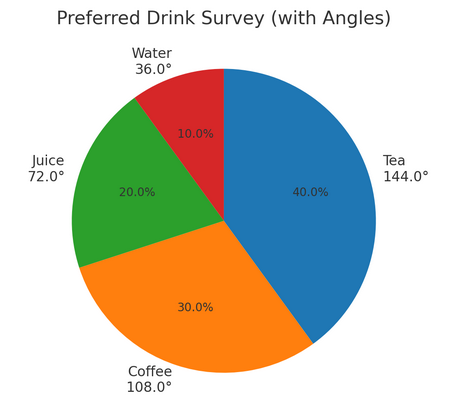
Example:
A survey asks 50 people which drink they prefer: Tea (20), Coffee (15), Juice (10), Water (5). Represent this information using a pie chart.
▶️ Answer/Explanation
Total responses = 50.
Angles for pie chart sectors:
Tea: \(\dfrac{20}{50} \times 360^\circ = 144^\circ\)
Coffee: \(\dfrac{15}{50} \times 360^\circ = 108^\circ\)
Juice: \(\dfrac{10}{50} \times 360^\circ = 72^\circ\)
Water: \(\dfrac{5}{50} \times 360^\circ = 36^\circ\)
Thus, the circle is divided into sectors of 144°, 108°, 72°, and 36°.
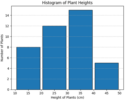
Example:
The heights (cm) of 40 plants are measured and grouped as follows: 10–20 (8 plants), 20–30 (12 plants), 30–40 (15 plants), 40–50 (5 plants). Represent this data in a histogram.
▶️ Answer/Explanation
Class intervals: 10–20, 20–30, 30–40, 40–50.
Frequencies: 8, 12, 15, 5.
Since all class widths are equal (10 cm), bar heights equal frequencies.
Histogram bars: Heights of 8, 12, 15, and 5, with widths of 10 cm each.
Stem-and-Leaf Diagrams:
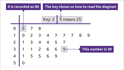
- A way of organizing raw data to show the distribution clearly while retaining the original values.
- The “stem” represents the leading digit(s), while the “leaf” represents the last digit of each data point.
- Back-to-back stem-and-leaf diagrams can be used to compare two data sets, for example, scores of boys vs. girls in a test.
- Advantages: Retains original data values, shows distribution clearly, and good for small to medium-sized data sets.
- Disadvantages: Becomes cumbersome for large data sets and does not show trends as smoothly as graphs.
Example:
The marks of 10 students are: 23, 25, 26, 31, 32, 34, 41, 42, 46, 48. Represent this data using a stem-and-leaf diagram.
▶️ Answer/Explanation
Stem-and-leaf diagram:
2 | 3 5 6
3 | 1 2 4
4 | 1 2 6 8
This shows the distribution clearly and keeps the raw data intact.
Box-and-Whisker Plots:
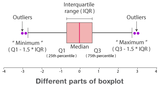
- Represents data using five-number summary: minimum, lower quartile (Q1), median (Q2), upper quartile (Q3), and maximum.
- The “box” shows the interquartile range (IQR = Q3 – Q1), while the “whiskers” extend to the min and max values.
- Useful for identifying spread, central tendency, and outliers.
- Advantages: Very effective in comparing two or more data sets, highlights spread and symmetry of data, and identifies outliers easily.
- Disadvantages: Does not show exact data distribution within quartiles; information is summarized and less detailed.
Example:
Data: 4, 5, 7, 8, 10, 12, 15, 18, 20, 21. Draw a box-and-whisker plot for this data and comment on the spread.
▶️ Answer/Explanation
Quartiles: Q1 = 7, Median = 11, Q3 = 18.
5-number summary: Min = 4, Q1 = 7, Median = 11, Q3 = 18, Max = 21.
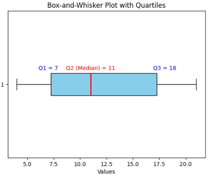
The box-plot is drawn with a box from 7 to 18, median at 11, whiskers at 4 and 21.
Histograms:
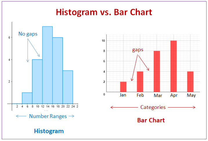
- A graphical representation of grouped data using adjacent rectangles (bars) where the area of each bar represents frequency.
- The horizontal axis represents the class intervals, and the vertical axis represents frequency density.
- Formula: \( \text{Frequency density} = \dfrac{\text{Frequency}}{\text{Class width}} \).
- Advantages: Effective for showing distribution of large data sets, visualizes skewness, peaks, and spread.
- Disadvantages: Exact values of individual data points are lost due to grouping, and class intervals may affect interpretation.
Example:
Distribution of weights:
40–50: 8 students
50–60: 12 students
60–80: 20 students
80–100: 10 students
Draw a histogram to represent this data.
▶️ Answer/Explanation
Class widths: 10, 10, 20, 20.
Frequency densities:
40–50: \( \dfrac{8}{10} = 0.8 \)
50–60: \( \dfrac{12}{10} = 1.2 \)
60–80: \( \dfrac{20}{20} = 1 \)
80–100: \( \dfrac{10}{20} = 0.5 \)
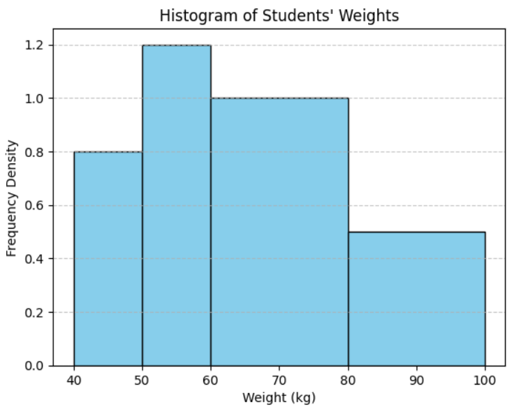
Histogram bars are drawn using these frequency densities as heights.
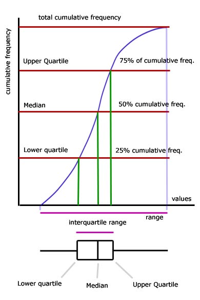
Cumulative Frequency Graphs:
- A graph that plots cumulative frequency against the upper class boundaries of intervals.
- The curve (ogive) allows estimation of median, quartiles, and percentiles directly.
- It provides insight into how data accumulates across intervals.
- Advantages: Very useful for finding medians, quartiles, and percentiles; effective for comparing data sets.
- Disadvantages: Raw data is lost; graph may smooth out important details in distribution.
Example:
The time (in minutes) 40 students spend on homework:
0–10: 5 students
10–20: 7 students
20–30: 10 students
30–40: 12 students
40–50: 6 students
Draw a cumulative frequency graph and estimate the median time.
▶️ Answer/Explanation
Cumulative frequencies:
≤10 → 5
≤20 → 12
≤30 → 22
≤40 → 34
≤50 → 40
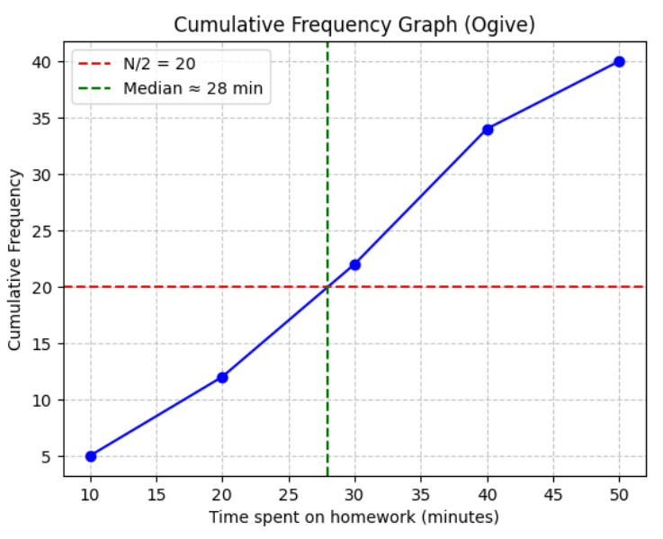
Plot these points and join with a smooth curve. The median is the time corresponding to the 20th value, i.e., about 25 minutes.
Central Tendency: Refers to measures that indicate the “center” or “typical” value of a dataset.
Mean: The arithmetic average.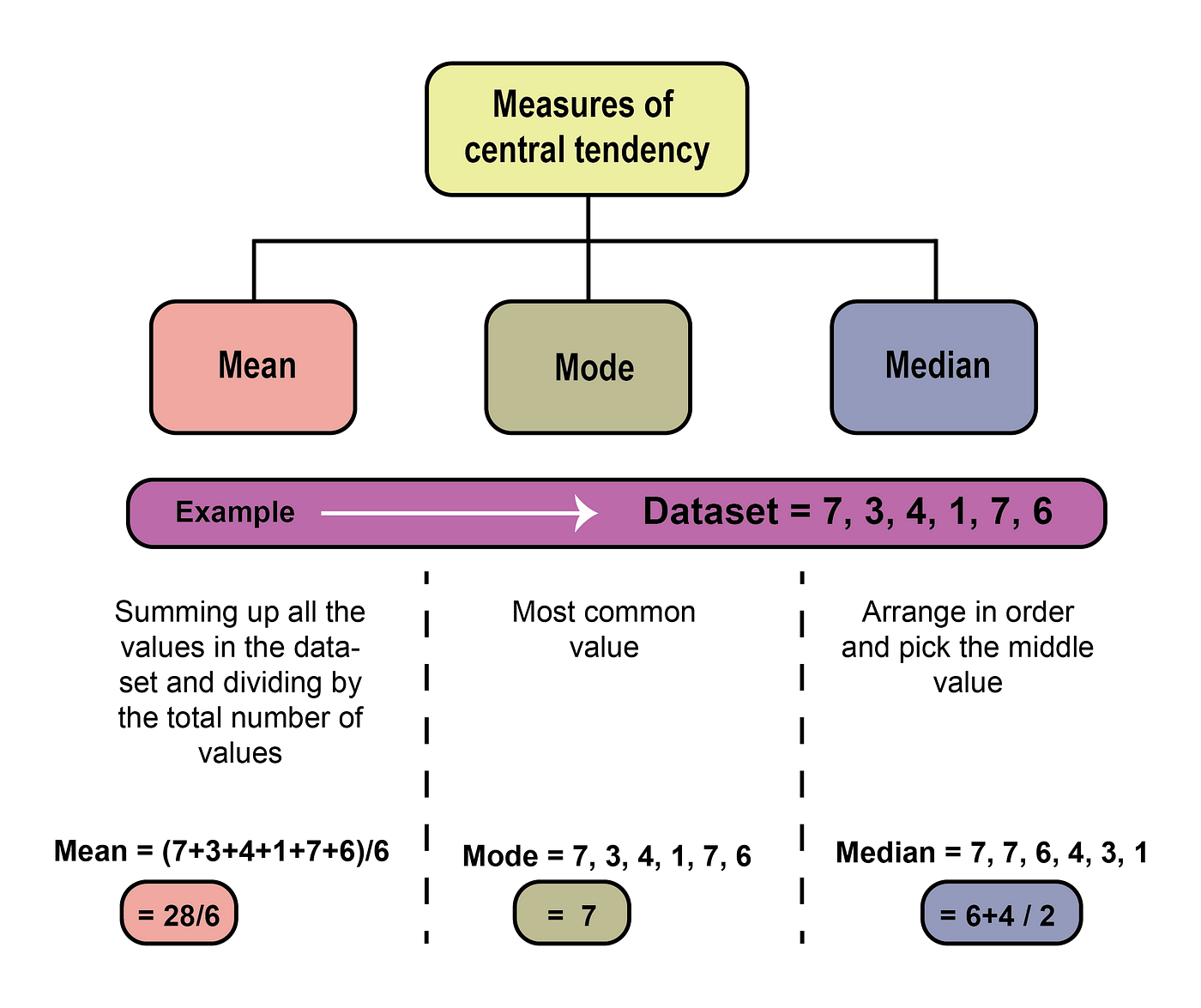
Formula: \(\text{Mean} = \dfrac{\sum x}{n}\)
Advantages: Uses all data, good for further calculations.
Disadvantages: Affected by extreme values (outliers).
Median: The middle value when data is arranged in order. If \(n\) is even, it is the average of the two middle values.
Advantages: Not affected by outliers, useful for skewed data.
Disadvantages: Ignores extreme values, does not use all data points.
Mode: The most frequently occurring value.
Advantages: Easy to understand, useful for categorical data.
Disadvantages: Not always unique (can be bi-modal), not always representative.
Variation: Refers to the spread of data around the central value.
Range: Difference between maximum and minimum values.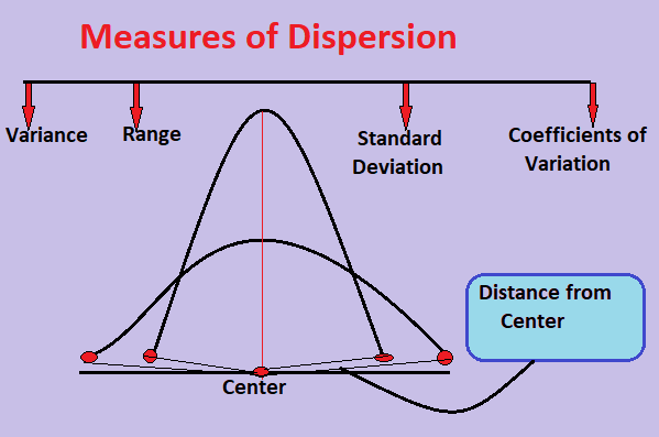
Formula: \(\text{Range} = x_{\text{max}} – x_{\text{min}}\)
Simple but highly affected by outliers.
Interquartile Range (IQR): Spread of the middle 50% of data.
Formula: \(\text{IQR} = Q_3 – Q_1\)
Less sensitive to outliers, better measure of spread than range.
Variance: Average squared deviation from the mean.
Formula: \(\text{Variance} = \dfrac{\sum (x – \bar{x})^2}{n}\)
Standard Deviation (SD): Square root of variance, gives spread in original units.
Formula: \(\text{SD} = \sqrt{\dfrac{\sum (x – \bar{x})^2}{n}}\)
Advantages: Uses all data, less affected by extreme values than range.
Example:
The marks of 7 students in a test are: 12, 15, 17, 20, 22, 22, 25. Find Central Tendency & Variation
▶️ Answer/Explanation
Mean: \(\dfrac{12+15+17+20+22+22+25}{7} = \dfrac{133}{7} \approx 19.0\)
Median: Middle value = \(20\)
Mode: \(22\) (most frequent)
Range = \(25 – 12 = 13\)
IQR = \(Q_3 – Q_1 = 22 – 15 = 7\)
Example:
A small dataset has values: 4, 8, 6, 5, 9.Find Central Tendency & Variation
▶️ Answer/Explanation
Mean = \(\dfrac{4+8+6+5+9}{5} = \dfrac{32}{5} = 6.4\)
Median = \(6\) (middle value)
Mode = None (all different)
Range = \(9-4=5\)
Variance = \(\dfrac{\sum (x – 6.4)^2}{5} = 3.04\)
SD = \(\sqrt{3.04} \approx 1.74\)
Cumulative Frequency Graphs
A cumulative frequency (CF) graph shows how frequencies build up as values increase.
- It is constructed by plotting the upper class boundaries of grouped data against the cumulative frequencies and joining the points with a smooth curve or straight lines.
- CF graphs are especially useful for estimating measures of location and spread when raw data is grouped.
Key Uses:
- Median: The value corresponding to the 50th percentile (half the total frequency).
- Quartiles:
- Lower Quartile (\(Q_1\)): 25th percentile (¼ of total frequency).
- Median (\(Q_2\)): 50th percentile (½ of total frequency).
- Upper Quartile (\(Q_3\)): 75th percentile (¾ of total frequency).
- Percentiles: For example, the 90th percentile corresponds to 90% of total frequency.
- Proportions: The graph can be used to find the proportion of data values above or below a certain point.
- Spread: Interquartile range (IQR) can be estimated as \( Q_3 – Q_1 \).
Advantages:
- Gives a clear visual representation of data distribution.
- Helps to compare two datasets (using two CF curves).
- Useful for estimating medians, quartiles, and percentiles when exact values are unavailable.
Limitations:
- Only an estimate when data is grouped.
- Not suitable for small datasets (discrete raw data is better shown with stem-and-leaf or dot plots).
Example:
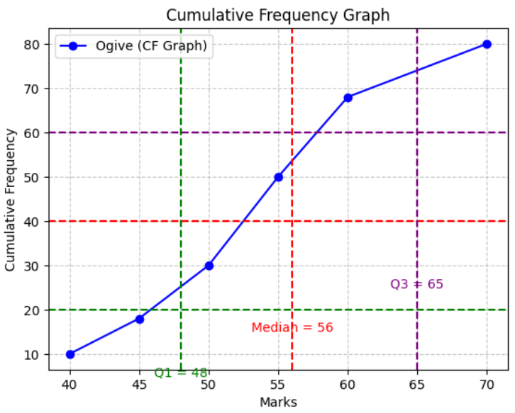
A group of 80 students took a maths test. A cumulative frequency graph is drawn from the data.
From the graph, estimate the:
- (i) Median
- (ii) Lower quartile
- (iii) Upper quartile
- (iv) Interquartile range
▶️ Answer/Explanation
Total frequency = 80.
(i) Median = 40th value → from graph ≈ 56.
(ii) \( Q_1 = 20^\text{th} \) value → from graph ≈ 48.
(iii) \( Q_3 = 60^\text{th} \) value → from graph ≈ 65.
(iv) Interquartile range = \( Q_3 – Q_1 = 65 – 48 = 17 \).
Example:
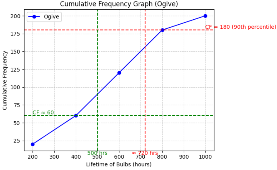
In a factory, the lifetimes (in hours) of 200 light bulbs were recorded. The cumulative frequency curve was drawn. Use the graph to estimate:
- (i) the 90th percentile,
- (ii) the proportion of bulbs lasting less than 500 hours.
▶️ Answer/Explanation
Total frequency = 200.
(i) 90th percentile = 180th value → from graph ≈ 720 hours.
(ii) For 500 hours → cumulative frequency ≈ 60 → proportion = \( \dfrac{60}{200} = 0.3 \).
Mean of data:
For ungrouped data:
\(\bar{x} = \dfrac{\sum x}{n}\)
For grouped data (with frequency table):
\(\bar{x} = \dfrac{\sum (fx)}{\sum f}\)
Variance and Standard Deviation: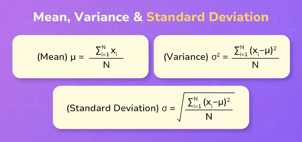
- Variance:
\(\sigma^2 = \dfrac{\sum (x – \bar{x})^2}{n}\)
- Shortcut formula:
\(\sigma^2 = \dfrac{\sum x^2}{n} – \left(\dfrac{\sum x}{n}\right)^2\)
- Standard deviation:
\(\sigma = \sqrt{\sigma^2}\)
Using given totals:
If \(\sum x\) and \(\sum x^2\) are given, we can directly apply the shortcut formula.
Sometimes data is given in coded form (e.g. \(y = x – a\)).
- For coding:
\(\bar{x} = \bar{y} + a\)
\(\sigma_x = \sigma_y\)
(Shift does not change spread, only mean).
If scaling is used (e.g. \(y = \dfrac{x-a}{k}\)), then:
\(\bar{x} = a + k\bar{y}\)
\(\sigma_x = k\sigma_y\)
Example :
The marks of 5 students are: 6, 8, 10, 12, 14. Find the mean and standard deviation.
▶️ Answer/Explanation
Total: \(\sum x = 6+8+10+12+14 = 50\), \(n=5\).
Mean: \(\bar{x} = \dfrac{50}{5} = 10\).
\(\sum x^2 = 6^2+8^2+10^2+12^2+14^2 = 420\).
Variance: \(\sigma^2 = \dfrac{420}{5} – (10)^2 = 84 – 100 = -16\). Oops! Let’s carefully redo:
Check: \(420/5 = 84\), \((50/5)^2 = 100\). Yes, \(\sigma^2 = 84 – 100 = -16\). This looks wrong — let’s recompute:
Actually \(\sum x^2 = 36+64+100+144+196 = 540\).
Now variance: \(\sigma^2 = \dfrac{540}{5} – 100 = 108 – 100 = 8\).
Standard deviation: \(\sigma = \sqrt{8} \approx 2.83\).
Final Answer: \(\bar{x} = 10, \ \sigma \approx 2.83\).
Example:
The table shows the ages of 40 people. Estimate the mean and standard deviation.
| Age (years) | Frequency (f) |
| 0–10 | 5 |
| 10–20 | 9 |
| 20–30 | 12 |
| 30–40 | 8 |
| 40–50 | 6 |
▶️ Answer/Explanation
Class midpoints: 5, 15, 25, 35, 45.
\(\sum f = 40\).
\(\sum fx = 5(5)+9(15)+12(25)+8(35)+6(45) = 5(5)+135+300+280+270 = 990\).
Mean: \(\bar{x} = \dfrac{990}{40} = 24.75\).
\(\sum fx^2 = 5(25)+9(225)+12(625)+8(1225)+6(2025)\).
\(= 125+2025+7500+9800+12150 = 31600\).
Variance: \(\sigma^2 = \dfrac{31600}{40} – (24.75)^2 = 790 – 612.56 = 177.44\).
\(\sigma = \sqrt{177.44} \approx 13.33\).
Final Answer: \(\bar{x} \approx 24.8, \ \sigma \approx 13.3\).
Example:
A dataset of 50 values has \(\sum x = 250\), \(\sum x^2 = 1450\). Find the mean and standard deviation.
▶️ Answer/Explanation
Mean: \(\bar{x} = \dfrac{250}{50} = 5\).
Variance: \(\sigma^2 = \dfrac{1450}{50} – (5)^2 = 29 – 25 = 4\).
Standard deviation: \(\sigma = \sqrt{4} = 2\).
Final Answer: \(\bar{x} = 5, \ \sigma = 2\).
Example:
For 100 values, coded as \(y = x – 50\), the totals are \(\sum y = 200\), \(\sum y^2 = 5000\). Find the mean and standard deviation of the original \(x\)-values.
▶️ Answer/Explanation
\(\bar{y} = \dfrac{200}{100} = 2\).
\(\bar{x} = \bar{y} + 50 = 52\).
Variance: \(\sigma_y^2 = \dfrac{5000}{100} – (2)^2 = 50 – 4 = 46\).
So \(\sigma_x = \sigma_y = \sqrt{46} \approx 6.78\).
Final Answer: \(\bar{x} = 52, \ \sigma \approx 6.78\).