Home / AP® Exam / AP® Statistics / AP Statistics 1.1 Introducing Statistics: What Can We Learn from Data?- FRQs

AP Statistics 1.1 Introducing Statistics: What Can We Learn from Data?- Exam Style Questions - FRQs - New Syllabus

Question

Studies have shown that foods rich in compounds known as flavonoids help lower blood pressure. Researchers conducted a study to investigate whether there was a greater reduction in blood pressure for people who consumed dark chocolate, which contains flavonoids, than people who consumed white chocolate, which does not contain flavonoids. Twenty-five healthy adults agreed to participate in the study and add 3.5 ounces of chocolate to their daily diets. Of the 25 participants, 13 were randomly assigned to the dark chocolate group and the rest were assigned to the white chocolate group. All participants had their blood pressure recorded, in millimeters of mercury (mmHg), before adding chocolate to their daily diets and again 30 days after adding chocolate to their daily diets.
The reduction in blood pressure (before minus after) for each of the participants in the two groups is shown in the dotplots below.
(a) Determine and compare the medians of the reduction in blood pressure for the two groups.
The researchers found the mean reduction in blood pressure for those who consumed dark chocolate is $\overline{x}_{dark}=6.08$ mmHg and the mean reduction in blood pressure for those who consumed white chocolate is $\overline{x}_{white}=0.42$ mmHg.
(b) One researcher indicated that because the difference in sample means of 5.66 mmHg is greater than 0 there is convincing statistical evidence to conclude that the population mean blood pressure reduction for those who consume dark chocolate is greater than for those who consume white chocolate. Why might the researcher’s conclusion, based only on the difference in sample means of 5.66 mmHg, not necessarily be true?
A simulation was conducted to investigate whether there is a greater reduction of blood pressure for those who consume dark chocolate than for those who consume white chocolate. The simulation was conducted under the assumption that no difference exists. The results of 120 trials of the simulation are shown in the following dotplot.
(c) Use the results of the simulation to determine whether the results from the 25 participants in the study provide convincing statistical evidence, at a 5 percent level of significance, that adding dark chocolate to a daily diet will result in a greater reduction in blood pressure, on average, than adding white chocolate to a daily diet. Justify your answer.

Most-appropriate topic codes (AP Statistics):

• Topic \(1.9\) — Comparing the Distributions of One Quantitative Variable (Part \( \mathrm{a} \))
• Topic \(1.1\) — Introducing Statistics: Do the Data We Collected Match What We Expected? (Parts \( \mathrm{b} \), \( \mathrm{c} \))
▶️ Answer/Explanation

(a)
The median reduction in blood pressure for the dark chocolate group is 7 mmHg, and the median reduction in blood pressure for the white chocolate group is 0 mmHg. Therefore, the median reduction for the dark chocolate group is greater than the median reduction for the white chocolate group.

(b)
The researcher’s conclusion might not be true because the difference in sample means could simply be due to sampling variability (chance variation) arising from the random assignment of participants to the two groups. A difference of 5.66 mmHg can sometimes occur by chance even if the treatments are equally effective, so a statistical simulation or hypothesis test is necessary to determine if the result is statistically significant.

(c)
Yes, the results provide convincing statistical evidence. The observed difference in sample means is $6.08 – 0.42 = 5.66$ mmHg. According to the simulation dotplot, a simulated difference of 5.66 or greater occurred in only 3 of the 120 trials. The estimated p-value is $\frac{3}{120} = 0.025$. Because the p-value ($0.025$) is less than the significance level ($\alpha = 0.05$), we reject the null hypothesis and conclude there is convincing evidence that dark chocolate results in a greater reduction in blood pressure on average than white chocolate.

Question
To determine the amount of sugar in a typical serving of breakfast cereal, a student randomly selected 60 boxes of different types of cereal from the shelves of a large grocery store.
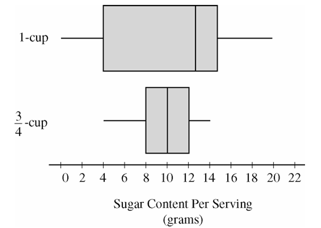
The student noticed that the side panels of some of the cereal boxes showed sugar content based on one-cup servings, while others showed sugar content based on three-quarter-cup servings. Many of the cereal boxes with side panels that showed three-quarter-cup servings were ones that appealed to young children, and the student wondered whether there might be some difference in the sugar content of the cereals that showed different-size servings on their side panels. To investigate the question, the data were separated into two groups. One group consisted of 29 cereals that showed one-cup serving sizes; the other group consisted of 31 cereals that showed three-quarter-cup serving sizes. The boxplots shown below display sugar content (in grams) per serving of the cereals for each of the two serving sizes.
(a) Write a few sentences to compare the distributions of sugar content per serving for the two serving sizes of cereals.
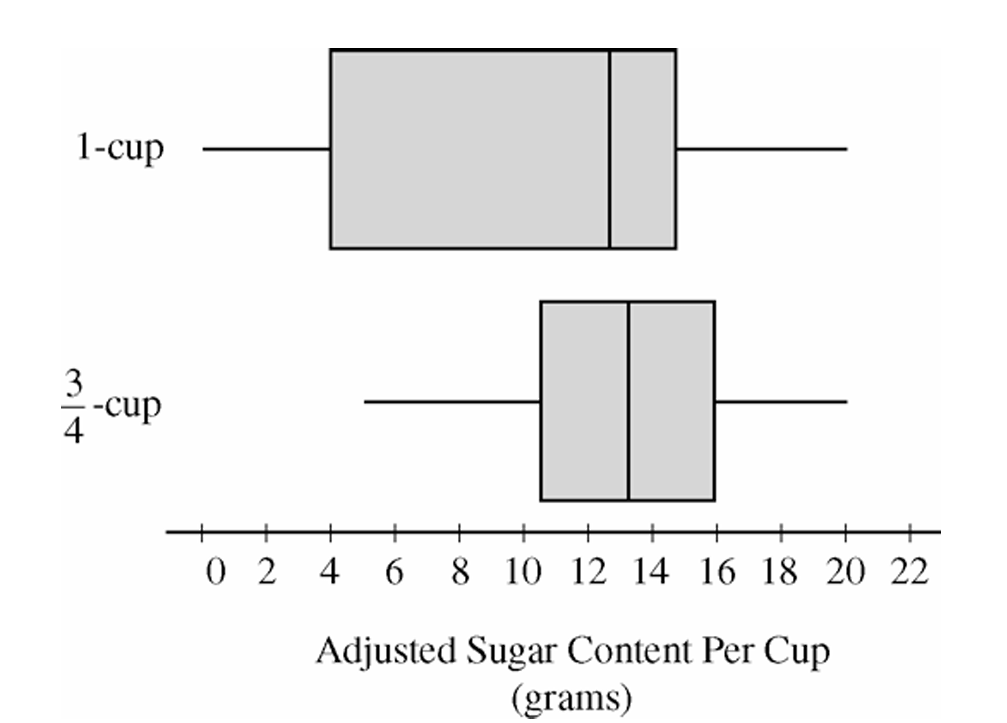
After analyzing the boxplots on the preceding page, the student decided that instead of a comparison of sugar content per recommended serving, it might be more appropriate to compare sugar content for equal-size servings. To compare the amount of sugar in serving sizes of one cup each, the amount of sugar in each of the cereals showing three-quarter-cup servings on their side panels was multiplied by \(\dfrac{4}{3}\). The bottom boxplot shown below displays sugar content (in grams) per cup for those cereals that showed a serving size of three-quarter-cup on their side panels.
(b) What new information about sugar content do the boxplots above provide?
(c) Based on the boxplots shown above on this page, how would you expect the mean amounts of sugar per cup to compare for the different recommended serving sizes? Explain.

Most-appropriate topic codes (AP Statistics):

• Topic \(1.1\) — Analyzing Categorical Data / Representing Data Graphically (Parts \(\mathrm{a}\), \(\mathrm{b}\))
• Topic \(1.7\) — Summary Statistics for a Quantitative Variable (Center, Spread, Shape) (Parts \(\mathrm{a}\), \(\mathrm{b}\), \(\mathrm{c}\))
• Topic \(1.9\) — Comparing Distributions of a Quantitative Variable (Parts \(\mathrm{a}\), \(\mathrm{b}\))
• Topic \(1.10\) — The Effect of Adding a Constant or Multiplying by a Constant on Summary Statistics (Part \(\mathrm{b}\))
• Topic \(3.1\) — Mean and Standard Deviation of a Linear Transformation (Part \(\mathrm{c}\))
▶️ Answer/Explanation

(a)

When comparing two distributions from boxplots, we examine center, spread, shape, and unusual features.
The cereals with one-cup serving sizes have a higher median sugar content per serving than the cereals with three-quarter-cup serving sizes. The one-cup distribution also has greater variability, as indicated by its larger range and larger interquartile range (IQR). In terms of shape, the one-cup distribution appears somewhat left-skewed because the median is closer to the upper quartile than to the lower quartile, while the three-quarter-cup distribution is more nearly symmetric. Neither distribution appears to contain extreme outliers.

(b)

Multiplying each sugar value in the three-quarter-cup group by \(\dfrac{4}{3}\) converts the measurements to sugar content per cup, allowing a fair comparison using equal serving sizes.
The adjusted boxplot shows that cereals with recommended serving sizes of three-quarter cup tend to contain more sugar per cup than cereals with recommended serving sizes of one cup. The median for the adjusted three-quarter-cup distribution is now noticeably higher than the median for the one-cup distribution. In addition, all measures of spread (range and IQR) for the adjusted distribution have increased by a factor of \(\dfrac{4}{3}\), reflecting the effect of multiplying every observation by a constant.

(c)

We would expect the mean sugar content per cup to be greater for cereals that list a serving size of three-quarter cup.
After adjustment, the three-quarter-cup distribution has a higher center than the one-cup distribution, as seen from its higher median. Because the mean generally follows the center of the distribution, the higher overall location of the adjusted three-quarter-cup distribution suggests a larger mean sugar content per cup.
\(\boxed{\bar{x}_{\frac{3}{4}\text{-cup}} > \bar{x}_{\text{1-cup}}}\)

Scroll to Top