Home / AP® Exam / AP® Statistics / AP Statistics 1.4 Graphical Representations for One Categorical Variable- Exam Style Questions – MCQs

AP Statistics 1.4 Graphical Representations for One Categorical Variable- Exam Style Questions - MCQs - New Syllabus

Question 

The following boxplot shows the completion times of runners for a recent 5K run. Faster runners require less time to complete the 5K distance.

Based on the boxplot, the fastest 25 percent of the runners (lowest times) have a typical time of at most what approximate value?

(A) 15.00 minutes
(B) 16.25 minutes
(C) 17.65 minutes
(D) 18.20 minutes
(E) 23.00 minutes

▶️ Answer/Explanation

The fastest 25% of runners correspond to the first quartile (Q1), since the first quartile marks the point below which 25% of the observations fall.

On a boxplot, \(Q_1\) is represented by the left edge of the box. Looking at the graph, the left edge of the box is slightly above 16 minutes, approximately:
\( Q_1 \approx 16.25 \text{ minutes} \)

This means that about 25% of the runners completed the race in 16.25 minutes or less.

Therefore, the fastest 25 percent of runners have a typical time of at most approximately 16.25 minutes.

Answer: (B)

Question

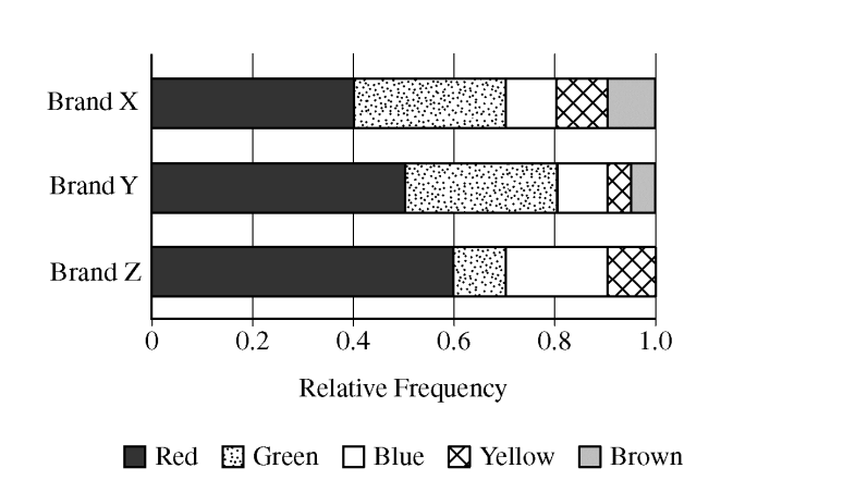
Three brands of candy pieces—X, Y, and Z—are made in many colors. Shaela bought one bag of each brand and counted the number of pieces of each color. The graph below shows the relative frequency distribution of the colors for each bag.
Which of the following statements must be true?
(A) For Brand X, there were more green candy pieces than red candy pieces in the bag.
(B) For Brand Y, there were more red candy pieces than green candy pieces in the bag.
(C) There were more green candy pieces in the Brand X bag than were in the Brand Z bag.
(D) There were the same number of blue candy pieces in the Brand X bag as were in the Brand Y bag.
(E) The number of blue candy pieces in the Brand Z bag was equal to the sum of the number of blue candy pieces in the other two bags.
▶️ Answer/Explanation
Detailed solution

1. Interpret the Graph:
The graph shows relative frequencies (proportions), not actual counts. We can only compare the proportions of colors within the same brand’s bag.

2. Analyze Brand Y:
– The proportion of red pieces for Brand Y is approximately \(0.50\) (from \(0\) to \(0.50\)).
– The proportion of green pieces for Brand Y is approximately \(0.30\) (from \(0.50\) to \(0.80\)).

Since \(0.50 > 0.30\), the proportion of red candy pieces was greater than the proportion of green candy pieces in the Brand Y bag. Because we are comparing proportions within the same bag, this means there were more red pieces than green pieces.
Answer: (B)

Scroll to Top