
AP Statistics 1.5 Graphical Representations for One Quantitative Variable- Exam Style Questions - FRQs - New Syllabus
Question
Most-appropriate topic codes (AP Statistics):
• Topic \(1.6\) — Descriptions for One Quantitative Variable Distributions (Part \( \mathrm{a} \))
• Topic \(1.9\) — Comparisons of the Distributions for One Quantitative Variable (Part \( \mathrm{c} \))
▶️ Answer/Explanation
(a)
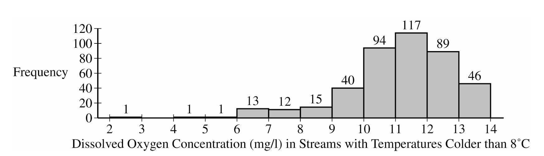
Shape: The distribution is heavily skewed to the left (negatively skewed).
Center: The center of the distribution is around a median of between 11 and 12 mg/l (which is also the modal interval).
Spread: The dissolved oxygen concentrations vary from a minimum between 2 and 3 mg/l to a maximum between 13 and 14 mg/l.
Unusual Features: There appear to be potential low outliers between 2 and 6 mg/l.
(b)
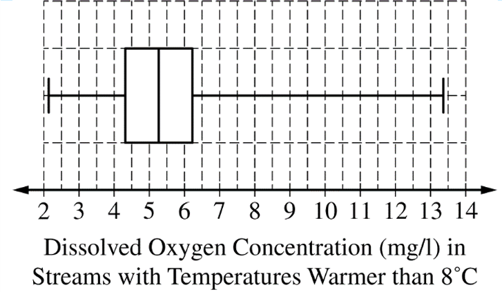
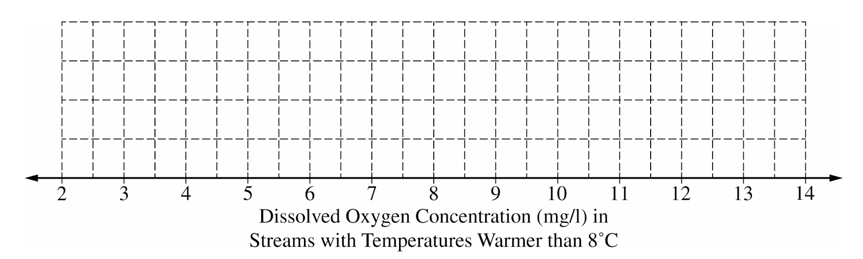
To construct the box plot, follow these steps plotted against an appropriate scale (e.g., 2 to 14):
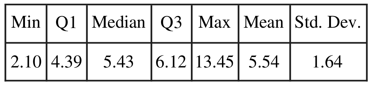
Draw a vertical line segment at the median: $M = 5.43$
Draw vertical line segments at the quartiles: $Q_1 = 4.39$ and $Q_3 = 6.12$, and connect them to form the central box.
Draw horizontal whiskers extending from the box to the minimum value at $2.10$ and the maximum value at $13.45$.
(c)
The streams with temperatures colder than 8°C are generally healthier for wildlife.
Justification: We must compare the centers and spreads. The median dissolved oxygen concentration for the colder streams (between 11 and 12 mg/l) is significantly higher than the median for the warmer streams ($5.43$ mg/l). Furthermore, the vast majority of colder streams have oxygen levels above 10 mg/l, while the third quartile ($Q_3$) for warmer streams is only $6.12$ mg/l. This means over 75% of warmer streams have lower oxygen concentrations than almost all of the colder streams.
Question
Most-appropriate topic codes (AP Statistics):
• Topic \(1.6\) — Descriptions for One Quantitative Variable Distributions (Part \( \mathrm{b} \) — checking normality condition)
• Topic \(4.2\) — Constructing a Confidence Interval for a Population Mean or Population Mean Difference (Part \( \mathrm{b} \))
• Topic \(4.3\) — Justifying a Claim Based on a Confidence Interval for a Population Mean or Population Mean Difference (Part \( \mathrm{b} \))
▶️ Answer/Explanation
(a)
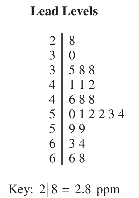
From the stemplot, the crows with lead levels greater than \(6.0\) ppm are those with values \(6.3,\ 6.4,\ 6.6,\) and \(6.8\) ppm — that gives us exactly \(4\) crows out of the \(23\) sampled.
$\text{Proportion} = \frac{4}{23} \approx 0.174$
\(\boxed{\dfrac{4}{23} \approx 0.174}\)
(b)
Step 1: Identify the procedure and check conditions.
The appropriate procedure is a one-sample \(t\)-interval for a population mean, using the formula:
$\bar{x} \pm t^* \cdot \frac{s}{\sqrt{n}}$
Condition 1 — Random sample: The problem states the \(23\) crows were randomly selected, so this condition is met.
Condition 2 — Normality: The sample size of \(23\) is not large enough on its own, so we check the stemplot. The data show no strong skewness and no outliers, so it is reasonable to assume the population distribution of lead levels is approximately normal.
Step 2: Compute the confidence interval.
Given: \(\bar{x} = 4.90\) ppm, \(s = 1.12\) ppm, \(n = 23\)
Degrees of freedom: \(df = n – 1 = 22\)
Critical value at \(95\%\) confidence with \(22\) df: \(t^* = 2.074\)
$4.90 \pm 2.074 \times \frac{1.12}{\sqrt{23}}$
$4.90 \pm 2.074 \times 0.2336$
$4.90 \pm 0.484$
$\boxed{(4.416,\ 5.384) \text{ ppm}}$
Step 3: Interpret the interval.
We are \(95\%\) confident that the true mean lead level among all crows in this region is between \(4.416\) ppm and \(5.384\) ppm.
Question
Most-appropriate topic codes (AP Statistics):
• Topic \(1.5\) — Graphical Representations for One Quantitative Variable (Part \( \mathrm{b} \))
• Topic \(1.7\) — Summary Statistics for One Quantitative Variable (Part \( \mathrm{c} \))
• Topic \(1.5\) — Graphical Representations for One Quantitative Variable (Part \( \mathrm{d} \))
• Topic \(1.9\) — Comparisons of the Distributions for One Quantitative Variable (Part \( \mathrm{e} \))
▶️ Answer/Explanation
(a)
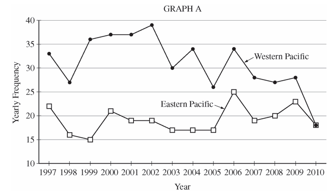
The Western Pacific consistently had a higher yearly frequency of typhoons than the Eastern Pacific throughout the entire period from \(1997\) to \(2010\). The center (median/mean) of the Western Pacific distribution is noticeably higher — roughly in the low-to-mid \(30\)s — compared to the Eastern Pacific, which clusters mostly in the high teens to low \(20\)s. The Western Pacific also showed greater year-to-year variability, with values ranging from \(18\) to \(39\), while the Eastern Pacific ranged from \(15\) to \(25\). Both distributions appear roughly similar in shape — neither strongly skewed — but the Western Pacific distribution is shifted considerably upward compared to the Eastern Pacific.
(b)
For the Eastern Pacific, typhoon frequencies were relatively stable throughout the period. After starting at \(22\) in \(1997\), the counts dipped slightly in the late \(1990\)s and early \(2000\)s, hovered in the high teens, then showed a slight increase around \(2006\) before settling back down to \(18\) in \(2010\). There is no strong overall upward or downward trend — the Eastern Pacific frequencies stayed roughly flat over the \(14\)-year period.
For the Western Pacific, typhoon frequencies showed a noticeable overall downward trend over the period. Starting at \(33\) in \(1997\), counts rose to a peak of \(39\) in \(2002\), then declined steadily, dropping sharply to \(18\) in \(2010\) — the same value as the Eastern Pacific in that year. The general trend in the Western Pacific is a decrease in typhoon frequency from the early \(2000\)s onward.
(c)
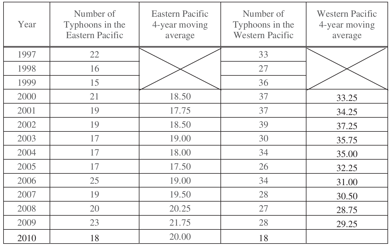
The \(4\)-year moving average for \(2010\) in the Western Pacific is the average of the four most recent yearly values: \(2007\), \(2008\), \(2009\), and \(2010\).
$\text{4-year moving average}_{2010} = \frac{28 + 27 + 28 + 18}{4} = \frac{101}{4} = \boxed{25.25}$
The value is written in the table as follows. 
(d)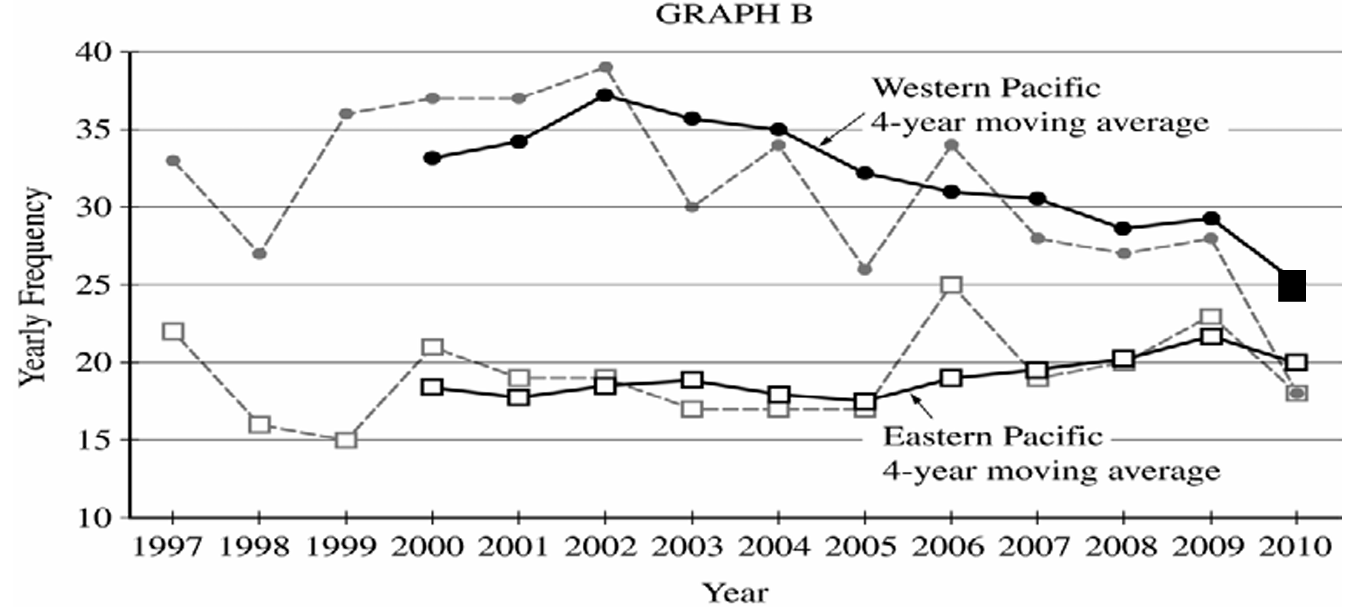
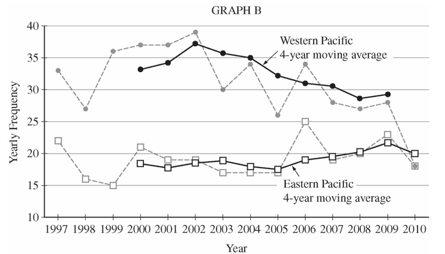
On Graph B, plot the point \((2010,\ 25.25)\) for the Western Pacific \(4\)-year moving average and connect it with a solid line to the previous moving average value of \(29.25\) at \(2009\). This completes the Western Pacific moving average line, which shows a continued decline ending at \(25.25\) in \(2010\).
(e)(i)
The \(4\)-year moving averages make the overall long-term trends in typhoon frequency more apparent. In particular, the moving average plot for the Western Pacific clearly shows the gradual downward trend in typhoon activity from the early \(2000\)s to \(2010\), which is harder to see in the raw yearly data due to year-to-year fluctuations. The moving averages smooth out the short-term noise and reveal the underlying direction of change over time.
(e)(ii)
The \(4\)-year moving averages make the year-to-year variability and individual fluctuations less apparent. For example, the sharp single-year spike or drop in a particular year (such as the Western Pacific dropping to \(26\) in \(2005\) or the Eastern Pacific jumping to \(25\) in \(2006\)) is dampened or obscured in the moving average plot. The raw yearly frequency plots show these individual extreme values much more clearly.
Question
Most-appropriate topic codes (AP Statistics):
• Topic 1.6 — Descriptions for One Quantitative Variable Distributions (Part b)
• Topic 1.9 — Comparisons of the Distributions for One Quantitative Variable (Part c)
▶️ Answer/Explanation
(a)
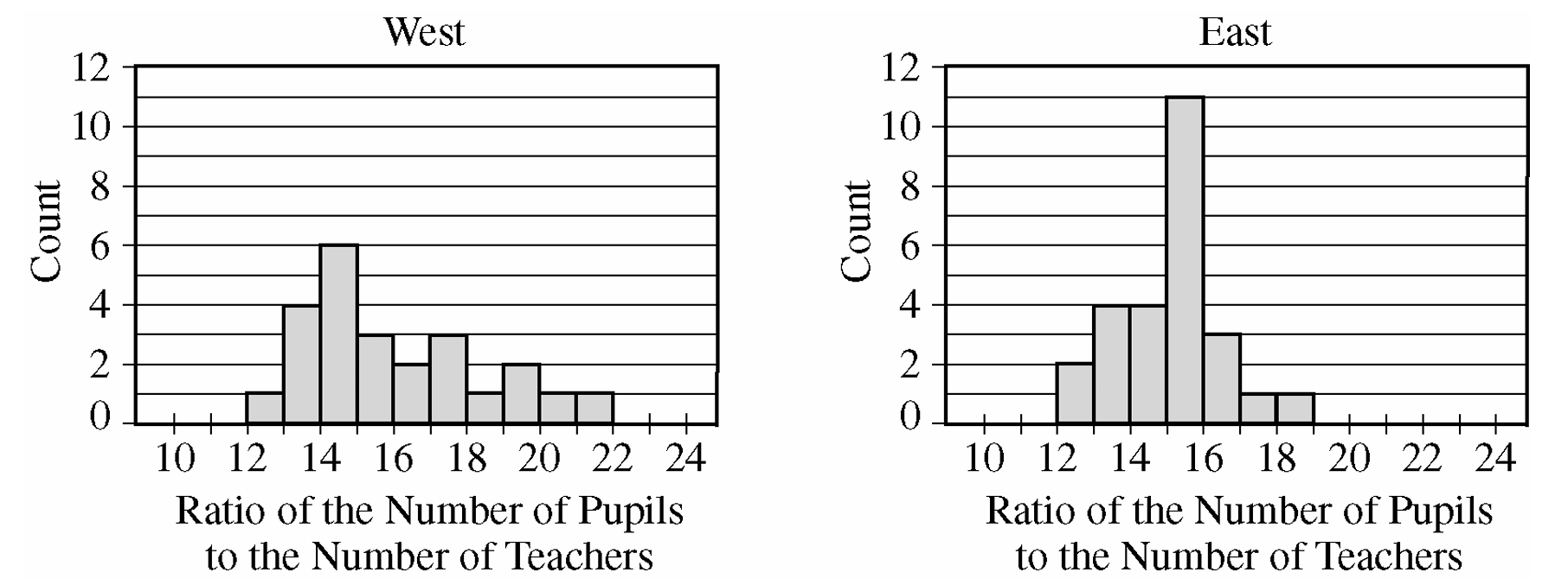
To find the median from a histogram, identify the interval that contains the middle observation by adding the frequencies of each bin from left to right until the cumulative total reaches half of the sample size.
For a group with \(n\) sorted observations, the median position is calculated using the formula \(\frac{n+1}{2}\).
For the West group, there are \(n = 24\) observations, meaning the median is the average of the 12th and 13th values.
By counting cumulative frequencies from the left: the 12-13 bin has 1, the 13-14 bin has 4 (total 5), the 14-15 bin has 6 (total 11), and the 15-16 bin has 3 (total 14).
Since the 12th and 13th observations fall inside the 15-16 interval, the estimated median P-T ratio for the West group is between 15 and 16.
For the East group, there are \(n = 26\) observations, meaning the median is the average of the 13th and 14th values.
Counting cumulative frequencies from the left: the 12-13 bin has 2, the 13-14 bin has 4 (total 6), the 14-15 bin has 4 (total 10), and the 15-16 bin has 11 (total 21).
Since the 13th and 14th observations also fall inside the 15-16 interval, the estimated median P-T ratio for the East group is also between 15 and 16.
\(\boxed{\text{West Median: } [15, 16], \text{ East Median: } [15, 16]}\)
From the histogram, cumulative frequencies for the two groups are shown in the table below. 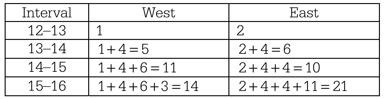
Thus, the median P-T ratio for both groups is at least 15 students per teacher and at most 16 students per teacher.
(b)
Shape: The distribution of P-T ratios for the West group is unimodal and skewed to the right, whereas the distribution for the East group is unimodal and approximately symmetric.
Center: The centers are nearly identical, with both the West and East groups having a median P-T ratio located in the interval between 15 and 16 students per teacher.
Spread: There is visibly more variability in the P-T ratios for the West group than for the East group. The maximum possible range for the West group is \(22 – 12 = 10\), which is larger than the maximum possible range for the East group, which is \(19 – 12 = 7\).
(c)
The mean P-T ratio for the West group will likely be greater than the mean P-T ratio for the East group.
As established in part (a), both distributions have approximately the same median value between 15 and 16.
Because the distribution for the West group is strongly skewed to the right, its mean will be pulled upward to a value greater than its median.
In contrast, because the distribution for the East group is roughly symmetric, its mean will remain close to its median value.
Therefore, the mean of the West group will be higher than the mean of the East group.
\(\boxed{\text{Mean}_{\text{West}} > \text{Mean}_{\text{East}}}\)
Question
\(8.6\quad 5.1\quad 8.7\quad 4.6\quad 7.5\quad 5.3\quad 8.2\quad 4.7\quad 4.8\quad 4.6\)
Most-appropriate topic codes (AP Statistics):
• Topic \(1.5\) — Graphical Representations for One Quantitative Variable (Part \( \mathrm{b} \))
• Topic \(1.6\) — Descriptions for One Quantitative Variable Distributions (Part \( \mathrm{c} \))
▶️ Answer/Explanation
(a)
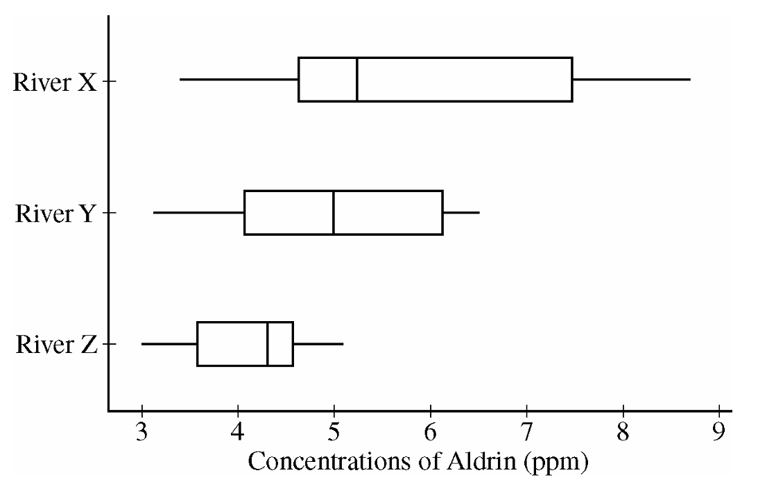
Comparing the medians reveals that the concentration of aldrin tends to be highest for River X and lowest for River Z.
About \(50\%\) of the concentrations of aldrin for Rivers X and Y are higher than all of the concentrations for River Z.
River X also displays the most variability in aldrin concentrations, as seen by the largest range and largest IQR, and River Z has the least variability, as judged by both IQR and range.
The shapes of the three distributions differ, in that the distribution appears to be skewed to the right for River X, roughly symmetric for River Y and slightly skewed to the left for River Z.
(b)
Aldrin concentrations (in ppm) for River X
Leaf unit \(= 0.1\) (for example, \(3 \mid 4\) represents \(3.4\,\text{ppm}\))
\(3 \mid 4\ 7\)
\(4 \mid 0\ 2\ 3\ 6\ 6\ 7\ 8\)
\(5 \mid 1\ 3\ 3\ 5\ 6\)
\(6 \mid \)
\(7 \mid 3\ 5\)
\(8 \mid 0\ 2\ 6\ 7\)
(c)
The stemplot shows a clear gap in the distribution of aldrin concentrations for River X.
This gap occurs between the values of \(5.6\) and \(7.3\,\text{ppm}\) of aldrin.
This gap is not apparent in the boxplot.
Question

Most-appropriate topic codes (AP Statistics):
• Topic \(2.9\) — Parameters of Random Variables (Part \(\mathrm{a}\))
• Topic \(2.7\) — Independent Events and Unions of Events (Parts \(\mathrm{b}\), \(\mathrm{c}\), \(\mathrm{d}\))
▶️ Answer/Explanation
(a)
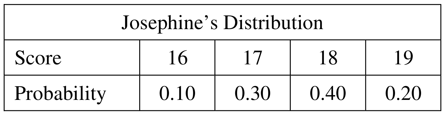
The expected value (mean) of a discrete random variable is \(\mu = \sum x_i \cdot P(x_i)\). We apply this to each player’s distribution.
For Josephine:
\(\mu_J = 16(0.10) + 17(0.30) + 18(0.40) + 19(0.20)\)
\(\mu_J = 1.6 + 5.1 + 7.2 + 3.8 = \boxed{17.7}\)
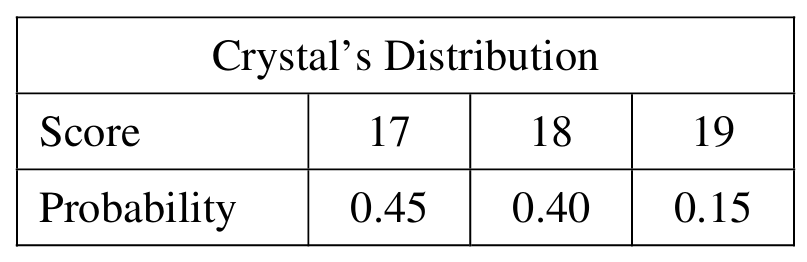
For Crystal:
\(\mu_C = 17(0.45) + 18(0.40) + 19(0.15)\)
\(\mu_C = 7.65 + 7.20 + 2.85 = \boxed{17.7}\)
Both players have the same expected score of \(17.7\).
(b)
We need all pairs \((J, C)\) such that \(J – C = -1\), i.e., Josephine’s score is exactly 1 less than Crystal’s. Since scores are independent, the probability of each pair is the product of the individual probabilities.
\(J = 16,\ C = 17\): \(\quad P = (0.10)(0.45) = 0.045\)
\(J = 17,\ C = 18\): \(\quad P = (0.30)(0.40) = 0.120\)
\(J = 18,\ C = 19\): \(\quad P = (0.40)(0.15) = 0.060\)
These are the only three combinations that produce a difference of \(-1\).
(c)
Since the three combinations in part (b) are mutually exclusive, we simply add their probabilities:
\(P(J – C = -1) = 0.045 + 0.120 + 0.060\)
\(\boxed{P(J – C = -1) = 0.225}\)
(d)
First, we find the missing probability for a difference of \(-2\). Since all probabilities in the distribution must sum to 1:
\(P(J – C = -2) = 1 – 0.015 – 0.225 – 0.325 – 0.260 – 0.090\)
\(P(J – C = -2) = 1 – 0.915 = \boxed{0.085}\)
The completed distribution table is:

Crystal’s score is higher than Josephine’s when the difference \(J – C < 0\), i.e., when the difference is \(-3\), \(-2\), or \(-1\).
\(P(\text{Crystal} > \text{Josephine}) = P(J – C < 0) = 0.015 + 0.085 + 0.225\)
\(\boxed{P(\text{Crystal} > \text{Josephine}) = 0.325}\)
Question
Most-appropriate topic codes (AP Statistics):
• Topic 1.9 — Comparisons of the Distributions for One Quantitative Variable (Part \(\mathrm{a}\))
• Topic 1.11 — Random Sampling (Part \(\mathrm{b}\))
• Topic 4.4 — Setting Up a Test for a Population Mean or Population Mean Difference (Part \(\mathrm{b}\))
▶️ Answer/Explanation
(a)
First, let’s organize the data for both groups:
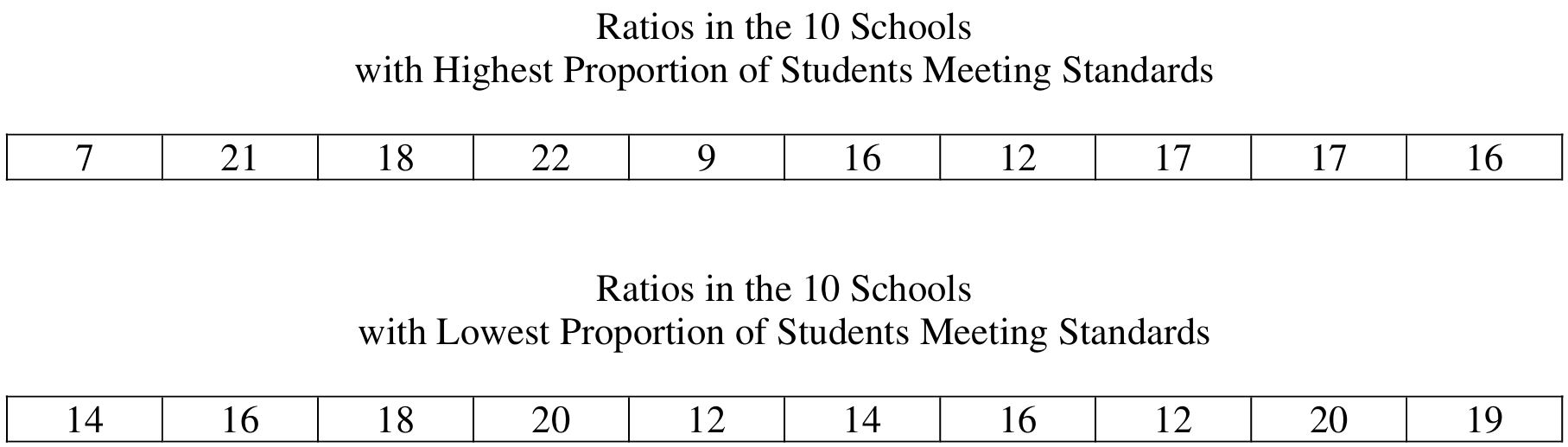
Highest Proportion group: \(7, 9, 12, 16, 16, 17, 17, 18, 21, 22\)
Lowest Proportion group: \(12, 12, 14, 14, 16, 16, 18, 19, 20, 20\)
The dotplots, displayed on a common scale from \(4\) to \(24\), are shown below:
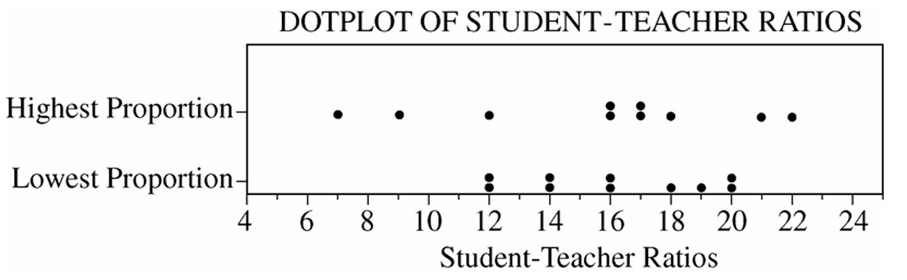
Similarities: The two distributions are centered at approximately the same place. The median for the Highest Proportion group is \(\dfrac{16+17}{2} = 16.5\) and the median for the Lowest Proportion group is \(\dfrac{16+16}{2} = 16\), so both centers are very close to \(16\).
Differences: The distribution for the Highest Proportion group is much more spread out (variable) than the distribution for the Lowest Proportion group. The range for the Highest Proportion group is \(22 – 7 = 15\), while the range for the Lowest Proportion group is only \(20 – 12 = 8\). In other words, the top schools show much greater variability in their student-to-teacher ratios compared to the bottom schools.
(b)
The two groups of schools are not random samples drawn from two larger populations of interest.
The group of 10 schools with the highest proportion of students meeting the standards is itself the entire population of such schools — it is not a random sample from some larger population of high-performing schools.
Similarly, the group of 10 schools with the lowest proportion is itself the complete population of the lowest-performing schools in the state — not a random sample from a larger population.
Since statistical inference is designed to generalize conclusions from a sample to a broader population, and these two groups are not random samples but rather complete populations defined by their extreme values, applying any inferential procedure (such as a two-sample \(t\)-test) to these data would be inappropriate. There is no larger population to generalize to.
Question
Most-appropriate topic codes (AP Statistics):
• Topic 4.4 — Setting Up a Test for a Population Mean or Population Mean Difference (Part \(\mathrm{c}\))
• Topic 4.5 — Carrying Out a Test for a Population Mean or Population Mean Difference (Part \(\mathrm{c}\))
• Topic 1.5 — Graphical Representations for One Quantitative Variable (Part \(\mathrm{d}\))
• Topic 1.9 — Comparisons of the Distributions for One Quantitative Variable (Part \(\mathrm{d}\))
▶️ Answer/Explanation
(a)
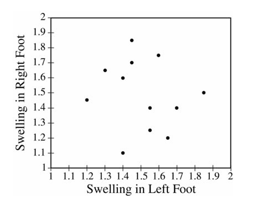
The trait that distinguishes the two groups in the scatterplot is the dominant foot (left or right). All the points in the upper-left cluster represent patients whose dominant foot is the right foot, while all the points in the lower-right cluster represent patients whose dominant foot is the left foot. The dominant foot type is the common trait, and it differs between the two groups.
(b)
Two conclusions become clear from this scatterplot that were not visible before:
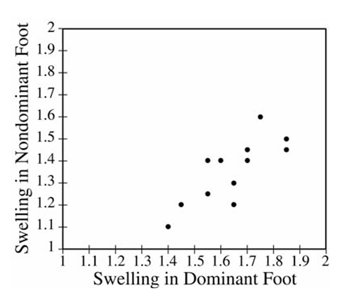
First, there is a positive linear relationship between swelling in the dominant foot and swelling in the nondominant foot — as swelling in the dominant foot increases, swelling in the nondominant foot tends to increase as well.
Second, and importantly, every single point lies below the line \(y = x\), which means swelling in the dominant foot is consistently greater than swelling in the nondominant foot for all patients in the sample. This pattern across both groups combined is something you simply could not see in the left-foot vs. right-foot scatterplot from part (a).
(c)
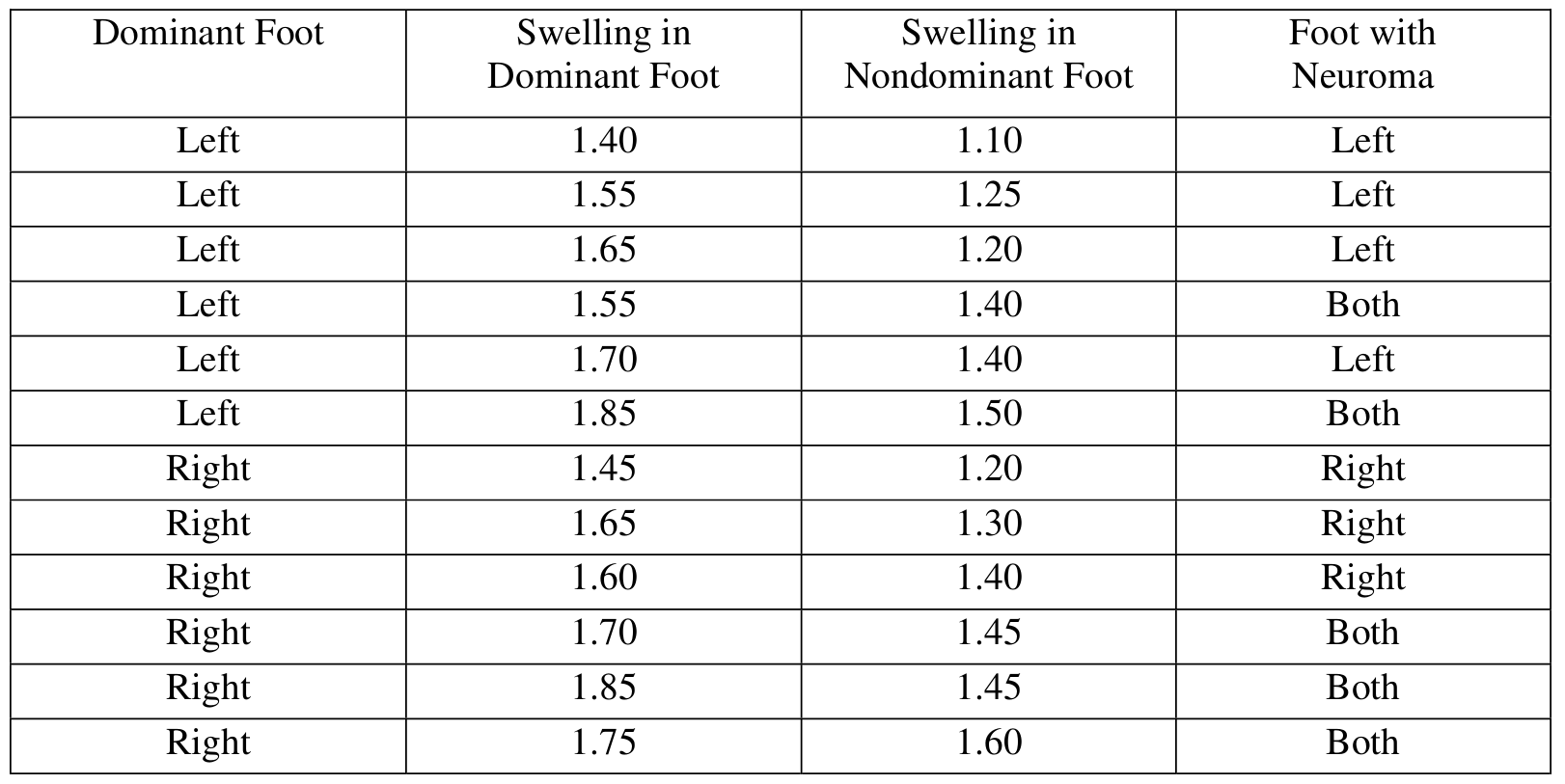
We perform a matched-pairs \(t\)-test on the differences \(d_i = \text{(dominant swelling)} – \text{(nondominant swelling)}\).
The 12 differences are:
\(0.30,\ 0.30,\ 0.45,\ 0.15,\ 0.30,\ 0.35,\ 0.25,\ 0.35,\ 0.20,\ 0.25,\ 0.40,\ 0.15\)
State hypotheses (where \(\mu_d\) is the mean difference, dominant minus nondominant):
\(H_0: \mu_d = 0\)
\(H_a: \mu_d \neq 0\)
Check conditions:
1. We are told a random sample was selected from the population of adult females with Morton’s neuroma.
2. A dotplot of the differences shows a roughly symmetric, unimodal distribution with no outliers — it is reasonable to treat the population of differences as approximately normal.
Compute the test statistic:
\(\bar{x}_d = 0.2875, \quad s_d = 0.0932, \quad n = 12, \quad df = 11\)
\(t = \dfrac{\bar{x}_d – 0}{\dfrac{s_d}{\sqrt{n}}} = \dfrac{0.2875 – 0}{\dfrac{0.0932}{\sqrt{12}}} = 10.68\)
\(p\text{-value} \approx 0.0000004 \approx 0\)
Since the \(p\)-value is essentially \(0\), which is far less than any reasonable significance level \(\alpha\), we reject \(H_0\). There is very convincing statistical evidence that the mean swelling in the dominant foot is different from (and specifically greater than) the mean swelling in the nondominant foot for adult females who have Morton’s neuroma in at least one foot.
(d)
To suggest a diagnostic criterion, we separate all 24 swelling measurements into two groups: the 17 foot measurements from feet that have Morton’s neuroma and the 7 foot measurements from feet that do not have Morton’s neuroma. A stacked dotplot of the two groups is shown below: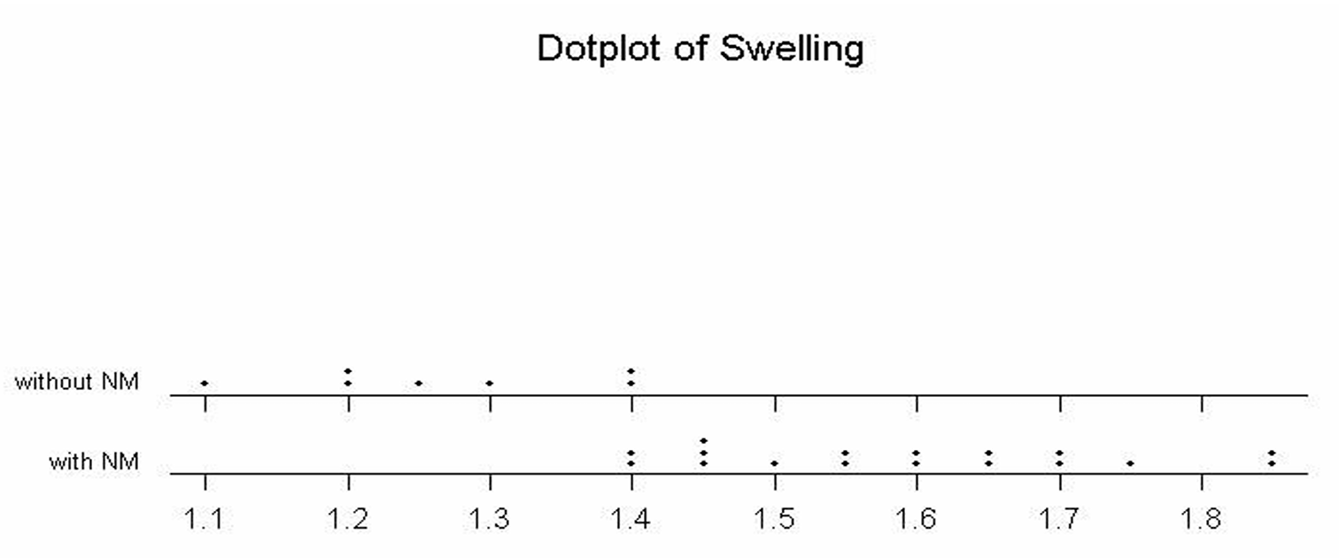
The dotplot makes it visually clear that all 7 feet without Morton’s neuroma have swelling measurements of \(1.40\) or below, while the feet with Morton’s neuroma have swelling values of \(1.40\) and above (with the measurements extending up to \(1.85\)). Based on this graphical display, a reasonable diagnostic criterion is:
\(\boxed{\text{Swelling measurement} \geq 1.4 \Rightarrow \text{diagnose Morton’s neuroma}}\)
A cutoff of approximately \(1.4\) or higher serves as a sensible threshold for diagnosing Morton’s neuroma, since it cleanly separates the feet with and without the condition in this dataset.
Question

Most-appropriate topic codes (AP Statistics):
• Topic 4.5 — Carrying Out a Test for a Population Mean or Population Mean Difference (Test Mechanics and Conclusion)
• Topic 1.5 — Graphical Representations for One Quantitative Variable (Checking the Distribution of Differences)
▶️ Answer/Explanation
We conduct a paired \(t\)-test for the mean difference in the level of E. coli bacteria contamination detected by the two methods.
Step 1 — Hypotheses
Let \(\mu_d\) be the population mean difference in E. coli contamination levels (Method A \(-\) Method B).
\(H_0: \mu_d = 0\) (no difference in mean contamination detected by the two methods)
\(H_a: \mu_d \neq 0\) (there is a difference in mean contamination detected by the two methods)
Step 2 — Identify Test and Check Conditions
We use a paired \(t\)-test with test statistic:
\(t = \dfrac{\bar{x}_d – 0}{s_d / \sqrt{n_d}}\)
First, compute the differences \(d_i = A_i – B_i\) for each specimen:
\(-0.3,\quad 0.5,\quad 0.3,\quad 0.6,\quad 0.8,\quad 0.7,\quad 1.2,\quad 0.2,\quad -0.1,\quad -1.0\)
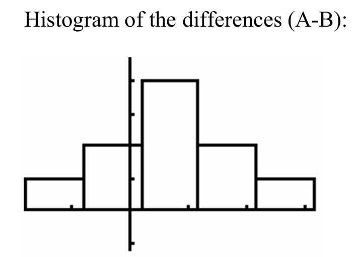
Condition 1 — Independence: The 10 specimens were randomly selected, so it is reasonable to assume the 10 pairs of measurements are independent of one another.
Condition 2 — Normality of Differences: With only \(n = 10\) differences, we check a histogram or boxplot of the differences. The histogram of the differences \((A – B)\) is roughly symmetric with no apparent outliers, so it is reasonable to assume the population distribution of differences is approximately normal.
Step 3 — Mechanics
From the differences:
\(\bar{x}_d = 0.29, \qquad s_d = 0.6297, \qquad n = 10\)
\(t = \dfrac{0.29 – 0}{0.6297/\sqrt{10}} = \dfrac{0.29}{0.1991} \approx 1.456\)
\(\text{degrees of freedom} = n – 1 = 9\)
\(p\text{-value} = 2 \times P(t_9 > 1.456) \approx 0.1793\)
Step 4 — Conclusion
Since the \(p\)-value of \(0.1793\) is greater than \(\alpha = 0.05\), we fail to reject \(H_0\).
We do not have statistically significant evidence to conclude that there is a difference in the mean amount of E. coli bacteria detected by the two methods for this type of beef.
\(\boxed{p\text{-value} = 0.1793 > 0.05 \Rightarrow \text{Fail to reject } H_0; \text{ no significant difference between the two methods.}}\)
Question
19 36 19 13 43 8 16 14 10 9
Most-appropriate topic codes (AP Statistics):
• Topic 1.6 — Descriptions for One Quantitative Variable Distributions (Part \(\mathrm{b}\))
• Topic 1.7 — Summary Statistics for One Quantitative Variable (Part \(\mathrm{c}\))
• Topic 1.9 — Comparisons of the Distributions for One Quantitative Variable (Parts \(\mathrm{b}\), \(\mathrm{c}\))
▶️ Answer/Explanation
(a)
To build the stemplot, use the tens digit as the stem and the units digit as the leaf. The data range from \(8\) to \(44\), so the stems are \(0, 1, 2, 3, 4\). Place each data value’s units digit on the appropriate row.
\( \begin{array}{r|l} 0 & 8 \quad 9 \\ 1 & 2 \quad 6 \quad 8 \quad 7 \quad 8 \quad 9 \quad 6 \quad 9 \quad 3 \quad 4 \quad 0 \\ 2 & \\ 3 & 3 \quad 8 \quad 6 \quad 5 \\ 4 & 1 \quad 4 \quad 3 \\ \end{array} \)
Legend: \(1 \mid 2\) represents \(12\) questions answered correctly.
Ordered version (leaves sorted in ascending order):
\( \begin{array}{r|l} 0 & 8 \quad 9 \\ 1 & 0 \quad 2 \quad 3 \quad 4 \quad 6 \quad 6 \quad 7 \quad 8 \quad 8 \quad 9 \quad 9 \\ 2 & \\ 3 & 3 \quad 5 \quad 6 \quad 8 \\ 4 & 1 \quad 3 \quad 4 \\ \end{array} \)
Legend: \(1 \mid 2\) represents \(12\) questions answered correctly.
(b)
The most striking feature of this distribution is that the scores split into two distinct groups — one cluster concentrated in the teens (roughly \(8\)–\(19\)) and a second, smaller cluster in the high \(30\)s and low \(40\)s. There is a complete gap in the \(20\)s, with no student scoring between \(19\) and \(33\). The distribution is bimodal, suggesting that students tended to perform either quite poorly or quite well on the test, with no middle ground.
(c)
A measure of center such as the mean or median would fall somewhere around \(\bar{x} \approx 22.95\), which lies right in the gap of the \(20\)s — a region where no student actually scored. Reporting only the center gives the false impression that a typical student scored around \(23\), when in reality no student did. Because the data are bimodal with two separated groups, the center alone completely misses the two-cluster structure of the distribution and would mislead the reader into thinking the scores are roughly symmetric or unimodal.
Question
Most-appropriate topic codes (AP Statistics):
• Topic 1.8 — Graphical Representations of Summary Statistics for One Quantitative Variable (Parts \(\mathrm{a}\), \(\mathrm{d}\))
▶️ Answer/Explanation
(a)
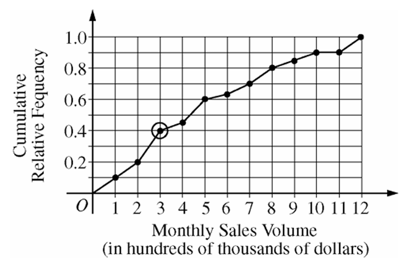
The circled point is located at approximately \((3,\ 0.40)\) on the graph.
This tells us that 40 percent of the sales agents at this real estate company had a monthly sales volume of \$300,000 or less in the month shown.
In other words, the circled point represents the 40th percentile of the distribution of most recent monthly sales volumes for all agents at the company.
\(\boxed{\text{40% of sales agents had monthly sales volume} \leq \$300{,}000}\)
(b)
Reading from the cumulative relative frequency plot:
Proportion of agents with sales volume \(\leq \$800{,}000\) (i.e., at \(x = 8\)) \(= 0.80\)
Proportion of agents with sales volume \(\leq \$700{,}000\) (i.e., at \(x = 7\)) \(= 0.70\)
So the proportion with sales volume between \$700,000 and \$800,000 is:
\(P(700{,}000 < X \leq 800{,}000) = P(X \leq 800{,}000) – P(X \leq 700{,}000) = 0.80 – 0.70 = 0.10\)
\(\boxed{0.10 \text{ (or 10 percent) of sales agents achieved monthly sales volumes between \$700,000 and \$800,000}}\)
(c)
When the cumulative relative frequency plot is flat between 10 and 11 on the horizontal axis, it means the cumulative proportion does not change in that interval.
Since no increase in cumulative frequency occurs, there were no sales agents whose monthly sales volume fell between \$1,000,000 and \$1,100,000 during that month.
\(\boxed{\text{No agents had a monthly sales volume between \$1,000,000 and \$1,100,000}}\)
(d)
Since the bonus goes to the top 20 percent of sales agents, we need to find the 80th percentile of the distribution (because the top 20% corresponds to a cumulative relative frequency of \(1 – 0.20 = 0.80\)).
Looking at the cumulative relative frequency plot, a cumulative relative frequency of \(0.80\) corresponds to a monthly sales volume of \$800,000 (i.e., \(x = 8\) on the horizontal axis).
Therefore, an agent must have achieved a monthly sales volume greater than \$800,000 to be in the top 20 percent and qualify for the bonus.
\(\boxed{\text{Minimum monthly sales volume to qualify for bonus} = \$800{,}000}\)