
AP Statistics 1.6 Descriptions for One Quantitative Variable Distributions- Exam Style Questions - FRQs - New Syllabus
Question
Most-appropriate topic codes (AP Statistics):
• Topic \(1.6\) — Descriptions for One Quantitative Variable Distributions (Part \( \mathrm{a} \))
• Topic \(1.9\) — Comparisons of the Distributions for One Quantitative Variable (Part \( \mathrm{c} \))
▶️ Answer/Explanation
(a)
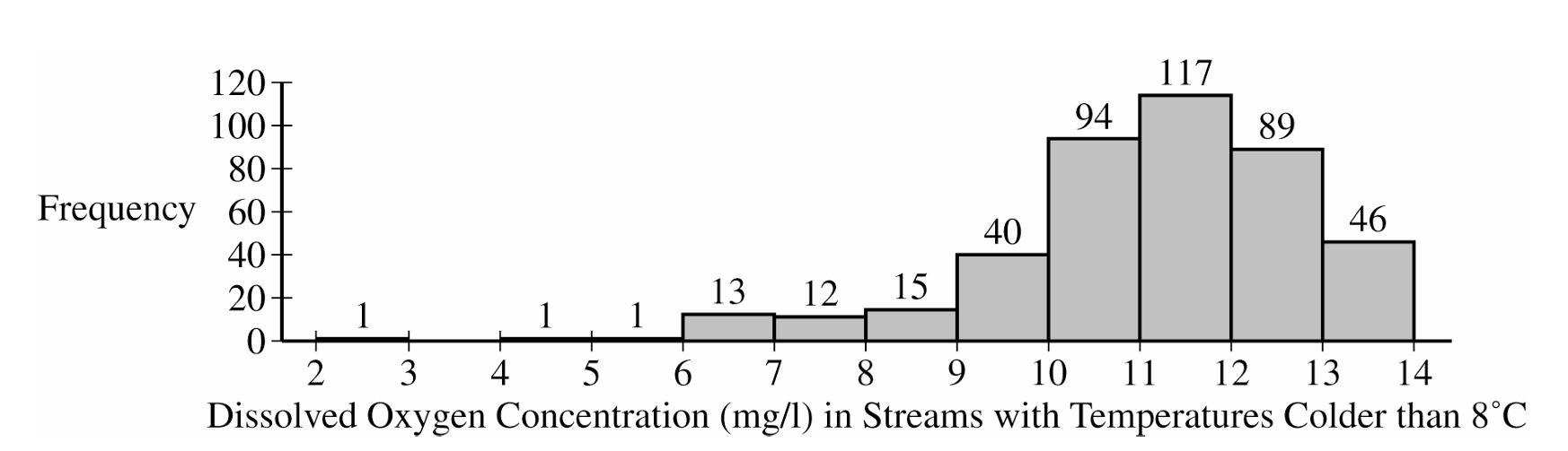
Shape: The distribution is heavily skewed to the left (negatively skewed).
Center: The center of the distribution is around a median of between 11 and 12 mg/l (which is also the modal interval).
Spread: The dissolved oxygen concentrations vary from a minimum between 2 and 3 mg/l to a maximum between 13 and 14 mg/l.
Unusual Features: There appear to be potential low outliers between 2 and 6 mg/l.
(b)
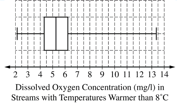
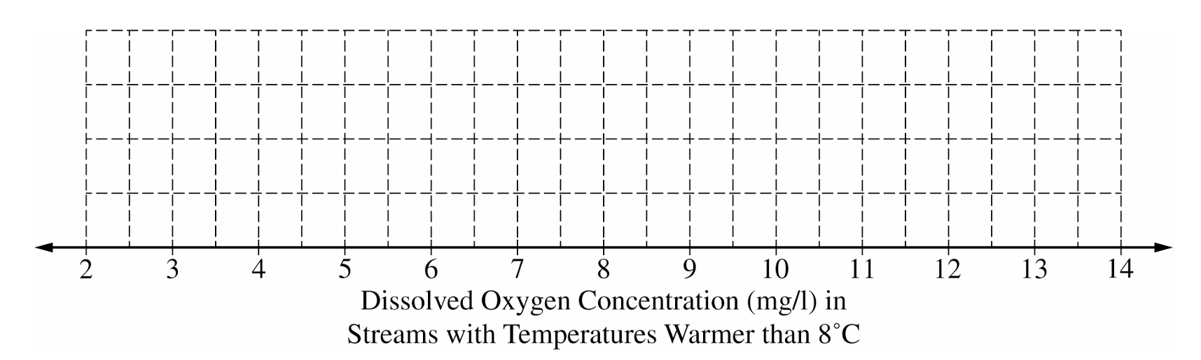
To construct the box plot, follow these steps plotted against an appropriate scale (e.g., 2 to 14):
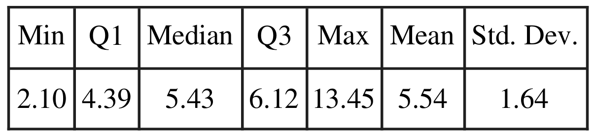
Draw a vertical line segment at the median: $M = 5.43$
Draw vertical line segments at the quartiles: $Q_1 = 4.39$ and $Q_3 = 6.12$, and connect them to form the central box.
Draw horizontal whiskers extending from the box to the minimum value at $2.10$ and the maximum value at $13.45$.
(c)
The streams with temperatures colder than 8°C are generally healthier for wildlife.
Justification: We must compare the centers and spreads. The median dissolved oxygen concentration for the colder streams (between 11 and 12 mg/l) is significantly higher than the median for the warmer streams ($5.43$ mg/l). Furthermore, the vast majority of colder streams have oxygen levels above 10 mg/l, while the third quartile ($Q_3$) for warmer streams is only $6.12$ mg/l. This means over 75% of warmer streams have lower oxygen concentrations than almost all of the colder streams.
Question
(ii) Suppose Cleo took a random sample of $n=2$ necklaces that resulted in a sample mean amount of gold applied of 303 mg. Would that result indicate that the population mean amount of gold being applied by the machine is different from 300 mg? Justify your answer without performing an inference procedure.
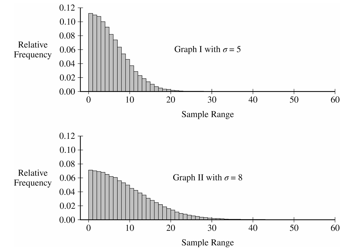
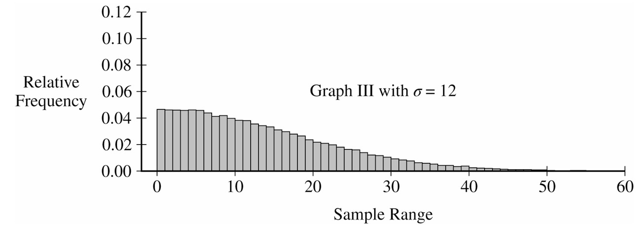
(ii) Describe how the sampling distribution of the sample range for samples of size $n=2$ changes as the value of the population standard deviation increases.
(ii) Do Cleo’s sample mean of 303 mg and range of 10 mg indicate that the machine is not working properly? Explain your answer.
Most-appropriate topic codes (AP Statistics):
• Topic \(2.11\) — The Normal Distribution (Part \( \mathrm{a} \))
• Topic \(2.12\) — Central Limit Theorem and Sampling Distributions for Sample Means (Parts \( \mathrm{b} \), \( \mathrm{d} \))
▶️ Answer/Explanation
(a)
To find the probability, standardize the given values to z-scores using the formula $z = \frac{x – \mu}{\sigma}$.
$P(296 < X < 304) = P\left(\frac{296-300}{5} < Z < \frac{304-300}{5}\right)$
This simplifies to $P(-0.8 < Z < 0.8) \approx 0.5762$.
(b) (i)
For $n=2$, the standard error of the mean is $\sigma_{\bar{x}} = \frac{5}{\sqrt{2}} \approx 3.535$.
$P(\bar{X} > 303) = P\left(Z > \frac{303-300}{3.535}\right) = P(Z > 0.849)$
$P(\bar{X} > 303) \approx 0.198$.
(b) (ii)
No, this result would not indicate the machine is malfunctioning. Because a sample mean of $303$ mg or higher has a probability of approximately $0.198$ (about $20\%$) assuming the machine is working properly, this result is fairly common and not unusual.
(c) (i)
The sampling distribution of the sample range is heavily right-skewed. The center is around a sample range of $4$ to $5$ mg, and the values vary from $0$ mg up to approximately $25$ mg.
(c) (ii)
As the population standard deviation increases, the center of the sampling distribution shifts to the right (indicating a larger expected range), and the distribution becomes more spread out, showing greater variability in the possible sample ranges.
(d) (i)
No, a sample range of $10$ mg is not unusual. Looking at Graph I (where $\sigma=5$), the bars at and to the right of $10$ mg make up a substantial portion of the total area (well over $5\%$), meaning a range of $10$ mg or more occurs quite frequently by chance.
(d) (ii)
No, these results do not indicate a problem. Based on part (b), a sample mean of $303$ mg is not unusual (happens about $20\%$ of the time), and based on part (d)(i), a sample range of $10$ mg is also quite typical. Since neither metric is statistically surprising, there is no convincing evidence to doubt the machine is working properly.
Question

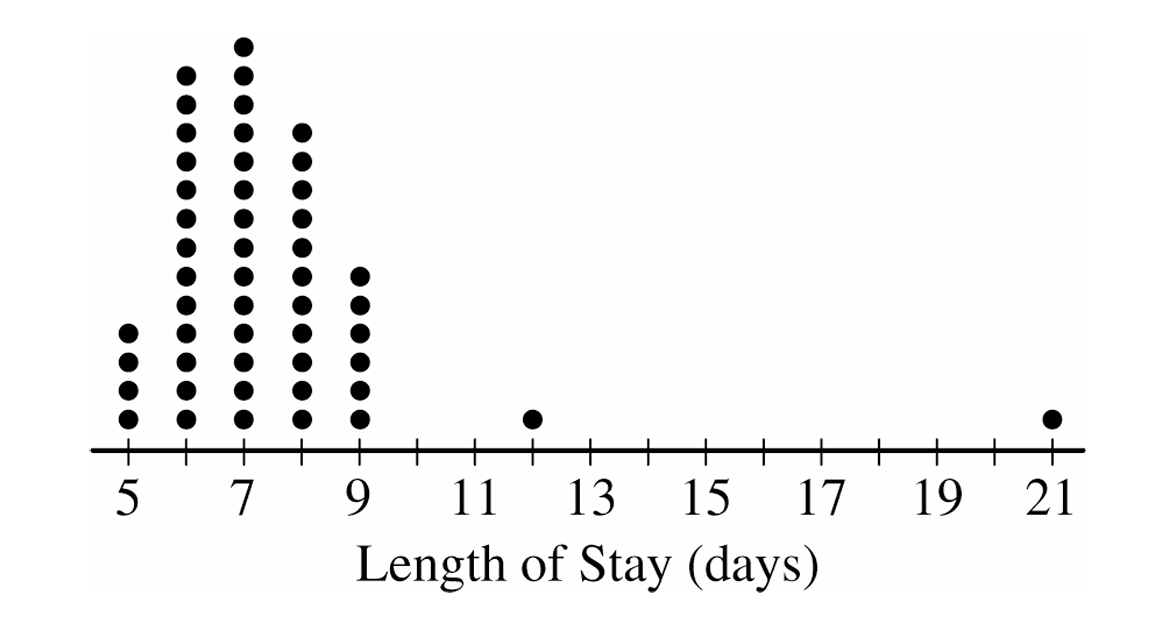
ii. The mean length of stay for the sample is \(7.42\) days with a standard deviation of \(2.37\) days. Using method B, determine any data points that are potential outliers in the distribution of length of stay. Justify your answer.
Most-appropriate topic codes (AP Statistics):
• Topic \(1.7\) — Summary Statistics for One Quantitative Variable (Parts \( \mathrm{a} \), \( \mathrm{b} \))
▶️ Answer/Explanation
(a)
To find the five-number summary, we arrange the data from our sample and extract the necessary percentiles. Based on our \(50\) observations, it naturally breaks down as follows:
\( \text{Minimum} = 5 \text{ days} \)
\( Q_1 = 6 \text{ days} \)
\( \text{Median} = 7 \text{ days} \)
\( Q_3 = 8 \text{ days} \)
\( \text{Maximum} = 21 \text{ days} \)
(b)(i)
For Method A, we rely on the \( 1.5 \times IQR \) rule to flag potential outliers. We first calculate our IQR and resulting boundaries:
\( IQR = Q_3 – Q_1 = 8 – 6 = 2 \)
Lower boundary: \( Q_1 – 1.5 \times IQR = 6 – 1.5(2) = 3 \)
Upper boundary: \( Q_3 + 1.5 \times IQR = 8 + 1.5(2) = 11 \)
Since we have no data points below \( 3 \), there are no lower outliers. However, any values strictly greater than \( 11 \) are upper outliers, which directs us perfectly to the patients who stayed for \( 12 \) days and \( 21 \) days.
(b)(ii)
Method B instead uses the \( 2 \) standard deviations rule, which is centered around our given mean and standard deviation. Let’s map out this interval:
Lower boundary: \( \text{Mean} – 2 \times SD = 7.42 – 2(2.37) = 2.68 \)
Upper boundary: \( \text{Mean} + 2 \times SD = 7.42 + 2(2.37) = 12.16 \)
Scanning our data, there are no lengths of stay below \( 2.68 \). The only length of stay strictly above \( 12.16 \) is the \( 21 \)-day point. So, the only outlier using Method B is the single patient who stayed \( 21 \) days.
(c)
In a distribution that exhibits strong right skewness, non-resistant measures like the mean and standard deviation get pulled heavily toward the extreme values in the long right tail.
This drastic pull inflates the upper outlier boundary for Method B much more than it affects Method A, which is anchored by the highly resistant median and IQR.
Because the threshold for Method B gets stretched out so much further into the right tail, it loses its sensitivity, making it much harder to detect potential outliers compared to Method A.
Question

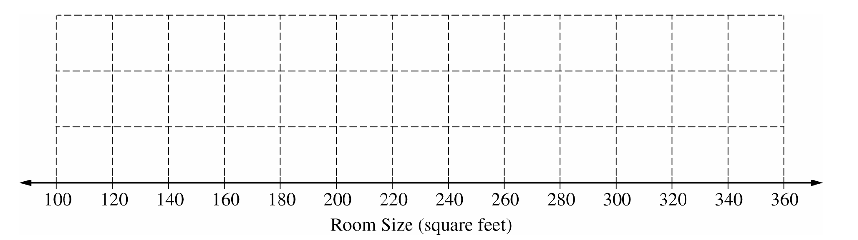
Most-appropriate topic codes (AP Statistics):
• Topic \(1.7\) — Summary Statistics for One Quantitative Variable (Part \( \mathrm{b} \))
• Topic \(1.8\) — Graphical Representations of Summary Statistics for One Quantitative Variable (Part \( \mathrm{b} \))
▶️ Answer/Explanation
(a)
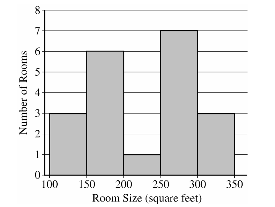
The distribution of the sample of room sizes is bimodal and roughly symmetric.
Most room sizes fall into two clusters: \(100\) to \(200\) square feet and \(250\) to \(350\) square feet.
The center of the distribution is between \(200\) and \(300\) square feet.
The range of the distribution is between \(150\) and \(250\) square feet.
There are no apparent outliers.
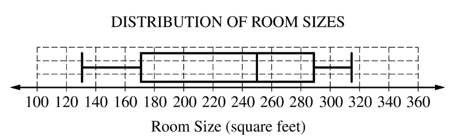
(b)
The interquartile range is:
\(IQR = Q_3 – Q_1 = 292 – 174 = 118\) square feet.
To find potential outliers, we check the lower and upper fences.
Lower Fence = \(Q_1 – 1.5(IQR) = 174 – 1.5(118) = -3\) square feet.
Upper Fence = \(Q_3 + 1.5(IQR) = 292 + 1.5(118) = 469\) square feet.
There are no potential outliers because the minimum room size of \(134\) square feet does not fall below \(-3\), and the maximum room size of \(315\) square feet does not exceed \(469\).
(c)
The histogram clearly shows the bimodal nature (two peaks or clusters) of the distribution of room sizes.
This bimodal characteristic is not apparent from the boxplot.
Question
Most-appropriate topic codes (AP Statistics):
• Topic \(1.7\) — Summary Statistics for One Quantitative Variable (Parts \( \mathrm{a} \), \( \mathrm{b} \), \( \mathrm{c} \))
▶️ Answer/Explanation
(a)
For High School A (\(n = 200\)), the median is the average of the \(100^{\text{th}}\) and \(101^{\text{st}}\) ordered values.
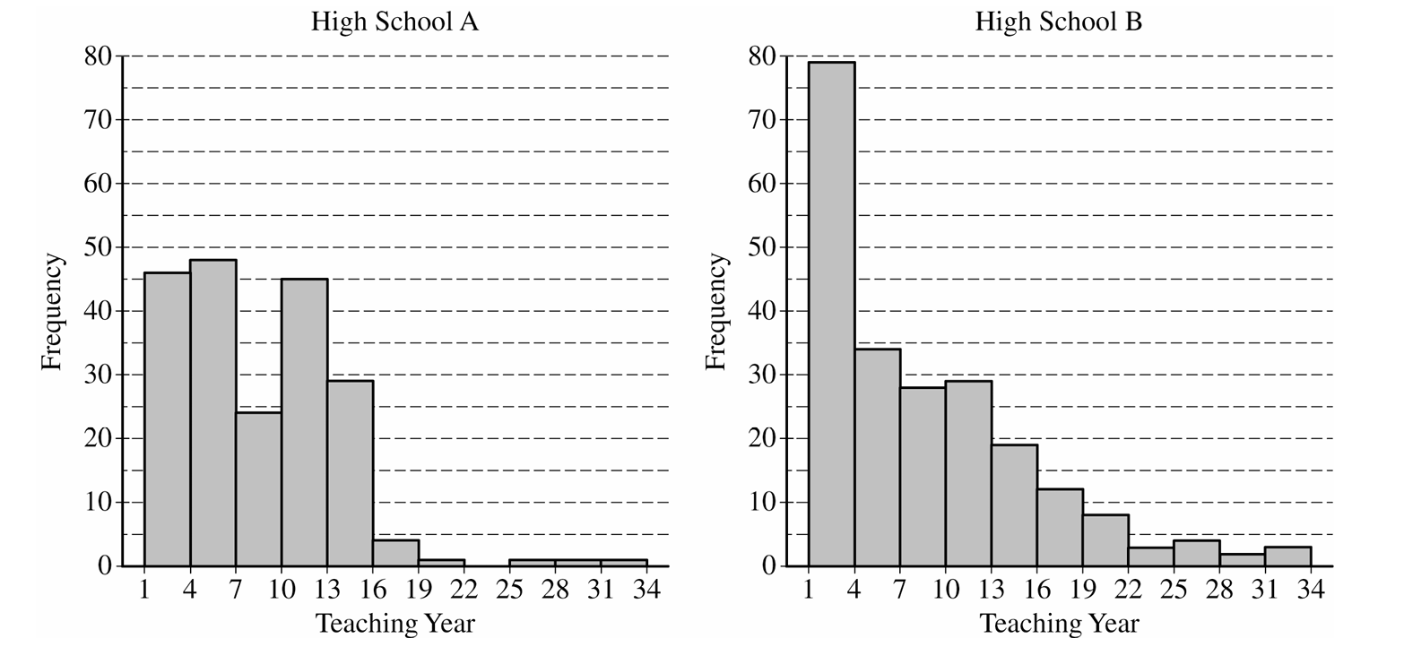
From the histogram, the number of teachers with teaching year in \((1, 7)\) is:
\(46 + 48 = 94 < 100\)
The number with teaching year in \((1, 10)\) is:
\(46 + 48 + 45 = 139 > 100\)
Since there are fewer than \(100\) values below \(7\) but more than \(100\) values below \(10\), both the \(100^{\text{th}}\) and \(101^{\text{st}}\) values fall in the interval \((7, 10)\).
\(\boxed{\text{High School A has median teaching year } = 7}\)
For High School B (\(n = 221\)), the median is the \(111^{\text{th}}\) ordered value.
From the histogram, the number of teachers with teaching year in \((1, 7)\) is:
\(79 + 34 = 113 > 111\)
Since there are more than \(111\) values below \(7\), the \(111^{\text{th}}\) value falls in the interval \((4, 7)\).
\(\boxed{\text{High School B has median teaching year } = 6}\)
Think of the median as a balancing point — you need to find where the “middle person” sits in the ordered list.
For School A, with 94 teachers below year 7 and the median being teacher #100, that teacher has to be somewhere in years 7–9.
For School B, there are already 113 teachers in years 1–6, so the 111th teacher — the median — must be in that same lower group.
The dramatically right-skewed shape of School B also gives a useful intuition: right-skewed distributions pull the mean upward away from the median, and since both schools share the same mean of 8.2, School B (the more skewed one) must have the bigger mean-median gap and therefore the lower median.
(b)
The mean of a combined group is a weighted average — you cannot simply average the two means.
Total teaching years for the original \(200\) teachers: \(\bar{x}_1 \cdot n_1 = 8.2 \times 200 = 1{,}640\)
Total teaching years for the additional \(18\) teachers: \(\bar{x}_2 \cdot n_2 = 2.5 \times 18 = 45\)
Combined mean for all \(218\) teachers: \(\bar{x}_{\text{combined}} = \frac{1{,}640 + 45}{200 + 18} = \frac{1{,}685}{218}\)
\(\boxed{\bar{x}_{\text{combined}} \approx 7.73 \text{ years}}\)
The 18 new teachers have a very low mean of 2.5 years — they are almost all brand-new — so they drag the overall mean down from 8.2 toward 7.73.
Because there are so few of them (only 18 out of 218), the pull is modest but real.
Always weight by group size when combining means; plain-averaging the means (i.e., \((8.2+2.5)/2=5.35\)) would be completely wrong here.
(c)
First, find the interval within \(1\) standard deviation of the mean:
\(\bar{x} \pm s = 8.2 \pm 7.2 \implies (1.0,\ 15.4)\)
Since teaching years are recorded as integers, the values that fall within this interval are \(1, 2, 3, \ldots, 15\) (since \(15 \leq 15.4 < 16\)).
From the High School B histogram, we count the teachers in the five histogram bars that contain years \(1\) through \(15\):
\((1,4):\; 79 \text{ teachers}\)
\((4,7):\; 34 \text{ teachers}\)
\((7,10):\; 28 \text{ teachers}\)
\((10,13):\; 29 \text{ teachers}\)
\((13,16):\; 19 \text{ teachers} \quad \text{(years 13, 14, 15 all} \leq 15.4\text{)}\)
\(\text{Total teachers with year} \in [1,\, 15] = 79 + 34 + 28 + 29 + 19 = 189\)
\(P(\text{within 1 SD of mean}) = \frac{189}{221}\)
\(\boxed{P \approx 0.8552}\)
The critical point here is that you must count directly from the histogram — the Empirical Rule (\(\approx 68\%\)) does not apply because High School B is strongly right-skewed, not bell-shaped.
Applying the Empirical Rule would give the wrong answer. Also note that the entire bar for \([13, 16)\) is included, because all integers in that bar (13, 14, 15) satisfy \(\leq 15.4\); only 16 would fall outside the interval, and there are no teachers listed as exactly year 16 in the \([13,16)\) bar.
Question
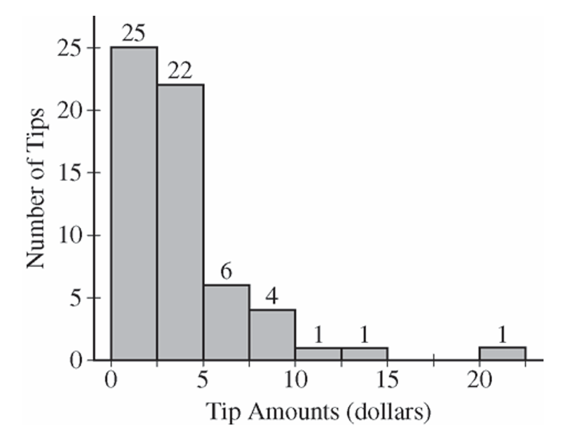
Most-appropriate topic codes (AP Statistics):
• Topic \(1.7\) — Summary Statistics for One Quantitative Variable (Part \( \mathrm{b} \))
▶️ Answer/Explanation
(a)
(b)
Question
Most-appropriate topic codes (AP Statistics):
• Topic \(1.6\) — Descriptions for One Quantitative Variable Distributions (Part \( \mathrm{b} \) — checking normality condition)
• Topic \(4.2\) — Constructing a Confidence Interval for a Population Mean or Population Mean Difference (Part \( \mathrm{b} \))
• Topic \(4.3\) — Justifying a Claim Based on a Confidence Interval for a Population Mean or Population Mean Difference (Part \( \mathrm{b} \))
▶️ Answer/Explanation
(a)
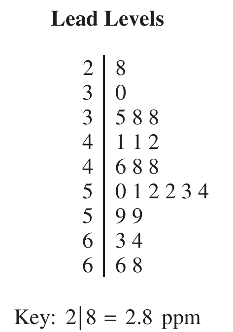
From the stemplot, the crows with lead levels greater than \(6.0\) ppm are those with values \(6.3,\ 6.4,\ 6.6,\) and \(6.8\) ppm — that gives us exactly \(4\) crows out of the \(23\) sampled.
$\text{Proportion} = \frac{4}{23} \approx 0.174$
\(\boxed{\dfrac{4}{23} \approx 0.174}\)
(b)
Step 1: Identify the procedure and check conditions.
The appropriate procedure is a one-sample \(t\)-interval for a population mean, using the formula:
$\bar{x} \pm t^* \cdot \frac{s}{\sqrt{n}}$
Condition 1 — Random sample: The problem states the \(23\) crows were randomly selected, so this condition is met.
Condition 2 — Normality: The sample size of \(23\) is not large enough on its own, so we check the stemplot. The data show no strong skewness and no outliers, so it is reasonable to assume the population distribution of lead levels is approximately normal.
Step 2: Compute the confidence interval.
Given: \(\bar{x} = 4.90\) ppm, \(s = 1.12\) ppm, \(n = 23\)
Degrees of freedom: \(df = n – 1 = 22\)
Critical value at \(95\%\) confidence with \(22\) df: \(t^* = 2.074\)
$4.90 \pm 2.074 \times \frac{1.12}{\sqrt{23}}$
$4.90 \pm 2.074 \times 0.2336$
$4.90 \pm 0.484$
$\boxed{(4.416,\ 5.384) \text{ ppm}}$
Step 3: Interpret the interval.
We are \(95\%\) confident that the true mean lead level among all crows in this region is between \(4.416\) ppm and \(5.384\) ppm.
Question
Most-appropriate topic codes (AP Statistics):
• Topic 1.6 — Descriptions for One Quantitative Variable Distributions (Part b)
• Topic 1.9 — Comparisons of the Distributions for One Quantitative Variable (Part c)
▶️ Answer/Explanation
(a)
To find the median from a histogram, identify the interval that contains the middle observation by adding the frequencies of each bin from left to right until the cumulative total reaches half of the sample size.
For a group with \(n\) sorted observations, the median position is calculated using the formula \(\frac{n+1}{2}\).
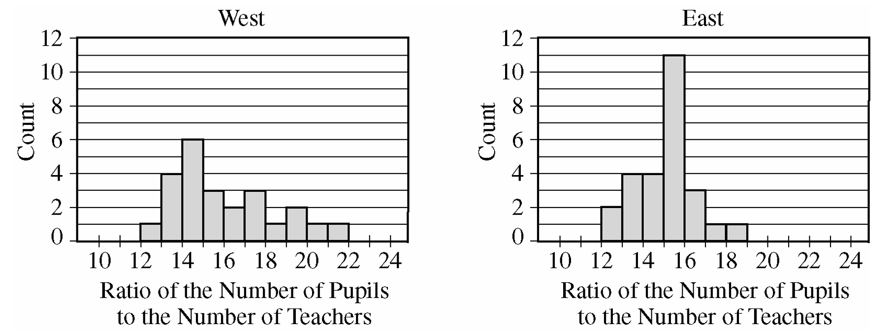
For the West group, there are \(n = 24\) observations, meaning the median is the average of the 12th and 13th values.
By counting cumulative frequencies from the left: the 12-13 bin has 1, the 13-14 bin has 4 (total 5), the 14-15 bin has 6 (total 11), and the 15-16 bin has 3 (total 14).
Since the 12th and 13th observations fall inside the 15-16 interval, the estimated median P-T ratio for the West group is between 15 and 16.
For the East group, there are \(n = 26\) observations, meaning the median is the average of the 13th and 14th values.
Counting cumulative frequencies from the left: the 12-13 bin has 2, the 13-14 bin has 4 (total 6), the 14-15 bin has 4 (total 10), and the 15-16 bin has 11 (total 21).
Since the 13th and 14th observations also fall inside the 15-16 interval, the estimated median P-T ratio for the East group is also between 15 and 16.
\(\boxed{\text{West Median: } [15, 16], \text{ East Median: } [15, 16]}\)
From the histogram, cumulative frequencies for the two groups are shown in the table below. 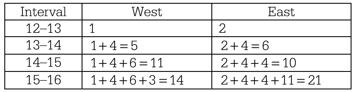
Thus, the median P-T ratio for both groups is at least 15 students per teacher and at most 16 students per teacher.
(b)
Shape: The distribution of P-T ratios for the West group is unimodal and skewed to the right, whereas the distribution for the East group is unimodal and approximately symmetric.
Center: The centers are nearly identical, with both the West and East groups having a median P-T ratio located in the interval between 15 and 16 students per teacher.
Spread: There is visibly more variability in the P-T ratios for the West group than for the East group. The maximum possible range for the West group is \(22 – 12 = 10\), which is larger than the maximum possible range for the East group, which is \(19 – 12 = 7\).
(c)
The mean P-T ratio for the West group will likely be greater than the mean P-T ratio for the East group.
As established in part (a), both distributions have approximately the same median value between 15 and 16.
Because the distribution for the West group is strongly skewed to the right, its mean will be pulled upward to a value greater than its median.
In contrast, because the distribution for the East group is roughly symmetric, its mean will remain close to its median value.
Therefore, the mean of the West group will be higher than the mean of the East group.
\(\boxed{\text{Mean}_{\text{West}} > \text{Mean}_{\text{East}}}\)
Question
\(8.6\quad 5.1\quad 8.7\quad 4.6\quad 7.5\quad 5.3\quad 8.2\quad 4.7\quad 4.8\quad 4.6\)
Most-appropriate topic codes (AP Statistics):
• Topic \(1.5\) — Graphical Representations for One Quantitative Variable (Part \( \mathrm{b} \))
• Topic \(1.6\) — Descriptions for One Quantitative Variable Distributions (Part \( \mathrm{c} \))
▶️ Answer/Explanation
(a)
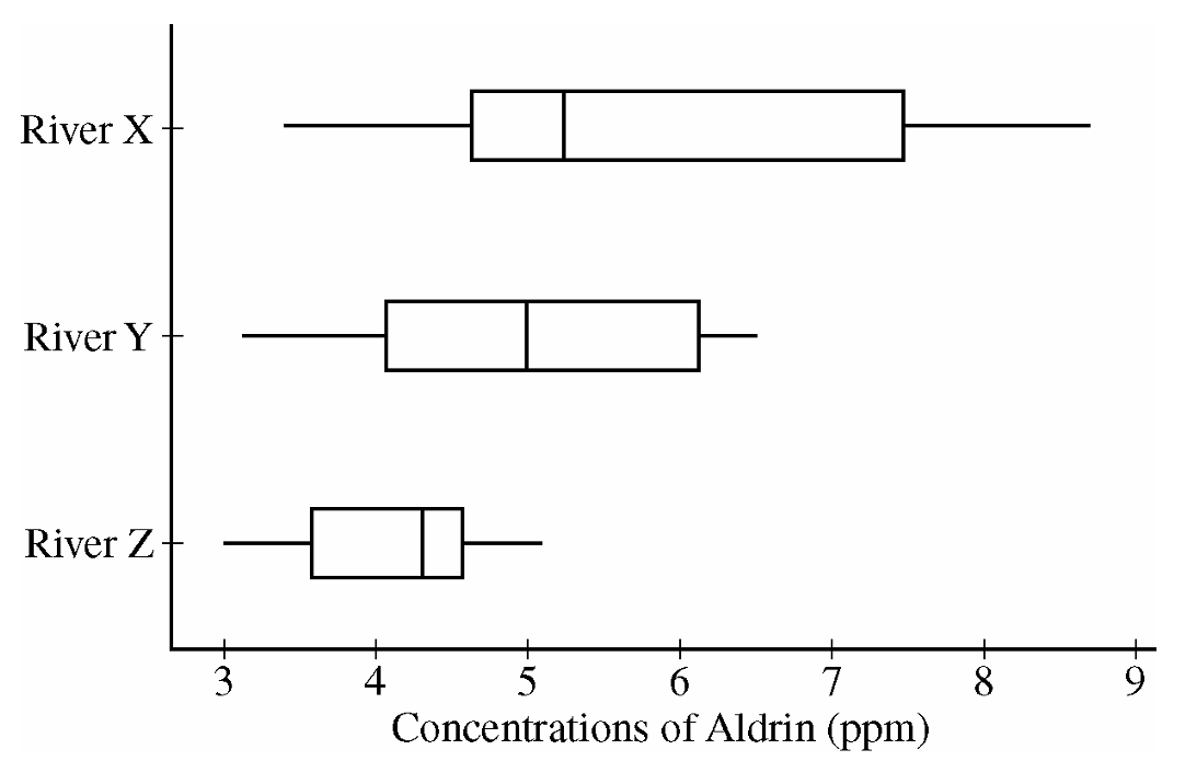
Comparing the medians reveals that the concentration of aldrin tends to be highest for River X and lowest for River Z.
About \(50\%\) of the concentrations of aldrin for Rivers X and Y are higher than all of the concentrations for River Z.
River X also displays the most variability in aldrin concentrations, as seen by the largest range and largest IQR, and River Z has the least variability, as judged by both IQR and range.
The shapes of the three distributions differ, in that the distribution appears to be skewed to the right for River X, roughly symmetric for River Y and slightly skewed to the left for River Z.
(b)
Aldrin concentrations (in ppm) for River X
Leaf unit \(= 0.1\) (for example, \(3 \mid 4\) represents \(3.4\,\text{ppm}\))
\(3 \mid 4\ 7\)
\(4 \mid 0\ 2\ 3\ 6\ 6\ 7\ 8\)
\(5 \mid 1\ 3\ 3\ 5\ 6\)
\(6 \mid \)
\(7 \mid 3\ 5\)
\(8 \mid 0\ 2\ 6\ 7\)
(c)
The stemplot shows a clear gap in the distribution of aldrin concentrations for River X.
This gap occurs between the values of \(5.6\) and \(7.3\,\text{ppm}\) of aldrin.
This gap is not apparent in the boxplot.
Question


Most-appropriate topic codes (AP Statistics):
• Topic \(1.6\) — Descriptions for One Quantitative Variable Distributions (Part \(\mathrm{b}\))
• Topic \(2.3\) — Estimating Probabilities Using Simulation (Part \(\mathrm{c}\))
• Topic \(1.8\) — Graphical Representations of Summary Statistics for One Quantitative Variable (Part \(\mathrm{d}\))
▶️ Answer/Explanation
(a)
Let \(\mu\) = the true population mean fuel efficiency (in miles per gallon) for all cars of this particular model.
The consumer organization suspects the manufacturer is overstating the mpg, so the alternative hypothesis is lower-tailed:
\( H_0:\ \mu = 27\ \text{mpg} \)
\( H_a:\ \mu < 27\ \text{mpg} \)
The parameter must be defined as a population mean — not just a sample mean — and must be stated in context (fuel efficiency of this car model) to receive full credit.
(b)
Large values (greater than 1) of the ratio \(\dfrac{\text{sample mean}}{\text{sample median}}\) would indicate that the population distribution is skewed to the right.
The reason is that in a right-skewed distribution, the few unusually large values in the upper tail pull the mean upward, but the median — being a positional measure — is resistant to those extreme values and stays lower.
Therefore, when the distribution is right-skewed, we expect:
\( \text{sample mean} > \text{sample median} \implies \dfrac{\text{sample mean}}{\text{sample median}} > 1 \)
The further the ratio exceeds 1, the stronger the evidence of right-skewness.
(c)
The observed value of the statistic from the original sample is \(1.03\).
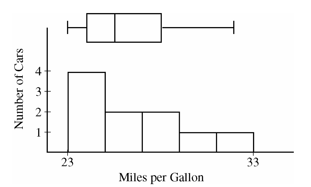
Looking at the dotplot of the 100 simulated statistics (all drawn from a normal population), we count that 14 out of 100 simulated values are greater than or equal to \(1.03\).
This gives a simulated \(p\)-value of approximately:
\( \hat{p} = \dfrac{14}{100} = 0.14 \)
Since \(0.14\) is larger than any commonly used significance level (such as \(\alpha = 0.05\) or \(\alpha = 0.10\)), we do not have convincing evidence that the original population is skewed to the right.
It is therefore plausible that the original sample of 10 cars came from a normally distributed population, and the observed right-skewness in the sample was simply due to random sampling variability.
(d)
Using only the five-number summary values, one reasonable skewness statistic is:
\( S = \dfrac{Q_3 – \text{Median}}{\text{Median} – Q_1} \)
Using the given data:
\( S = \dfrac{28 – 25.5}{25.5 – 24} = \dfrac{2.5}{1.5} \approx 1.67 \)
Values greater than 1 indicate right-skewness.
The reasoning is: in a right-skewed distribution, the data in the upper half are more spread out than in the lower half, so the distance from the median up to \(Q_3\) (the upper half of the middle 50%) will be larger than the distance from \(Q_1\) down to the median (the lower half of the middle 50%). This makes the numerator larger than the denominator, giving a ratio greater than 1.
Other acceptable statistics using only the five-number summary include:
\( S = \dfrac{\text{Maximum} – \text{Median}}{\text{Median} – \text{Minimum}}, \qquad S = \dfrac{\text{Maximum} – Q_3}{Q_1 – \text{Minimum}}, \qquad S = \dfrac{\frac{Q_1 + Q_3}{2}}{\text{Median}} \)
For all of these, values greater than 1 indicate right-skewness.
Question

Most-appropriate topic codes (AP Statistics):
• Topic \(2.9\) — Parameters of Random Variables (Part \(\mathrm{a}\))
• Topic \(2.7\) — Independent Events and Unions of Events (Parts \(\mathrm{b}\), \(\mathrm{c}\), \(\mathrm{d}\))
▶️ Answer/Explanation
(a)
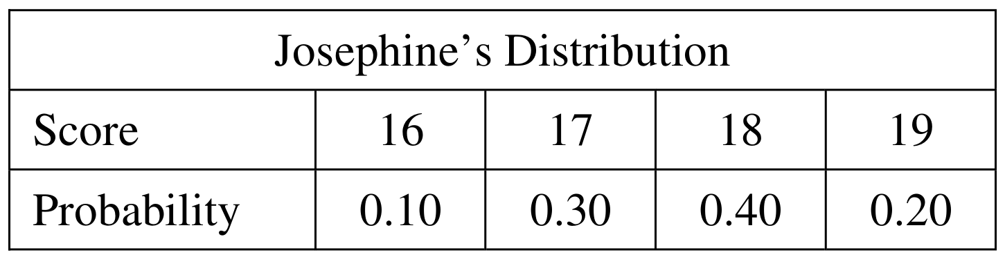
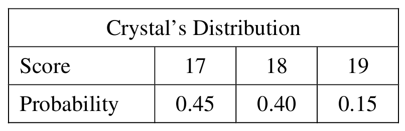
The expected value (mean) of a discrete random variable is \(\mu = \sum x_i \cdot P(x_i)\). We apply this to each player’s distribution.
For Josephine:
\(\mu_J = 16(0.10) + 17(0.30) + 18(0.40) + 19(0.20)\)
\(\mu_J = 1.6 + 5.1 + 7.2 + 3.8 = \boxed{17.7}\)
For Crystal:
\(\mu_C = 17(0.45) + 18(0.40) + 19(0.15)\)
\(\mu_C = 7.65 + 7.20 + 2.85 = \boxed{17.7}\)
Both players have the same expected score of \(17.7\).
(b)
We need all pairs \((J, C)\) such that \(J – C = -1\), i.e., Josephine’s score is exactly 1 less than Crystal’s. Since scores are independent, the probability of each pair is the product of the individual probabilities.
\(J = 16,\ C = 17\): \(\quad P = (0.10)(0.45) = 0.045\)
\(J = 17,\ C = 18\): \(\quad P = (0.30)(0.40) = 0.120\)
\(J = 18,\ C = 19\): \(\quad P = (0.40)(0.15) = 0.060\)
These are the only three combinations that produce a difference of \(-1\).
(c)
Since the three combinations in part (b) are mutually exclusive, we simply add their probabilities:
\(P(J – C = -1) = 0.045 + 0.120 + 0.060\)
\(\boxed{P(J – C = -1) = 0.225}\)
(d)
First, we find the missing probability for a difference of \(-2\). Since all probabilities in the distribution must sum to 1:
\(P(J – C = -2) = 1 – 0.015 – 0.225 – 0.325 – 0.260 – 0.090\)
\(P(J – C = -2) = 1 – 0.915 = \boxed{0.085}\)
The completed distribution table is:

Crystal’s score is higher than Josephine’s when the difference \(J – C < 0\), i.e., when the difference is \(-3\), \(-2\), or \(-1\).
\(P(\text{Crystal} > \text{Josephine}) = P(J – C < 0) = 0.015 + 0.085 + 0.225\)
\(\boxed{P(\text{Crystal} > \text{Josephine}) = 0.325}\)
Question
19 36 19 13 43 8 16 14 10 9
Most-appropriate topic codes (AP Statistics):
• Topic 1.6 — Descriptions for One Quantitative Variable Distributions (Part \(\mathrm{b}\))
• Topic 1.7 — Summary Statistics for One Quantitative Variable (Part \(\mathrm{c}\))
• Topic 1.9 — Comparisons of the Distributions for One Quantitative Variable (Parts \(\mathrm{b}\), \(\mathrm{c}\))
▶️ Answer/Explanation
(a)
To build the stemplot, use the tens digit as the stem and the units digit as the leaf. The data range from \(8\) to \(44\), so the stems are \(0, 1, 2, 3, 4\). Place each data value’s units digit on the appropriate row.
\( \begin{array}{r|l} 0 & 8 \quad 9 \\ 1 & 2 \quad 6 \quad 8 \quad 7 \quad 8 \quad 9 \quad 6 \quad 9 \quad 3 \quad 4 \quad 0 \\ 2 & \\ 3 & 3 \quad 8 \quad 6 \quad 5 \\ 4 & 1 \quad 4 \quad 3 \\ \end{array} \)
Legend: \(1 \mid 2\) represents \(12\) questions answered correctly.
Ordered version (leaves sorted in ascending order):
\( \begin{array}{r|l} 0 & 8 \quad 9 \\ 1 & 0 \quad 2 \quad 3 \quad 4 \quad 6 \quad 6 \quad 7 \quad 8 \quad 8 \quad 9 \quad 9 \\ 2 & \\ 3 & 3 \quad 5 \quad 6 \quad 8 \\ 4 & 1 \quad 3 \quad 4 \\ \end{array} \)
Legend: \(1 \mid 2\) represents \(12\) questions answered correctly.
(b)
The most striking feature of this distribution is that the scores split into two distinct groups — one cluster concentrated in the teens (roughly \(8\)–\(19\)) and a second, smaller cluster in the high \(30\)s and low \(40\)s. There is a complete gap in the \(20\)s, with no student scoring between \(19\) and \(33\). The distribution is bimodal, suggesting that students tended to perform either quite poorly or quite well on the test, with no middle ground.
(c)
A measure of center such as the mean or median would fall somewhere around \(\bar{x} \approx 22.95\), which lies right in the gap of the \(20\)s — a region where no student actually scored. Reporting only the center gives the false impression that a typical student scored around \(23\), when in reality no student did. Because the data are bimodal with two separated groups, the center alone completely misses the two-cluster structure of the distribution and would mislead the reader into thinking the scores are roughly symmetric or unimodal.
Question
Most-appropriate topic codes (AP Statistics):
• Topic 1.7 — Summary Statistics for One Quantitative Variable (Parts \(\mathrm{a}\), \(\mathrm{c}\))
• Topic 1.9 — Comparisons of the Distributions for One Quantitative Variable (Parts \(\mathrm{a}\), \(\mathrm{b}\))
▶️ Answer/Explanation
(a)
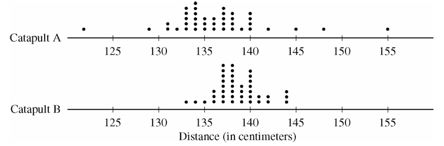
Both distributions of distances are roughly symmetric and somewhat mound-shaped (bell-shaped). Looking at the centers, the median of Catapult A is approximately \(136\,\text{cm}\), which is slightly lower than the median of Catapult B at approximately \(138\,\text{cm}\). In terms of spread, Catapult A shows considerably more variability than Catapult B — the range of Catapult A is about \(30\,\text{cm}\), while the range of Catapult B is approximately \(11\,\text{cm}\). Additionally, there appear to be potential outliers in Catapult A’s distribution (e.g., a ball traveling approximately \(155\,\text{cm}\)), whereas Catapult B has no such extreme values.
(b)
Catapult B would be the better choice.
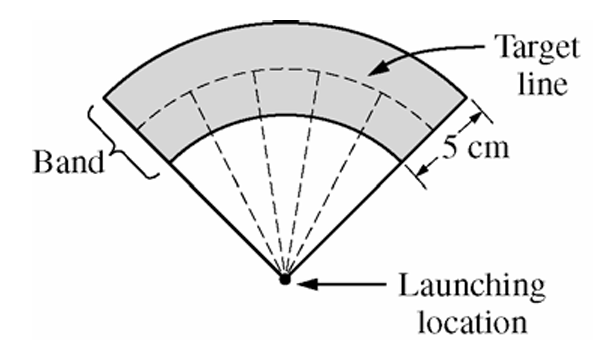
Since the target band is only \(5\,\text{cm}\) wide, the key factor is how tightly clustered the distances are around the center. Catapult B has a much smaller spread — most balls land between approximately \(133\,\text{cm}\) and \(143\,\text{cm}\) — meaning when placed correctly, a higher proportion of balls will fall within the narrow band. Catapult A’s larger variability means balls are scattered over a much wider range, making it far less likely that they will land consistently within the band.
(c)
Catapult B should be placed approximately \(\boxed{138\,\text{cm}}\) from the target line.
Since Catapult B’s distribution is roughly symmetric and mound-shaped, the median (approximately \(138\,\text{cm}\)) is a reliable measure of center and represents the most typical distance a ball will travel. Placing the catapult so that the target line is \(138\,\text{cm}\) away aligns the center of the distribution with the target, maximizing the chance that any given ball lands within the \(5\,\text{cm}\) band. Based on the sample data, approximately \(\frac{30}{40} = 0.75\) of the 40 balls launched from Catapult B landed within \(2.5\,\text{cm}\) on either side of \(138\,\text{cm}\), which further confirms this placement.
Question
Most-appropriate topic codes (AP Statistics):
• Topic 1.7 — Summary Statistics for One Quantitative Variable (Parts b, c)
• Topic 1.9 — Comparisons of the Distributions for One Quantitative Variable (Part b)
▶️ Answer/Explanation
(a)
The distribution is skewed to the left (skewed toward the lower values). You can see this from the stemplot: the longer tail stretches down into the 60s and lower 70s, while most of the data cluster in the upper 80s and 90s. There are relatively few low scores pulling the tail downward.
(b)
The instructor should report the median.
Because the distribution is skewed toward the lower values, the mean gets pulled in that direction — it will be lower than the median. The median, being resistant to the few very low scores, will better represent the “typical” high performance of the class. So ironically, to make performance look as high as possible, the median is the better choice here.
(c)
Step 1 — Compute the midrange:
The minimum score is \(64\) and the maximum score is \(95\), so:
\( \text{midrange} = \frac{\text{maximum} + \text{minimum}}{2} = \frac{95 + 64}{2} = \frac{159}{2} = 79.5 \)
\(\boxed{\text{midrange} = 79.5}\)
Step 2 — Identify as measure of center:
The midrange is a measure of center.
Step 3 — Rationale:
The maximum value tells us about the upper extreme and the minimum tells us about the lower extreme. By averaging these two values, we find the point that sits exactly halfway between the two extremes — this is a center point, not a spread. Measures of spread (like range, standard deviation, or IQR) describe how far apart the data are; the midrange instead gives a single representative middle value, placing it firmly in the category of measures of center.