AP Statistics 1.6 Descriptions for One Quantitative Variable Distributions- Exam Style Questions - MCQs - New Syllabus
Question
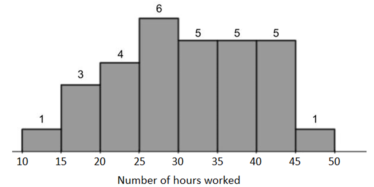
A researcher surveyed a random sample of 30 restaurant employees from a large city. In the survey, information was collected regarding the number of hours worked by each employee during the previous week. The histogram below displays the information collected.

In which of the following intervals is the third quartile of this data located?
(A) 20 hours to less than 25 hours
(B) 25 hours to less than 30 hours
(C) 30 hours to less than 35 hours
(D) 35 hours to less than 40 hours
(E) 40 hours to less than 45 hours
▶️ Answer/Explanation
There are 30 observations in the histogram. The third quartile \(Q_3\) corresponds to the 75th percentile, which is approximately the 23rd observation when the data are ordered from smallest to largest.
Using the frequencies shown in the histogram:
10–15: 1 observation (cumulative = 1)
15–20: 3 observations (cumulative = 4)
20–25: 4 observations (cumulative = 8)
25–30: 6 observations (cumulative = 14)
30–35: 5 observations (cumulative = 19)
35–40: 5 observations (cumulative = 24)
The 23rd observation falls within the interval from 35 hours to less than 40 hours. Therefore, the third quartile is located in that class interval.
✅ Answer: (D)
Question
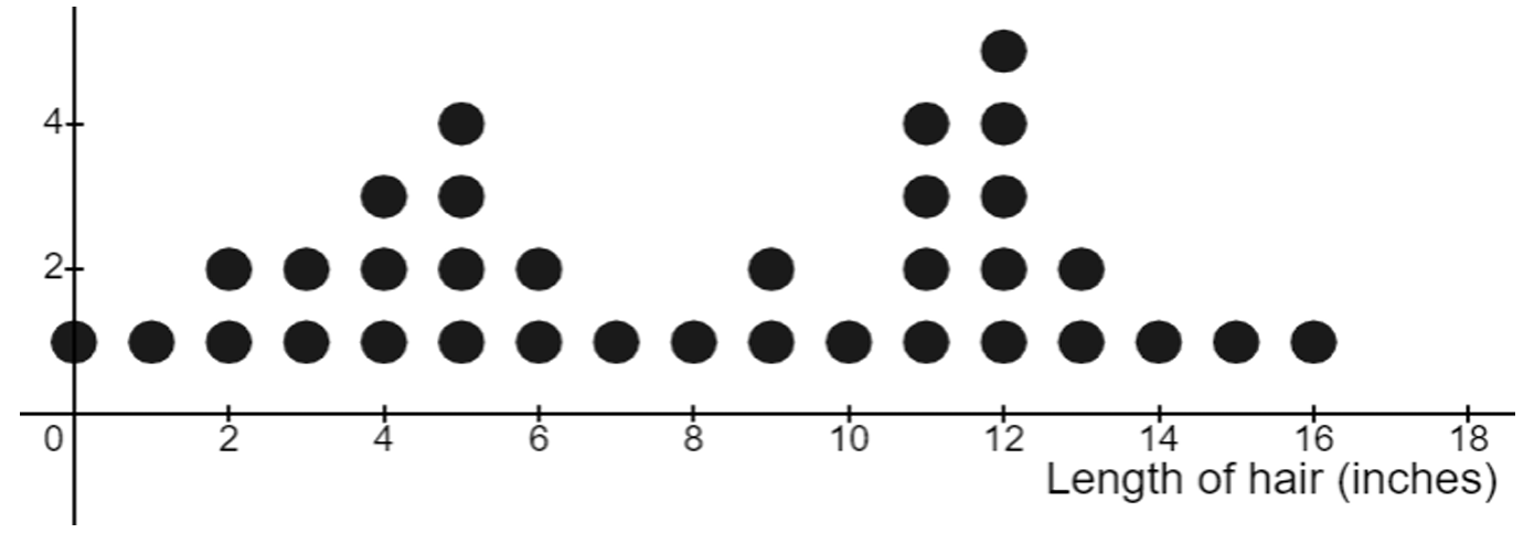
Thirty-four (34) statistics students investigated their hair length. Each student measured their longest strand of hair, to the nearest inch. The results are shown in the dotplot below.

Which of the following is the best description of the shape of the distribution of hair length shown in the dotplot?
(A) Approximately normal
(B) Bimodal without a gap
(C) Bimodal with a gap
(D) Skewed to the right
(E) Skewed to the left
▶️ Answer/Explanation
The dotplot has two clear peaks: one centered around 5 inches and another centered around 12 inches. This indicates that the distribution is bimodal.
Although there is a dip in frequency between the two peaks, there are still observations present throughout the middle values (around 7–10 inches). Therefore, there is no empty interval separating the two clusters.
Since the distribution has two modes and no gap between them, it is best described as a bimodal distribution without a gap.
✅ Answer: (B)
Question

| Min | \(Q_1\) | Median | \(Q_3\) | Max | Mean | Std. Dev. |
|---|---|---|---|---|---|---|
| \(2.10\) | \(4.39\) | \(5.43\) | \(6.12\) | \(13.45\) | \(5.54\) | \(1.64\) |
(B) Streams colder than \(8^\circ\text{C}\) are generally healthier because their dissolved oxygen concentrations are generally much higher than those of warmer streams.
(C) Streams warmer than \(8^\circ\text{C}\) are generally healthier because their mean and median are close together.
(D) The two groups are equally healthy because both groups include some streams with dissolved oxygen concentrations above \(13\,\text{mg/l}\).
▶️ Answer/Explanation
Streams with higher dissolved oxygen concentration are considered healthier for wildlife.
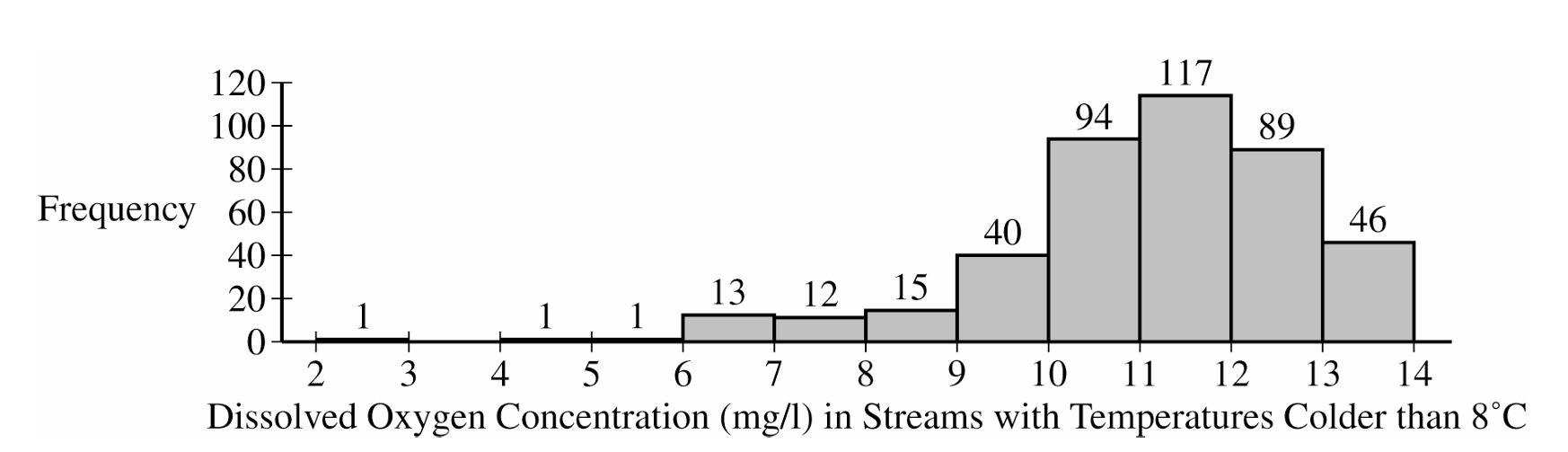
For streams colder than \(8^\circ\text{C}\), the histogram shows that most dissolved oxygen concentrations are between about \(10\,\text{mg/l}\) and \(13\,\text{mg/l}\), with a center near \(11\) to \(12\,\text{mg/l}\).
For streams warmer than \(8^\circ\text{C}\), the median is only \(5.43\,\text{mg/l}\), and \(Q_3=6.12\,\text{mg/l}\). This means about \(75\%\) of the warmer-stream values are at or below \(6.12\,\text{mg/l}\).
Since the colder-stream distribution has a much higher center and most values are above the upper quartile for the warmer-stream distribution, the colder streams are generally healthier for wildlife.
✅ Answer: (B)
