
AP Statistics 1.7 Summary Statistics for One Quantitative Variable- Exam Style Questions - FRQs - New Syllabus
Question
Distribution of the Number of Bedrooms for the Houses Sampled in 2024

ii. What is the mean number of bedrooms for the sample of newly built houses in 2024? Show your work.
ii. Explain, in context, what a Type I error would be for Rodney’s hypothesis test.
Most-appropriate topic codes (AP Statistics):
• Topic \(2.9\) — Parameters of Random Variables (Part \( \mathrm{A} \))
• Topic \(4.3\) — Justifying a Claim Based on a Confidence Interval for a Population Mean or Population Mean Difference (Parts \( \mathrm{B} \), \( \mathrm{C} \))
• Topic \(4.4\) — Setting Up a Test for a Population Mean or Population Mean Difference (Part \( \mathrm{B} \))
▶️ Answer/Explanation
A. i.
Fewer than 3 bedrooms means a house has either 1 or 2 bedrooms.
\(P(\text{Bedrooms} < 3) = P(1) + P(2) = 0.12 + 0.22\)
\(\boxed{P(\text{Bedrooms} < 3) = 0.34}\)
A. ii.
The sample mean is calculated by summing the products of the values and their corresponding proportions.
\(\bar{x} = \sum x_i \cdot p_i = 1(0.12) + 2(0.22) + 3(0.28) + 4(0.22) + 5(0.14) + 6(0.02)\)
\(\bar{x} = 0.12 + 0.44 + 0.84 + 0.88 + 0.70 + 0.12\)
\(\boxed{\bar{x} = 3.10\,\text{bedrooms}}\)
B. i.
Let \(\mu\) represent the true mean number of bedrooms in all newly built houses in Country B in 2024.
\(H_0: \mu = 2.9\)
\(H_a: \mu \neq 2.9\)
B. ii.
• A Type I error happens if Rodney concludes that the true mean number of bedrooms in 2024 is different from 2.9 when, in reality, it is still exactly 2.9.
• In practice, this means the researcher would mistakenly declare a shift in housing layout profiles where no genuine structural trend modification occurred.
C.
• Since the significance level \(\alpha = 0.03\) matches the two-sided boundary of a 97% confidence interval \((1 – 0.97 = 0.03)\), we can judge the test based on whether the null value falls inside the interval boundaries.
• The hypothesized baseline mean value \(\mu_0 = 2.9\) lies completely outside Keisha’s 97% confidence interval of \((3.01, 3.19)\).
• Therefore, Rodney would reject the null hypothesis \(H_0\) and conclude that there is convincing statistical evidence that the true mean number of bedrooms in newly built houses in Country B in 2024 is different from 2.9.
Question
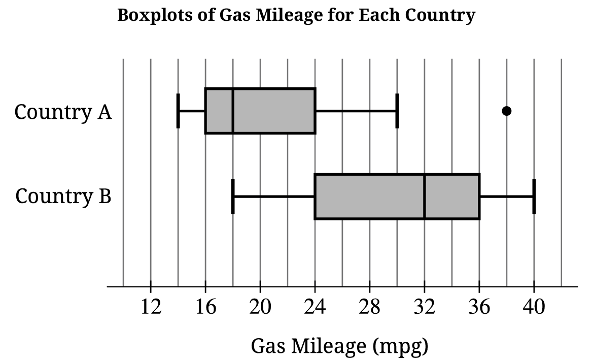
ii. What is a possible value of the median of the combined data set? Justify your answer by referencing the boxplots shown.
Most-appropriate topic codes (AP Statistics):
• Topic \(1.8\) — Graphical Representations of Summary Statistics for One Quantitative Variable (Parts \( \mathrm{B} \), \( \mathrm{C} \))
• Topic \(1.9\) — Comparisons of the Distributions for One Quantitative Variable (Part \( \mathrm{A} \))
▶️ Answer/Explanation
A.
• Center: The median gas mileage for Country B (\(32\,\text{mpg}\)) is higher than that of Country A (\(18\,\text{mpg}\)).
• Spread: The overall range for Country A (\(38 – 14 = 24\,\text{mpg}\)) is slightly wider than Country B (\(40 – 18 = 22\,\text{mpg}\)), but the Interquartile Range (IQR) for Country B (\(36 – 24 = 12\,\text{mpg}\)) is larger than Country A (\(22 – 14 = 8\,\text{mpg}\)).
• Outliers: Country A has a single extreme high value plotted as an outlier at \(38\,\text{mpg}\), while Country B displays no outliers.
B.
• The mean is expected to be greater than \(18\,\text{mpg}\).
• Because the distribution for Country A is skewed to the right and contains a high outlier at \(38\,\text{mpg}\), the mean will be pulled upward toward the long right tail while the median remains resistant.
C. i.
• The minimum value of the combined set is \(14\,\text{mpg}\) (from Country A) and the maximum value is \(40\,\text{mpg}\) (from Country B).
• \(\text{Combined Range} = \text{Maximum} – \text{Minimum} = 40 – 14 = 26\,\text{mpg}\).
C. ii.
• A possible value for the combined median is any value satisfying \(18\,\text{mpg} \le \text{Median} \le 32\,\text{mpg}\), such as \(24\,\text{mpg}\).
• Since both samples contain exactly 100 cars, combining them creates a total group of 200 cars where the new median rests between the 100th and 101st ordered values, forcing it to fall cleanly between the separate sample medians of \(18\,\text{mpg}\) and \(32\,\text{mpg}\).
Question
i. Identify the appropriate inference procedure for Julio to use.
ii. Describe the parameter for the inference procedure you identified in part (a-i) in context.
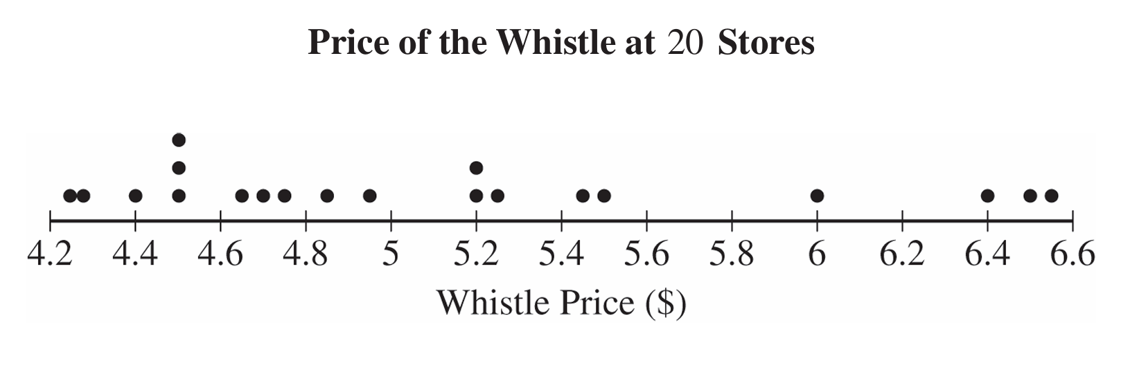

ii. Using the \(1.5 \times \text{IQR}\) rule, determine whether there are any outliers in the sample of whistle prices. Justify your response.
i. Calculate Pearson’s coefficient of skewness for Julio’s sample of \(20\) whistle prices. Show your work.
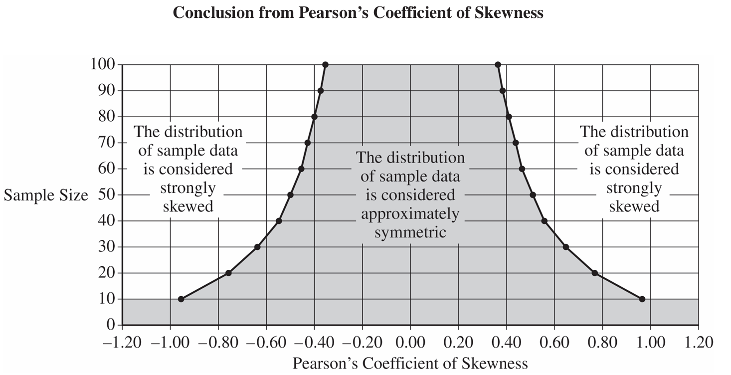 ii. Indicate the value of the Pearson’s coefficient of skewness you calculated in part (c-i) for the appropriate sample size by marking it with an “X” on the preceding graph.
• The sample size is greater than or equal to \(30\).
• If the sample size is less than \(30\), the distribution of the sample data is not strongly skewed and does not have outliers.
Most-appropriate topic codes (AP Statistics):
• Topic \(1.8\) — Graphical Representations of Summary Statistics for One Quantitative Variable (Parts \( \mathrm{b} \), \( \mathrm{c} \))
• Topic \(4.2\) — Constructing a Confidence Interval for a Population Mean or Population Mean Difference (Parts \( \mathrm{a} \), \( \mathrm{d} \))
▶️ Answer/Explanation
(a)
i. Julio should use a one-sample \(t\)-interval for a population mean.
ii. The parameter of interest is \(\mu\), the true mean price (in dollars) of this type of whistle at all stores that sell it.
(b)
i. The distribution of the sample of whistle prices is skewed to the right. This is because the mean (\(5.12\)) is greater than the median (\(4.885\)).
ii. \(\text{IQR} = Q_3 – Q_1 = 5.475 – 4.51 = 0.965\).
Lower boundary: \(Q_1 – 1.5(\text{IQR}) = 4.51 – 1.5(0.965) = 3.0625\).
Upper boundary: \(Q_3 + 1.5(\text{IQR}) = 5.475 + 1.5(0.965) = 6.9225\).
Since the minimum value (\(4.25\)) is greater than \(3.0625\) and the maximum value (\(6.58\)) is less than \(6.9225\), there are no outliers in the sample.
(c)
i. \(\text{Pearson’s Coefficient} = \dfrac{3(5.12 – 4.885)}{0.743} \approx 0.949\).
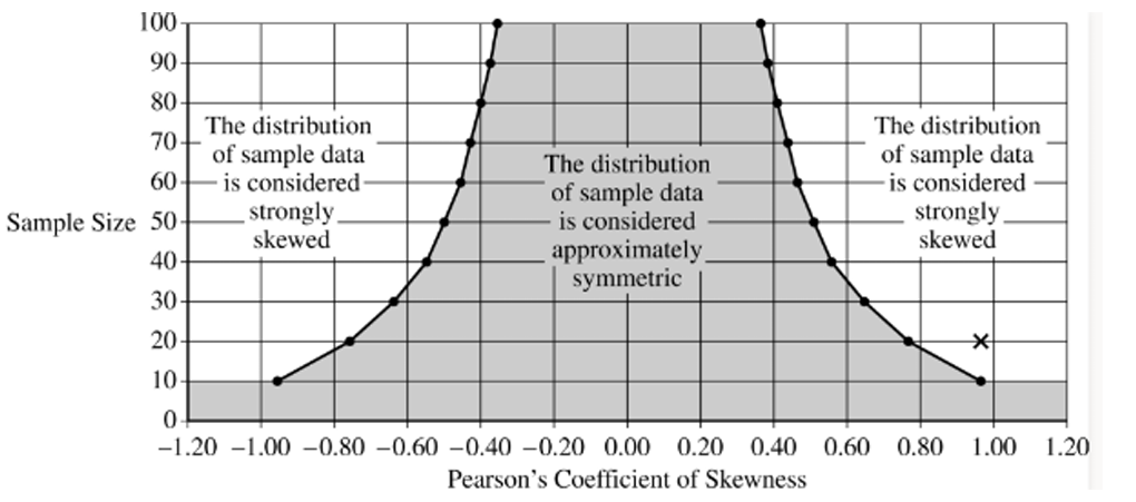
ii. On the graph, you would plot an “X” at a sample size of \(y = 20\) and a skewness coefficient of \(x \approx 0.949\).
(d)
i. We can conclude that the distribution of the sample of whistle prices is strongly skewed. This is justified because the calculated coefficient of \(0.949\) for a sample size of \(20\) falls in the “strongly skewed” region of the provided graph.
ii. No, the normality condition is not satisfied. The sample size (\(n = 20\)) is less than \(30\), and although there are no outliers, the sample data is strongly skewed, failing the second condition.
Question

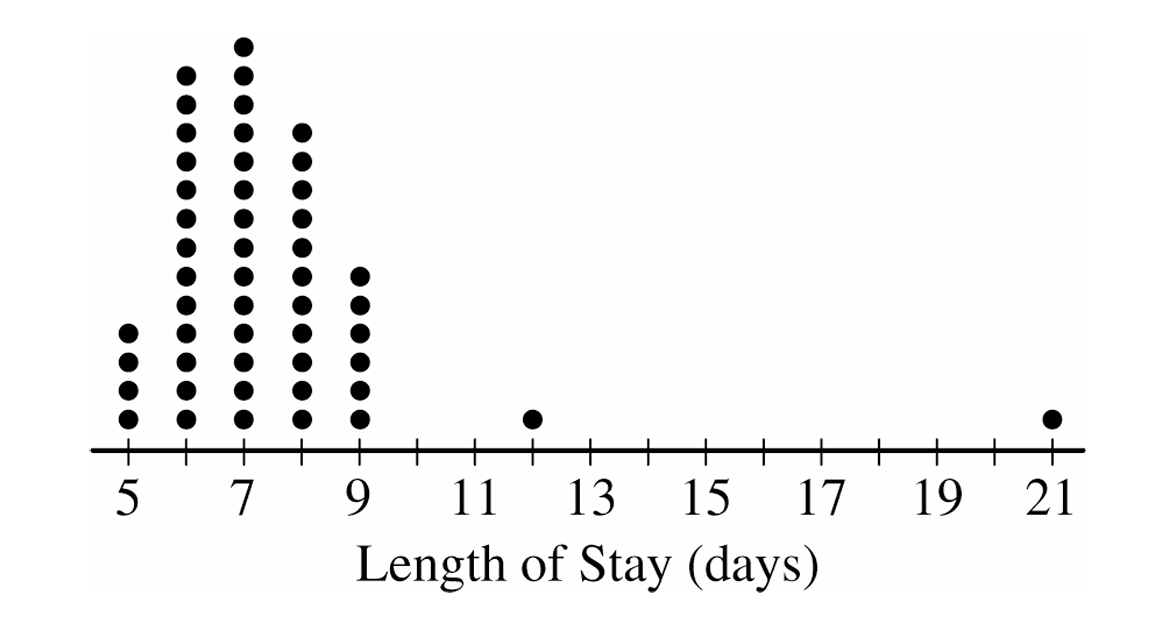
ii. The mean length of stay for the sample is \(7.42\) days with a standard deviation of \(2.37\) days. Using method B, determine any data points that are potential outliers in the distribution of length of stay. Justify your answer.
Most-appropriate topic codes (AP Statistics):
• Topic \(1.7\) — Summary Statistics for One Quantitative Variable (Parts \( \mathrm{a} \), \( \mathrm{b} \))
▶️ Answer/Explanation
(a)
To find the five-number summary, we arrange the data from our sample and extract the necessary percentiles. Based on our \(50\) observations, it naturally breaks down as follows:
\( \text{Minimum} = 5 \text{ days} \)
\( Q_1 = 6 \text{ days} \)
\( \text{Median} = 7 \text{ days} \)
\( Q_3 = 8 \text{ days} \)
\( \text{Maximum} = 21 \text{ days} \)
(b)(i)
For Method A, we rely on the \( 1.5 \times IQR \) rule to flag potential outliers. We first calculate our IQR and resulting boundaries:
\( IQR = Q_3 – Q_1 = 8 – 6 = 2 \)
Lower boundary: \( Q_1 – 1.5 \times IQR = 6 – 1.5(2) = 3 \)
Upper boundary: \( Q_3 + 1.5 \times IQR = 8 + 1.5(2) = 11 \)
Since we have no data points below \( 3 \), there are no lower outliers. However, any values strictly greater than \( 11 \) are upper outliers, which directs us perfectly to the patients who stayed for \( 12 \) days and \( 21 \) days.
(b)(ii)
Method B instead uses the \( 2 \) standard deviations rule, which is centered around our given mean and standard deviation. Let’s map out this interval:
Lower boundary: \( \text{Mean} – 2 \times SD = 7.42 – 2(2.37) = 2.68 \)
Upper boundary: \( \text{Mean} + 2 \times SD = 7.42 + 2(2.37) = 12.16 \)
Scanning our data, there are no lengths of stay below \( 2.68 \). The only length of stay strictly above \( 12.16 \) is the \( 21 \)-day point. So, the only outlier using Method B is the single patient who stayed \( 21 \) days.
(c)
In a distribution that exhibits strong right skewness, non-resistant measures like the mean and standard deviation get pulled heavily toward the extreme values in the long right tail.
This drastic pull inflates the upper outlier boundary for Method B much more than it affects Method A, which is anchored by the highly resistant median and IQR.
Because the threshold for Method B gets stretched out so much further into the right tail, it loses its sensitivity, making it much harder to detect potential outliers compared to Method A.
Question

Most-appropriate topic codes (AP Statistics):
• Topic \(1.7\) — Summary Statistics for One Quantitative Variable (Part \( \mathrm{b} \))
• Topic \(1.8\) — Graphical Representations of Summary Statistics for One Quantitative Variable (Part \( \mathrm{b} \))
▶️ Answer/Explanation
(a)
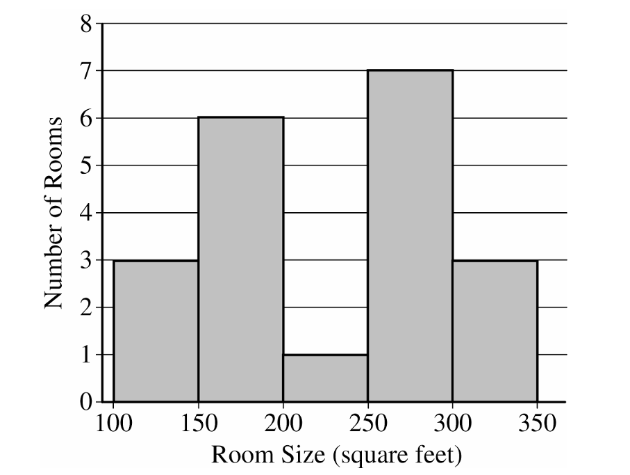
The distribution of the sample of room sizes is bimodal and roughly symmetric.
Most room sizes fall into two clusters: \(100\) to \(200\) square feet and \(250\) to \(350\) square feet.
The center of the distribution is between \(200\) and \(300\) square feet.
The range of the distribution is between \(150\) and \(250\) square feet.
There are no apparent outliers.
(b)
The interquartile range is:
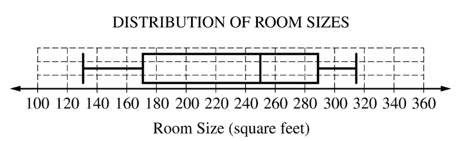
\(IQR = Q_3 – Q_1 = 292 – 174 = 118\) square feet.
To find potential outliers, we check the lower and upper fences.
Lower Fence = \(Q_1 – 1.5(IQR) = 174 – 1.5(118) = -3\) square feet.
Upper Fence = \(Q_3 + 1.5(IQR) = 292 + 1.5(118) = 469\) square feet.
There are no potential outliers because the minimum room size of \(134\) square feet does not fall below \(-3\), and the maximum room size of \(315\) square feet does not exceed \(469\).
(c)
The histogram clearly shows the bimodal nature (two peaks or clusters) of the distribution of room sizes.
This bimodal characteristic is not apparent from the boxplot.
Question
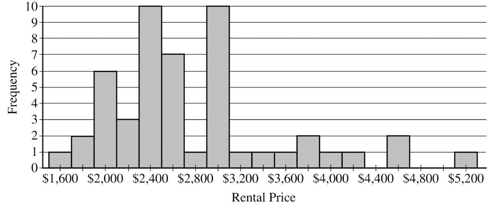
• Calculate and record the median of the sample.
• Repeat the process to obtain a total of \(15,000\) medians.
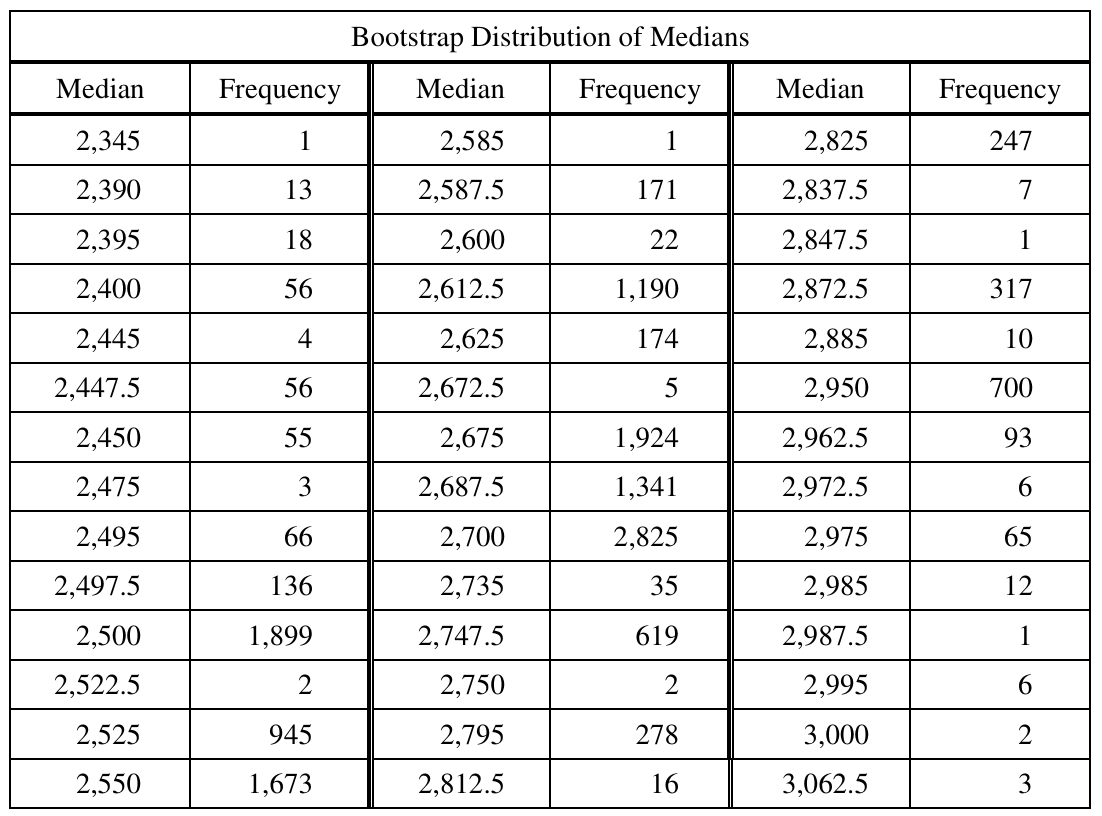
Most-appropriate topic codes (AP Statistics):
• Topic \(1.12\) — Potential Problems with Sampling (Part \( \mathrm{a} \))
• Topic \(1.7\) — Summary Statistics for One Quantitative Variable (Parts \( \mathrm{b} \), \( \mathrm{d} \), \( \mathrm{e} \))
• Topic \(2.12\) — Central Limit Theorem and Sampling Distributions for Sample Means (Parts \( \mathrm{c} \), \( \mathrm{f} \))
▶️ Answer/Explanation
(a)
Because a random sample was used, it is appropriate to generalize the results to the population of all rental prices for one-bedroom apartments in the city that are listed on this particular website at the time the sample was taken.
(b)
The histogram indicates that the distribution of rental prices is strongly skewed to the right.
Because of this right skewness, the sample mean will be pulled substantially higher by a few very large rental prices.
Consequently, the sample mean would overestimate the typical rental price, whereas the sample median provides a more accurate representation of the center.
(c)
To develop a theoretical sampling distribution, Emma would need to obtain every possible sample of size \(50\) from the population of apartments listed on the website.
She would then compute the median rental price for each of these possible samples.
The entire collection of all these computed sample medians forms the theoretical sampling distribution for the sample median.
(d)
i. The \(5\text{th}\) percentile corresponds to the \((0.05)(15,000) = 750\text{th}\) value in the ordered data.
By keeping a running cumulative total of the frequencies down the columns, the \(750\text{th}\) value first falls in the row for the median of \(\$2,500\).
ii. The \(95\text{th}\) percentile corresponds to the \((0.95)(15,000) = 14,250\text{th}\) value in the ordered data.
Continuing to add the frequencies, the \(14,250\text{th}\) value falls in the row for the median of \(\$2,950\).
(e)
We need to sum the frequencies of all bootstrap medians from \(\$2,500\) to \(\$2,950\) inclusive.
\(\text{Sum} = 1,899 + 2 + \dots + 10 + 700 = 14,404\)
\(\text{Percentage} = \left(\dfrac{14,404}{15,000}\right) \times 100\% \approx 96.03\%\)
(f)
Based on our previous parts, an approximate \(96\%\) confidence interval for the median is \((\$2,500, \$2,950)\).
Interpretation: We are approximately \(96\%\) confident that the true median rental price of all one-bedroom apartments listed on this website for this city is between \(\$2,500\) and \(\$2,950\).
Question
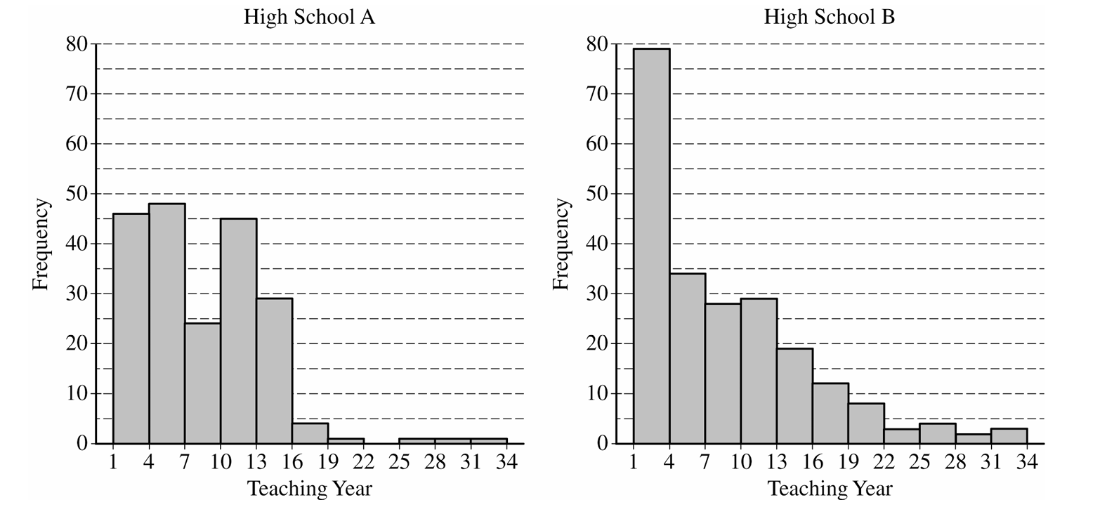
Most-appropriate topic codes (AP Statistics):
• Topic \(1.7\) — Summary Statistics for One Quantitative Variable (Parts \( \mathrm{a} \), \( \mathrm{b} \), \( \mathrm{c} \))
▶️ Answer/Explanation
(a)
For High School A (\(n = 200\)), the median is the average of the \(100^{\text{th}}\) and \(101^{\text{st}}\) ordered values.
From the histogram, the number of teachers with teaching year in \((1, 7)\) is:
\(46 + 48 = 94 < 100\)
The number with teaching year in \((1, 10)\) is:
\(46 + 48 + 45 = 139 > 100\)
Since there are fewer than \(100\) values below \(7\) but more than \(100\) values below \(10\), both the \(100^{\text{th}}\) and \(101^{\text{st}}\) values fall in the interval \((7, 10)\).
\(\boxed{\text{High School A has median teaching year } = 7}\)
For High School B (\(n = 221\)), the median is the \(111^{\text{th}}\) ordered value.
From the histogram, the number of teachers with teaching year in \((1, 7)\) is:
\(79 + 34 = 113 > 111\)
Since there are more than \(111\) values below \(7\), the \(111^{\text{th}}\) value falls in the interval \((4, 7)\).
\(\boxed{\text{High School B has median teaching year } = 6}\)
Think of the median as a balancing point — you need to find where the “middle person” sits in the ordered list.
For School A, with 94 teachers below year 7 and the median being teacher #100, that teacher has to be somewhere in years 7–9.
For School B, there are already 113 teachers in years 1–6, so the 111th teacher — the median — must be in that same lower group.
The dramatically right-skewed shape of School B also gives a useful intuition: right-skewed distributions pull the mean upward away from the median, and since both schools share the same mean of 8.2, School B (the more skewed one) must have the bigger mean-median gap and therefore the lower median.
(b)
The mean of a combined group is a weighted average — you cannot simply average the two means.
Total teaching years for the original \(200\) teachers: \(\bar{x}_1 \cdot n_1 = 8.2 \times 200 = 1{,}640\)
Total teaching years for the additional \(18\) teachers: \(\bar{x}_2 \cdot n_2 = 2.5 \times 18 = 45\)
Combined mean for all \(218\) teachers: \(\bar{x}_{\text{combined}} = \frac{1{,}640 + 45}{200 + 18} = \frac{1{,}685}{218}\)
\(\boxed{\bar{x}_{\text{combined}} \approx 7.73 \text{ years}}\)
The 18 new teachers have a very low mean of 2.5 years — they are almost all brand-new — so they drag the overall mean down from 8.2 toward 7.73.
Because there are so few of them (only 18 out of 218), the pull is modest but real.
Always weight by group size when combining means; plain-averaging the means (i.e., \((8.2+2.5)/2=5.35\)) would be completely wrong here.
(c)
First, find the interval within \(1\) standard deviation of the mean:
\(\bar{x} \pm s = 8.2 \pm 7.2 \implies (1.0,\ 15.4)\)
Since teaching years are recorded as integers, the values that fall within this interval are \(1, 2, 3, \ldots, 15\) (since \(15 \leq 15.4 < 16\)).
From the High School B histogram, we count the teachers in the five histogram bars that contain years \(1\) through \(15\):
\((1,4):\; 79 \text{ teachers}\)
\((4,7):\; 34 \text{ teachers}\)
\((7,10):\; 28 \text{ teachers}\)
\((10,13):\; 29 \text{ teachers}\)
\((13,16):\; 19 \text{ teachers} \quad \text{(years 13, 14, 15 all} \leq 15.4\text{)}\)
\(\text{Total teachers with year} \in [1,\, 15] = 79 + 34 + 28 + 29 + 19 = 189\)
\(P(\text{within 1 SD of mean}) = \frac{189}{221}\)
\(\boxed{P \approx 0.8552}\)
The critical point here is that you must count directly from the histogram — the Empirical Rule (\(\approx 68\%\)) does not apply because High School B is strongly right-skewed, not bell-shaped.
Applying the Empirical Rule would give the wrong answer. Also note that the entire bar for \([13, 16)\) is included, because all integers in that bar (13, 14, 15) satisfy \(\leq 15.4\); only 16 would fall outside the interval, and there are no teachers listed as exactly year 16 in the \([13,16)\) bar.
Question
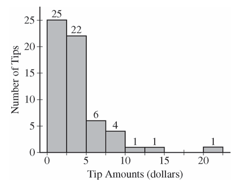
Most-appropriate topic codes (AP Statistics):
• Topic \(1.7\) — Summary Statistics for One Quantitative Variable (Part \( \mathrm{b} \))
▶️ Answer/Explanation
(a)
(b)
Question
Most-appropriate topic codes (AP Statistics):
• Topic \(1.12\) — Potential Biases in Sampling Methods (Part \( \mathrm{b} \))
▶️ Answer/Explanation
(a)
The median is a better measure of typical income because it is resistant to skewness and outliers, while the mean is not. Income distributions tend to be right-skewed — a small number of very high earners can pull the mean far above what most people actually earn, making the mean an inflated and misleading estimate of the typical income. The median, by contrast, simply reflects the middle value and is not distorted by a few extremely large incomes.
(b)
Method 2 is the better choice.
Method 1 relies on voluntary response — members choose whether or not to reply to the e-mail. This introduces voluntary response bias: alumni with higher incomes are likely more motivated to respond (to show their success), while alumni with lower incomes may be less likely to reply. As a result, the sample from Method 1 would not be representative of the entire class, and the estimated mean income would be inflated — higher than the true mean income of all 6,826 members.
Method 2, despite its smaller sample size of 100, uses a simple random sample with guaranteed follow-up to ensure all selected members respond. Random selection makes the sample much more representative of the full class, producing an approximately unbiased estimate of the true average yearly income. A smaller but unbiased sample is far preferable to a larger but systematically biased one.
Question
Most-appropriate topic codes (AP Statistics):
• Topic \(1.5\) — Graphical Representations for One Quantitative Variable (Part \( \mathrm{b} \))
• Topic \(1.7\) — Summary Statistics for One Quantitative Variable (Part \( \mathrm{c} \))
• Topic \(1.5\) — Graphical Representations for One Quantitative Variable (Part \( \mathrm{d} \))
• Topic \(1.9\) — Comparisons of the Distributions for One Quantitative Variable (Part \( \mathrm{e} \))
▶️ Answer/Explanation
(a)
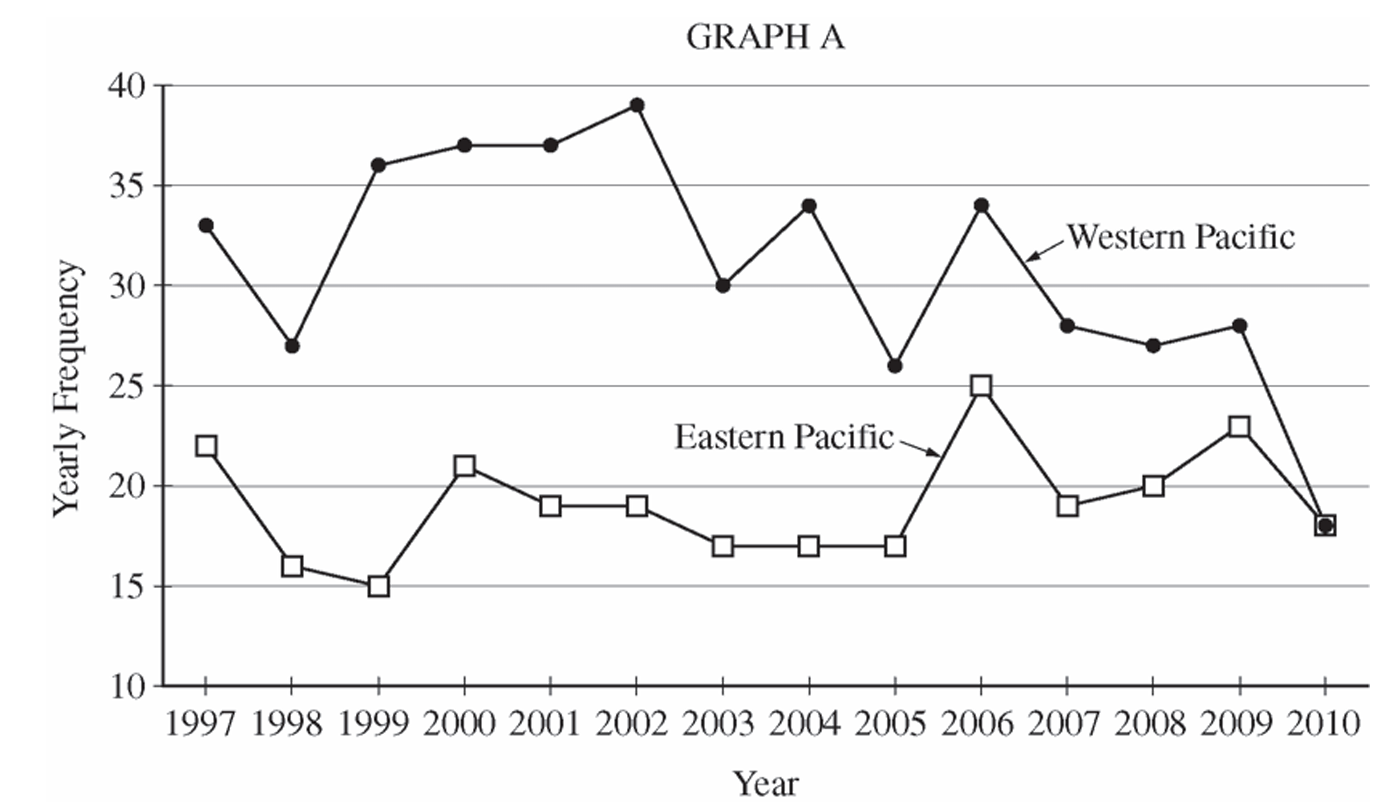
The Western Pacific consistently had a higher yearly frequency of typhoons than the Eastern Pacific throughout the entire period from \(1997\) to \(2010\). The center (median/mean) of the Western Pacific distribution is noticeably higher — roughly in the low-to-mid \(30\)s — compared to the Eastern Pacific, which clusters mostly in the high teens to low \(20\)s. The Western Pacific also showed greater year-to-year variability, with values ranging from \(18\) to \(39\), while the Eastern Pacific ranged from \(15\) to \(25\). Both distributions appear roughly similar in shape — neither strongly skewed — but the Western Pacific distribution is shifted considerably upward compared to the Eastern Pacific.
(b)
For the Eastern Pacific, typhoon frequencies were relatively stable throughout the period. After starting at \(22\) in \(1997\), the counts dipped slightly in the late \(1990\)s and early \(2000\)s, hovered in the high teens, then showed a slight increase around \(2006\) before settling back down to \(18\) in \(2010\). There is no strong overall upward or downward trend — the Eastern Pacific frequencies stayed roughly flat over the \(14\)-year period.
For the Western Pacific, typhoon frequencies showed a noticeable overall downward trend over the period. Starting at \(33\) in \(1997\), counts rose to a peak of \(39\) in \(2002\), then declined steadily, dropping sharply to \(18\) in \(2010\) — the same value as the Eastern Pacific in that year. The general trend in the Western Pacific is a decrease in typhoon frequency from the early \(2000\)s onward.
(c)
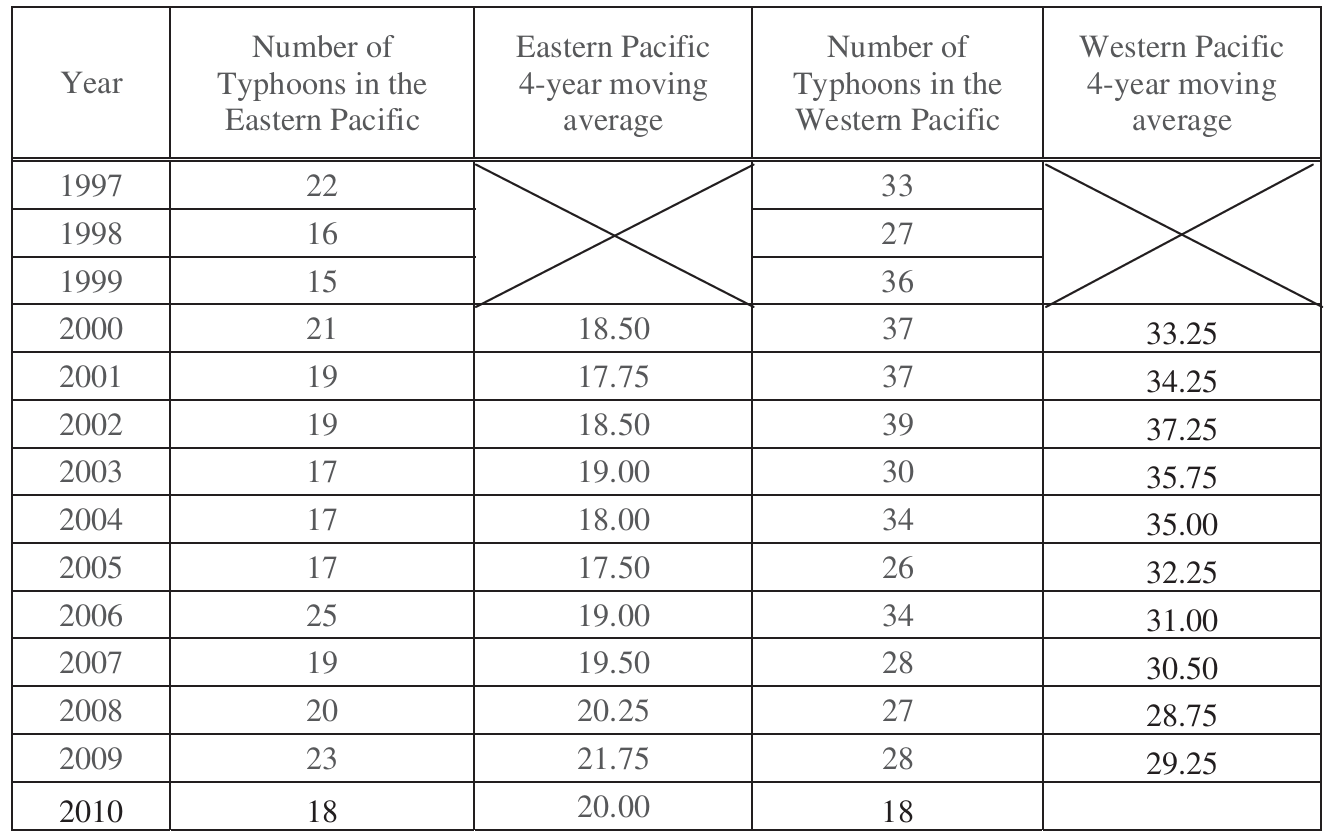
The \(4\)-year moving average for \(2010\) in the Western Pacific is the average of the four most recent yearly values: \(2007\), \(2008\), \(2009\), and \(2010\).
$\text{4-year moving average}_{2010} = \frac{28 + 27 + 28 + 18}{4} = \frac{101}{4} = \boxed{25.25}$
The value is written in the table as follows. 
(d)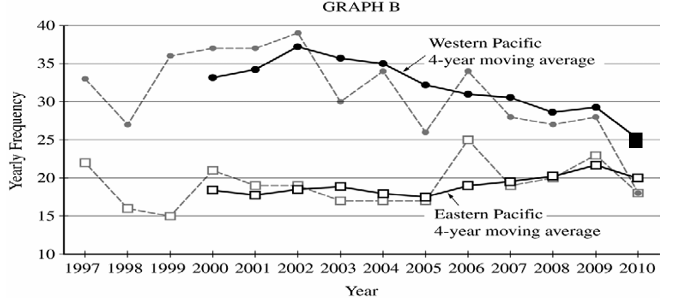
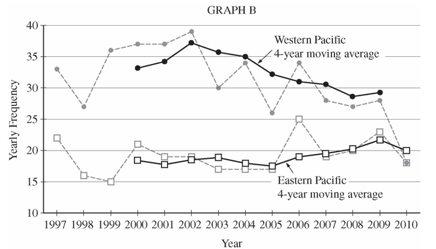
On Graph B, plot the point \((2010,\ 25.25)\) for the Western Pacific \(4\)-year moving average and connect it with a solid line to the previous moving average value of \(29.25\) at \(2009\). This completes the Western Pacific moving average line, which shows a continued decline ending at \(25.25\) in \(2010\).
(e)(i)
The \(4\)-year moving averages make the overall long-term trends in typhoon frequency more apparent. In particular, the moving average plot for the Western Pacific clearly shows the gradual downward trend in typhoon activity from the early \(2000\)s to \(2010\), which is harder to see in the raw yearly data due to year-to-year fluctuations. The moving averages smooth out the short-term noise and reveal the underlying direction of change over time.
(e)(ii)
The \(4\)-year moving averages make the year-to-year variability and individual fluctuations less apparent. For example, the sharp single-year spike or drop in a particular year (such as the Western Pacific dropping to \(26\) in \(2005\) or the Eastern Pacific jumping to \(25\) in \(2006\)) is dampened or obscured in the moving average plot. The raw yearly frequency plots show these individual extreme values much more clearly.
Question


Most-appropriate topic codes (AP Statistics):
• Topic 1.7 — Summary Statistics for One Quantitative Variable (Part b)
• Topic 1.9 — Comparisons of the Distributions for One Quantitative Variable (Part c)
▶️ Answer/Explanation
(a)
No, it is not reasonable to believe that the distribution of running times is approximately normal.
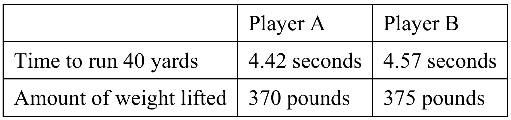
In a normal distribution, data extends several standard deviations below the mean. For this dataset, the minimum running time is \(4.40\) seconds, which yields a standardized distance from the mean of:
\(z = \dfrac{4.40 – 4.60}{0.15} = -1.33\)
Since a normal distribution expects approximately \(9.2\%\) of its observations to fall below \(1.33\) standard deviations beneath the mean, having a hard cutoff at \(1.33\) standard deviations indicates that the left tail is severely truncated. Thus, the distribution is likely skewed to the right.
(b)
To find the standardized score for a weight of \(370\) pounds, we use the z-score formula:
\(z = \dfrac{x – \mu}{\sigma}\)
\(z = \dfrac{370 – 310}{25} = \dfrac{60}{25} = 2.40\)
Interpretation: This player’s weightlifting performance is \(2.40\) standard deviations above the average weight lifted by all players in this position.
(c)
The team should select Player A.
To perform a fair comparison since both speed and strength carry equal importance, we compute the z-scores for both players on each metric:
Player A:
\(z_{\text{speed}} = \dfrac{4.42 – 4.60}{0.15} = -1.20\)
\(z_{\text{strength}} = \dfrac{370 – 310}{25} = 2.40\)
Since a lower running time indicates a more desirable speed, a negative z-score is a positive attribute. The combined standardized advantage for Player A is \(2.40 – (-1.20) = 3.60\) units of desirability (or we can think of a speed index where faster is positive, meaning a net sum of \(1.20 + 2.40 = 3.60\)).
Player B:
\(z_{\text{speed}} = \dfrac{4.57 – 4.60}{0.15} = -0.20\)
\(z_{\text{strength}} = \dfrac{375 – 310}{25} = 2.60\)
The combined standardized index advantage for Player B is \(0.20 + 2.60 = 2.80\).
Comparing the two candidates, Player A is dramatically faster than Player B (\(1.20\) standard deviations below the mean versus only \(0.20\) standard deviations below), while Player B is only slightly stronger than Player A (\(2.60\) standard deviations above the mean versus \(2.40\)). Therefore, Player A represents a significantly better overall draft value when both metrics are weighted equally.
Question
Most-appropriate topic codes (AP Statistics):
• Topic \(1.8\) — Graphical Representations of Summary Statistics for One Quantitative Variable (Part \(\mathrm{a}\))
• Topic \(1.7\) — Summary Statistics for One Quantitative Variable (Part \(\mathrm{b}\))
▶️ Answer/Explanation
(a)
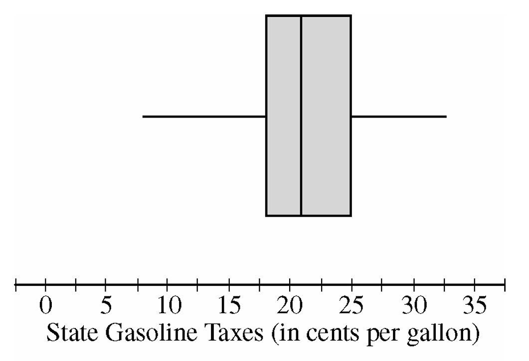
From the boxplot, identify the median as the line inside the box — it falls at approximately \(21\) cents per gallon.
The first quartile \(Q_1\) is the left edge of the box, reading approximately \(18\) cents per gallon, and the third quartile \(Q_3\) is the right edge, reading approximately \(25\) cents per gallon.
The interquartile range is calculated as:
\(\text{IQR} = Q_3 – Q_1 \approx 25 – 18 = 7 \text{ cents per gallon}\)
\(\boxed{\text{Median} \approx 21 \text{ cents per gallon}, \quad \text{IQR} \approx 7 \text{ cents per gallon}}\)
(b)
When a constant value is added to every observation in a distribution, the entire distribution shifts by that constant — so the median increases by exactly \(18.4\) cents per gallon.
\(\text{New Median} = 21 + 18.4 = 39.4 \text{ cents per gallon}\)
However, adding the same constant to every data value shifts \(Q_1\) and \(Q_3\) by equal amounts, so their difference remains unchanged:
\(\text{New } Q_1 = 18 + 18.4 = 36.4, \quad \text{New } Q_3 = 25 + 18.4 = 43.4\)
\(\text{New IQR} = 43.4 – 36.4 = 7 \text{ cents per gallon}\)
\(\boxed{\text{New Median} \approx 39.4 \text{ cents per gallon}, \quad \text{New IQR} \approx 7 \text{ cents per gallon}}\)
Question
Most-appropriate topic codes (AP Statistics):
• Topic \(1.7\) — Summary Statistics for a Quantitative Variable (Center, Spread, Shape) (Parts \(\mathrm{a}\), \(\mathrm{b}\), \(\mathrm{c}\))
• Topic \(1.9\) — Comparing Distributions of a Quantitative Variable (Parts \(\mathrm{a}\), \(\mathrm{b}\))
• Topic \(1.10\) — The Effect of Adding a Constant or Multiplying by a Constant on Summary Statistics (Part \(\mathrm{b}\))
• Topic \(3.1\) — Mean and Standard Deviation of a Linear Transformation (Part \(\mathrm{c}\))
▶️ Answer/Explanation
(a)
When comparing two distributions from boxplots, we examine center, spread, shape, and unusual features.
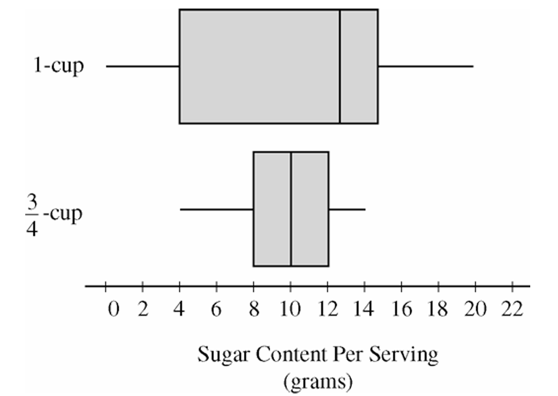
The cereals with one-cup serving sizes have a higher median sugar content per serving than the cereals with three-quarter-cup serving sizes. The one-cup distribution also has greater variability, as indicated by its larger range and larger interquartile range (IQR). In terms of shape, the one-cup distribution appears somewhat left-skewed because the median is closer to the upper quartile than to the lower quartile, while the three-quarter-cup distribution is more nearly symmetric. Neither distribution appears to contain extreme outliers.
(b)
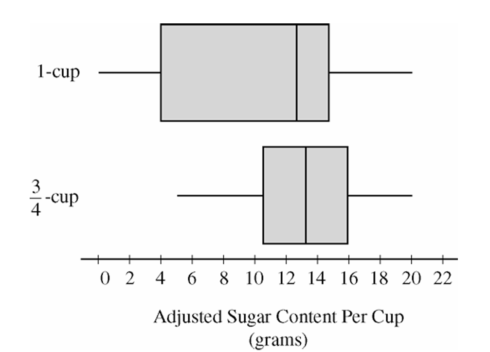
Multiplying each sugar value in the three-quarter-cup group by \(\dfrac{4}{3}\) converts the measurements to sugar content per cup, allowing a fair comparison using equal serving sizes.
The adjusted boxplot shows that cereals with recommended serving sizes of three-quarter cup tend to contain more sugar per cup than cereals with recommended serving sizes of one cup. The median for the adjusted three-quarter-cup distribution is now noticeably higher than the median for the one-cup distribution. In addition, all measures of spread (range and IQR) for the adjusted distribution have increased by a factor of \(\dfrac{4}{3}\), reflecting the effect of multiplying every observation by a constant.
(c)
We would expect the mean sugar content per cup to be greater for cereals that list a serving size of three-quarter cup.
After adjustment, the three-quarter-cup distribution has a higher center than the one-cup distribution, as seen from its higher median. Because the mean generally follows the center of the distribution, the higher overall location of the adjusted three-quarter-cup distribution suggests a larger mean sugar content per cup.
\(\boxed{\bar{x}_{\frac{3}{4}\text{-cup}} > \bar{x}_{\text{1-cup}}}\)
Question
Most-appropriate topic codes (AP Statistics):
• Topic 1.9 — Comparisons of the Distributions for One Quantitative Variable (Part \(\mathrm{b}\))
• Topic 4.7 — Constructing a Confidence Interval for the Difference Between Two Population Means (Part \(\mathrm{c}\))
• Topic 4.8 — Justifying a Claim Based on a Confidence Interval for the Difference Between Two Population Means (Part \(\mathrm{c}\))
▶️ Answer/Explanation
(a)
The standard deviation \(s = 2.141\) tells us roughly how far a typical discoloration rating in the control group falls from the group’s mean rating.
In other words, on average, a single strawberry’s discoloration rating in the control group deviates from the mean discoloration rating by about \(2.141\) points.
A larger standard deviation would indicate that the individual ratings are more spread out from the mean, while a smaller value would indicate the ratings are clustered more tightly around the mean.
\(\boxed{s = 2.141 \text{ is the typical distance of each discoloration rating from the mean in the control group.}}\)
(b)
The preservative does appear to have been effective in lowering the amount of discoloration in strawberries.
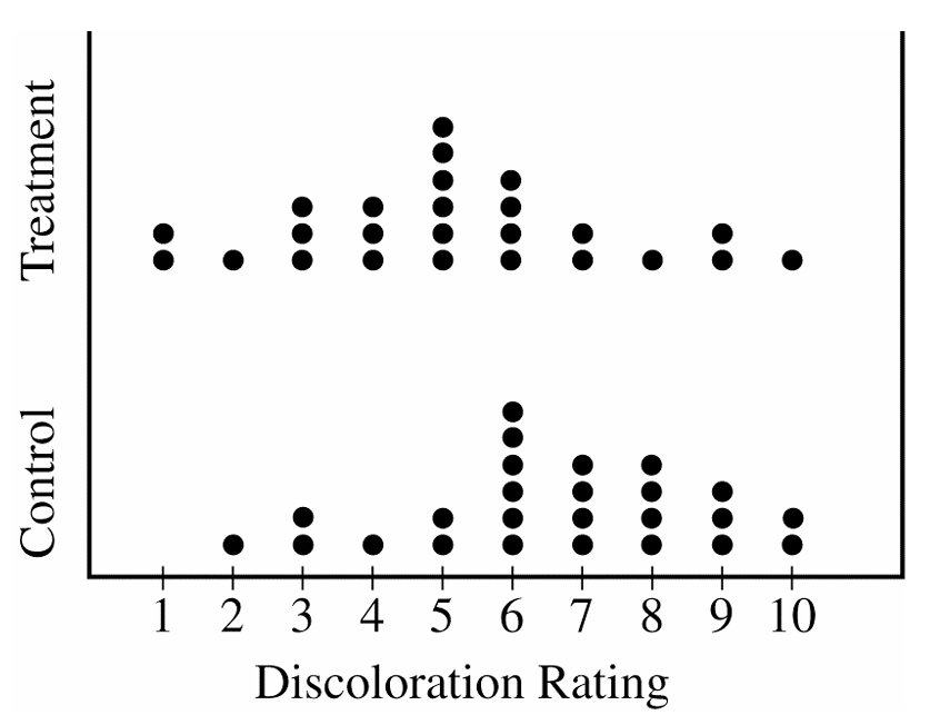
Looking at the dotplots, the treatment group’s distribution is clearly centered at a lower value than the control group’s distribution — the treatment group’s center is around 5, while the control group’s center is around 7.
Additionally, nearly all the summary statistics (minimum, \(Q_1\), median, and \(Q_3\)) are lower for the treatment group than for the control group, which consistently supports the conclusion that the preservative reduced discoloration.
\(\boxed{\text{The preservative appears effective: treatment ratings are consistently lower than control ratings.}}\)
(c)
We are given a 95% confidence interval for \(\mu_{\text{control}} – \mu_{\text{treatment}}\) as \((0.16,\ 2.72)\).
Since the entire interval lies above zero — meaning zero is not contained within \((0.16,\ 2.72)\) — we have convincing evidence that the two population means are not equal.
We are 95% confident that the population mean discoloration rating for untreated strawberries is between \(0.16\) and \(2.72\) units higher than the population mean rating for treated strawberries, indicating the preservative does make a real difference.
\(\boxed{0 \notin (0.16,\ 2.72) \Rightarrow \text{there is a significant difference in population mean discoloration ratings.}}\)
Question
19 36 19 13 43 8 16 14 10 9
Most-appropriate topic codes (AP Statistics):
• Topic 1.6 — Descriptions for One Quantitative Variable Distributions (Part \(\mathrm{b}\))
• Topic 1.7 — Summary Statistics for One Quantitative Variable (Part \(\mathrm{c}\))
• Topic 1.9 — Comparisons of the Distributions for One Quantitative Variable (Parts \(\mathrm{b}\), \(\mathrm{c}\))
▶️ Answer/Explanation
(a)
To build the stemplot, use the tens digit as the stem and the units digit as the leaf. The data range from \(8\) to \(44\), so the stems are \(0, 1, 2, 3, 4\). Place each data value’s units digit on the appropriate row.
\( \begin{array}{r|l} 0 & 8 \quad 9 \\ 1 & 2 \quad 6 \quad 8 \quad 7 \quad 8 \quad 9 \quad 6 \quad 9 \quad 3 \quad 4 \quad 0 \\ 2 & \\ 3 & 3 \quad 8 \quad 6 \quad 5 \\ 4 & 1 \quad 4 \quad 3 \\ \end{array} \)
Legend: \(1 \mid 2\) represents \(12\) questions answered correctly.
Ordered version (leaves sorted in ascending order):
\( \begin{array}{r|l} 0 & 8 \quad 9 \\ 1 & 0 \quad 2 \quad 3 \quad 4 \quad 6 \quad 6 \quad 7 \quad 8 \quad 8 \quad 9 \quad 9 \\ 2 & \\ 3 & 3 \quad 5 \quad 6 \quad 8 \\ 4 & 1 \quad 3 \quad 4 \\ \end{array} \)
Legend: \(1 \mid 2\) represents \(12\) questions answered correctly.
(b)
The most striking feature of this distribution is that the scores split into two distinct groups — one cluster concentrated in the teens (roughly \(8\)–\(19\)) and a second, smaller cluster in the high \(30\)s and low \(40\)s. There is a complete gap in the \(20\)s, with no student scoring between \(19\) and \(33\). The distribution is bimodal, suggesting that students tended to perform either quite poorly or quite well on the test, with no middle ground.
(c)
A measure of center such as the mean or median would fall somewhere around \(\bar{x} \approx 22.95\), which lies right in the gap of the \(20\)s — a region where no student actually scored. Reporting only the center gives the false impression that a typical student scored around \(23\), when in reality no student did. Because the data are bimodal with two separated groups, the center alone completely misses the two-cluster structure of the distribution and would mislead the reader into thinking the scores are roughly symmetric or unimodal.
Question
Most-appropriate topic codes (AP Statistics):
• Topic 1.7 — Summary Statistics for One Quantitative Variable (Parts \(\mathrm{a}\), \(\mathrm{c}\))
• Topic 1.9 — Comparisons of the Distributions for One Quantitative Variable (Parts \(\mathrm{a}\), \(\mathrm{b}\))
▶️ Answer/Explanation
(a)
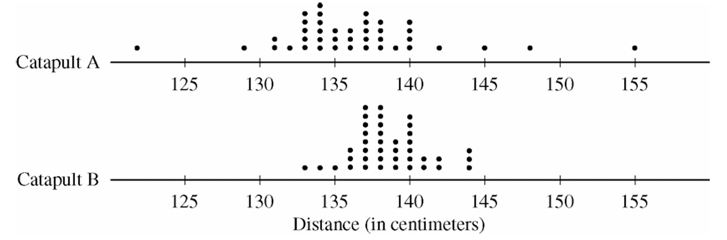
Both distributions of distances are roughly symmetric and somewhat mound-shaped (bell-shaped). Looking at the centers, the median of Catapult A is approximately \(136\,\text{cm}\), which is slightly lower than the median of Catapult B at approximately \(138\,\text{cm}\). In terms of spread, Catapult A shows considerably more variability than Catapult B — the range of Catapult A is about \(30\,\text{cm}\), while the range of Catapult B is approximately \(11\,\text{cm}\). Additionally, there appear to be potential outliers in Catapult A’s distribution (e.g., a ball traveling approximately \(155\,\text{cm}\)), whereas Catapult B has no such extreme values.
(b)
Catapult B would be the better choice.
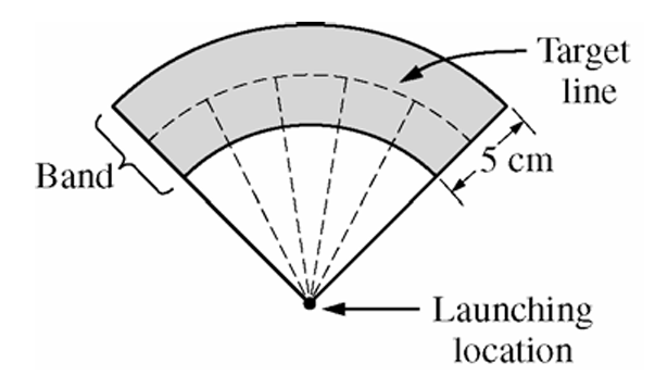
Since the target band is only \(5\,\text{cm}\) wide, the key factor is how tightly clustered the distances are around the center. Catapult B has a much smaller spread — most balls land between approximately \(133\,\text{cm}\) and \(143\,\text{cm}\) — meaning when placed correctly, a higher proportion of balls will fall within the narrow band. Catapult A’s larger variability means balls are scattered over a much wider range, making it far less likely that they will land consistently within the band.
(c)
Catapult B should be placed approximately \(\boxed{138\,\text{cm}}\) from the target line.
Since Catapult B’s distribution is roughly symmetric and mound-shaped, the median (approximately \(138\,\text{cm}\)) is a reliable measure of center and represents the most typical distance a ball will travel. Placing the catapult so that the target line is \(138\,\text{cm}\) away aligns the center of the distribution with the target, maximizing the chance that any given ball lands within the \(5\,\text{cm}\) band. Based on the sample data, approximately \(\frac{30}{40} = 0.75\) of the 40 balls launched from Catapult B landed within \(2.5\,\text{cm}\) on either side of \(138\,\text{cm}\), which further confirms this placement.
Question

Most-appropriate topic codes (AP Statistics):
• Topic 2.12 — Sampling Distributions and the Central Limit Theorem (Part \(\mathrm{b}\))
• Topic 1.7 — Summary Statistics for One Quantitative Variable (Part \(\mathrm{c}\))
• Topic 1.9 — Comparisons of the Distributions for One Quantitative Variable (Part \(\mathrm{d}\))
▶️ Answer/Explanation
(a)
The expected value of a discrete random variable is found by multiplying each value by its probability and adding the results:
\( E(X)=\sum x_i\,p(x_i) \)
Plugging in the values from the table:
\( E(X)=0(0.35)+1(0.20)+2(0.15)+3(0.15)+4(0.10)+5(0.05) \)
\( E(X)=0+0.20+0.30+0.45+0.40+0.25 \)
\( \boxed{E(X)=1.6} \)
(b)
Both sample averages are estimates of the same population mean, \(\mu_X=1.6\), so they should be centered around the same value. What changes is how precise that estimate is.
The standard deviation of a sample mean is
\( \sigma_{\bar{x}}=\dfrac{\sigma}{\sqrt{n}} \)
Since \(1{,}000>20\), a sample of 1,000 days has a much smaller standard deviation for its average, meaning the sample average will tend to land closer to 1.6 than the first sample’s average of 1.25 did.
\( \boxed{\text{The new average should be closer to } 1.6\text{ than }1.25\text{, since larger samples have less variability}} \)
(c)
To find the median, build up the cumulative probabilities:
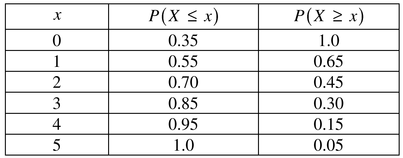
At \(x=1\), both \(P(X\le 1)=0.55\ge 0.5\) and \(P(X\ge 1)=0.65\ge 0.5\) are satisfied. At \(x=2\), \(P(X\ge 2)=0.45<0.5\), so \(x=2\) does not work.
\( \boxed{\text{Median} = 1} \)
(d)
Looking at the table, most of the probability is piled up at the small values (0, 1, 2) with a long tail of smaller probabilities stretching out to 4 and 5. This makes the distribution right-skewed, which pulls the mean up above the median — here the mean of 1.6 is noticeably larger than the median of 1, which is exactly the pattern you’d expect for a distribution skewed toward larger values.
\( \boxed{\text{The distribution is right-skewed, so the mean (1.6) is greater than the median (1)}} \)
Question
Most-appropriate topic codes (AP Statistics):
• Topic 1.7 — Summary Statistics for One Quantitative Variable (Parts b, c)
• Topic 1.9 — Comparisons of the Distributions for One Quantitative Variable (Part b)
▶️ Answer/Explanation
(a)
The distribution is skewed to the left (skewed toward the lower values). You can see this from the stemplot: the longer tail stretches down into the 60s and lower 70s, while most of the data cluster in the upper 80s and 90s. There are relatively few low scores pulling the tail downward.
(b)
The instructor should report the median.
Because the distribution is skewed toward the lower values, the mean gets pulled in that direction — it will be lower than the median. The median, being resistant to the few very low scores, will better represent the “typical” high performance of the class. So ironically, to make performance look as high as possible, the median is the better choice here.
(c)
Step 1 — Compute the midrange:
The minimum score is \(64\) and the maximum score is \(95\), so:
\( \text{midrange} = \frac{\text{maximum} + \text{minimum}}{2} = \frac{95 + 64}{2} = \frac{159}{2} = 79.5 \)
\(\boxed{\text{midrange} = 79.5}\)
Step 2 — Identify as measure of center:
The midrange is a measure of center.
Step 3 — Rationale:
The maximum value tells us about the upper extreme and the minimum tells us about the lower extreme. By averaging these two values, we find the point that sits exactly halfway between the two extremes — this is a center point, not a spread. Measures of spread (like range, standard deviation, or IQR) describe how far apart the data are; the midrange instead gives a single representative middle value, placing it firmly in the category of measures of center.
Question

Most-appropriate topic codes (AP Statistics):
• Topic 1.9 — Comparisons of the Distributions for One Quantitative Variable (Parts a, b)
• Topic 1.7 — Summary Statistics for One Quantitative Variable (Part b)
▶️ Answer/Explanation
(a)
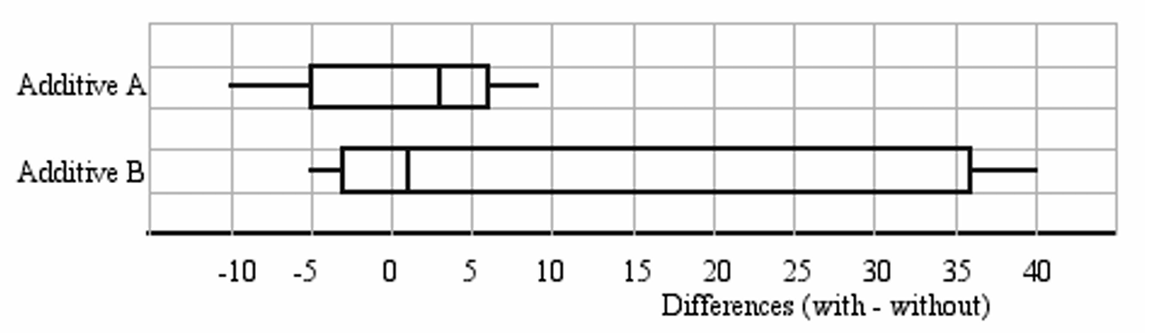
First, check for outliers using the \(1.5 \times \text{IQR}\) rule.
For Additive A:
\(\text{IQR}_A = Q_3 – Q_1 = 4 – 1 = 3\)
\(1.5 \times \text{IQR}_A = 1.5 \times 3 = 4.5\)
Lower fence: \(Q_1 – 4.5 = 1 – 4.5 = -3.5\)
Upper fence: \(Q_3 + 4.5 = 4 + 4.5 = 8.5\)
Values below \(-3.5\): \(-10, -8\) → both are outliers
Values above \(8.5\): \(9\) → outlier
For Additive B:
\(\text{IQR}_B = Q_3 – Q_1 = 25 – (-2) = 27\)
\(1.5 \times \text{IQR}_B = 1.5 \times 27 = 40.5\)
Lower fence: \(-2 – 40.5 = -42.5\)
Upper fence: \(25 + 40.5 = 65.5\)
No values fall outside these fences → no outliers
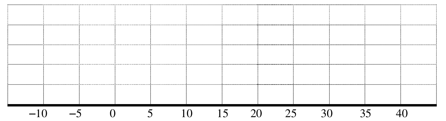
The parallel boxplots should be drawn as follows:
(b)(i)
Additive A is the better recommendation when the goal is to improve mileage in the highest proportion of cars. Since \(Q_1 = 1 > 0\) for Additive A, we know that at least 75% of the cars in the sample showed a positive difference (i.e., improved mileage). For Additive B, \(Q_1 = -2 < 0\), so we can only be certain that at least 50% of the cars showed improvement — and it could be less than 75%. Therefore, Additive A is more reliable for maximizing the proportion of cars that benefit.
\(\boxed{\text{Recommend Additive A for highest proportion of cars with improved mileage}}\)
(b)(ii)
Additive B is the better recommendation when the goal is to maximize the mean increase in gas mileage. Although the median for Additive B (Median \(= 1\)) is lower than that of Additive A (Median \(= 3\)), the distribution for Additive B is strongly right-skewed, with very large values above \(Q_3\) such as \(35, 37,\) and \(40\). This skewness pulls the mean well above the median. In contrast, Additive A has two low outliers (\(-10, -8\)) pulling the mean downward. So the mean for Additive B is expected to be substantially higher than the mean for Additive A.
\(\boxed{\text{Recommend Additive B for highest mean increase in gas mileage}}\)