
AP Statistics 1.8 Graphical Representations of Summary Statistics for One Quantitative Variable- Exam Style Questions - FRQs - New Syllabus
Question
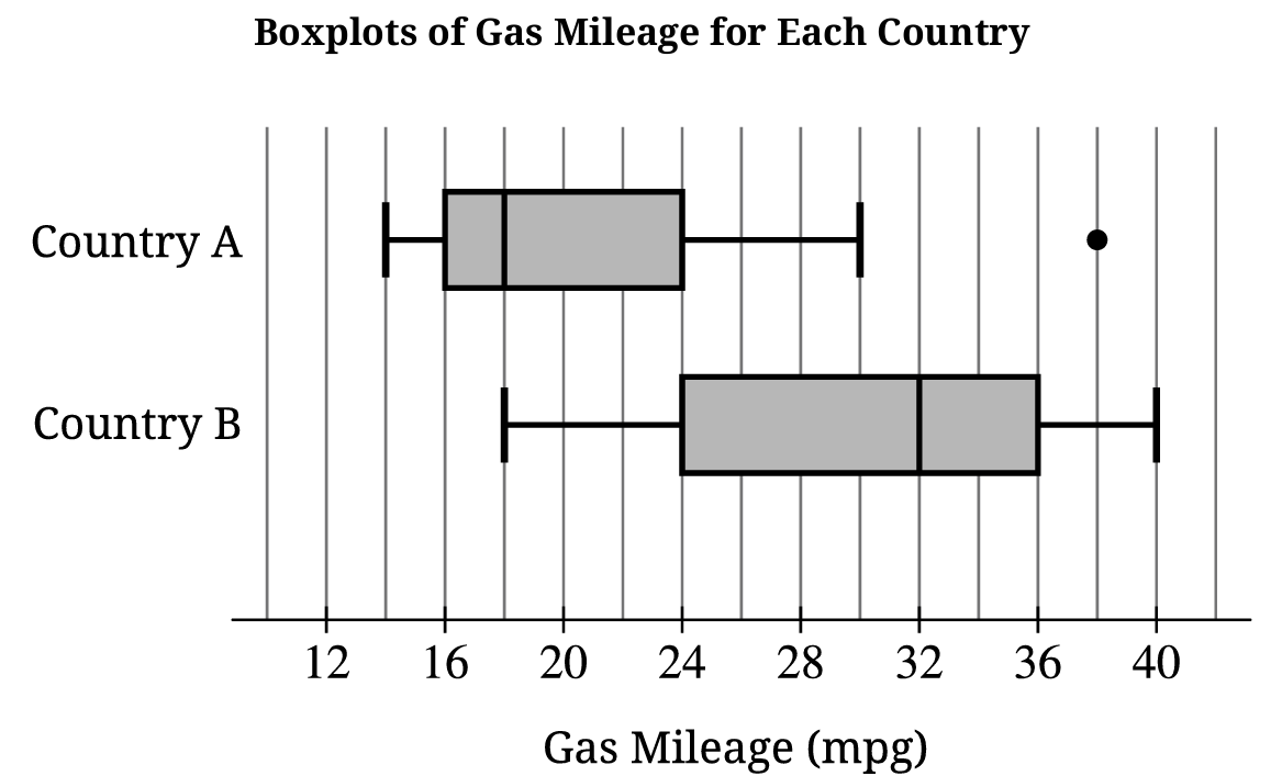
ii. What is a possible value of the median of the combined data set? Justify your answer by referencing the boxplots shown.
Most-appropriate topic codes (AP Statistics):
• Topic \(1.8\) — Graphical Representations of Summary Statistics for One Quantitative Variable (Parts \( \mathrm{B} \), \( \mathrm{C} \))
• Topic \(1.9\) — Comparisons of the Distributions for One Quantitative Variable (Part \( \mathrm{A} \))
▶️ Answer/Explanation
A.
• Center: The median gas mileage for Country B (\(32\,\text{mpg}\)) is higher than that of Country A (\(18\,\text{mpg}\)).
• Spread: The overall range for Country A (\(38 – 14 = 24\,\text{mpg}\)) is slightly wider than Country B (\(40 – 18 = 22\,\text{mpg}\)), but the Interquartile Range (IQR) for Country B (\(36 – 24 = 12\,\text{mpg}\)) is larger than Country A (\(22 – 14 = 8\,\text{mpg}\)).
• Outliers: Country A has a single extreme high value plotted as an outlier at \(38\,\text{mpg}\), while Country B displays no outliers.
B.
• The mean is expected to be greater than \(18\,\text{mpg}\).
• Because the distribution for Country A is skewed to the right and contains a high outlier at \(38\,\text{mpg}\), the mean will be pulled upward toward the long right tail while the median remains resistant.
C. i.
• The minimum value of the combined set is \(14\,\text{mpg}\) (from Country A) and the maximum value is \(40\,\text{mpg}\) (from Country B).
• \(\text{Combined Range} = \text{Maximum} – \text{Minimum} = 40 – 14 = 26\,\text{mpg}\).
C. ii.
• A possible value for the combined median is any value satisfying \(18\,\text{mpg} \le \text{Median} \le 32\,\text{mpg}\), such as \(24\,\text{mpg}\).
• Since both samples contain exactly 100 cars, combining them creates a total group of 200 cars where the new median rests between the 100th and 101st ordered values, forcing it to fall cleanly between the separate sample medians of \(18\,\text{mpg}\) and \(32\,\text{mpg}\).
Question
i. Identify the appropriate inference procedure for Julio to use.
ii. Describe the parameter for the inference procedure you identified in part (a-i) in context.
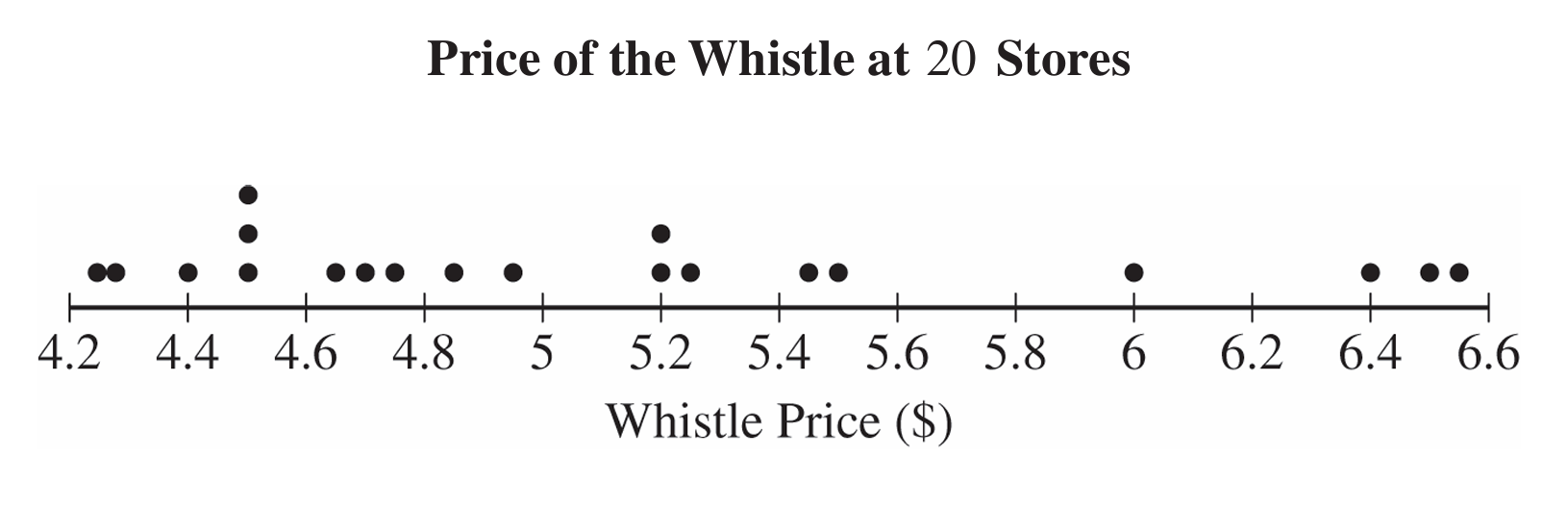

ii. Using the \(1.5 \times \text{IQR}\) rule, determine whether there are any outliers in the sample of whistle prices. Justify your response.
i. Calculate Pearson’s coefficient of skewness for Julio’s sample of \(20\) whistle prices. Show your work.
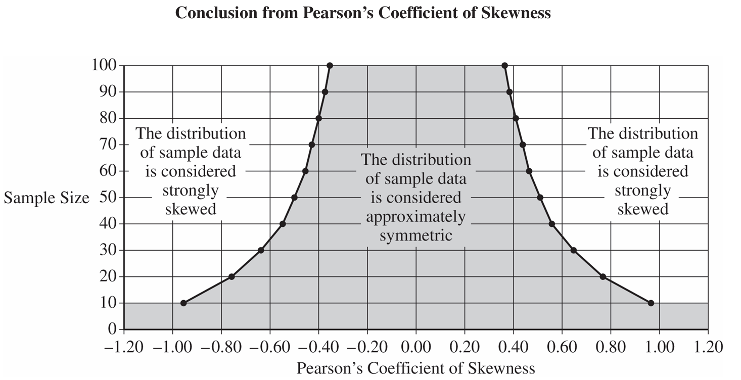 ii. Indicate the value of the Pearson’s coefficient of skewness you calculated in part (c-i) for the appropriate sample size by marking it with an “X” on the preceding graph.
• The sample size is greater than or equal to \(30\).
• If the sample size is less than \(30\), the distribution of the sample data is not strongly skewed and does not have outliers.
Most-appropriate topic codes (AP Statistics):
• Topic \(1.8\) — Graphical Representations of Summary Statistics for One Quantitative Variable (Parts \( \mathrm{b} \), \( \mathrm{c} \))
• Topic \(4.2\) — Constructing a Confidence Interval for a Population Mean or Population Mean Difference (Parts \( \mathrm{a} \), \( \mathrm{d} \))
▶️ Answer/Explanation
(a)
i. Julio should use a one-sample \(t\)-interval for a population mean.
ii. The parameter of interest is \(\mu\), the true mean price (in dollars) of this type of whistle at all stores that sell it.
(b)
i. The distribution of the sample of whistle prices is skewed to the right. This is because the mean (\(5.12\)) is greater than the median (\(4.885\)).
ii. \(\text{IQR} = Q_3 – Q_1 = 5.475 – 4.51 = 0.965\).
Lower boundary: \(Q_1 – 1.5(\text{IQR}) = 4.51 – 1.5(0.965) = 3.0625\).
Upper boundary: \(Q_3 + 1.5(\text{IQR}) = 5.475 + 1.5(0.965) = 6.9225\).
Since the minimum value (\(4.25\)) is greater than \(3.0625\) and the maximum value (\(6.58\)) is less than \(6.9225\), there are no outliers in the sample.
(c)
i. \(\text{Pearson’s Coefficient} = \dfrac{3(5.12 – 4.885)}{0.743} \approx 0.949\).
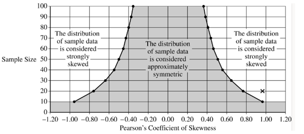
ii. On the graph, you would plot an “X” at a sample size of \(y = 20\) and a skewness coefficient of \(x \approx 0.949\).
(d)
i. We can conclude that the distribution of the sample of whistle prices is strongly skewed. This is justified because the calculated coefficient of \(0.949\) for a sample size of \(20\) falls in the “strongly skewed” region of the provided graph.
ii. No, the normality condition is not satisfied. The sample size (\(n = 20\)) is less than \(30\), and although there are no outliers, the sample data is strongly skewed, failing the second condition.
Question

Most-appropriate topic codes (AP Statistics):
• Topic \(1.7\) — Summary Statistics for One Quantitative Variable (Part \( \mathrm{b} \))
• Topic \(1.8\) — Graphical Representations of Summary Statistics for One Quantitative Variable (Part \( \mathrm{b} \))
▶️ Answer/Explanation
(a)
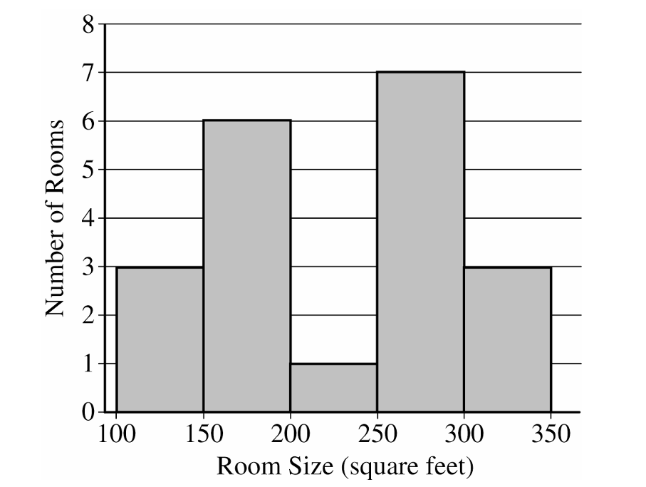
The distribution of the sample of room sizes is bimodal and roughly symmetric.
Most room sizes fall into two clusters: \(100\) to \(200\) square feet and \(250\) to \(350\) square feet.
The center of the distribution is between \(200\) and \(300\) square feet.
The range of the distribution is between \(150\) and \(250\) square feet.
There are no apparent outliers.
(b)
The interquartile range is:
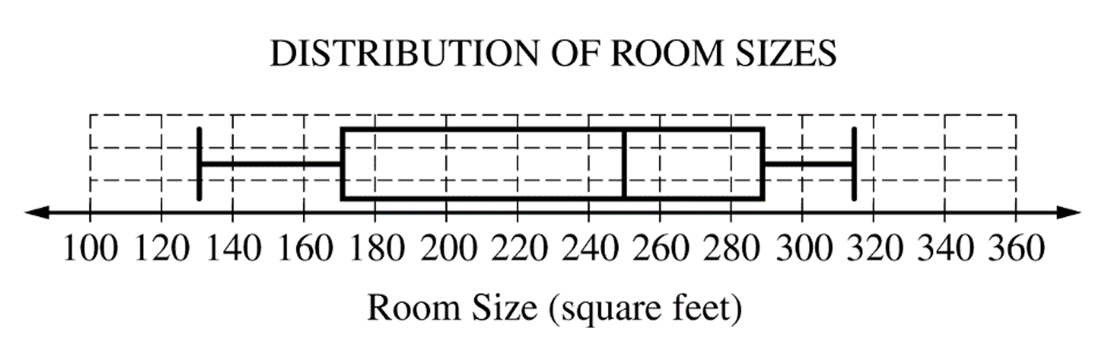
\(IQR = Q_3 – Q_1 = 292 – 174 = 118\) square feet.
To find potential outliers, we check the lower and upper fences.
Lower Fence = \(Q_1 – 1.5(IQR) = 174 – 1.5(118) = -3\) square feet.
Upper Fence = \(Q_3 + 1.5(IQR) = 292 + 1.5(118) = 469\) square feet.
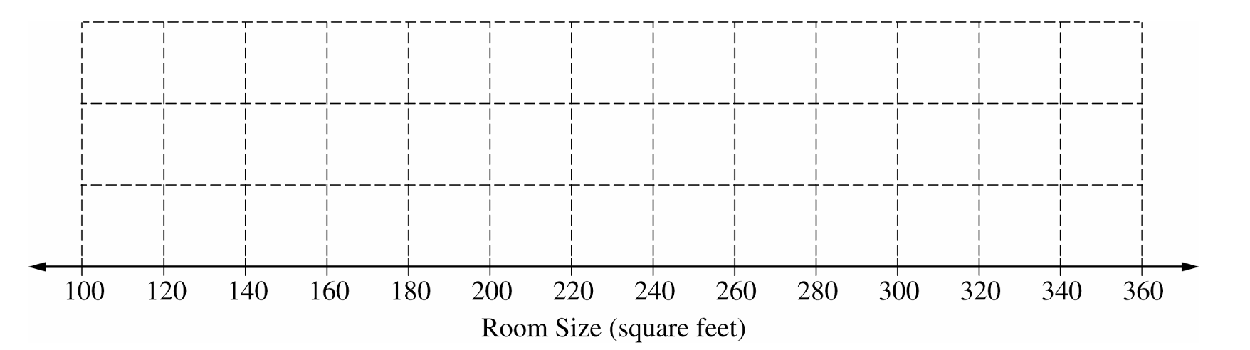
There are no potential outliers because the minimum room size of \(134\) square feet does not fall below \(-3\), and the maximum room size of \(315\) square feet does not exceed \(469\).
(c)
The histogram clearly shows the bimodal nature (two peaks or clusters) of the distribution of room sizes.
This bimodal characteristic is not apparent from the boxplot.
Question
Most-appropriate topic codes (AP Statistics):
• Topic \(1.8\) — Graphical Representations of Summary Statistics for One Quantitative Variable (Parts \( \mathrm{a} \), \( \mathrm{b} \))
▶️ Answer/Explanation
(a)
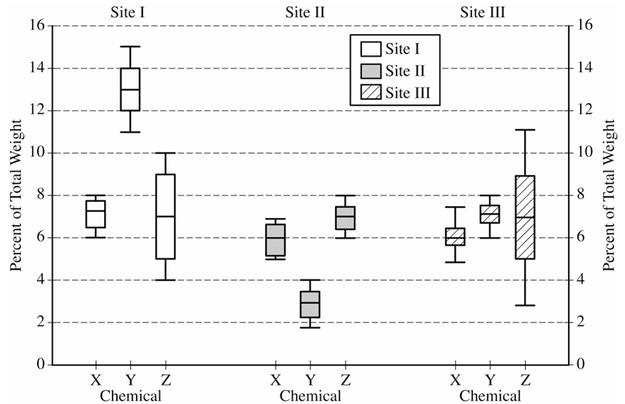
Similarity: The median percent of chemical Z is approximately the same across all three sites, at roughly \(7\%\) of total weight. This means the center of the distribution of chemical Z does not help distinguish one site from another.
Difference: The spread (range) of the percent of chemical Z differs considerably among the three sites.
Site II has the smallest range, approximately \(2\%\) (from about \(6\%\) to \(8\%\)).
Site I has a moderate range, approximately \(6\%\) (from about \(4\%\) to \(10\%\)).
Site III has the largest range, approximately \(8\%\) (from about \(3\%\) to \(11\%\)).
So while the typical chemical Z content is similar at all three sites, Site II pottery is far more consistent in its Z content, while Site III pottery shows the greatest variability.
(b)(i)
The piece of pottery most likely originated at Site III.
To decide, we estimate the minimum and maximum possible sums of the percents of X, Y, and Z at each site by reading the minimum and maximum values from the boxplots:
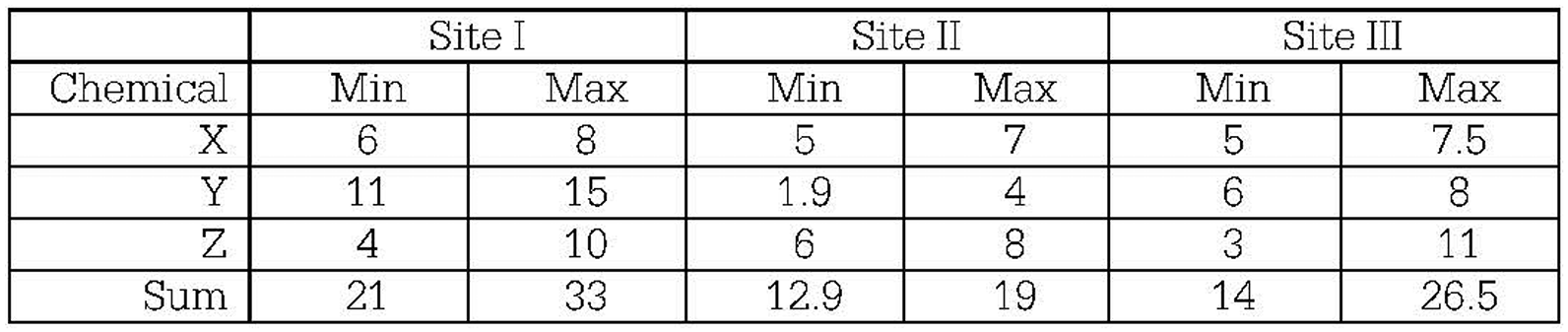
For Site I, the possible sum ranges from \(21\%\) to \(33\%\) — since \(20.5\%\) falls below the minimum, a sum of \(20.5\%\) is unlikely for Site I.
For Site II, the possible sum ranges from \(12.9\%\) to \(19\%\) — since \(20.5\%\) falls above the maximum, a sum of \(20.5\%\) is also unlikely for Site II.
For Site III, the possible sum ranges from \(14\%\) to \(26.5\%\) — since \(20.5\%\) falls comfortably within this interval, Site III is the most plausible origin.
\(\boxed{\text{Most likely site: Site III}}\)
(b)(ii)
Chemical Y would be the most useful for identifying the site of origin.
Looking at the boxplots for chemical Y across the three sites:
Site I: chemical Y ranges from approximately \(11\%\) to \(15\%\)
Site II: chemical Y ranges from approximately \(1.9\%\) to \(4\%\)
Site III: chemical Y ranges from approximately \(6\%\) to \(8\%\)
These three ranges do not overlap at all — every possible value of chemical Y belongs to exactly one site’s range. So if we measure chemical Y in an unknown piece, we can pinpoint its origin with certainty.
By contrast, the distributions of chemicals X and Z show substantial overlap across the three sites, meaning a measured value of X or Z could plausibly belong to multiple sites, making those chemicals far less useful for classification.
\(\boxed{\text{Most useful chemical: Y}}\)
Question


Most-appropriate topic codes (AP Statistics):
• Topic \(1.6\) — Descriptions for One Quantitative Variable Distributions (Part \(\mathrm{b}\))
• Topic \(2.3\) — Estimating Probabilities Using Simulation (Part \(\mathrm{c}\))
• Topic \(1.8\) — Graphical Representations of Summary Statistics for One Quantitative Variable (Part \(\mathrm{d}\))
▶️ Answer/Explanation
(a)
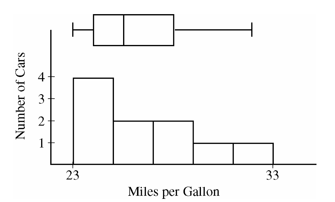
Let \(\mu\) = the true population mean fuel efficiency (in miles per gallon) for all cars of this particular model.
The consumer organization suspects the manufacturer is overstating the mpg, so the alternative hypothesis is lower-tailed:
\( H_0:\ \mu = 27\ \text{mpg} \)
\( H_a:\ \mu < 27\ \text{mpg} \)
The parameter must be defined as a population mean — not just a sample mean — and must be stated in context (fuel efficiency of this car model) to receive full credit.
(b)
Large values (greater than 1) of the ratio \(\dfrac{\text{sample mean}}{\text{sample median}}\) would indicate that the population distribution is skewed to the right.
The reason is that in a right-skewed distribution, the few unusually large values in the upper tail pull the mean upward, but the median — being a positional measure — is resistant to those extreme values and stays lower.
Therefore, when the distribution is right-skewed, we expect:
\( \text{sample mean} > \text{sample median} \implies \dfrac{\text{sample mean}}{\text{sample median}} > 1 \)
The further the ratio exceeds 1, the stronger the evidence of right-skewness.
(c)
The observed value of the statistic from the original sample is \(1.03\).
Looking at the dotplot of the 100 simulated statistics (all drawn from a normal population), we count that 14 out of 100 simulated values are greater than or equal to \(1.03\).
This gives a simulated \(p\)-value of approximately:
\( \hat{p} = \dfrac{14}{100} = 0.14 \)
Since \(0.14\) is larger than any commonly used significance level (such as \(\alpha = 0.05\) or \(\alpha = 0.10\)), we do not have convincing evidence that the original population is skewed to the right.
It is therefore plausible that the original sample of 10 cars came from a normally distributed population, and the observed right-skewness in the sample was simply due to random sampling variability.
(d)
Using only the five-number summary values, one reasonable skewness statistic is:
\( S = \dfrac{Q_3 – \text{Median}}{\text{Median} – Q_1} \)
Using the given data:
\( S = \dfrac{28 – 25.5}{25.5 – 24} = \dfrac{2.5}{1.5} \approx 1.67 \)
Values greater than 1 indicate right-skewness.
The reasoning is: in a right-skewed distribution, the data in the upper half are more spread out than in the lower half, so the distance from the median up to \(Q_3\) (the upper half of the middle 50%) will be larger than the distance from \(Q_1\) down to the median (the lower half of the middle 50%). This makes the numerator larger than the denominator, giving a ratio greater than 1.
Other acceptable statistics using only the five-number summary include:
\( S = \dfrac{\text{Maximum} – \text{Median}}{\text{Median} – \text{Minimum}}, \qquad S = \dfrac{\text{Maximum} – Q_3}{Q_1 – \text{Minimum}}, \qquad S = \dfrac{\frac{Q_1 + Q_3}{2}}{\text{Median}} \)
For all of these, values greater than 1 indicate right-skewness.
Question
Most-appropriate topic codes (AP Statistics):
• Topic \(1.8\) — Graphical Representations of Summary Statistics for One Quantitative Variable (Part \(\mathrm{a}\))
• Topic \(1.7\) — Summary Statistics for One Quantitative Variable (Part \(\mathrm{b}\))
▶️ Answer/Explanation
(a)
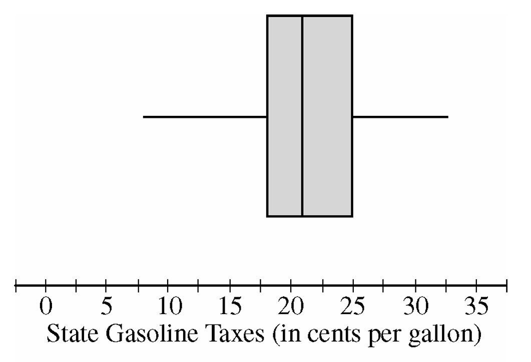
From the boxplot, identify the median as the line inside the box — it falls at approximately \(21\) cents per gallon.
The first quartile \(Q_1\) is the left edge of the box, reading approximately \(18\) cents per gallon, and the third quartile \(Q_3\) is the right edge, reading approximately \(25\) cents per gallon.
The interquartile range is calculated as:
\(\text{IQR} = Q_3 – Q_1 \approx 25 – 18 = 7 \text{ cents per gallon}\)
\(\boxed{\text{Median} \approx 21 \text{ cents per gallon}, \quad \text{IQR} \approx 7 \text{ cents per gallon}}\)
(b)
When a constant value is added to every observation in a distribution, the entire distribution shifts by that constant — so the median increases by exactly \(18.4\) cents per gallon.
\(\text{New Median} = 21 + 18.4 = 39.4 \text{ cents per gallon}\)
However, adding the same constant to every data value shifts \(Q_1\) and \(Q_3\) by equal amounts, so their difference remains unchanged:
\(\text{New } Q_1 = 18 + 18.4 = 36.4, \quad \text{New } Q_3 = 25 + 18.4 = 43.4\)
\(\text{New IQR} = 43.4 – 36.4 = 7 \text{ cents per gallon}\)
\(\boxed{\text{New Median} \approx 39.4 \text{ cents per gallon}, \quad \text{New IQR} \approx 7 \text{ cents per gallon}}\)
Question
Most-appropriate topic codes (AP Statistics):
• Topic 1.8 — Graphical Representations of Summary Statistics for One Quantitative Variable (Parts \(\mathrm{a}\), \(\mathrm{d}\))
▶️ Answer/Explanation
(a)
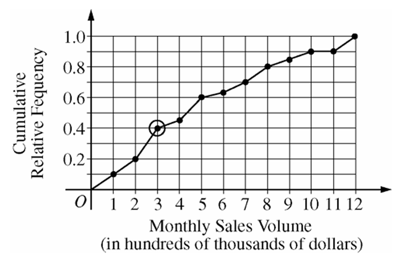
The circled point is located at approximately \((3,\ 0.40)\) on the graph.
This tells us that 40 percent of the sales agents at this real estate company had a monthly sales volume of \$300,000 or less in the month shown.
In other words, the circled point represents the 40th percentile of the distribution of most recent monthly sales volumes for all agents at the company.
\(\boxed{\text{40% of sales agents had monthly sales volume} \leq \$300{,}000}\)
(b)
Reading from the cumulative relative frequency plot:
Proportion of agents with sales volume \(\leq \$800{,}000\) (i.e., at \(x = 8\)) \(= 0.80\)
Proportion of agents with sales volume \(\leq \$700{,}000\) (i.e., at \(x = 7\)) \(= 0.70\)
So the proportion with sales volume between \$700,000 and \$800,000 is:
\(P(700{,}000 < X \leq 800{,}000) = P(X \leq 800{,}000) – P(X \leq 700{,}000) = 0.80 – 0.70 = 0.10\)
\(\boxed{0.10 \text{ (or 10 percent) of sales agents achieved monthly sales volumes between \$700,000 and \$800,000}}\)
(c)
When the cumulative relative frequency plot is flat between 10 and 11 on the horizontal axis, it means the cumulative proportion does not change in that interval.
Since no increase in cumulative frequency occurs, there were no sales agents whose monthly sales volume fell between \$1,000,000 and \$1,100,000 during that month.
\(\boxed{\text{No agents had a monthly sales volume between \$1,000,000 and \$1,100,000}}\)
(d)
Since the bonus goes to the top 20 percent of sales agents, we need to find the 80th percentile of the distribution (because the top 20% corresponds to a cumulative relative frequency of \(1 – 0.20 = 0.80\)).
Looking at the cumulative relative frequency plot, a cumulative relative frequency of \(0.80\) corresponds to a monthly sales volume of \$800,000 (i.e., \(x = 8\) on the horizontal axis).
Therefore, an agent must have achieved a monthly sales volume greater than \$800,000 to be in the top 20 percent and qualify for the bonus.
\(\boxed{\text{Minimum monthly sales volume to qualify for bonus} = \$800{,}000}\)
Question

Most-appropriate topic codes (AP Statistics):
• Topic 1.9 — Comparisons of the Distributions for One Quantitative Variable (Parts a, b)
• Topic 1.7 — Summary Statistics for One Quantitative Variable (Part b)
▶️ Answer/Explanation
(a)
First, check for outliers using the \(1.5 \times \text{IQR}\) rule.
For Additive A:
\(\text{IQR}_A = Q_3 – Q_1 = 4 – 1 = 3\)
\(1.5 \times \text{IQR}_A = 1.5 \times 3 = 4.5\)
Lower fence: \(Q_1 – 4.5 = 1 – 4.5 = -3.5\)
Upper fence: \(Q_3 + 4.5 = 4 + 4.5 = 8.5\)
Values below \(-3.5\): \(-10, -8\) → both are outliers
Values above \(8.5\): \(9\) → outlier
For Additive B:
\(\text{IQR}_B = Q_3 – Q_1 = 25 – (-2) = 27\)
\(1.5 \times \text{IQR}_B = 1.5 \times 27 = 40.5\)
Lower fence: \(-2 – 40.5 = -42.5\)
Upper fence: \(25 + 40.5 = 65.5\)
No values fall outside these fences → no outliers
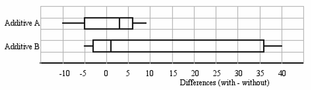
The parallel boxplots should be drawn as follows:
(b)(i)
Additive A is the better recommendation when the goal is to improve mileage in the highest proportion of cars. Since \(Q_1 = 1 > 0\) for Additive A, we know that at least 75% of the cars in the sample showed a positive difference (i.e., improved mileage). For Additive B, \(Q_1 = -2 < 0\), so we can only be certain that at least 50% of the cars showed improvement — and it could be less than 75%. Therefore, Additive A is more reliable for maximizing the proportion of cars that benefit.
\(\boxed{\text{Recommend Additive A for highest proportion of cars with improved mileage}}\)
(b)(ii)
Additive B is the better recommendation when the goal is to maximize the mean increase in gas mileage. Although the median for Additive B (Median \(= 1\)) is lower than that of Additive A (Median \(= 3\)), the distribution for Additive B is strongly right-skewed, with very large values above \(Q_3\) such as \(35, 37,\) and \(40\). This skewness pulls the mean well above the median. In contrast, Additive A has two low outliers (\(-10, -8\)) pulling the mean downward. So the mean for Additive B is expected to be substantially higher than the mean for Additive A.
\(\boxed{\text{Recommend Additive B for highest mean increase in gas mileage}}\)
Question

Most-appropriate topic codes (AP Statistics):
• Topic 1.9 — Comparisons of the Distributions for One Quantitative Variable (Part a)
• Topic 4.2 — Constructing a Confidence Interval for a Population Mean or Population Mean Difference (Part b)
• Topic 4.4 — Setting Up a Test for a Population Mean or Population Mean Difference (Part c)
▶️ Answer/Explanation
(a)
First, we check for outliers in each sample using the \(1.5 \times \text{IQR}\) rule.
Modern Thai Dogs:
\(\text{IQR} = Q_3 – Q_1 = 128 – 121 = 7\)
Lower fence: \(121 – 1.5(7) = 121 – 10.5 = 110.5\)
Upper fence: \(128 + 1.5(7) = 128 + 10.5 = 138.5\)
All values (minimum = 114, maximum = 132) fall within these fences. No outliers.
Golden Jackals:
\(\text{IQR} = Q_3 – Q_1 = 112 – 107 = 5\)
Lower fence: \(107 – 1.5(5) = 107 – 7.5 = 99.5\)
Upper fence: \(112 + 1.5(5) = 112 + 7.5 = 119.5\)
Values 122, 124, and 125 exceed the upper fence of 119.5. Outliers: 122, 124, 125.
The parallel boxplots (with the scale from 100 to 140 mm) are shown below:
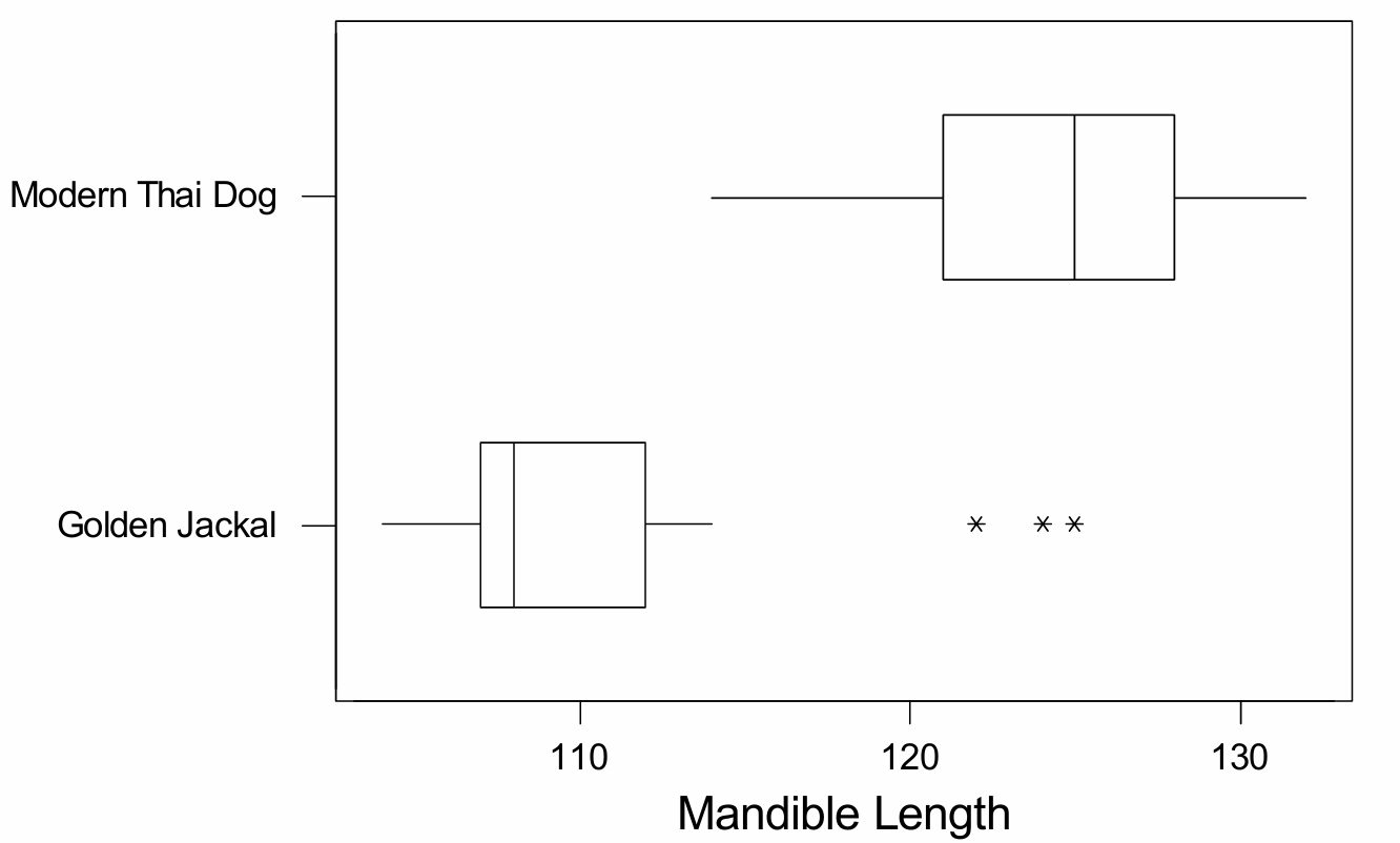
Comparison of distributions: The distributions of mandible lengths for modern Thai dogs and golden jackals are quite different. Modern Thai dogs have a much larger typical mandible length — a median of 125 mm — compared to golden jackals, whose median is only 108 mm. The distribution for modern Thai dogs appears approximately symmetric with no outliers, whereas the distribution for golden jackals is heavily skewed to the right, with three high outliers (122, 124, and 125 mm). The variability (spread) of the two distributions is roughly similar in terms of IQR, but the overall range for golden jackals is larger once the outliers are included.
(b)
Yes, it is reasonable to construct a \(t\)-confidence interval for the mean mandible length of modern Thai dogs. The boxplot for this sample is roughly symmetric with no outliers, which provides support for the assumption that the underlying population distribution is approximately normal. Since the data come from a random sample and the normality condition is reasonably satisfied even with a sample size of only 16, using a one-sample \(t\)-interval is appropriate here.
(c)
No, it would not be reasonable to perform a two-sample \(t\)-test using both groups. While the modern Thai dog sample looks approximately normal, the golden jackal sample is clearly not. The boxplot for golden jackals is strongly skewed to the right and contains three high outliers (122, 124, 125) in a sample of only 16 animals — a substantial proportion of the data. With such a small sample size, the \(t\)-test is not robust enough to overcome this serious departure from normality, so the normality condition required for the two-sample \(t\)-test is not reasonably met for the golden jackal population. Therefore, performing the two-sample \(t\)-test with this data would not be appropriate.
Question

Most-appropriate topic codes (AP Statistics):
• Topic 1.9 — Comparisons of the Distributions for One Quantitative Variable (Part b)
• Topic 4.4 — Setting Up a Test for a Population Mean or Population Mean Difference (Part c)
▶️ Answer/Explanation
(a)
To build a boxplot, we need the five-number summary for each group. Since the data are already sorted, we just split each set in half around the median.
For the students (\(n=9\)):
\( \text{Min}=-4.5 \)
\( Q_1=\dfrac{-3.0+(-0.5)}{2}=-1.75 \)
\( \text{Median}=0 \)
\( Q_3=\dfrac{0.5+1.5}{2}=1.0 \)
\( \text{Max}=5.0 \)
For the teachers (\(n=9\)):
\( \text{Min}=-2.0 \)
\( Q_1=\dfrac{-1.5+(-1.5)}{2}=-1.5 \)
\( \text{Median}=-1.0 \)
\( Q_3=\dfrac{0+0}{2}=0 \)
\( \text{Max}=0.5 \)
Neither group has any outliers, since no value falls beyond \(1.5\times\text{IQR}\) from the nearer quartile. Plotting both sets of five-number summaries on the same number line (a common scale is essential so the two groups can be compared directly) gives:
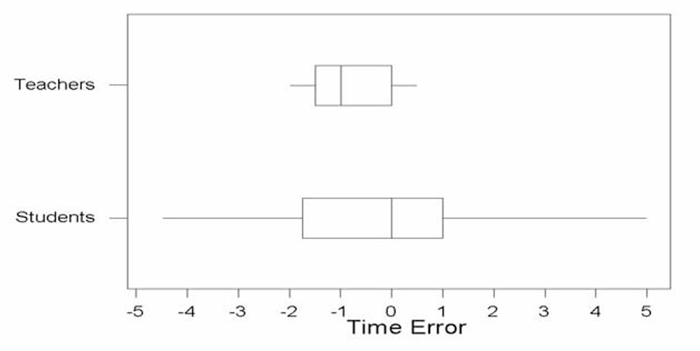
Each boxplot uses the same horizontal scale, with “T” marking the teachers’ plot and “S” marking the students’ plot, so the two distributions can be lined up and compared directly.
(b)
The teachers’ watch times tend to be closer to the true noon time. Looking at the two boxplots, the teachers’ values are all squeezed into a fairly narrow band (roughly from \(-2.0\) to \(0.5\)), while the students’ values are spread out over a much wider range (from \(-4.5\) to \(5.0\)). Even though the teachers’ watches tend to run a little slow on average (the box is shifted slightly below \(0\)), their times stay much closer together and closer to zero than the students’ times do. Since “closer to the true time” is really about how small the time errors tend to be, the group with less spread — the teachers — is the better answer here.
(c)
No, this is not an appropriate pair of hypotheses for answering the teacher’s question. The teacher wants to know whether individual students’ watches tend to be set correctly, but \(H_0:\mu=0\) versus \(H_a:\mu\neq0\) only tests something about the average error across all student watches. It’s entirely possible for this mean to come out close to \(0\) even if no individual watch is actually correct — for instance, if some students’ watches run fast by a few minutes and others run slow by a few minutes, those errors could cancel out in the average, making \(\mu\) look like \(0\) overall. So a test about the population mean \(\mu\) doesn’t tell us anything about how far off each individual student’s watch tends to be from the true time.