AP Statistics 1.8 Graphical Representations of Summary Statistics for One Quantitative Variable- Exam Style Questions - MCQs - New Syllabus
Question
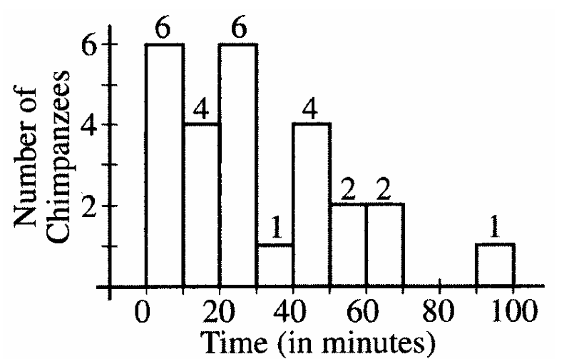
The histogram below displays the times, in minutes, needed for each chimpanzee in a sample of 26 to complete a simple navigational task.

It was determined that the largest observation, 93, is an outlier since
\[ Q_3 + 1.5(Q_3-Q_1)=87.125 \]
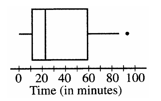
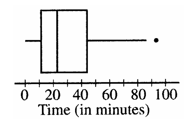
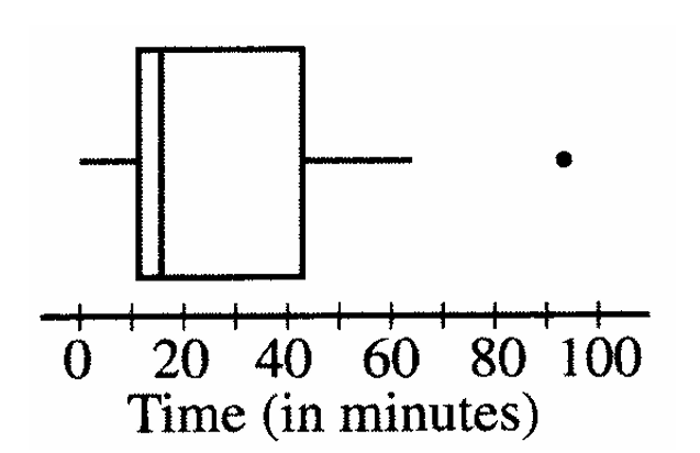
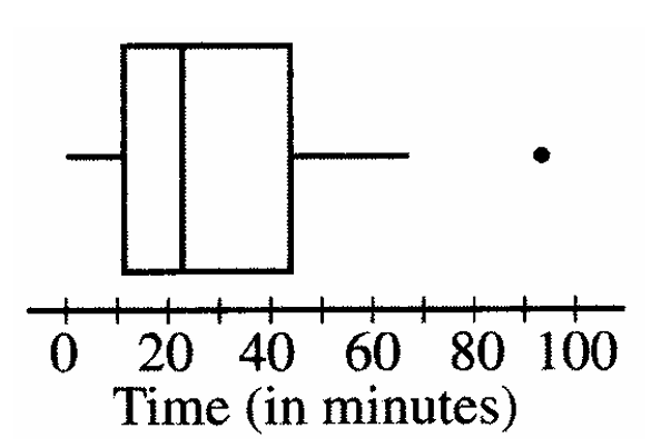
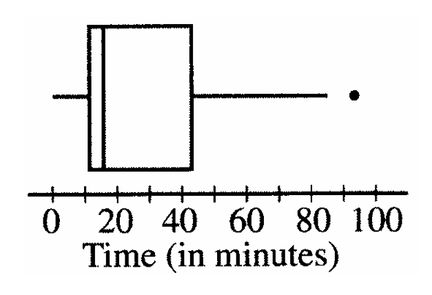
Which of the following boxplots could represent the information in the histogram?
(A) 
(B) 
(C) 
(D) 
(E) 
▶️ Answer/Explanation
The histogram is strongly right-skewed. Most of the chimpanzees completed the task between about 0 and 40 minutes, with fewer observations at larger times and a single high outlier at 93 minutes.
Since 93 is an outlier, the boxplot must show a separate point near 93 and the right whisker should stop at the largest non-outlier value. The median should also be left of the center of the box because the distribution is right-skewed.
Looking at the choices, only boxplot (D) shows:
• a single outlier near 93
• a longer right whisker than left whisker
• a median located left of center within the box
• quartiles consistent with the histogram’s concentration of lower values
Therefore, boxplot (D) is the only graph that matches the histogram and the given outlier information.
✅ Answer: (D)
Question
A botanist is studying the petal lengths, measured in millimeters, of two species of lilies. The boxplots above illustrate the distribution of petal lengths from two samples of equal size, one from species A and the other from species B. Based on these boxplots, which of the following is a correct conclusion about the data collected in this study?
(A) The interquartile ranges are the same for both samples.
(B) The range for species B is greater than the range for species A.
(C) There are more petal lengths that are greater than 70 mm for species A than there are for species B.
(D) There are more petal lengths that are greater than 40 mm for species B than there are for species A.
(E) There are more petal lengths that are less than 30 mm for species B than there are for species A.
▶️ Answer/Explanation
The samples are stated to be of equal size. Looking at the boxplots, the first quartile for species A is approximately 30 mm, while for species B it is approximately 20 mm.
In a boxplot, about 25% of the observations lie below the first quartile. Therefore, approximately 25% of species A observations are below 30 mm, and approximately 25% of species B observations are below 20 mm.
Since 30 mm is approximately the median for species B, about 50% of the observations for species B are less than 30 mm. Because the samples are the same size, species B has more observations below 30 mm than species A.
The other statements cannot be concluded from the boxplots or are contradicted by the quartiles shown.
✅ Answer: (E)
Question

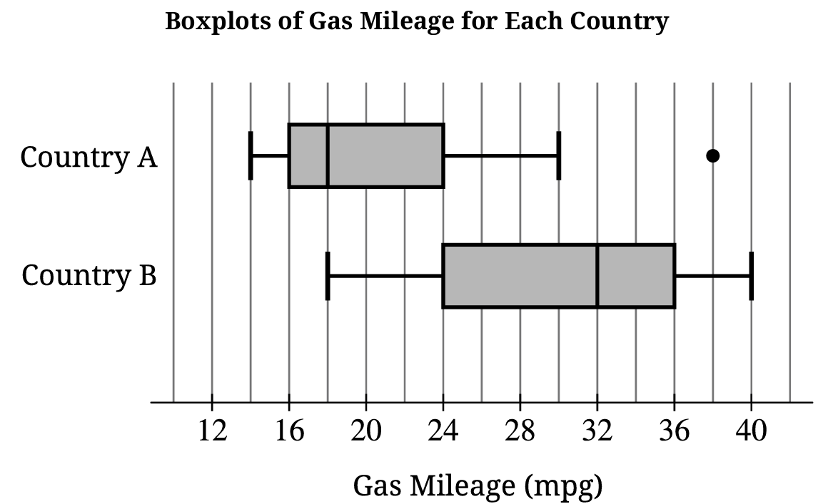
(B) The mean is equal to \(18\,\text{mpg}\) because the median is \(18\,\text{mpg}\).
(C) The mean is greater than \(18\,\text{mpg}\) because the distribution is skewed right with a high outlier.
(D) The mean is greater than \(32\,\text{mpg}\) because Country A has an outlier.
▶️ Answer/Explanation
A high outlier pulls the mean upward. Since the median is resistant to outliers but the mean is not, the mean is expected to be greater than \(18\,\text{mpg}\).
The mean would not necessarily be greater than \(32\,\text{mpg}\); the outlier only pulls the mean upward from \(18\,\text{mpg}\), not beyond the center of Country B.
✅ Answer: (C)
