
AP Statistics 1.9 Comparisons of the Distributions for One Quantitative Variable- Exam Style Questions - FRQs - New Syllabus
Question
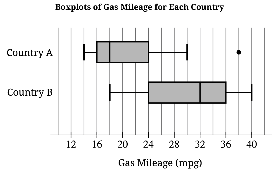
ii. What is a possible value of the median of the combined data set? Justify your answer by referencing the boxplots shown.
Most-appropriate topic codes (AP Statistics):
• Topic \(1.8\) — Graphical Representations of Summary Statistics for One Quantitative Variable (Parts \( \mathrm{B} \), \( \mathrm{C} \))
• Topic \(1.9\) — Comparisons of the Distributions for One Quantitative Variable (Part \( \mathrm{A} \))
▶️ Answer/Explanation
A.
• Center: The median gas mileage for Country B (\(32\,\text{mpg}\)) is higher than that of Country A (\(18\,\text{mpg}\)).
• Spread: The overall range for Country A (\(38 – 14 = 24\,\text{mpg}\)) is slightly wider than Country B (\(40 – 18 = 22\,\text{mpg}\)), but the Interquartile Range (IQR) for Country B (\(36 – 24 = 12\,\text{mpg}\)) is larger than Country A (\(22 – 14 = 8\,\text{mpg}\)).
• Outliers: Country A has a single extreme high value plotted as an outlier at \(38\,\text{mpg}\), while Country B displays no outliers.
B.
• The mean is expected to be greater than \(18\,\text{mpg}\).
• Because the distribution for Country A is skewed to the right and contains a high outlier at \(38\,\text{mpg}\), the mean will be pulled upward toward the long right tail while the median remains resistant.
C. i.
• The minimum value of the combined set is \(14\,\text{mpg}\) (from Country A) and the maximum value is \(40\,\text{mpg}\) (from Country B).
• \(\text{Combined Range} = \text{Maximum} – \text{Minimum} = 40 – 14 = 26\,\text{mpg}\).
C. ii.
• A possible value for the combined median is any value satisfying \(18\,\text{mpg} \le \text{Median} \le 32\,\text{mpg}\), such as \(24\,\text{mpg}\).
• Since both samples contain exactly 100 cars, combining them creates a total group of 200 cars where the new median rests between the 100th and 101st ordered values, forcing it to fall cleanly between the separate sample medians of \(18\,\text{mpg}\) and \(32\,\text{mpg}\).
Question
Most-appropriate topic codes (AP Statistics):
• Topic \(1.6\) — Descriptions for One Quantitative Variable Distributions (Part \( \mathrm{a} \))
• Topic \(1.9\) — Comparisons of the Distributions for One Quantitative Variable (Part \( \mathrm{c} \))
▶️ Answer/Explanation
(a)
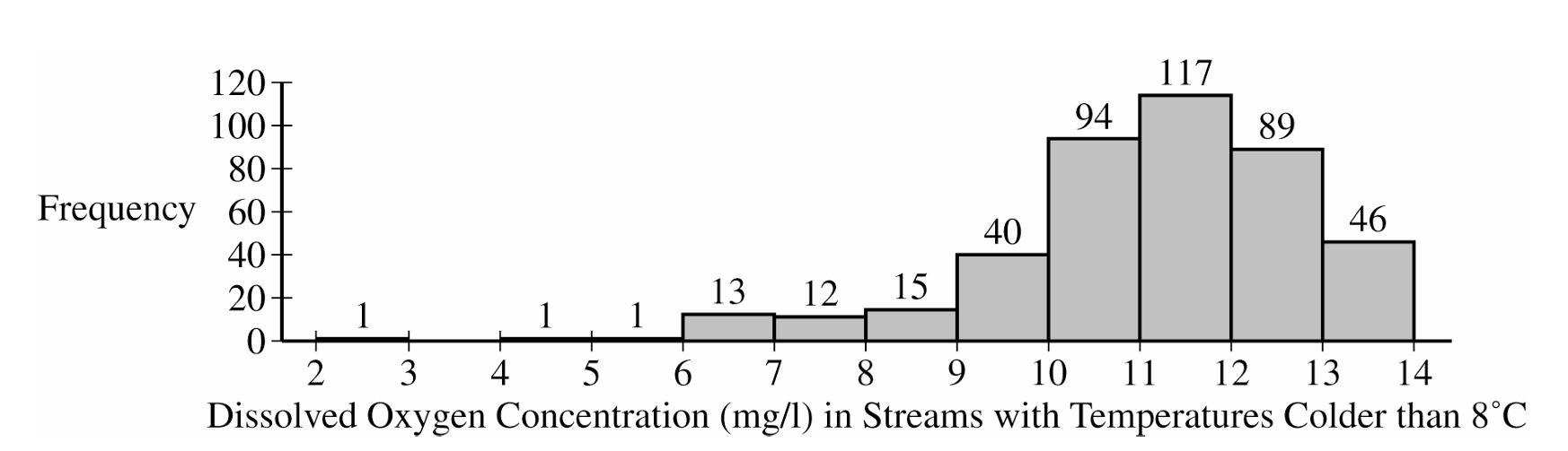
Shape: The distribution is heavily skewed to the left (negatively skewed).
Center: The center of the distribution is around a median of between 11 and 12 mg/l (which is also the modal interval).
Spread: The dissolved oxygen concentrations vary from a minimum between 2 and 3 mg/l to a maximum between 13 and 14 mg/l.
Unusual Features: There appear to be potential low outliers between 2 and 6 mg/l.
(b)
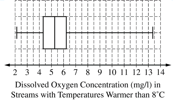
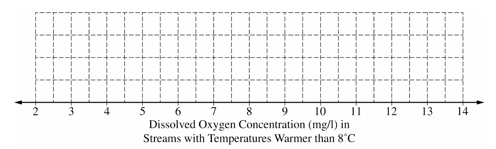
To construct the box plot, follow these steps plotted against an appropriate scale (e.g., 2 to 14):
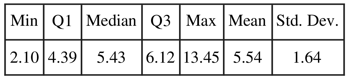
Draw a vertical line segment at the median: $M = 5.43$
Draw vertical line segments at the quartiles: $Q_1 = 4.39$ and $Q_3 = 6.12$, and connect them to form the central box.
Draw horizontal whiskers extending from the box to the minimum value at $2.10$ and the maximum value at $13.45$.
(c)
The streams with temperatures colder than 8°C are generally healthier for wildlife.
Justification: We must compare the centers and spreads. The median dissolved oxygen concentration for the colder streams (between 11 and 12 mg/l) is significantly higher than the median for the warmer streams ($5.43$ mg/l). Furthermore, the vast majority of colder streams have oxygen levels above 10 mg/l, while the third quartile ($Q_3$) for warmer streams is only $6.12$ mg/l. This means over 75% of warmer streams have lower oxygen concentrations than almost all of the colder streams.
Question


Most-appropriate topic codes (AP Statistics):
• Topic \(1.1\) — Introducing Statistics: Do the Data We Collected Match What We Expected? (Parts \( \mathrm{b} \), \( \mathrm{c} \))
▶️ Answer/Explanation
(a)
The median reduction in blood pressure for the dark chocolate group is 7 mmHg, and the median reduction in blood pressure for the white chocolate group is 0 mmHg. Therefore, the median reduction for the dark chocolate group is greater than the median reduction for the white chocolate group.
(b)
The researcher’s conclusion might not be true because the difference in sample means could simply be due to sampling variability (chance variation) arising from the random assignment of participants to the two groups. A difference of 5.66 mmHg can sometimes occur by chance even if the treatments are equally effective, so a statistical simulation or hypothesis test is necessary to determine if the result is statistically significant.
(c)
Yes, the results provide convincing statistical evidence. The observed difference in sample means is $6.08 – 0.42 = 5.66$ mmHg. According to the simulation dotplot, a simulated difference of 5.66 or greater occurred in only 3 of the 120 trials. The estimated p-value is $\frac{3}{120} = 0.025$. Because the p-value ($0.025$) is less than the significance level ($\alpha = 0.05$), we reject the null hypothesis and conclude there is convincing evidence that dark chocolate results in a greater reduction in blood pressure on average than white chocolate.
Question
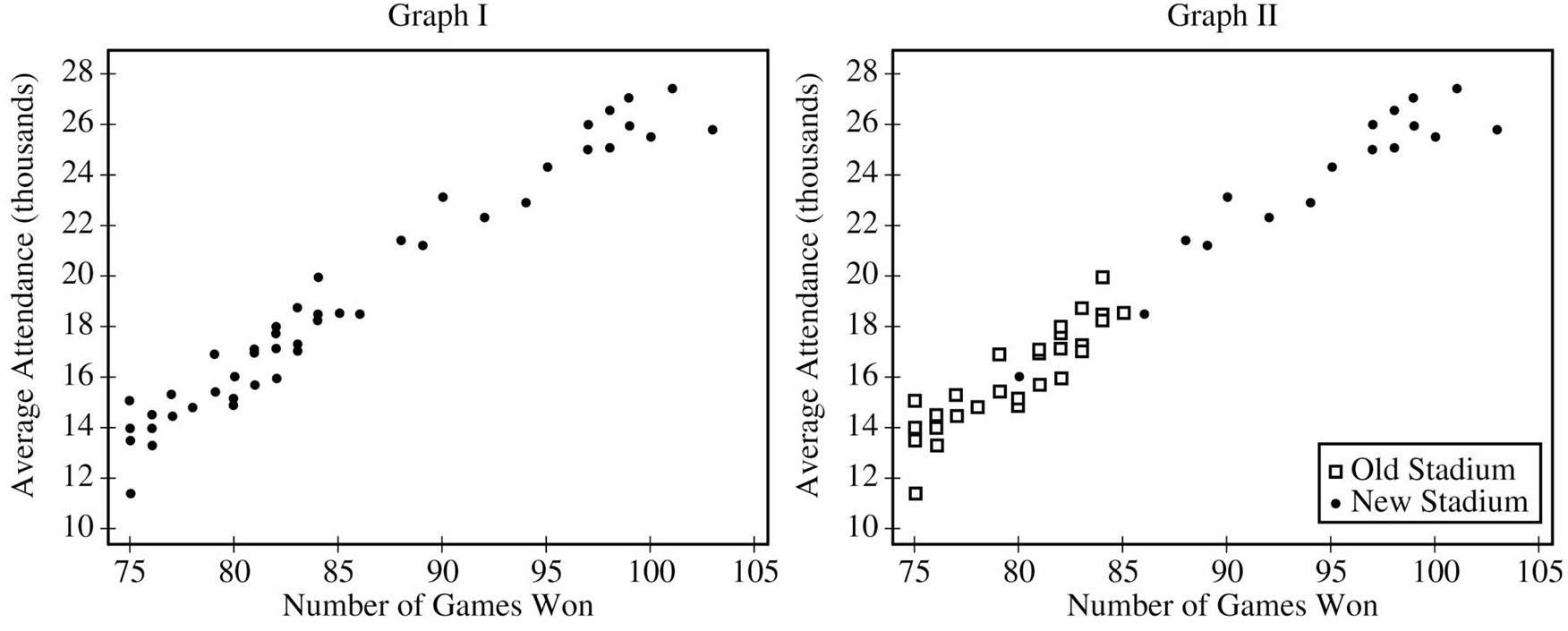
ii. Graph II shows the same information as Graph I, but also indicates the old and new stadiums. Does Graph II suggest that the rate at which attendance changes as number of games won increases is different in the new stadium compared to the old stadium? Explain your reasoning.
Most-appropriate topic codes (AP Statistics):
• Topic \(5.1\) — Graphical Representations Between Two Quantitative Variables (Parts \( \mathrm{b} \), \( \mathrm{c} \))
• Topic \(5.3\) — Linear Regression Models (Parts \( \mathrm{c} \), \( \mathrm{d} \))
▶️ Answer/Explanation
(a)
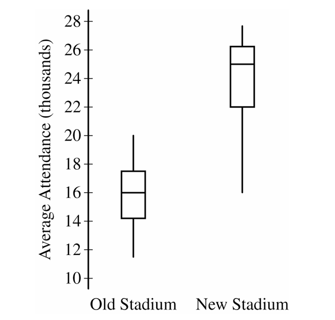
The median average attendance is noticeably higher in the new stadium (around \(25,000\)) compared to the old stadium (around \(16,000\)).
While the interquartile ranges are fairly similar, indicating comparable variability in the middle \(50\%\) of attendance figures, the overall range is slightly wider for the new stadium.
Neither stadium’s distribution shows any clear outliers.
(b)
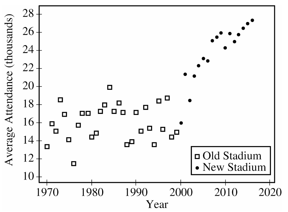
Average attendance in the old stadium remained relatively flat over time with no clear upward or downward trend.
In contrast, the new stadium exhibits a strong, positive, upward trend in average attendance over the years it was actively used.
(c)(i)
There is a strong, positive, linear relationship between the number of games won and the average attendance for each year.
(c)(ii)
No, the rate of change appears to be roughly the same for both stadiums.
If you drew separate lines of best fit through the points representing the old stadium and the new stadium, the slopes of both lines would be nearly identical, meaning attendance increases at a similar rate per win regardless of the venue.
(d)
The number of games won could serve as a confounding variable when assessing the relationship between the stadium type and average attendance.
Since the team won significantly more games playing in the new stadium, and winning is strongly associated with higher attendance, it’s impossible to tell if the attendance spike was caused by the appeal of the new stadium or simply because the team was performing better on the field.
Question
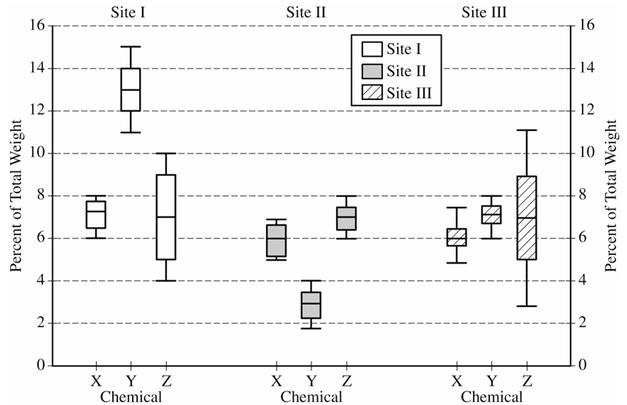
Most-appropriate topic codes (AP Statistics):
• Topic \(1.8\) — Graphical Representations of Summary Statistics for One Quantitative Variable (Parts \( \mathrm{a} \), \( \mathrm{b} \))
▶️ Answer/Explanation
(a)
Similarity: The median percent of chemical Z is approximately the same across all three sites, at roughly \(7\%\) of total weight. This means the center of the distribution of chemical Z does not help distinguish one site from another.
Difference: The spread (range) of the percent of chemical Z differs considerably among the three sites.
Site II has the smallest range, approximately \(2\%\) (from about \(6\%\) to \(8\%\)).
Site I has a moderate range, approximately \(6\%\) (from about \(4\%\) to \(10\%\)).
Site III has the largest range, approximately \(8\%\) (from about \(3\%\) to \(11\%\)).
So while the typical chemical Z content is similar at all three sites, Site II pottery is far more consistent in its Z content, while Site III pottery shows the greatest variability.
(b)(i)
The piece of pottery most likely originated at Site III.
To decide, we estimate the minimum and maximum possible sums of the percents of X, Y, and Z at each site by reading the minimum and maximum values from the boxplots:
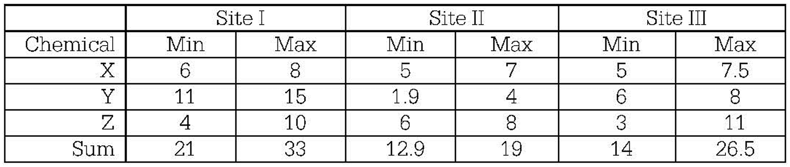
For Site I, the possible sum ranges from \(21\%\) to \(33\%\) — since \(20.5\%\) falls below the minimum, a sum of \(20.5\%\) is unlikely for Site I.
For Site II, the possible sum ranges from \(12.9\%\) to \(19\%\) — since \(20.5\%\) falls above the maximum, a sum of \(20.5\%\) is also unlikely for Site II.
For Site III, the possible sum ranges from \(14\%\) to \(26.5\%\) — since \(20.5\%\) falls comfortably within this interval, Site III is the most plausible origin.
\(\boxed{\text{Most likely site: Site III}}\)
(b)(ii)
Chemical Y would be the most useful for identifying the site of origin.
Looking at the boxplots for chemical Y across the three sites:
Site I: chemical Y ranges from approximately \(11\%\) to \(15\%\)
Site II: chemical Y ranges from approximately \(1.9\%\) to \(4\%\)
Site III: chemical Y ranges from approximately \(6\%\) to \(8\%\)
These three ranges do not overlap at all — every possible value of chemical Y belongs to exactly one site’s range. So if we measure chemical Y in an unknown piece, we can pinpoint its origin with certainty.
By contrast, the distributions of chemicals X and Z show substantial overlap across the three sites, meaning a measured value of X or Z could plausibly belong to multiple sites, making those chemicals far less useful for classification.
\(\boxed{\text{Most useful chemical: Y}}\)
Question
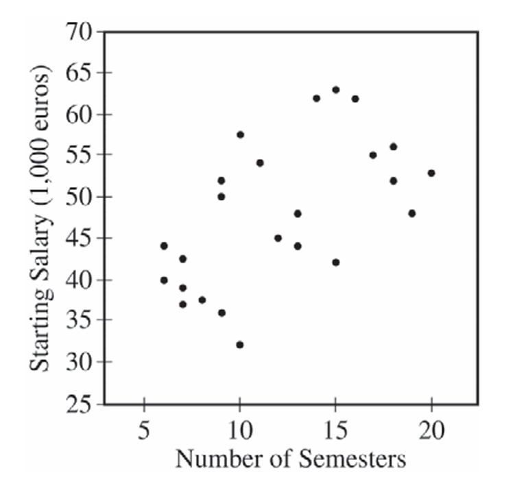
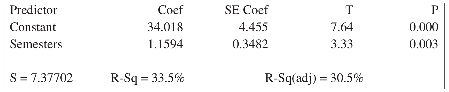
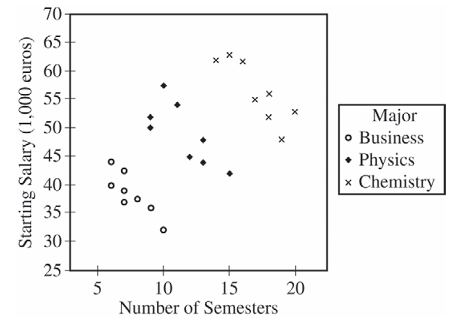
Most-appropriate topic codes (AP Statistics):
• Topic \(5.2\) — Correlation (Part \( \mathrm{e} \))
• Topic \(5.3\) — Linear Regression Models (Part \( \mathrm{b} \))
• Topic \(1.9\) — Comparisons of the Distributions for One Quantitative Variable (Part \( \mathrm{d} \))
▶️ Answer/Explanation
(a)
Yes, the scatterplot supports the newspaper report. The scatterplot shows a positive association between the number of semesters needed to complete an academic program and starting salary — as the number of semesters increases, starting salary tends to increase as well. This is consistent with the newspaper’s claim that more semesters are associated with a greater starting salary.
(b)
The slope of the least-squares regression line is \(b_1 = 1.1594\).
The least-squares regression equation is:
\( \hat{y} = 34.018 + 1.1594x \)
Interpretation: For each additional semester needed to complete an academic program, the predicted starting salary in the first year of a job increases by approximately €1,159.40 (i.e., 1.1594 thousand euros).
(c)
For the business majors alone, there is a strong, negative, linear association between the number of semesters and starting salary. Business majors who need more semesters to complete their academic program tend to have lower starting salaries — which is the opposite direction from the overall trend seen in the combined scatterplot.
(d)
Business majors have the lowest median starting salary, at approximately €38,000. Physics majors have the next highest median starting salary, at approximately €48,000. Chemistry majors have the highest median starting salary, at approximately €55,000.
So in order from lowest to highest median starting salary: Business \(\approx\) €38,000 < Physics \(\approx\) €48,000 < Chemistry \(\approx\) €55,000.
(e)
The newspaper report should be modified to account for the major of each person. The overall positive association in the original report is largely explained by the fact that different majors — chemistry, physics, and business — tend to require different numbers of semesters and also have very different starting salary levels. Chemistry majors take more semesters on average and also earn the highest salaries; business majors take fewer semesters and earn the lowest salaries. This creates an apparent positive association when all three majors are pooled together.
However, within each individual major, students who take a greater number of semesters to complete their program tend to have lower starting salaries, not higher. The newspaper report should therefore be revised to state that, while majors requiring more semesters overall tend to have higher starting salaries (chemistry highest, physics next, business lowest), within any given major, taking more semesters to complete the program is associated with a lower starting salary.
Question

Most-appropriate topic codes (AP Statistics):
▶️ Answer/Explanation
(a)
The median salary is approximately the same for both corporations. The range and interquartile range of the salaries are greater for Corporation A than for Corporation B. The two highest salaries at Corporation A are outliers while Corporation B has no outliers.
(b)(i)
Five years after starting, at least \(3\) out of \(30\) (\(10\%\)) of the salaries at Corporation A are greater than the maximum salary at Corporation B. If I accept the offer from Corporation A, I might be able to make a higher salary at Corporation A than at Corporation B.
(b)(ii)
Five years after starting, the minimum salary at Corporation B is greater than at Corporation A. In fact, at Corporation A it looks like some people are still making the starting salary of \(\$36,000\) and never received a raise in the five years since they were hired. So if I work at Corporation A, I might never receive a raise in salary.
Question
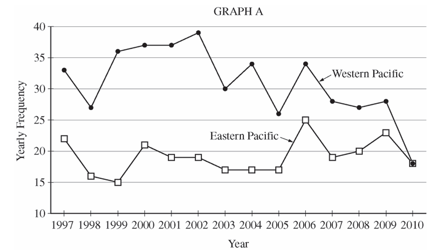
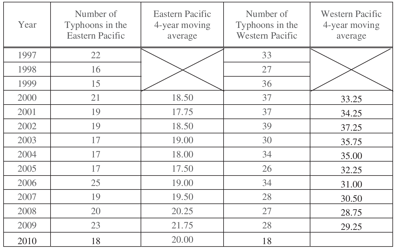
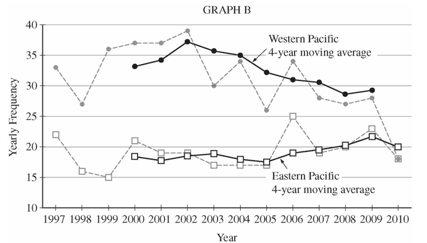
Most-appropriate topic codes (AP Statistics):
• Topic \(1.5\) — Graphical Representations for One Quantitative Variable (Part \( \mathrm{b} \))
• Topic \(1.7\) — Summary Statistics for One Quantitative Variable (Part \( \mathrm{c} \))
• Topic \(1.5\) — Graphical Representations for One Quantitative Variable (Part \( \mathrm{d} \))
• Topic \(1.9\) — Comparisons of the Distributions for One Quantitative Variable (Part \( \mathrm{e} \))
▶️ Answer/Explanation
(a)
The Western Pacific consistently had a higher yearly frequency of typhoons than the Eastern Pacific throughout the entire period from \(1997\) to \(2010\). The center (median/mean) of the Western Pacific distribution is noticeably higher — roughly in the low-to-mid \(30\)s — compared to the Eastern Pacific, which clusters mostly in the high teens to low \(20\)s. The Western Pacific also showed greater year-to-year variability, with values ranging from \(18\) to \(39\), while the Eastern Pacific ranged from \(15\) to \(25\). Both distributions appear roughly similar in shape — neither strongly skewed — but the Western Pacific distribution is shifted considerably upward compared to the Eastern Pacific.
(b)
For the Eastern Pacific, typhoon frequencies were relatively stable throughout the period. After starting at \(22\) in \(1997\), the counts dipped slightly in the late \(1990\)s and early \(2000\)s, hovered in the high teens, then showed a slight increase around \(2006\) before settling back down to \(18\) in \(2010\). There is no strong overall upward or downward trend — the Eastern Pacific frequencies stayed roughly flat over the \(14\)-year period.
For the Western Pacific, typhoon frequencies showed a noticeable overall downward trend over the period. Starting at \(33\) in \(1997\), counts rose to a peak of \(39\) in \(2002\), then declined steadily, dropping sharply to \(18\) in \(2010\) — the same value as the Eastern Pacific in that year. The general trend in the Western Pacific is a decrease in typhoon frequency from the early \(2000\)s onward.
(c)
The \(4\)-year moving average for \(2010\) in the Western Pacific is the average of the four most recent yearly values: \(2007\), \(2008\), \(2009\), and \(2010\).
$\text{4-year moving average}_{2010} = \frac{28 + 27 + 28 + 18}{4} = \frac{101}{4} = \boxed{25.25}$
The value is written in the table as follows. 
(d)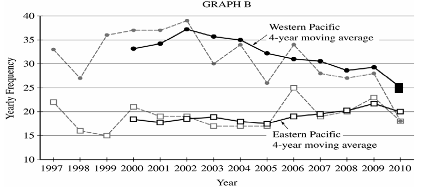
On Graph B, plot the point \((2010,\ 25.25)\) for the Western Pacific \(4\)-year moving average and connect it with a solid line to the previous moving average value of \(29.25\) at \(2009\). This completes the Western Pacific moving average line, which shows a continued decline ending at \(25.25\) in \(2010\).
(e)(i)
The \(4\)-year moving averages make the overall long-term trends in typhoon frequency more apparent. In particular, the moving average plot for the Western Pacific clearly shows the gradual downward trend in typhoon activity from the early \(2000\)s to \(2010\), which is harder to see in the raw yearly data due to year-to-year fluctuations. The moving averages smooth out the short-term noise and reveal the underlying direction of change over time.
(e)(ii)
The \(4\)-year moving averages make the year-to-year variability and individual fluctuations less apparent. For example, the sharp single-year spike or drop in a particular year (such as the Western Pacific dropping to \(26\) in \(2005\) or the Eastern Pacific jumping to \(25\) in \(2006\)) is dampened or obscured in the moving average plot. The raw yearly frequency plots show these individual extreme values much more clearly.
Question
Most-appropriate topic codes (AP Statistics):
• Topic 4.2 — Constructing a Confidence Interval for a Population Mean or Population Mean Difference (Part b)
▶️ Answer/Explanation
(a)
When comparing distributions, we address shape, center, spread, and any unusual features:
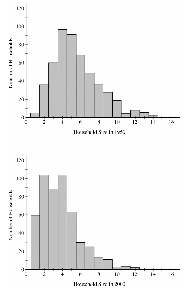
• Shape: Both distributions of household sizes are strongly skewed to the right (positively skewed).
• Center: The household sizes in 1950 typical center at a higher value than in 2000. The median household size in 1950 is approximately 4 people, whereas the median household size in 2000 has shifted downward to approximately 3 people.
• Spread: Household sizes were more variable in 1950 than in 2000. The total range for 1950 runs from 1 to 14 (a range of 13), while the range for 2000 is slightly narrower, running from 1 to 12 (a range of 11).
• Outliers/Features: Both time periods show a cluster of typical values between 1 and 6 people, but 1950 has a longer tail extending to very large households compared to 2000.
(b)
The conditions required for a two-sample \(t\)-procedure, along with verification, are outlined below:
1. Independent Random Sampling Condition: The data must come from two independent random samples.
• Status: Met. The problem states that “independent random samples of 500 households were taken.”
2. Normality Condition: The populations should be normally distributed, or the sample sizes must be large enough to apply the Central Limit Theorem.
• Status: Met. Even though both histograms show distinct right-skewness, the sample sizes are \(n_{1950} = 500\) and \(n_{2000} = 500\). Since both sample sizes are well above the threshold of 30 (\(500 \ge 30\)), the Central Limit Theorem ensures that the sampling distribution of the difference in sample means is approximately normal.
3. Independence (10% Rule) Condition: The sample sizes should not exceed 10% of their respective population sizes if sampling without replacement.
• Status: Met. It is highly reasonable to assume that 500 households is less than 10% of all available households in a “large metropolitan area” in the United States for both 1950 and 2000.
Question


Most-appropriate topic codes (AP Statistics):
• Topic 1.7 — Summary Statistics for One Quantitative Variable (Part b)
• Topic 1.9 — Comparisons of the Distributions for One Quantitative Variable (Part c)
▶️ Answer/Explanation
(a)
No, it is not reasonable to believe that the distribution of running times is approximately normal.
In a normal distribution, data extends several standard deviations below the mean. For this dataset, the minimum running time is \(4.40\) seconds, which yields a standardized distance from the mean of:
\(z = \dfrac{4.40 – 4.60}{0.15} = -1.33\)
Since a normal distribution expects approximately \(9.2\%\) of its observations to fall below \(1.33\) standard deviations beneath the mean, having a hard cutoff at \(1.33\) standard deviations indicates that the left tail is severely truncated. Thus, the distribution is likely skewed to the right.
(b)
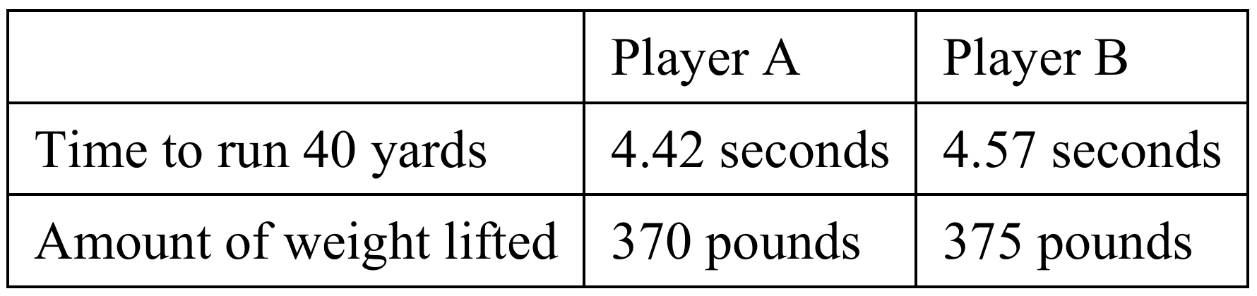
To find the standardized score for a weight of \(370\) pounds, we use the z-score formula:
\(z = \dfrac{x – \mu}{\sigma}\)
\(z = \dfrac{370 – 310}{25} = \dfrac{60}{25} = 2.40\)
Interpretation: This player’s weightlifting performance is \(2.40\) standard deviations above the average weight lifted by all players in this position.
(c)
The team should select Player A.
To perform a fair comparison since both speed and strength carry equal importance, we compute the z-scores for both players on each metric:
Player A:
\(z_{\text{speed}} = \dfrac{4.42 – 4.60}{0.15} = -1.20\)
\(z_{\text{strength}} = \dfrac{370 – 310}{25} = 2.40\)
Since a lower running time indicates a more desirable speed, a negative z-score is a positive attribute. The combined standardized advantage for Player A is \(2.40 – (-1.20) = 3.60\) units of desirability (or we can think of a speed index where faster is positive, meaning a net sum of \(1.20 + 2.40 = 3.60\)).
Player B:
\(z_{\text{speed}} = \dfrac{4.57 – 4.60}{0.15} = -0.20\)
\(z_{\text{strength}} = \dfrac{375 – 310}{25} = 2.60\)
The combined standardized index advantage for Player B is \(0.20 + 2.60 = 2.80\).
Comparing the two candidates, Player A is dramatically faster than Player B (\(1.20\) standard deviations below the mean versus only \(0.20\) standard deviations below), while Player B is only slightly stronger than Player A (\(2.60\) standard deviations above the mean versus \(2.40\)). Therefore, Player A represents a significantly better overall draft value when both metrics are weighted equally.
Question
Most-appropriate topic codes (AP Statistics):
• Topic 1.6 — Descriptions for One Quantitative Variable Distributions (Part b)
• Topic 1.9 — Comparisons of the Distributions for One Quantitative Variable (Part c)
▶️ Answer/Explanation
(a)
To find the median from a histogram, identify the interval that contains the middle observation by adding the frequencies of each bin from left to right until the cumulative total reaches half of the sample size.
For a group with \(n\) sorted observations, the median position is calculated using the formula \(\frac{n+1}{2}\).
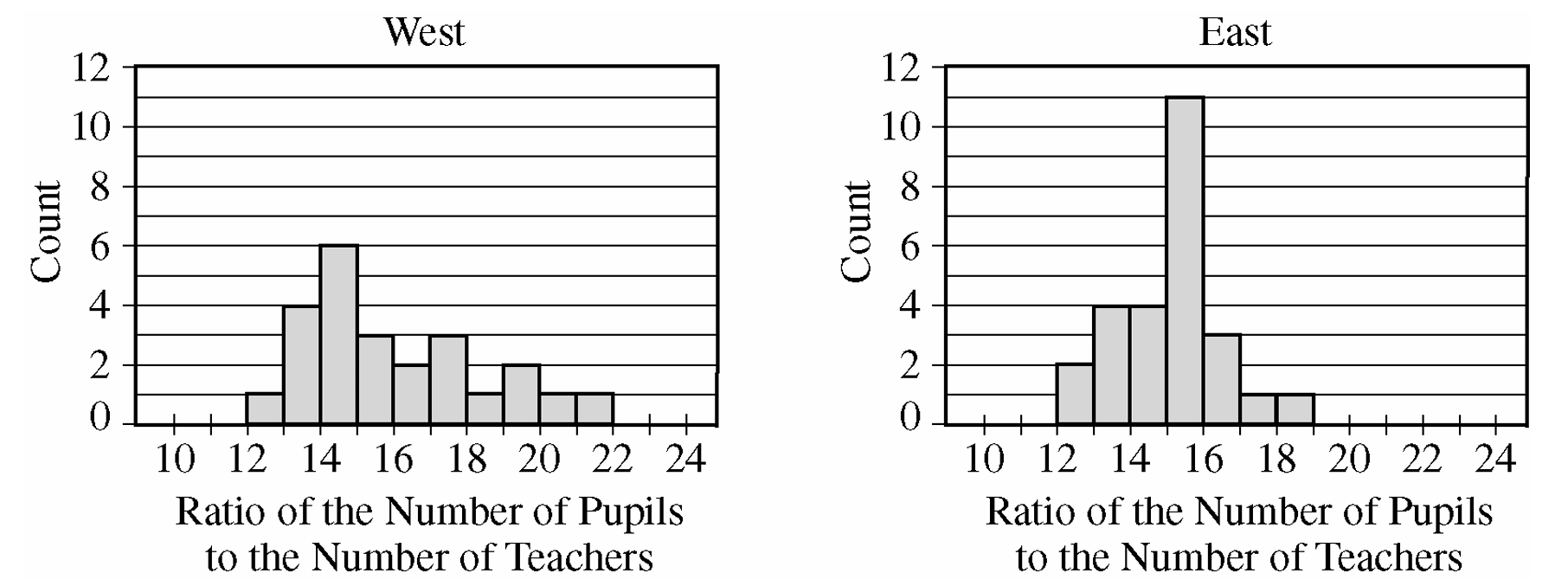
For the West group, there are \(n = 24\) observations, meaning the median is the average of the 12th and 13th values.
By counting cumulative frequencies from the left: the 12-13 bin has 1, the 13-14 bin has 4 (total 5), the 14-15 bin has 6 (total 11), and the 15-16 bin has 3 (total 14).
Since the 12th and 13th observations fall inside the 15-16 interval, the estimated median P-T ratio for the West group is between 15 and 16.
For the East group, there are \(n = 26\) observations, meaning the median is the average of the 13th and 14th values.
Counting cumulative frequencies from the left: the 12-13 bin has 2, the 13-14 bin has 4 (total 6), the 14-15 bin has 4 (total 10), and the 15-16 bin has 11 (total 21).
Since the 13th and 14th observations also fall inside the 15-16 interval, the estimated median P-T ratio for the East group is also between 15 and 16.
\(\boxed{\text{West Median: } [15, 16], \text{ East Median: } [15, 16]}\)
From the histogram, cumulative frequencies for the two groups are shown in the table below. 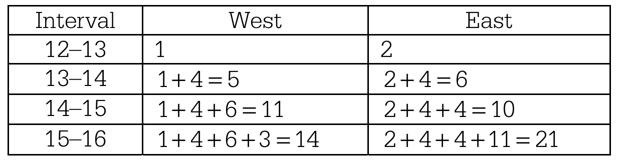
Thus, the median P-T ratio for both groups is at least 15 students per teacher and at most 16 students per teacher.
(b)
Shape: The distribution of P-T ratios for the West group is unimodal and skewed to the right, whereas the distribution for the East group is unimodal and approximately symmetric.
Center: The centers are nearly identical, with both the West and East groups having a median P-T ratio located in the interval between 15 and 16 students per teacher.
Spread: There is visibly more variability in the P-T ratios for the West group than for the East group. The maximum possible range for the West group is \(22 – 12 = 10\), which is larger than the maximum possible range for the East group, which is \(19 – 12 = 7\).
(c)
The mean P-T ratio for the West group will likely be greater than the mean P-T ratio for the East group.
As established in part (a), both distributions have approximately the same median value between 15 and 16.
Because the distribution for the West group is strongly skewed to the right, its mean will be pulled upward to a value greater than its median.
In contrast, because the distribution for the East group is roughly symmetric, its mean will remain close to its median value.
Therefore, the mean of the West group will be higher than the mean of the East group.
\(\boxed{\text{Mean}_{\text{West}} > \text{Mean}_{\text{East}}}\)
Question
\(H_a\): There is a difference in the distributions of hurricane damage amounts among the three regions.
Most-appropriate topic codes (AP Statistics):
• Topic 2.8 — Introduction to Random Variables and Probability Distributions (Part c)
• Topic 3.15 — Carrying Out a Chi-Square Test for Homogeneity or Independence (Parts d, e)
▶️ Answer/Explanation
(a) Graphical Display
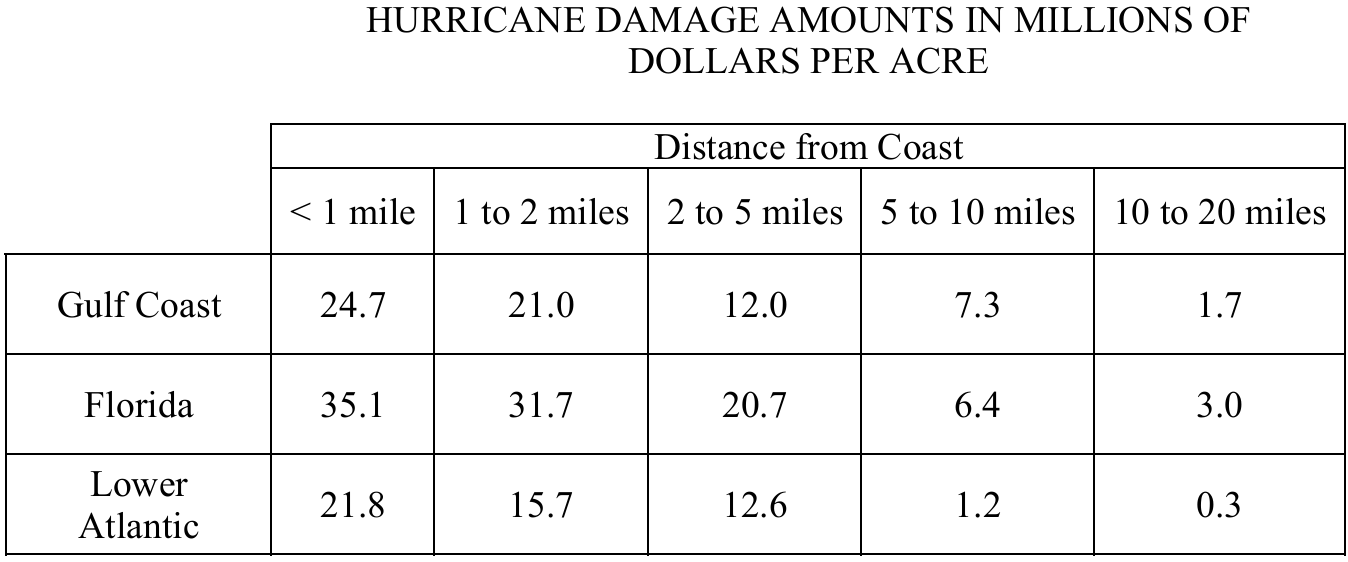
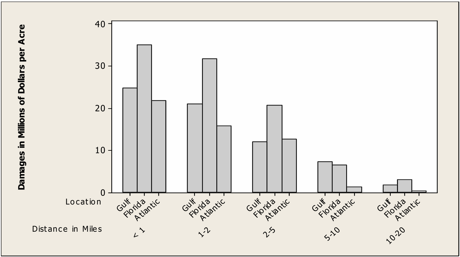
A well-constructed graphical display for this data is a grouped bar chart, with the five distance-from-coast categories on the horizontal axis and damage amounts (in millions of dollars per acre) on the vertical axis. Three bars are drawn side by side within each distance group — one for Gulf Coast, one for Florida, and one for Lower Atlantic — with a clearly labeled key.
(b) Differences and Similarities
Similarity: In all three regions, hurricane damage amounts decrease consistently as distance from the coast increases. This pattern holds without exception across all five distance categories for every region.
Difference: For almost every distance category, Florida has the highest damage amounts, while the Lower Atlantic region generally has the lowest. The Gulf Coast falls in between, though at the 5-to-10-mile distance, the Gulf Coast actually has the highest damage of the three regions.
(c) Missing Ranks and Average Ranks
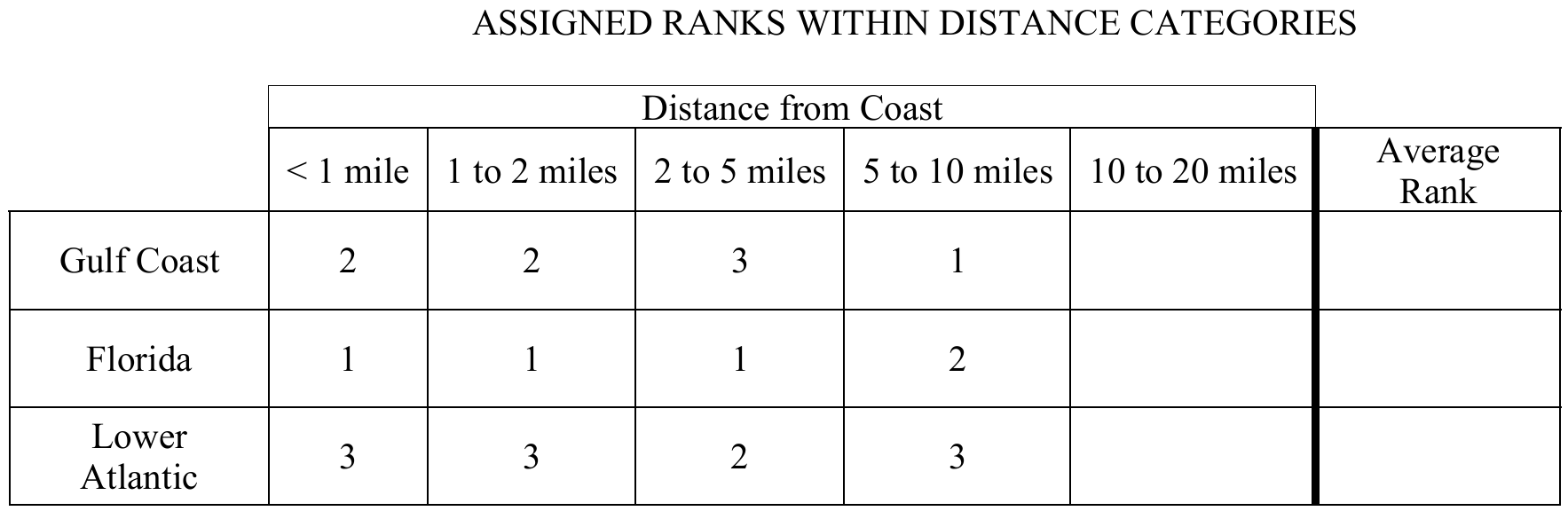
For the 10-to-20-miles distance category, compare the three damage amounts:
Florida: \(3.0\) million (highest) \(\Rightarrow\) rank \(= 1\)
Gulf Coast: \(1.7\) million (middle) \(\Rightarrow\) rank \(= 2\)
Lower Atlantic: \(0.3\) million (lowest) \(\Rightarrow\) rank \(= 3\)
The completed rank table is:

The average ranks are computed as follows:
\(\bar{R}_G = \frac{2+2+3+1+2}{5} = \frac{10}{5} = 2.0\)
\(\bar{R}_F = \frac{1+1+1+2+1}{5} = \frac{6}{5} = 1.2\)
\(\bar{R}_A = \frac{3+3+2+3+3}{5} = \frac{14}{5} = 2.8\)
(d) Calculating the Test Statistic \(Q\)
Substitute the average ranks from part (c) into the formula:
\(Q = 5\left[\left(\bar{R}_G – 2\right)^2 + \left(\bar{R}_F – 2\right)^2 + \left(\bar{R}_A – 2\right)^2\right]\)
\(Q = 5\left[(2.0 – 2)^2 + (1.2 – 2)^2 + (2.8 – 2)^2\right]\)
\(Q = 5\left[0 + (-0.8)^2 + (0.8)^2\right]\)
\(Q = 5\left[0 + 0.64 + 0.64\right]\)
\(\boxed{Q = 5 \times 1.28 = 6.4}\)
(e) Simulation-Based Conclusion
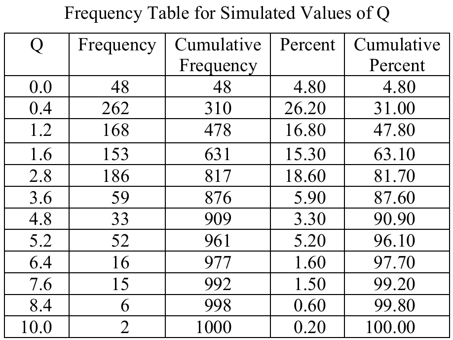
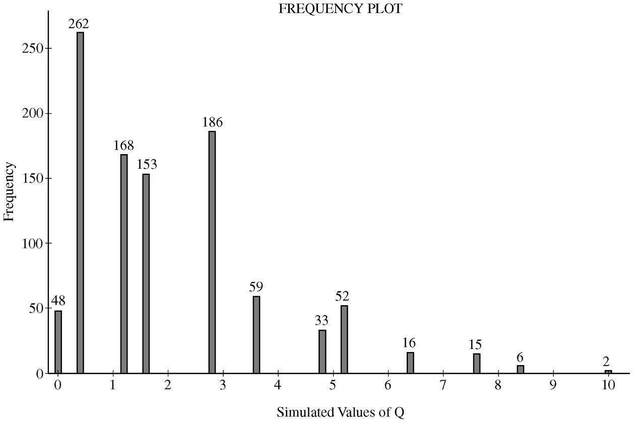
From the frequency table, simulated \(Q\) values of \(6.4\) or greater occurred in:
\(16 + 15 + 6 + 2 = 39 \text{ out of } 1{,}000 \text{ simulations}\)
This gives an approximate \(p\)-value of:
\(p\text{-value} \approx \frac{39}{1{,}000} = 0.039\)
Since the \(p\)-value of \(0.039\) is less than \(\alpha = 0.05\), we reject \(H_0\). The sample data provide reasonably strong evidence that there is a difference in the distributions of hurricane damage amounts among the three coastal regions (Gulf Coast, Florida, and Lower Atlantic).
Question
\(8.6\quad 5.1\quad 8.7\quad 4.6\quad 7.5\quad 5.3\quad 8.2\quad 4.7\quad 4.8\quad 4.6\)
Most-appropriate topic codes (AP Statistics):
• Topic \(1.5\) — Graphical Representations for One Quantitative Variable (Part \( \mathrm{b} \))
• Topic \(1.6\) — Descriptions for One Quantitative Variable Distributions (Part \( \mathrm{c} \))
▶️ Answer/Explanation
(a)
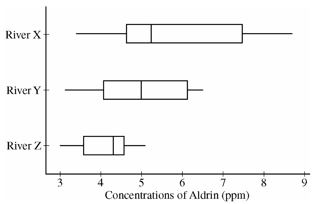
Comparing the medians reveals that the concentration of aldrin tends to be highest for River X and lowest for River Z.
About \(50\%\) of the concentrations of aldrin for Rivers X and Y are higher than all of the concentrations for River Z.
River X also displays the most variability in aldrin concentrations, as seen by the largest range and largest IQR, and River Z has the least variability, as judged by both IQR and range.
The shapes of the three distributions differ, in that the distribution appears to be skewed to the right for River X, roughly symmetric for River Y and slightly skewed to the left for River Z.
(b)
Aldrin concentrations (in ppm) for River X
Leaf unit \(= 0.1\) (for example, \(3 \mid 4\) represents \(3.4\,\text{ppm}\))
\(3 \mid 4\ 7\)
\(4 \mid 0\ 2\ 3\ 6\ 6\ 7\ 8\)
\(5 \mid 1\ 3\ 3\ 5\ 6\)
\(6 \mid \)
\(7 \mid 3\ 5\)
\(8 \mid 0\ 2\ 6\ 7\)
(c)
The stemplot shows a clear gap in the distribution of aldrin concentrations for River X.
This gap occurs between the values of \(5.6\) and \(7.3\,\text{ppm}\) of aldrin.
This gap is not apparent in the boxplot.
Question
Most-appropriate topic codes (AP Statistics):
• Topic \(1.7\) — Summary Statistics for a Quantitative Variable (Center, Spread, Shape) (Parts \(\mathrm{a}\), \(\mathrm{b}\), \(\mathrm{c}\))
• Topic \(1.9\) — Comparing Distributions of a Quantitative Variable (Parts \(\mathrm{a}\), \(\mathrm{b}\))
• Topic \(1.10\) — The Effect of Adding a Constant or Multiplying by a Constant on Summary Statistics (Part \(\mathrm{b}\))
• Topic \(3.1\) — Mean and Standard Deviation of a Linear Transformation (Part \(\mathrm{c}\))
▶️ Answer/Explanation
(a)
When comparing two distributions from boxplots, we examine center, spread, shape, and unusual features.
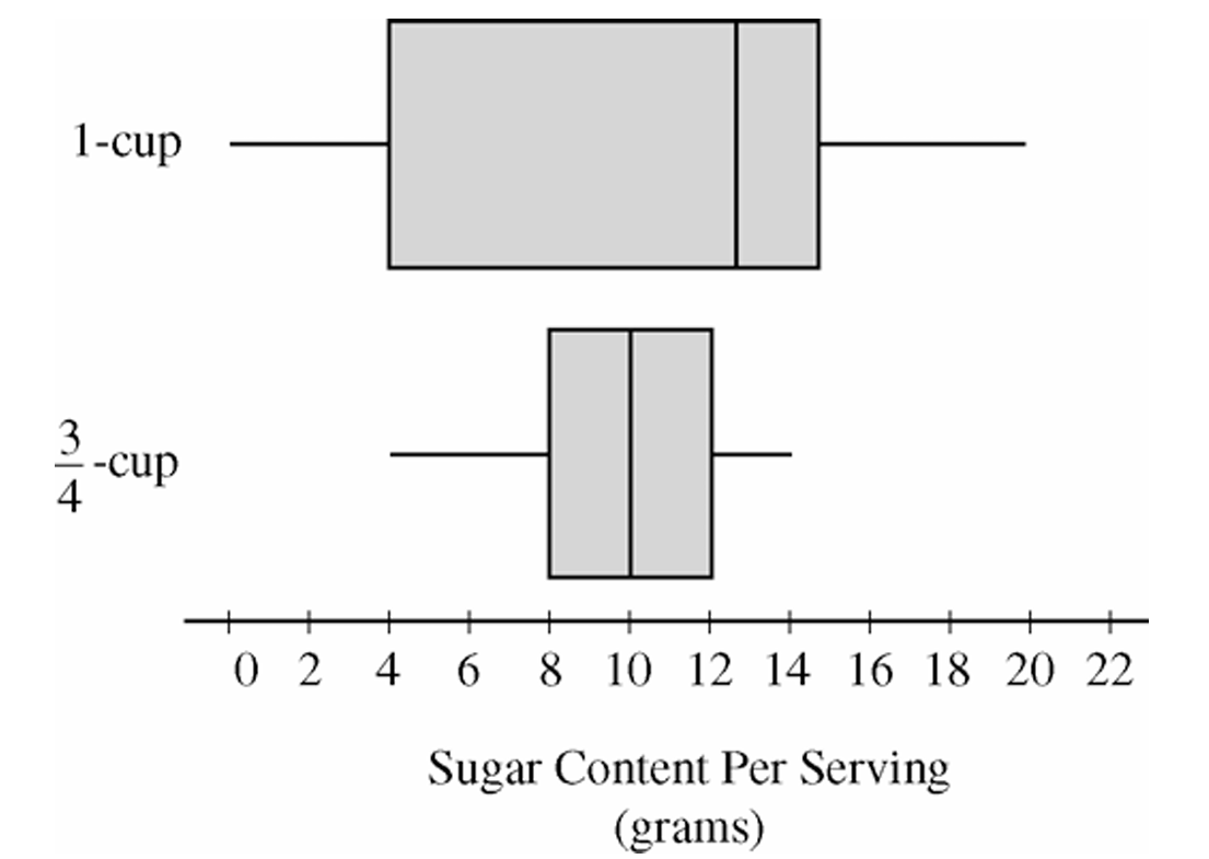
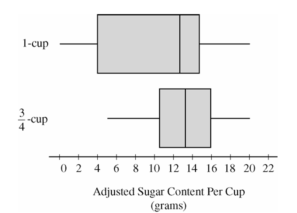
The cereals with one-cup serving sizes have a higher median sugar content per serving than the cereals with three-quarter-cup serving sizes. The one-cup distribution also has greater variability, as indicated by its larger range and larger interquartile range (IQR). In terms of shape, the one-cup distribution appears somewhat left-skewed because the median is closer to the upper quartile than to the lower quartile, while the three-quarter-cup distribution is more nearly symmetric. Neither distribution appears to contain extreme outliers.
(b)
Multiplying each sugar value in the three-quarter-cup group by \(\dfrac{4}{3}\) converts the measurements to sugar content per cup, allowing a fair comparison using equal serving sizes.
The adjusted boxplot shows that cereals with recommended serving sizes of three-quarter cup tend to contain more sugar per cup than cereals with recommended serving sizes of one cup. The median for the adjusted three-quarter-cup distribution is now noticeably higher than the median for the one-cup distribution. In addition, all measures of spread (range and IQR) for the adjusted distribution have increased by a factor of \(\dfrac{4}{3}\), reflecting the effect of multiplying every observation by a constant.
(c)
We would expect the mean sugar content per cup to be greater for cereals that list a serving size of three-quarter cup.
After adjustment, the three-quarter-cup distribution has a higher center than the one-cup distribution, as seen from its higher median. Because the mean generally follows the center of the distribution, the higher overall location of the adjusted three-quarter-cup distribution suggests a larger mean sugar content per cup.
\(\boxed{\bar{x}_{\frac{3}{4}\text{-cup}} > \bar{x}_{\text{1-cup}}}\)
Question
Most-appropriate topic codes (AP Statistics):
• Topic 1.9 — Comparisons of the Distributions for One Quantitative Variable (Part \(\mathrm{a}\))
• Topic 1.11 — Random Sampling (Part \(\mathrm{b}\))
• Topic 4.4 — Setting Up a Test for a Population Mean or Population Mean Difference (Part \(\mathrm{b}\))
▶️ Answer/Explanation
(a)
First, let’s organize the data for both groups:
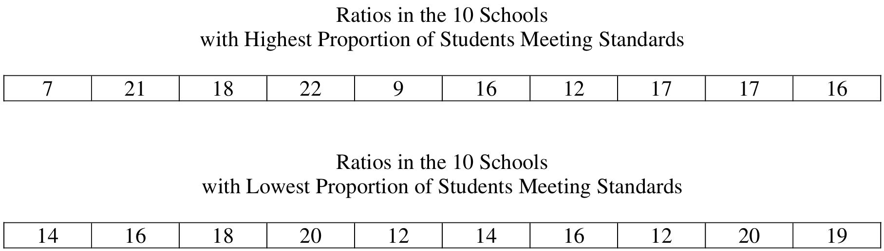
Highest Proportion group: \(7, 9, 12, 16, 16, 17, 17, 18, 21, 22\)
Lowest Proportion group: \(12, 12, 14, 14, 16, 16, 18, 19, 20, 20\)
The dotplots, displayed on a common scale from \(4\) to \(24\), are shown below:
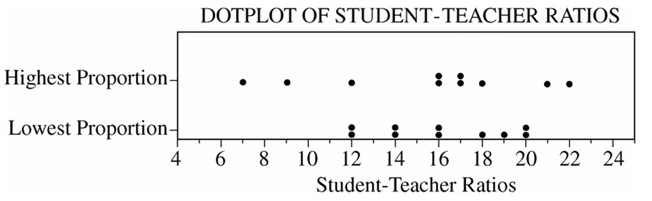
Similarities: The two distributions are centered at approximately the same place. The median for the Highest Proportion group is \(\dfrac{16+17}{2} = 16.5\) and the median for the Lowest Proportion group is \(\dfrac{16+16}{2} = 16\), so both centers are very close to \(16\).
Differences: The distribution for the Highest Proportion group is much more spread out (variable) than the distribution for the Lowest Proportion group. The range for the Highest Proportion group is \(22 – 7 = 15\), while the range for the Lowest Proportion group is only \(20 – 12 = 8\). In other words, the top schools show much greater variability in their student-to-teacher ratios compared to the bottom schools.
(b)
The two groups of schools are not random samples drawn from two larger populations of interest.
The group of 10 schools with the highest proportion of students meeting the standards is itself the entire population of such schools — it is not a random sample from some larger population of high-performing schools.
Similarly, the group of 10 schools with the lowest proportion is itself the complete population of the lowest-performing schools in the state — not a random sample from a larger population.
Since statistical inference is designed to generalize conclusions from a sample to a broader population, and these two groups are not random samples but rather complete populations defined by their extreme values, applying any inferential procedure (such as a two-sample \(t\)-test) to these data would be inappropriate. There is no larger population to generalize to.
Question
Most-appropriate topic codes (AP Statistics):
• Topic 4.4 — Setting Up a Test for a Population Mean or Population Mean Difference (Part \(\mathrm{c}\))
• Topic 4.5 — Carrying Out a Test for a Population Mean or Population Mean Difference (Part \(\mathrm{c}\))
• Topic 1.5 — Graphical Representations for One Quantitative Variable (Part \(\mathrm{d}\))
• Topic 1.9 — Comparisons of the Distributions for One Quantitative Variable (Part \(\mathrm{d}\))
▶️ Answer/Explanation
(a)
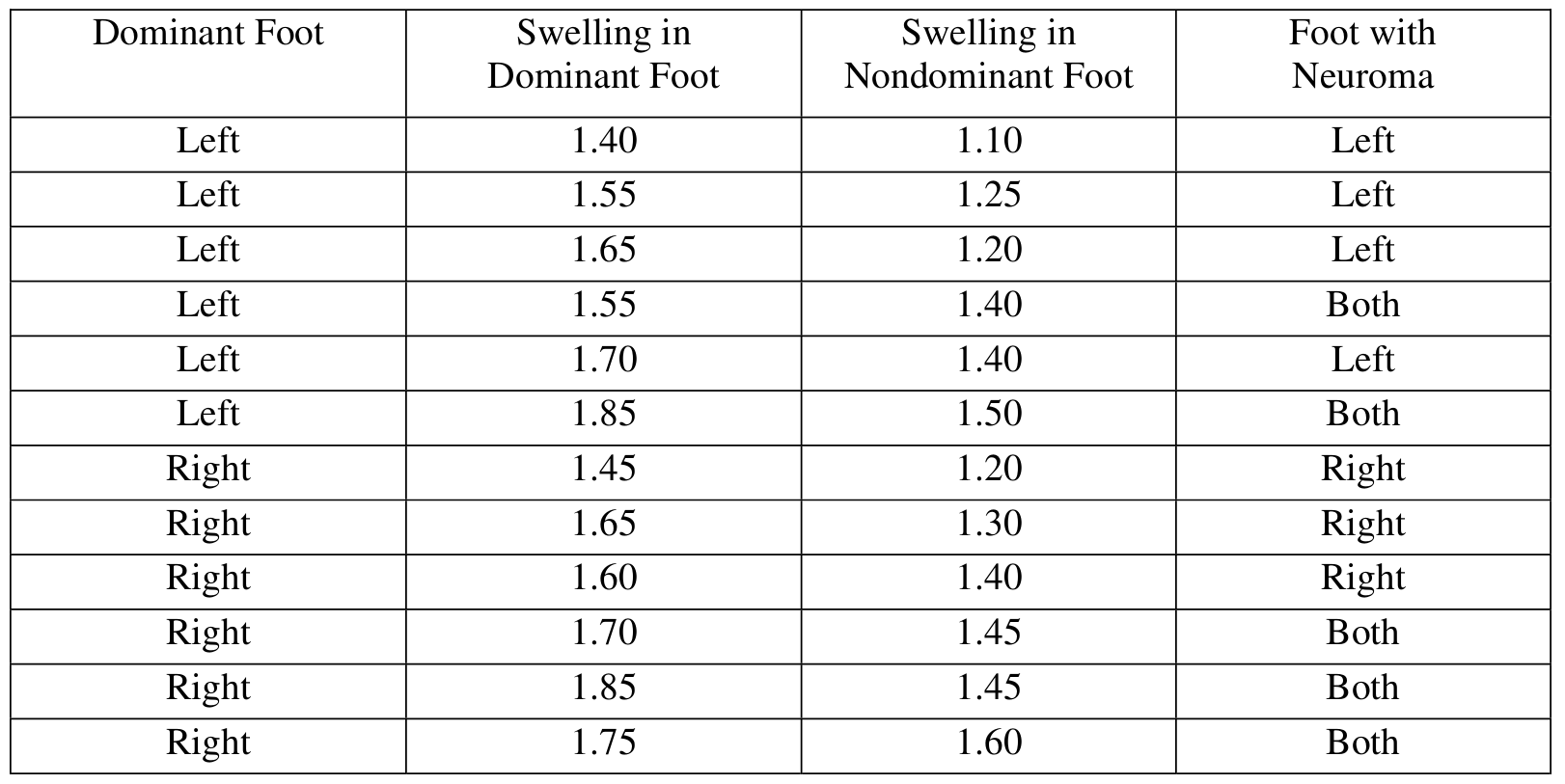
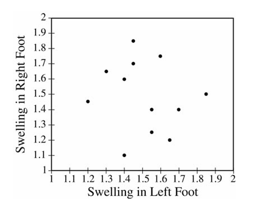
The trait that distinguishes the two groups in the scatterplot is the dominant foot (left or right). All the points in the upper-left cluster represent patients whose dominant foot is the right foot, while all the points in the lower-right cluster represent patients whose dominant foot is the left foot. The dominant foot type is the common trait, and it differs between the two groups.
(b)
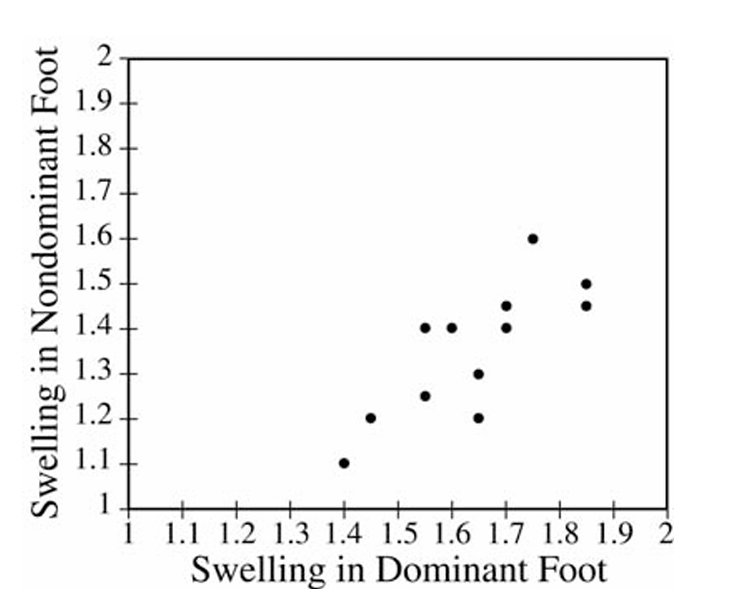
Two conclusions become clear from this scatterplot that were not visible before:
First, there is a positive linear relationship between swelling in the dominant foot and swelling in the nondominant foot — as swelling in the dominant foot increases, swelling in the nondominant foot tends to increase as well.
Second, and importantly, every single point lies below the line \(y = x\), which means swelling in the dominant foot is consistently greater than swelling in the nondominant foot for all patients in the sample. This pattern across both groups combined is something you simply could not see in the left-foot vs. right-foot scatterplot from part (a).
(c)
We perform a matched-pairs \(t\)-test on the differences \(d_i = \text{(dominant swelling)} – \text{(nondominant swelling)}\).
The 12 differences are:
\(0.30,\ 0.30,\ 0.45,\ 0.15,\ 0.30,\ 0.35,\ 0.25,\ 0.35,\ 0.20,\ 0.25,\ 0.40,\ 0.15\)
State hypotheses (where \(\mu_d\) is the mean difference, dominant minus nondominant):
\(H_0: \mu_d = 0\)
\(H_a: \mu_d \neq 0\)
Check conditions:
1. We are told a random sample was selected from the population of adult females with Morton’s neuroma.
2. A dotplot of the differences shows a roughly symmetric, unimodal distribution with no outliers — it is reasonable to treat the population of differences as approximately normal.
Compute the test statistic:
\(\bar{x}_d = 0.2875, \quad s_d = 0.0932, \quad n = 12, \quad df = 11\)
\(t = \dfrac{\bar{x}_d – 0}{\dfrac{s_d}{\sqrt{n}}} = \dfrac{0.2875 – 0}{\dfrac{0.0932}{\sqrt{12}}} = 10.68\)
\(p\text{-value} \approx 0.0000004 \approx 0\)
Since the \(p\)-value is essentially \(0\), which is far less than any reasonable significance level \(\alpha\), we reject \(H_0\). There is very convincing statistical evidence that the mean swelling in the dominant foot is different from (and specifically greater than) the mean swelling in the nondominant foot for adult females who have Morton’s neuroma in at least one foot.
(d)
To suggest a diagnostic criterion, we separate all 24 swelling measurements into two groups: the 17 foot measurements from feet that have Morton’s neuroma and the 7 foot measurements from feet that do not have Morton’s neuroma. A stacked dotplot of the two groups is shown below: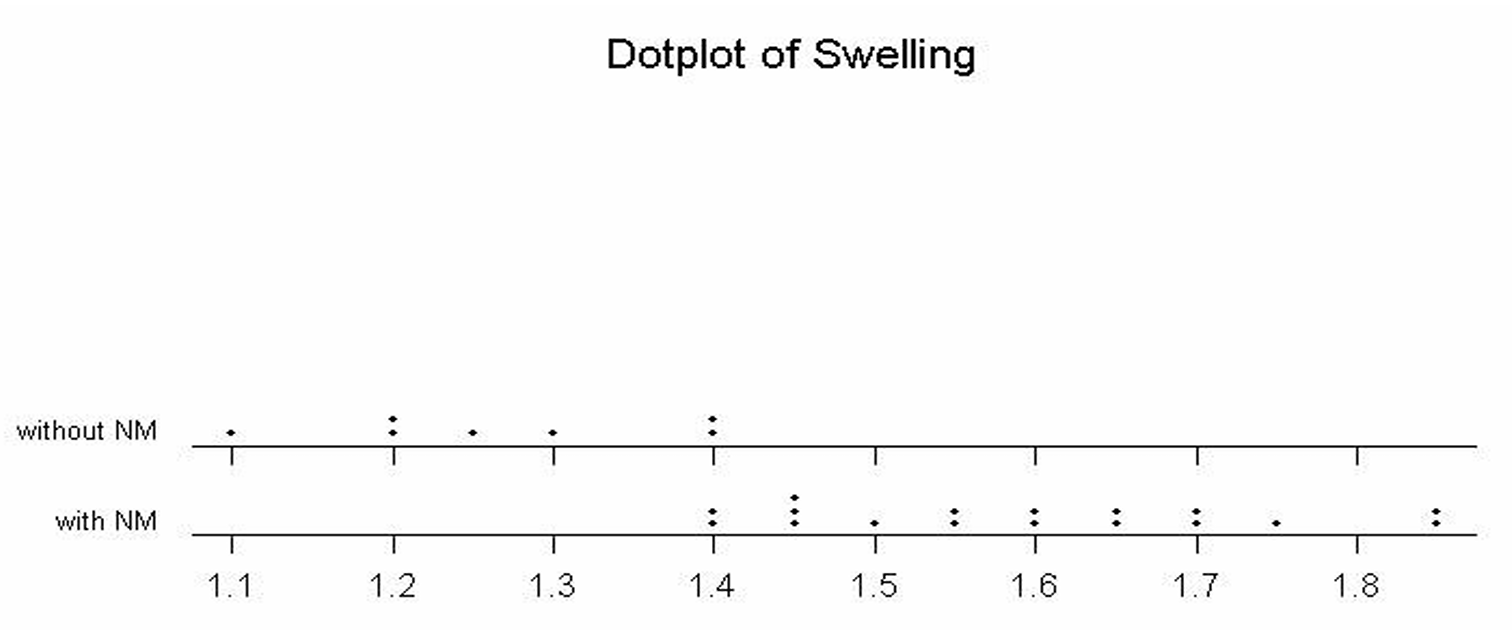
The dotplot makes it visually clear that all 7 feet without Morton’s neuroma have swelling measurements of \(1.40\) or below, while the feet with Morton’s neuroma have swelling values of \(1.40\) and above (with the measurements extending up to \(1.85\)). Based on this graphical display, a reasonable diagnostic criterion is:
\(\boxed{\text{Swelling measurement} \geq 1.4 \Rightarrow \text{diagnose Morton’s neuroma}}\)
A cutoff of approximately \(1.4\) or higher serves as a sensible threshold for diagnosing Morton’s neuroma, since it cleanly separates the feet with and without the condition in this dataset.
Question
Most-appropriate topic codes (AP Statistics):
• Topic 1.9 — Comparisons of the Distributions for One Quantitative Variable (Part \(\mathrm{b}\))
• Topic 4.7 — Constructing a Confidence Interval for the Difference Between Two Population Means (Part \(\mathrm{c}\))
• Topic 4.8 — Justifying a Claim Based on a Confidence Interval for the Difference Between Two Population Means (Part \(\mathrm{c}\))
▶️ Answer/Explanation
(a)
The standard deviation \(s = 2.141\) tells us roughly how far a typical discoloration rating in the control group falls from the group’s mean rating.
In other words, on average, a single strawberry’s discoloration rating in the control group deviates from the mean discoloration rating by about \(2.141\) points.
A larger standard deviation would indicate that the individual ratings are more spread out from the mean, while a smaller value would indicate the ratings are clustered more tightly around the mean.
\(\boxed{s = 2.141 \text{ is the typical distance of each discoloration rating from the mean in the control group.}}\)
(b)
The preservative does appear to have been effective in lowering the amount of discoloration in strawberries.
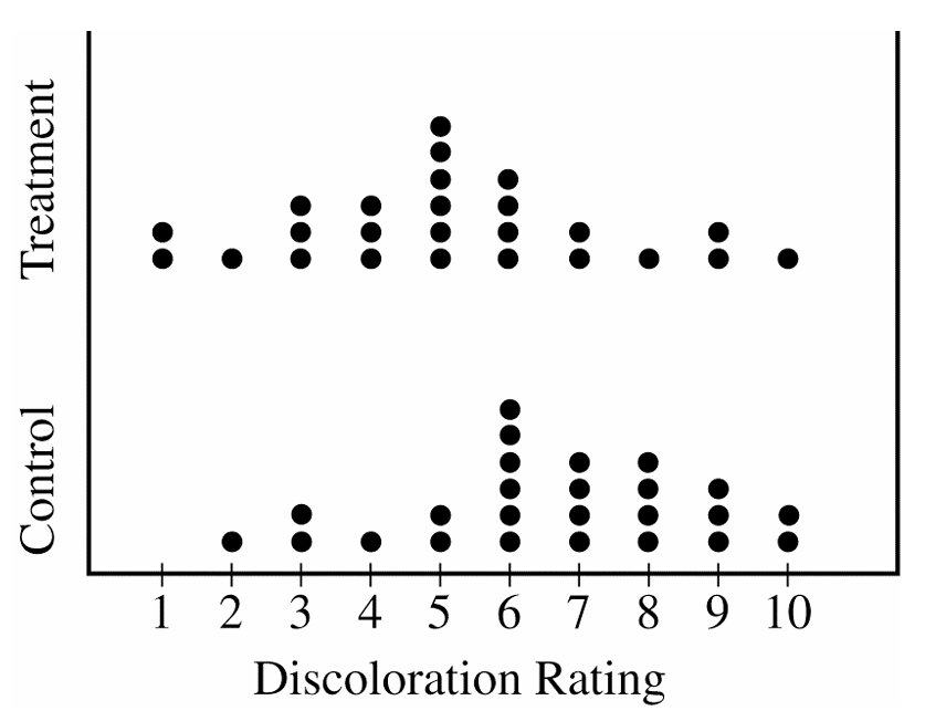
Looking at the dotplots, the treatment group’s distribution is clearly centered at a lower value than the control group’s distribution — the treatment group’s center is around 5, while the control group’s center is around 7.
Additionally, nearly all the summary statistics (minimum, \(Q_1\), median, and \(Q_3\)) are lower for the treatment group than for the control group, which consistently supports the conclusion that the preservative reduced discoloration.
\(\boxed{\text{The preservative appears effective: treatment ratings are consistently lower than control ratings.}}\)
(c)
We are given a 95% confidence interval for \(\mu_{\text{control}} – \mu_{\text{treatment}}\) as \((0.16,\ 2.72)\).
Since the entire interval lies above zero — meaning zero is not contained within \((0.16,\ 2.72)\) — we have convincing evidence that the two population means are not equal.
We are 95% confident that the population mean discoloration rating for untreated strawberries is between \(0.16\) and \(2.72\) units higher than the population mean rating for treated strawberries, indicating the preservative does make a real difference.
\(\boxed{0 \notin (0.16,\ 2.72) \Rightarrow \text{there is a significant difference in population mean discoloration ratings.}}\)
Question
19 36 19 13 43 8 16 14 10 9
Most-appropriate topic codes (AP Statistics):
• Topic 1.6 — Descriptions for One Quantitative Variable Distributions (Part \(\mathrm{b}\))
• Topic 1.7 — Summary Statistics for One Quantitative Variable (Part \(\mathrm{c}\))
• Topic 1.9 — Comparisons of the Distributions for One Quantitative Variable (Parts \(\mathrm{b}\), \(\mathrm{c}\))
▶️ Answer/Explanation
(a)
To build the stemplot, use the tens digit as the stem and the units digit as the leaf. The data range from \(8\) to \(44\), so the stems are \(0, 1, 2, 3, 4\). Place each data value’s units digit on the appropriate row.
\( \begin{array}{r|l} 0 & 8 \quad 9 \\ 1 & 2 \quad 6 \quad 8 \quad 7 \quad 8 \quad 9 \quad 6 \quad 9 \quad 3 \quad 4 \quad 0 \\ 2 & \\ 3 & 3 \quad 8 \quad 6 \quad 5 \\ 4 & 1 \quad 4 \quad 3 \\ \end{array} \)
Legend: \(1 \mid 2\) represents \(12\) questions answered correctly.
Ordered version (leaves sorted in ascending order):
\( \begin{array}{r|l} 0 & 8 \quad 9 \\ 1 & 0 \quad 2 \quad 3 \quad 4 \quad 6 \quad 6 \quad 7 \quad 8 \quad 8 \quad 9 \quad 9 \\ 2 & \\ 3 & 3 \quad 5 \quad 6 \quad 8 \\ 4 & 1 \quad 3 \quad 4 \\ \end{array} \)
Legend: \(1 \mid 2\) represents \(12\) questions answered correctly.
(b)
The most striking feature of this distribution is that the scores split into two distinct groups — one cluster concentrated in the teens (roughly \(8\)–\(19\)) and a second, smaller cluster in the high \(30\)s and low \(40\)s. There is a complete gap in the \(20\)s, with no student scoring between \(19\) and \(33\). The distribution is bimodal, suggesting that students tended to perform either quite poorly or quite well on the test, with no middle ground.
(c)
A measure of center such as the mean or median would fall somewhere around \(\bar{x} \approx 22.95\), which lies right in the gap of the \(20\)s — a region where no student actually scored. Reporting only the center gives the false impression that a typical student scored around \(23\), when in reality no student did. Because the data are bimodal with two separated groups, the center alone completely misses the two-cluster structure of the distribution and would mislead the reader into thinking the scores are roughly symmetric or unimodal.
Question
Most-appropriate topic codes (AP Statistics):
• Topic 1.7 — Summary Statistics for One Quantitative Variable (Parts \(\mathrm{a}\), \(\mathrm{c}\))
• Topic 1.9 — Comparisons of the Distributions for One Quantitative Variable (Parts \(\mathrm{a}\), \(\mathrm{b}\))
▶️ Answer/Explanation
(a)
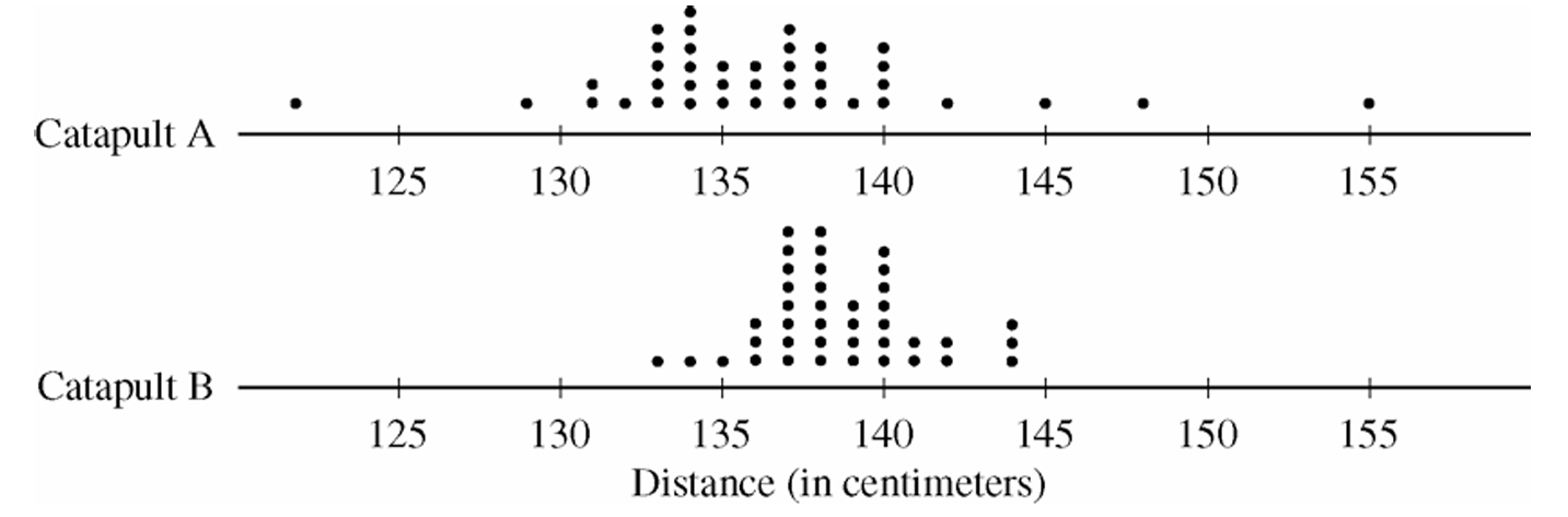
Both distributions of distances are roughly symmetric and somewhat mound-shaped (bell-shaped). Looking at the centers, the median of Catapult A is approximately \(136\,\text{cm}\), which is slightly lower than the median of Catapult B at approximately \(138\,\text{cm}\). In terms of spread, Catapult A shows considerably more variability than Catapult B — the range of Catapult A is about \(30\,\text{cm}\), while the range of Catapult B is approximately \(11\,\text{cm}\). Additionally, there appear to be potential outliers in Catapult A’s distribution (e.g., a ball traveling approximately \(155\,\text{cm}\)), whereas Catapult B has no such extreme values.
(b)
Catapult B would be the better choice.
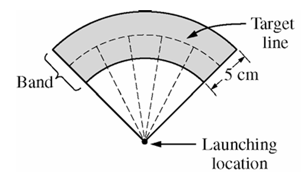
Since the target band is only \(5\,\text{cm}\) wide, the key factor is how tightly clustered the distances are around the center. Catapult B has a much smaller spread — most balls land between approximately \(133\,\text{cm}\) and \(143\,\text{cm}\) — meaning when placed correctly, a higher proportion of balls will fall within the narrow band. Catapult A’s larger variability means balls are scattered over a much wider range, making it far less likely that they will land consistently within the band.
(c)
Catapult B should be placed approximately \(\boxed{138\,\text{cm}}\) from the target line.
Since Catapult B’s distribution is roughly symmetric and mound-shaped, the median (approximately \(138\,\text{cm}\)) is a reliable measure of center and represents the most typical distance a ball will travel. Placing the catapult so that the target line is \(138\,\text{cm}\) away aligns the center of the distribution with the target, maximizing the chance that any given ball lands within the \(5\,\text{cm}\) band. Based on the sample data, approximately \(\frac{30}{40} = 0.75\) of the 40 balls launched from Catapult B landed within \(2.5\,\text{cm}\) on either side of \(138\,\text{cm}\), which further confirms this placement.
Question
Most-appropriate topic codes (AP Statistics):
• Topic 1.11 — Random Sampling (Part \(\mathrm{b}\))
• Topic 1.12 — Potential Problems with Sampling (Part \(\mathrm{b}\))
• Topic 1.10 — The Investigative Question Revisited and Data Collection (Part \(\mathrm{c}\))
▶️ Answer/Explanation
(a)
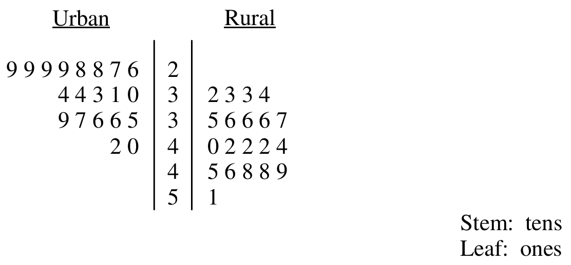
Reading the stemplot, the rural distribution is centered higher and is more spread out than the urban distribution.
For the rural students:
Mean \(\approx 40.45\) cal/kg
Median \(\approx 41\) cal/kg
Range \(= 19\)
SD \(\approx 6.04\)
IQR \(\approx 10\)
For the urban students:
Mean \(\approx 32.6\) cal/kg
Median \(\approx 32\) cal/kg
Range \(= 16\)
SD \(\approx 4.67\)
IQR \(\approx 7\)
So both the typical value and the spread are larger for the rural group. In terms of shape, the rural data look fairly symmetric and spread evenly between about 32 and 51 cal/kg, while the urban data appear skewed toward the larger values.
\( \boxed{\text{Rural: higher center and more spread; Urban: lower center, less spread, right-skewed}} \)
(b)
No. Each sample came from just one rural school and one urban school, so these two specific schools may not represent the much larger and more diverse population of all rural and urban ninth graders across the country. Because the schools themselves were not randomly chosen from all such schools, the results can’t be safely extended beyond these two schools.
\( \boxed{\text{No — only one school of each type was sampled, so results cannot be generalized nationally}} \)
(c)
Plan II is the better choice.
Both plans already adjust for body size by dividing calories by body weight, so that part is the same. The real issue is that a single day’s eating can be unusually high or low depending on what happened that day — a birthday party, a sick day, a weekend versus a school day, and so on. By recording food over a full 7-day period and averaging, Plan II smooths out this day-to-day variability and gives a more stable, precise picture of each student’s typical caloric intake.
\( \boxed{\text{Plan II — averaging over 7 days reduces day-to-day variability and gives a more precise estimate}} \)
Question

Most-appropriate topic codes (AP Statistics):
• Topic 2.12 — Sampling Distributions and the Central Limit Theorem (Part \(\mathrm{b}\))
• Topic 1.7 — Summary Statistics for One Quantitative Variable (Part \(\mathrm{c}\))
• Topic 1.9 — Comparisons of the Distributions for One Quantitative Variable (Part \(\mathrm{d}\))
▶️ Answer/Explanation
(a)
The expected value of a discrete random variable is found by multiplying each value by its probability and adding the results:
\( E(X)=\sum x_i\,p(x_i) \)
Plugging in the values from the table:
\( E(X)=0(0.35)+1(0.20)+2(0.15)+3(0.15)+4(0.10)+5(0.05) \)
\( E(X)=0+0.20+0.30+0.45+0.40+0.25 \)
\( \boxed{E(X)=1.6} \)
(b)
Both sample averages are estimates of the same population mean, \(\mu_X=1.6\), so they should be centered around the same value. What changes is how precise that estimate is.
The standard deviation of a sample mean is
\( \sigma_{\bar{x}}=\dfrac{\sigma}{\sqrt{n}} \)
Since \(1{,}000>20\), a sample of 1,000 days has a much smaller standard deviation for its average, meaning the sample average will tend to land closer to 1.6 than the first sample’s average of 1.25 did.
\( \boxed{\text{The new average should be closer to } 1.6\text{ than }1.25\text{, since larger samples have less variability}} \)
(c)
To find the median, build up the cumulative probabilities:
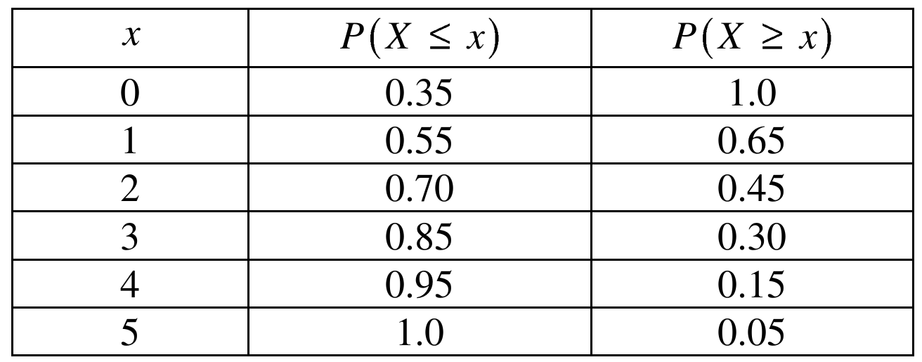
At \(x=1\), both \(P(X\le 1)=0.55\ge 0.5\) and \(P(X\ge 1)=0.65\ge 0.5\) are satisfied. At \(x=2\), \(P(X\ge 2)=0.45<0.5\), so \(x=2\) does not work.
\( \boxed{\text{Median} = 1} \)
(d)
Looking at the table, most of the probability is piled up at the small values (0, 1, 2) with a long tail of smaller probabilities stretching out to 4 and 5. This makes the distribution right-skewed, which pulls the mean up above the median — here the mean of 1.6 is noticeably larger than the median of 1, which is exactly the pattern you’d expect for a distribution skewed toward larger values.
\( \boxed{\text{The distribution is right-skewed, so the mean (1.6) is greater than the median (1)}} \)
Question
Most-appropriate topic codes (AP Statistics):
• Topic 1.7 — Summary Statistics for One Quantitative Variable (Parts b, c)
• Topic 1.9 — Comparisons of the Distributions for One Quantitative Variable (Part b)
▶️ Answer/Explanation
(a)
The distribution is skewed to the left (skewed toward the lower values). You can see this from the stemplot: the longer tail stretches down into the 60s and lower 70s, while most of the data cluster in the upper 80s and 90s. There are relatively few low scores pulling the tail downward.
(b)
The instructor should report the median.
Because the distribution is skewed toward the lower values, the mean gets pulled in that direction — it will be lower than the median. The median, being resistant to the few very low scores, will better represent the “typical” high performance of the class. So ironically, to make performance look as high as possible, the median is the better choice here.
(c)
Step 1 — Compute the midrange:
The minimum score is \(64\) and the maximum score is \(95\), so:
\( \text{midrange} = \frac{\text{maximum} + \text{minimum}}{2} = \frac{95 + 64}{2} = \frac{159}{2} = 79.5 \)
\(\boxed{\text{midrange} = 79.5}\)
Step 2 — Identify as measure of center:
The midrange is a measure of center.
Step 3 — Rationale:
The maximum value tells us about the upper extreme and the minimum tells us about the lower extreme. By averaging these two values, we find the point that sits exactly halfway between the two extremes — this is a center point, not a spread. Measures of spread (like range, standard deviation, or IQR) describe how far apart the data are; the midrange instead gives a single representative middle value, placing it firmly in the category of measures of center.
Question

Most-appropriate topic codes (AP Statistics):
• Topic 1.9 — Comparisons of the Distributions for One Quantitative Variable (Parts a, b)
• Topic 1.7 — Summary Statistics for One Quantitative Variable (Part b)
▶️ Answer/Explanation
(a)
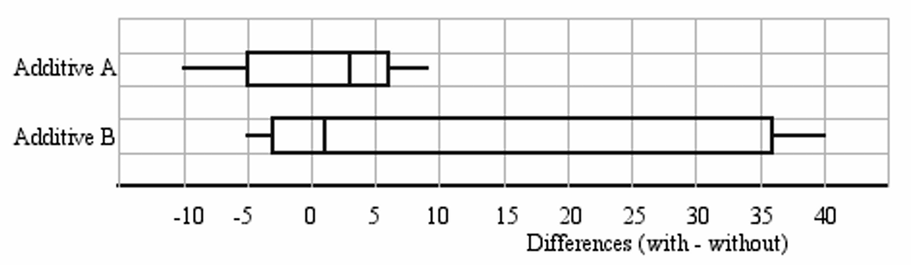
First, check for outliers using the \(1.5 \times \text{IQR}\) rule.
For Additive A:
\(\text{IQR}_A = Q_3 – Q_1 = 4 – 1 = 3\)
\(1.5 \times \text{IQR}_A = 1.5 \times 3 = 4.5\)
Lower fence: \(Q_1 – 4.5 = 1 – 4.5 = -3.5\)
Upper fence: \(Q_3 + 4.5 = 4 + 4.5 = 8.5\)
Values below \(-3.5\): \(-10, -8\) → both are outliers
Values above \(8.5\): \(9\) → outlier
For Additive B:
\(\text{IQR}_B = Q_3 – Q_1 = 25 – (-2) = 27\)
\(1.5 \times \text{IQR}_B = 1.5 \times 27 = 40.5\)
Lower fence: \(-2 – 40.5 = -42.5\)
Upper fence: \(25 + 40.5 = 65.5\)
No values fall outside these fences → no outliers
The parallel boxplots should be drawn as follows:
(b)(i)
Additive A is the better recommendation when the goal is to improve mileage in the highest proportion of cars. Since \(Q_1 = 1 > 0\) for Additive A, we know that at least 75% of the cars in the sample showed a positive difference (i.e., improved mileage). For Additive B, \(Q_1 = -2 < 0\), so we can only be certain that at least 50% of the cars showed improvement — and it could be less than 75%. Therefore, Additive A is more reliable for maximizing the proportion of cars that benefit.
\(\boxed{\text{Recommend Additive A for highest proportion of cars with improved mileage}}\)
(b)(ii)
Additive B is the better recommendation when the goal is to maximize the mean increase in gas mileage. Although the median for Additive B (Median \(= 1\)) is lower than that of Additive A (Median \(= 3\)), the distribution for Additive B is strongly right-skewed, with very large values above \(Q_3\) such as \(35, 37,\) and \(40\). This skewness pulls the mean well above the median. In contrast, Additive A has two low outliers (\(-10, -8\)) pulling the mean downward. So the mean for Additive B is expected to be substantially higher than the mean for Additive A.
\(\boxed{\text{Recommend Additive B for highest mean increase in gas mileage}}\)
Question

Most-appropriate topic codes (AP Statistics):
• Topic 1.9 — Comparisons of the Distributions for One Quantitative Variable (Part a)
• Topic 4.2 — Constructing a Confidence Interval for a Population Mean or Population Mean Difference (Part b)
• Topic 4.4 — Setting Up a Test for a Population Mean or Population Mean Difference (Part c)
▶️ Answer/Explanation
(a)
First, we check for outliers in each sample using the \(1.5 \times \text{IQR}\) rule.
Modern Thai Dogs:
\(\text{IQR} = Q_3 – Q_1 = 128 – 121 = 7\)
Lower fence: \(121 – 1.5(7) = 121 – 10.5 = 110.5\)
Upper fence: \(128 + 1.5(7) = 128 + 10.5 = 138.5\)
All values (minimum = 114, maximum = 132) fall within these fences. No outliers.
Golden Jackals:
\(\text{IQR} = Q_3 – Q_1 = 112 – 107 = 5\)
Lower fence: \(107 – 1.5(5) = 107 – 7.5 = 99.5\)
Upper fence: \(112 + 1.5(5) = 112 + 7.5 = 119.5\)
Values 122, 124, and 125 exceed the upper fence of 119.5. Outliers: 122, 124, 125.
The parallel boxplots (with the scale from 100 to 140 mm) are shown below:
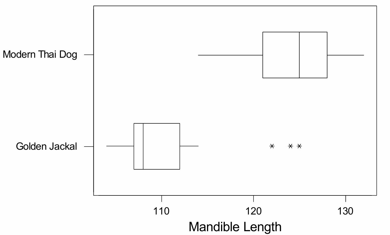
Comparison of distributions: The distributions of mandible lengths for modern Thai dogs and golden jackals are quite different. Modern Thai dogs have a much larger typical mandible length — a median of 125 mm — compared to golden jackals, whose median is only 108 mm. The distribution for modern Thai dogs appears approximately symmetric with no outliers, whereas the distribution for golden jackals is heavily skewed to the right, with three high outliers (122, 124, and 125 mm). The variability (spread) of the two distributions is roughly similar in terms of IQR, but the overall range for golden jackals is larger once the outliers are included.
(b)
Yes, it is reasonable to construct a \(t\)-confidence interval for the mean mandible length of modern Thai dogs. The boxplot for this sample is roughly symmetric with no outliers, which provides support for the assumption that the underlying population distribution is approximately normal. Since the data come from a random sample and the normality condition is reasonably satisfied even with a sample size of only 16, using a one-sample \(t\)-interval is appropriate here.
(c)
No, it would not be reasonable to perform a two-sample \(t\)-test using both groups. While the modern Thai dog sample looks approximately normal, the golden jackal sample is clearly not. The boxplot for golden jackals is strongly skewed to the right and contains three high outliers (122, 124, 125) in a sample of only 16 animals — a substantial proportion of the data. With such a small sample size, the \(t\)-test is not robust enough to overcome this serious departure from normality, so the normality condition required for the two-sample \(t\)-test is not reasonably met for the golden jackal population. Therefore, performing the two-sample \(t\)-test with this data would not be appropriate.
Question

Most-appropriate topic codes (AP Statistics):
• Topic 1.9 — Comparisons of the Distributions for One Quantitative Variable (Part b)
• Topic 4.4 — Setting Up a Test for a Population Mean or Population Mean Difference (Part c)
▶️ Answer/Explanation
(a)
To build a boxplot, we need the five-number summary for each group. Since the data are already sorted, we just split each set in half around the median.
For the students (\(n=9\)):
\( \text{Min}=-4.5 \)
\( Q_1=\dfrac{-3.0+(-0.5)}{2}=-1.75 \)
\( \text{Median}=0 \)
\( Q_3=\dfrac{0.5+1.5}{2}=1.0 \)
\( \text{Max}=5.0 \)
For the teachers (\(n=9\)):
\( \text{Min}=-2.0 \)
\( Q_1=\dfrac{-1.5+(-1.5)}{2}=-1.5 \)
\( \text{Median}=-1.0 \)
\( Q_3=\dfrac{0+0}{2}=0 \)
\( \text{Max}=0.5 \)
Neither group has any outliers, since no value falls beyond \(1.5\times\text{IQR}\) from the nearer quartile. Plotting both sets of five-number summaries on the same number line (a common scale is essential so the two groups can be compared directly) gives:
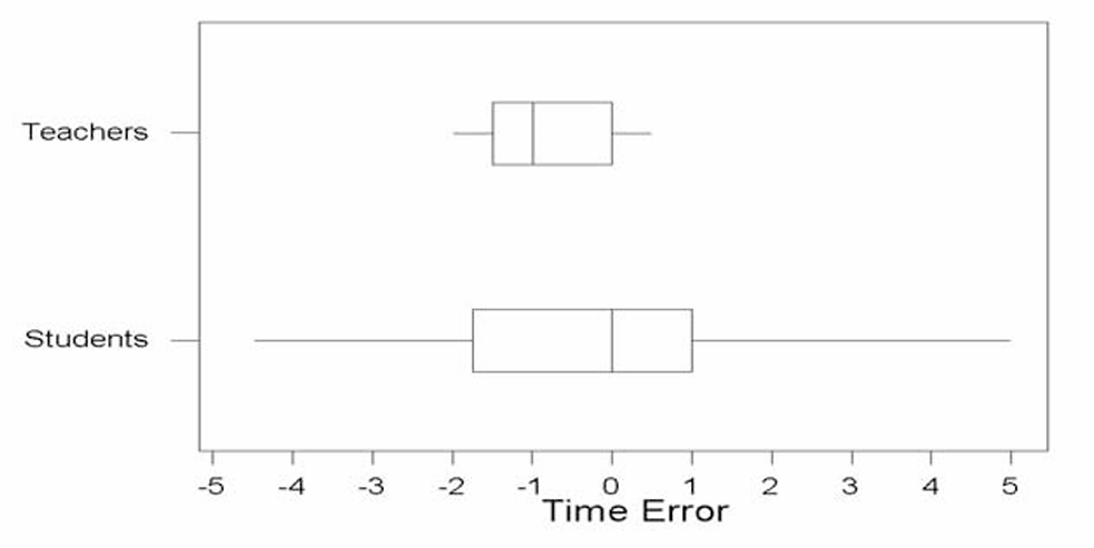
Each boxplot uses the same horizontal scale, with “T” marking the teachers’ plot and “S” marking the students’ plot, so the two distributions can be lined up and compared directly.
(b)
The teachers’ watch times tend to be closer to the true noon time. Looking at the two boxplots, the teachers’ values are all squeezed into a fairly narrow band (roughly from \(-2.0\) to \(0.5\)), while the students’ values are spread out over a much wider range (from \(-4.5\) to \(5.0\)). Even though the teachers’ watches tend to run a little slow on average (the box is shifted slightly below \(0\)), their times stay much closer together and closer to zero than the students’ times do. Since “closer to the true time” is really about how small the time errors tend to be, the group with less spread — the teachers — is the better answer here.
(c)
No, this is not an appropriate pair of hypotheses for answering the teacher’s question. The teacher wants to know whether individual students’ watches tend to be set correctly, but \(H_0:\mu=0\) versus \(H_a:\mu\neq0\) only tests something about the average error across all student watches. It’s entirely possible for this mean to come out close to \(0\) even if no individual watch is actually correct — for instance, if some students’ watches run fast by a few minutes and others run slow by a few minutes, those errors could cancel out in the average, making \(\mu\) look like \(0\) overall. So a test about the population mean \(\mu\) doesn’t tell us anything about how far off each individual student’s watch tends to be from the true time.