AP Statistics 2.1 Tabular and Graphical Representations for the Distributions of Two Categorical Variables- Exam Style Questions - MCQs - New Syllabus
Question
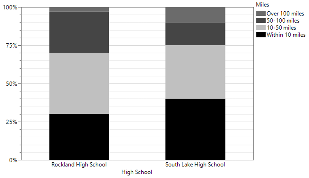
A random sample of 300 seniors from Rockland High School and a random sample of 200 seniors from South Lake High School were asked how far, in miles, their college of choice is from their home. The results are summarized in the following graph:

Which of the following statements about the sampled students is supported by the bar chart?
(A) Within 10 miles was the most popular response from students at both high schools.
(B) Three quarters of the students at Rockland have a college of choice within 50 miles of home.
(C) More students at South Lake High School wish to stay within 10 miles of home than students at Rockland High School who wish to stay within 10 miles of home.
(D) More than twice as many students at Rockland High School wish to be between 50-100 miles from home than students at South Lake High School.
(E) More students at Rockland High School than at South Lake High School wish to be more than 100 miles away from home.
▶️ Answer/Explanation
The bar chart shows percentages, but the sample sizes are different:
\(n_{\text{Rockland}}=300\)
\(n_{\text{South Lake}}=200\)
For students whose college choice is more than 100 miles away:
Rockland: approximately \(2\%\)
\(0.02(300)=6\text{ students}\)
South Lake: approximately \(10\%\)
\(0.10(200)=20\text{ students}\)
So (E) is false.
For students choosing a college within 10 miles:
Rockland: approximately \(30\%\)
\(0.30(300)=90\text{ students}\)
South Lake: approximately \(40\%\)
\(0.40(200)=80\text{ students}\)
So (C) is false.
For students choosing a college 50–100 miles away:
Rockland: approximately \(28\%\)
\(0.28(300)=84\text{ students}\)
South Lake: approximately \(15\%\)
\(0.15(200)=30\text{ students}\)
Since:
\(84 > 2(30)=60\)
more than twice as many students at Rockland chose colleges 50–100 miles away compared with South Lake.
Therefore, the statement supported by the graph is choice (D).
✅ Answer: (D)
Question
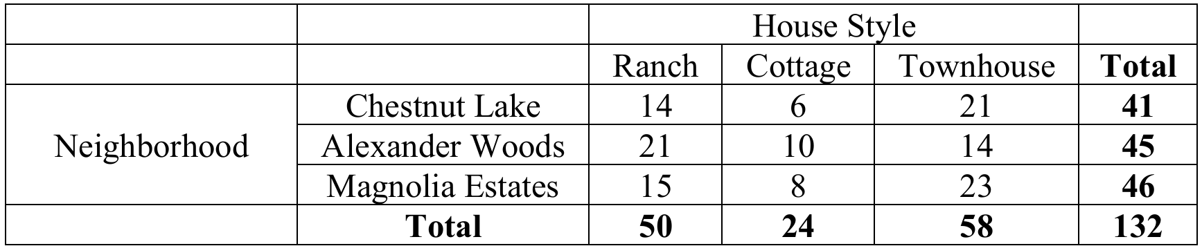
The following table shows data collected on types of homes randomly chosen from three different neighborhoods.

Based on the results above, what proportion of the randomly selected homes are ranch or cottages?
(A) \(\frac{24}{132}\)
(B) \(\frac{50}{132}\)
(C) \(\frac{58}{132}\)
(D) \(\frac{74}{132}\)
(E) \(\frac{86}{132}\)
▶️ Answer/Explanation
The question asks for the proportion of homes that are either ranch or cottage.
From the totals row:
\(\text{Ranch} = 50\)
\(\text{Cottage} = 24\)
Since a home cannot be both a ranch and a cottage, add the counts:
\(50+24=74\)
The total number of homes sampled is 132, so the required proportion is:
\(\frac{74}{132}\)
Therefore, the correct answer is choice (D).
✅ Answer: (D)
Question
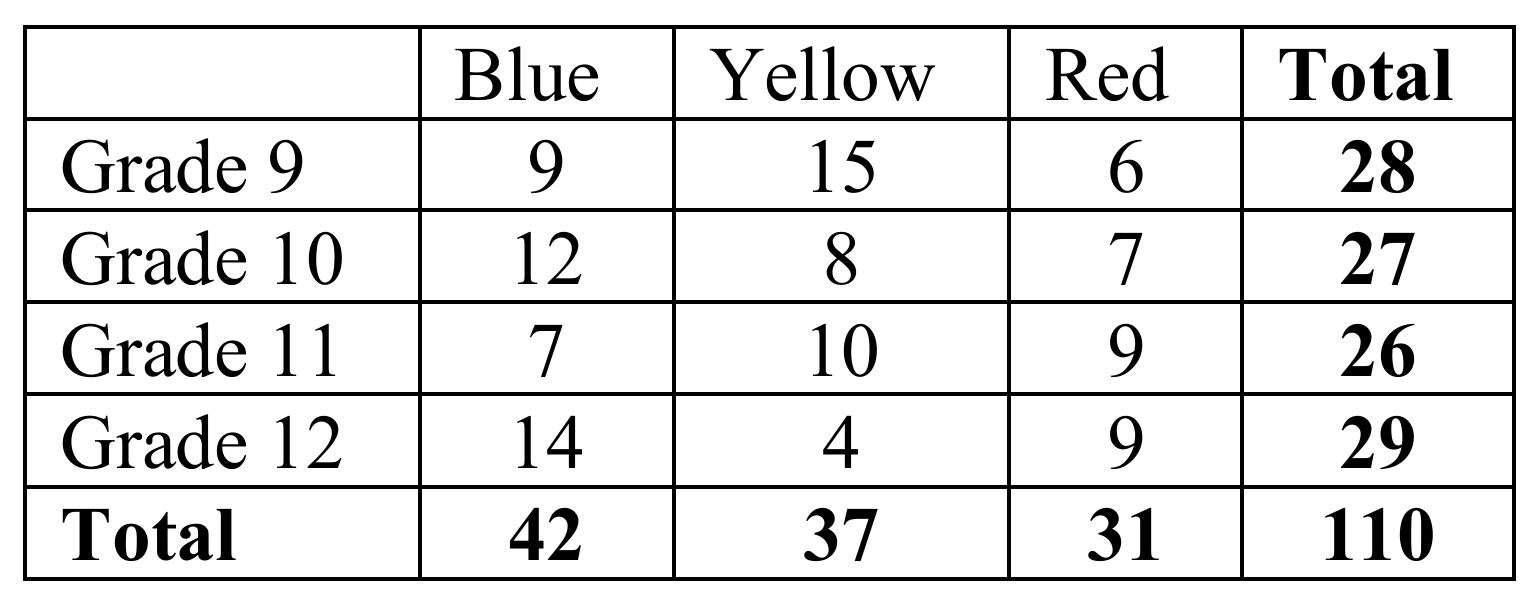
The following table shows the data collected from students at a local high school regarding their favorite primary color.

Which of the following statements is supported by the table?
(A) Yellow is the color least chosen by students surveyed at this high school.
(B) There were more 10th grade students surveyed than students in any other grades.
(C) The percentage of students who chose red is approximately 31%.
(D) The percentage of students in grade 11 who chose blue as their favorite primary color is approximately 27%.
(E) Blue was the primary color chosen least by students in grade 9.
▶️ Answer/Explanation
To check statement (D), calculate the percentage of Grade 11 students who selected blue:
\(\frac{7}{26}\times 100 \approx 26.92\%\)
This rounds to approximately 27%, so statement (D) is supported by the data. The other options are not supported because yellow is not the least chosen color overall, Grade 10 does not have the largest total, the percentage choosing red is about \(\frac{31}{110}\times100\approx28\%\), and blue was not the least chosen color in Grade 9.
✅ Answer: (D)
