
AP Statistics 5.2 Correlation- Exam Style Questions - FRQs - New Syllabus
Question
Most-appropriate topic codes (AP Statistics):
• Topic \(5.2\) — Correlation (Part \( \mathrm{e} \))
• Topic \(5.3\) — Linear Regression Models (Part \( \mathrm{b} \))
• Topic \(1.9\) — Comparisons of the Distributions for One Quantitative Variable (Part \( \mathrm{d} \))
▶️ Answer/Explanation
(a)
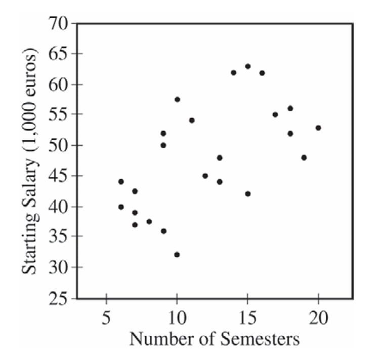
Yes, the scatterplot supports the newspaper report. The scatterplot shows a positive association between the number of semesters needed to complete an academic program and starting salary — as the number of semesters increases, starting salary tends to increase as well. This is consistent with the newspaper’s claim that more semesters are associated with a greater starting salary.
(b)
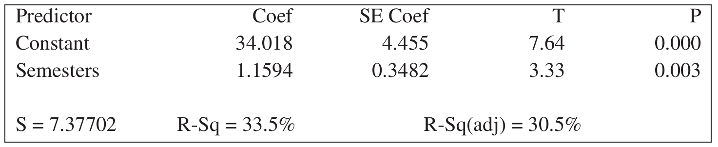
The slope of the least-squares regression line is \(b_1 = 1.1594\).
The least-squares regression equation is:
\( \hat{y} = 34.018 + 1.1594x \)
Interpretation: For each additional semester needed to complete an academic program, the predicted starting salary in the first year of a job increases by approximately €1,159.40 (i.e., 1.1594 thousand euros).
(c)
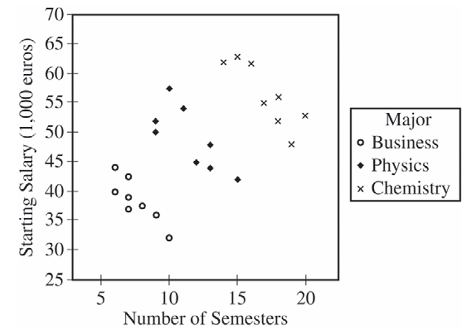
For the business majors alone, there is a strong, negative, linear association between the number of semesters and starting salary. Business majors who need more semesters to complete their academic program tend to have lower starting salaries — which is the opposite direction from the overall trend seen in the combined scatterplot.
(d)
Business majors have the lowest median starting salary, at approximately €38,000. Physics majors have the next highest median starting salary, at approximately €48,000. Chemistry majors have the highest median starting salary, at approximately €55,000.
So in order from lowest to highest median starting salary: Business \(\approx\) €38,000 < Physics \(\approx\) €48,000 < Chemistry \(\approx\) €55,000.
(e)
The newspaper report should be modified to account for the major of each person. The overall positive association in the original report is largely explained by the fact that different majors — chemistry, physics, and business — tend to require different numbers of semesters and also have very different starting salary levels. Chemistry majors take more semesters on average and also earn the highest salaries; business majors take fewer semesters and earn the lowest salaries. This creates an apparent positive association when all three majors are pooled together.
However, within each individual major, students who take a greater number of semesters to complete their program tend to have lower starting salaries, not higher. The newspaper report should therefore be revised to state that, while majors requiring more semesters overall tend to have higher starting salaries (chemistry highest, physics next, business lowest), within any given major, taking more semesters to complete the program is associated with a lower starting salary.
Question
Most-appropriate topic codes (AP Statistics):
• Topic 5.3 — Linear Regression Models (Part b)
• Topic 5.2 — Correlation (Part c)
▶️ Answer/Explanation
(a)
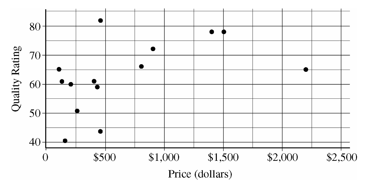
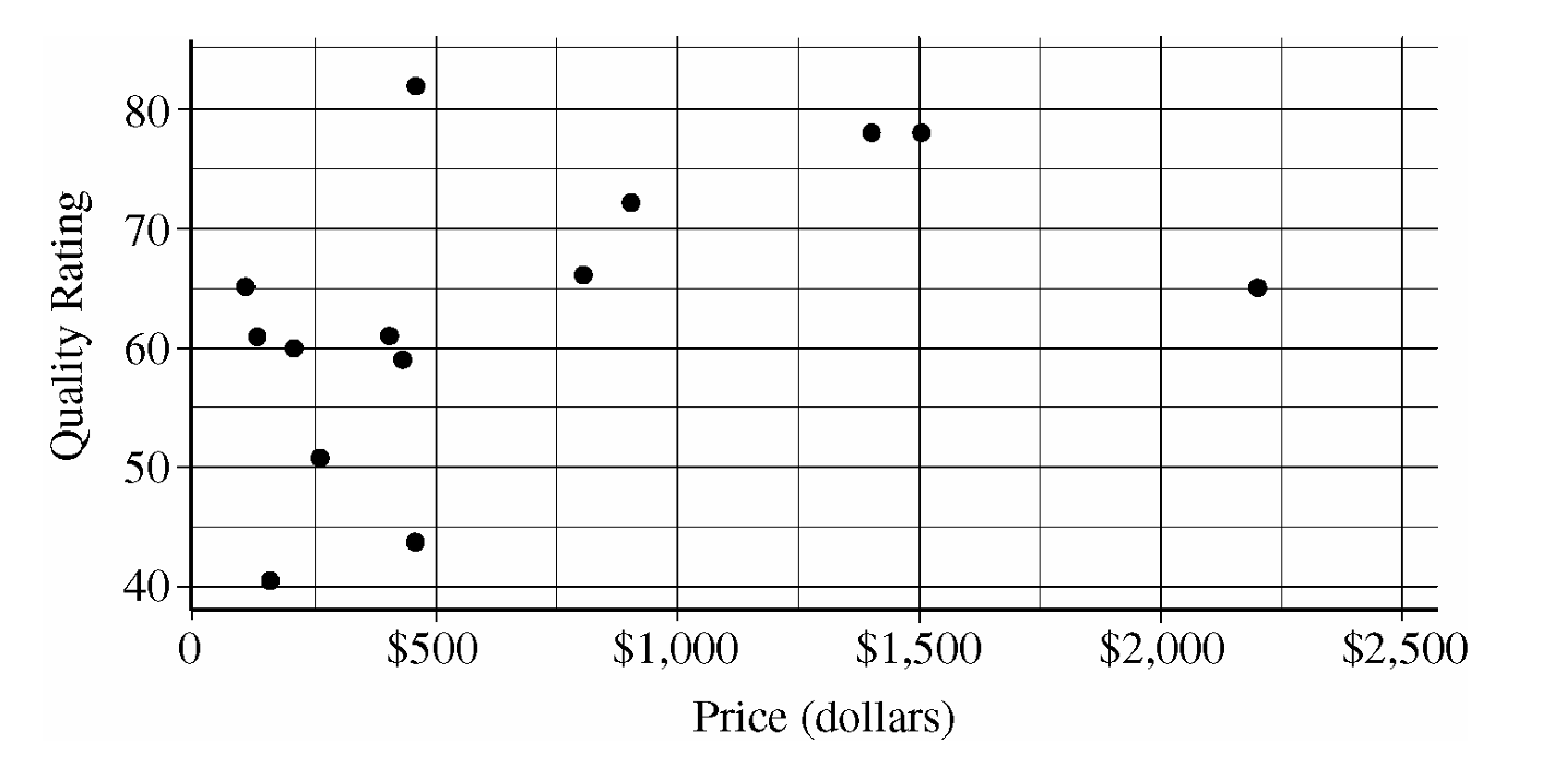
The data show a weak to moderate, positive association between price and quality rating for these sewing machines.
The overall form of the relationship is curved or nonlinear rather than a straight line.
Among the machines costing under \$500, there appears to be little to no visible association between price and quality rating.
However, machines costing above \$500 generally tend to achieve much higher quality ratings than the cheaper group, which creates the overall positive direction.
(b)
The machine that most heavily influences and reduces the appropriateness of a linear regression model is the one located at an approximate price of \(\$2,200\) with a quality rating of approximately \(65\).
The general trend among the other four machines priced over \$500 suggests that quality starts to level off or approach a maximum potential limit rather than increasing continuously with price.
This particular \(\$2,200\) sewing machine is the absolute most expensive model in the entire dataset, yet its quality rating drops significantly compared to the models around \$1,500.
Including this point in a linear regression model would heavily drag the least-squares line down toward it, creating a poor overall fit for the rest of the data points.
(c)
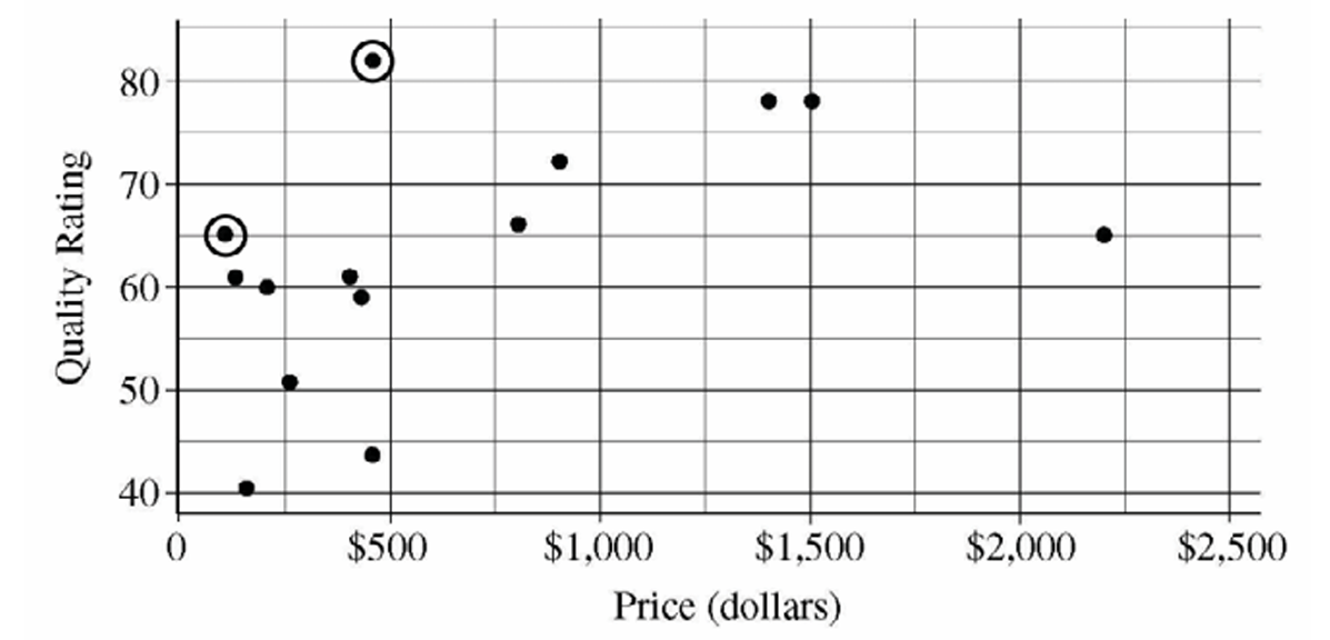
According to Chris’s rule, he wants a machine only if there isn’t another choice available that is both cheaper and higher in quality. Following this strategy, only two models fit his standard and should be circled on the scatterplot:
1. The model positioned at a price slightly above \(\$100\) with a quality rating of \(65\).
2. The model positioned at a price slightly below \(\$500\) with a quality rating of \(81\) (or \(82\)).
The data points corresponding to these two machines have been circled on the scatterplot below.
Question
(b)
Most-appropriate topic codes (AP Statistics):
• Topic 4.5 — Carrying Out a Test for a Population Mean or Population Mean Difference (Part \(\mathrm{a}\))
• Topic 5.3 — Linear Regression Models (Part \(\mathrm{b}\))
• Topic 5.2 — Correlation (Part \(\mathrm{c}\))
• Topic 5.5 — Least-Squares Regression (Parts \(\mathrm{b}\), \(\mathrm{c}\), \(\mathrm{d}\))
▶️ Answer/Explanation
(a)
Step 1 — Hypotheses
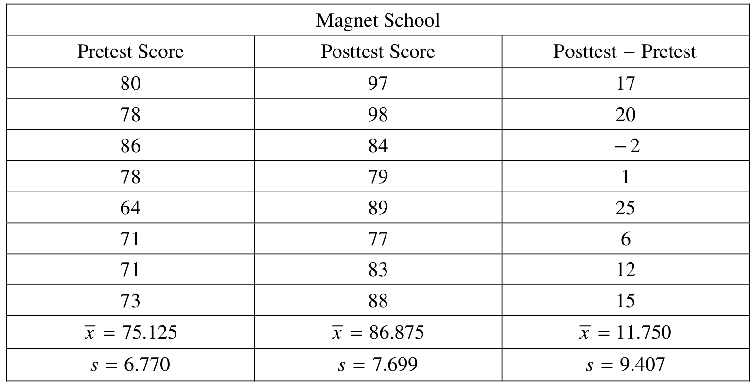
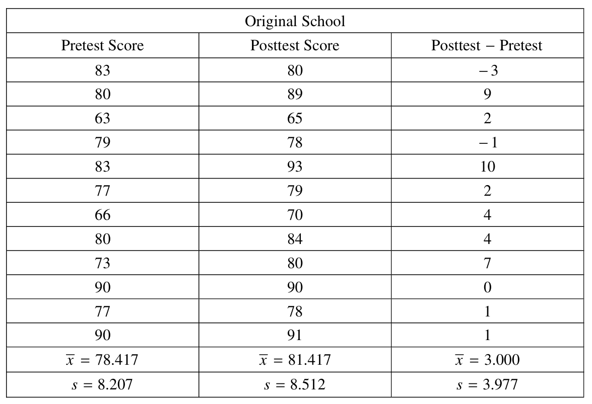
Let \(\mu_{\text{DiffM}}\) = the mean difference (posttest \(-\) pretest) for all students at the magnet school, and \(\mu_{\text{DiffO}}\) = the mean difference for all students who applied but were not selected and attended their original school.
\(H_0: \mu_{\text{DiffM}} = \mu_{\text{DiffO}}\)
\(H_a: \mu_{\text{DiffM}} > \mu_{\text{DiffO}}\)
Step 2 — Test and Conditions
We use a two-sample \(t\)-test for the difference of two means:
\(t = \dfrac{\bar{x}_M – \bar{x}_O}{\sqrt{\dfrac{s_M^2}{n_M} + \dfrac{s_O^2}{n_O}}}\)
- We need to assume randomness of the sampling used. It was stated in the stem that the students from the two different schools were randomly selected.
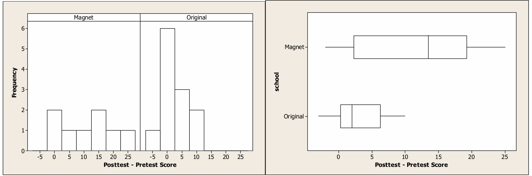
- We need to check the assumption that the distributions of differences (posttest – pretest) for each of the two schools are normally distributed. Based on histograms and boxplots of these differences, there are no outliers or extreme skewness. Because these graphs reveal no obvious departures from normality, it appears reasonable to proceed with the t-test.
Step 3 — Test Statistic and \(p\)-value
\(t = \dfrac{11.750 – 3.000}{\sqrt{\dfrac{(9.407)^2}{8} + \dfrac{(3.977)^2}{12}}} = \dfrac{8.750}{\sqrt{11.062 + 1.318}} = \dfrac{8.750}{\sqrt{12.380}} = \dfrac{8.750}{3.518} \approx 2.487\)
\(df \approx 8.69\), \(\quad p\text{-value} \approx 0.0177\)
Step 4 — Conclusion
Since \(p = 0.0177 < \alpha = 0.05\), we reject \(H_0\). There is convincing evidence that students who attend the magnet school have a higher mean improvement in science test scores than students who attended their original school.
(b)(i)
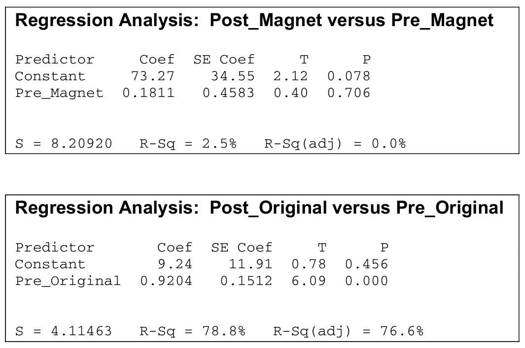
The regression equation for the magnet school is:
\(\hat{y} = 73.27 + 0.1811x\)
where \(x\) is the pretest score and \(\hat{y}\) is the predicted posttest score. The slope of \(0.1811\) means that for each additional point scored on the pretest by a magnet school student, the posttest score is predicted to increase by \(0.1811\) points, on average. The slope is positive but very close to zero, suggesting that pretest performance has almost no predictive power for posttest performance at the magnet school.
(b)(ii)
The regression equation for the original school is:
\(\hat{y} = 9.24 + 0.9204x\)
where \(x\) is the pretest score and \(\hat{y}\) is the predicted posttest score. The slope of \(0.9204\) means that for each additional point scored on the pretest by an original school student, the posttest score is predicted to increase by approximately \(0.9204\) points, on average — a nearly one-for-one relationship.
(c)(i) — Magnet School
From the regression output, the test statistic is \(t = 0.40\) with \(p\text{-value} = 0.706\).
Since \(0.706 > 0.05\), we fail to reject \(H_0\). There is insufficient evidence to conclude that there is a significant correlation between pretest score and posttest score at the magnet school. Pretest score is not a useful linear predictor of posttest score for magnet school students.
(c)(ii) — Original School
From the regression output, the test statistic is \(t = 6.09\) with \(p\text{-value} = 0.000\).
Since \(0.000 < 0.05\), we reject \(H_0\). There is strong evidence of a significant correlation between pretest score and posttest score at the original school. Pretest score is a very strong linear predictor of posttest score for original school students.
(d)
The two-sample \(t\)-test in part (a) told us only that the magnet school group had a higher average improvement — but it didn’t explain who benefited or by how much depending on their initial ability. The regression analyses reveal something much more interesting:
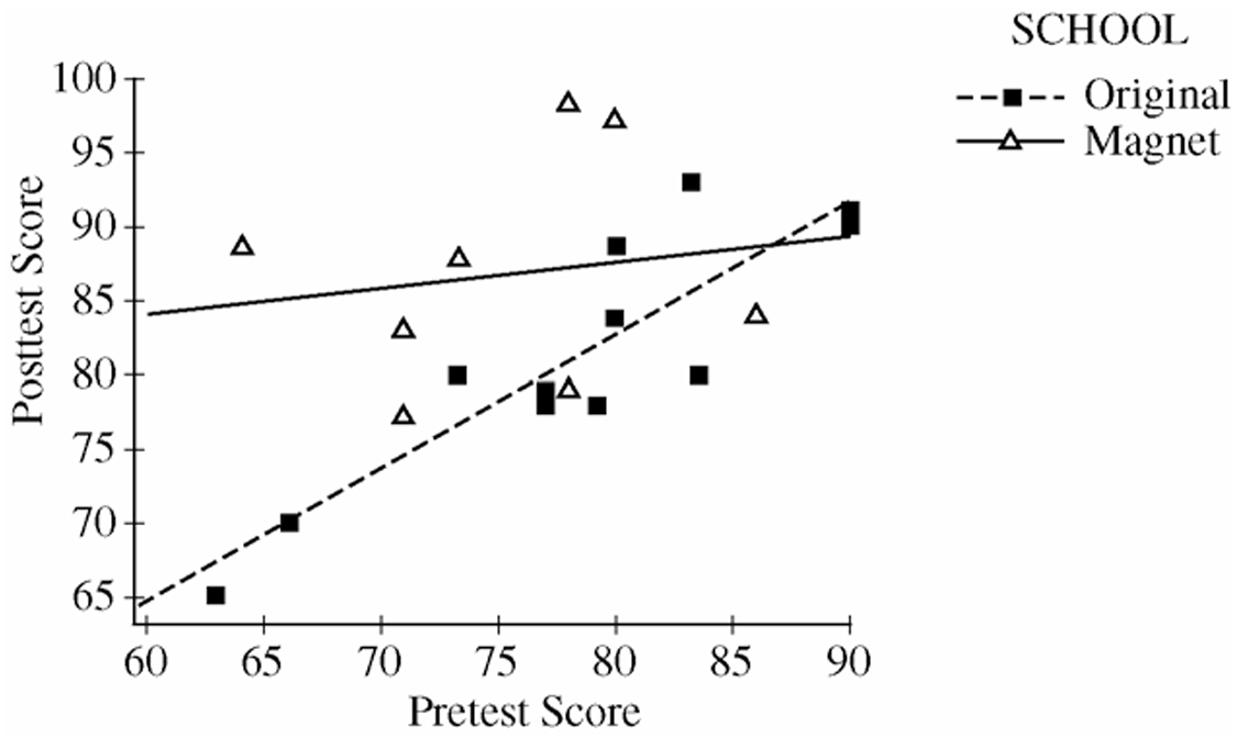
• At the magnet school, the slope is nearly zero (\(0.1811\)), and \(R^2 = 2.5\%\) — this means students score high on the posttest regardless of how they did on the pretest. A student who entered the magnet school with a low pretest score of 64 scored 89 on the posttest (an improvement of 25 points), while a student with a higher pretest score of 86 actually dropped 2 points. The magnet school appears to level the playing field and disproportionately benefits students who start with lower ability.
• At the original school, the slope is close to 1 (\(0.9204\)) and \(R^2 = 78.8\%\) — students essentially maintained their relative ranking, with high pretest scorers also achieving high posttest scores. There is very little “boost” effect for any student regardless of their starting point.
In short, the regression analyses reveal that the magnet school benefits students with low pretest scores the most, while the original school produces predictable but modest gains proportional to where students started.
Question
Most-appropriate topic codes (AP Statistics):
• Topic 5.5 — Least-Squares Regression (Part \(\mathrm{b}\))
• Topic 5.3 — Linear Regression Models (Part \(\mathrm{c}\))
• Topic 5.2 — Correlation (Part \(\mathrm{c}\))
• Topic 5.3 — Linear Regression Models (Parts \(\mathrm{d}\), \(\mathrm{e}\))
▶️ Answer/Explanation
(a)
The estimated slope of \(1.080\) in Model 1 means that for each additional foot of actual distance between the two objects, the perceived (estimated) distance is expected to increase by about \(1.080\) feet on average.
In other words, as the objects are placed farther apart in reality, subjects in dim light tend to perceive the distance as growing slightly faster than the true distance — at a rate of roughly \(1.080\) feet of perceived distance per foot of actual distance.
\( \boxed{\text{For every 1 ft increase in actual distance, perceived distance increases by approximately } 1.080 \text{ ft on average.}}\)
(b)
Model 2 is preferable because it has a \(y\)-intercept of zero, which makes physical sense in this context — if two objects are placed in the same location (actual distance \(= 0\)), a subject would be expected to perceive a distance of zero feet, not \(0.238\) feet as Model 1 would predict.
Since the intercept in Model 1 is not meaningfully different from zero (it is small relative to its standard error of \(0.260\)), removing it and using the simpler through-the-origin Model 2 produces a more interpretable and contextually appropriate model.
\(\boxed{\text{Model 2 is preferred because a zero intercept is physically sensible when actual distance} = 0.}\)
(c)
Let \(\beta\) be the true slope of the linear relationship between perceived distance and actual distance in Model 2. The researcher’s hypothesis that subjects overestimate with the overestimation growing as distance grows is equivalent to \(\beta > 1\).
Step 1 — Hypotheses:
\(H_0: \beta = 1\) (perceived distance increases at the same rate as actual distance — no overestimation growth)
\(H_a: \beta > 1\) (perceived distance increases faster than actual distance — overestimation grows with distance)
Step 2 — Test Statistic:
We use a \(t\)-test for the slope:
\(t = \dfrac{b – \beta_0}{s_b} = \dfrac{1.102 – 1}{0.393} = \dfrac{0.102}{0.393} \approx 0.260\)
\(\text{degrees of freedom} = n – 1 = 40 – 1 = 39\)
\(p\text{-value} = P(t_{39} > 0.260) \approx 0.398\)
Step 3 — Conclusion:
Since the \(p\)-value of \(0.398\) is much greater than \(\alpha = 0.05\), we fail to reject \(H_0\). We do not have statistically significant evidence to conclude that subjects overestimate the distance with the overestimation increasing as the actual distance increases.
\(\boxed{t \approx 0.260,\quad p\text{-value} \approx 0.398 > 0.05 \Rightarrow \text{Fail to reject } H_0.}\)
(d)
Substituting the two values of the indicator variable into Model 3:
For contact wearers (\(\text{contact} = 1\)):
\(\hat{y} = 1.05(\text{actual distance}) + 0.12(1)(\text{actual distance}) = 1.17 \times (\text{actual distance})\)
For noncontact wearers (\(\text{contact} = 0\)):
\(\hat{y} = 1.05(\text{actual distance}) + 0.12(0)(\text{actual distance}) = 1.05 \times (\text{actual distance})\)
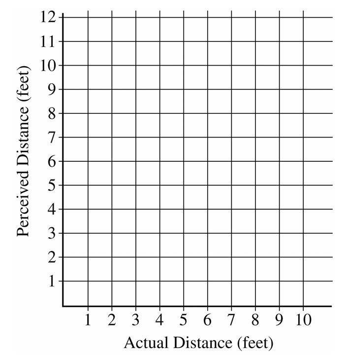
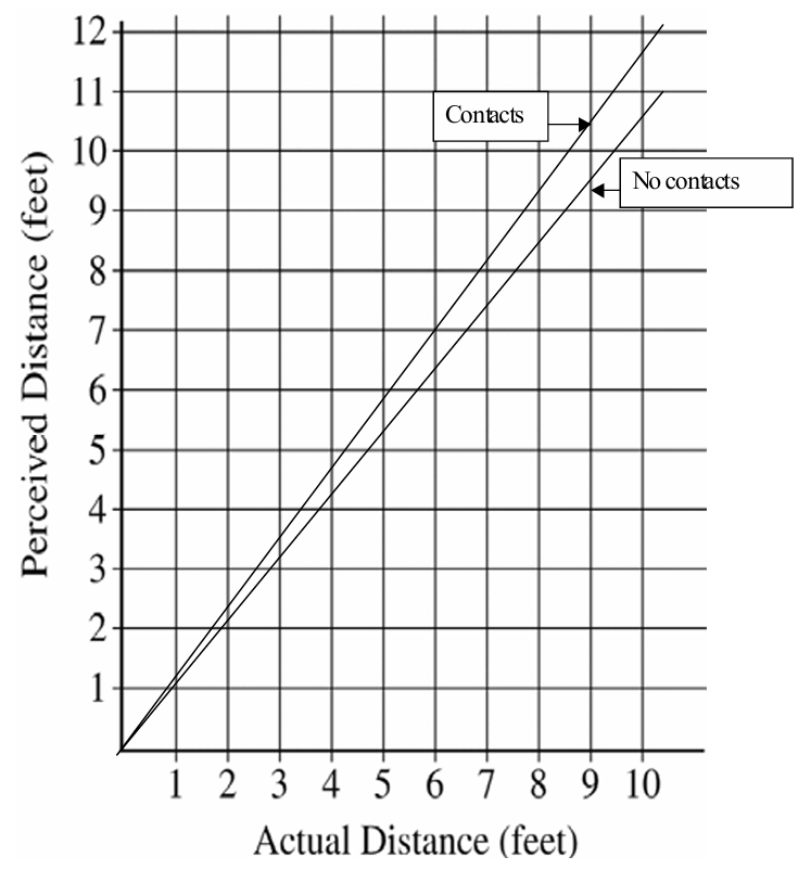
Both lines pass through the origin. The contact wearers’ line has a steeper slope (\(1.17\)) than the noncontact wearers’ line (\(1.05\)), as shown in the graph above.
\(\boxed{\text{Contact: } \hat{y} = 1.17x;\quad \text{Noncontact: } \hat{y} = 1.05x \text{ (both through origin)}}\)
(e)
The coefficient \(1.05\) estimates the average increase in perceived distance (in feet) for each one-foot increase in actual distance for noncontact wearers — that is, for every foot farther apart the objects actually are, a noncontact wearer perceives them as about \(1.05\) feet farther apart on average.
The coefficient \(0.12\) estimates the additional average increase in perceived distance (in feet) for each one-foot increase in actual distance specifically for contact wearers, above and beyond the \(1.05\) rate for noncontact wearers — so contact wearers perceive distance as growing at a rate of \(1.05 + 0.12 = 1.17\) feet per foot of actual distance on average.
Taken together, the model tells us that both groups overestimate distance in dim light, but contact wearers overestimate by a slightly greater amount per foot of actual distance than noncontact wearers do.
\(\boxed{1.05: \text{ per-foot slope for noncontact wearers};\quad 0.12: \text{ additional per-foot slope for contact wearers.}}\)
Question
Most-appropriate topic codes (AP Statistics):
• Topic 5.3 — Linear Regression Models (Parts \(\mathrm{a}\), \(\mathrm{b}\), \(\mathrm{c}\))
• Topic 5.4 — Residuals (Part \(\mathrm{b}\))
▶️ Answer/Explanation
(a)
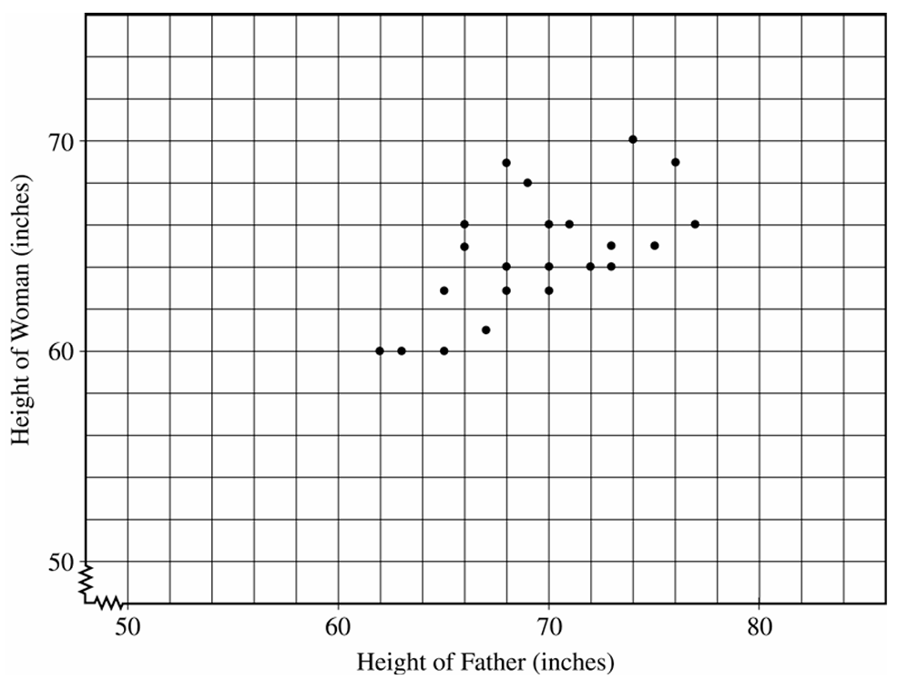
To draw the least squares regression line \(\hat{y} = 35.1 + 0.427x\), compute two points on the line and connect them. For example:
At \(x = 55\): \(\quad \hat{y} = 35.1 + 0.427(55) = 35.1 + 23.485 = 58.585\)
At \(x = 80\): \(\quad \hat{y} = 35.1 + 0.427(80) = 35.1 + 34.16 = 69.26\)
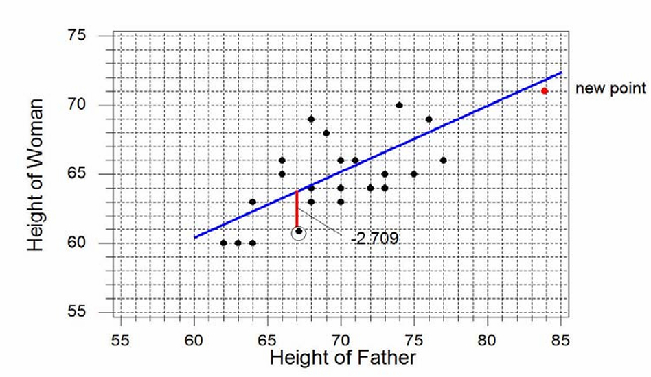
Plot the points \((55,\ 58.6)\) and \((80,\ 69.3)\) on the scatterplot and draw a straight line through them. The line is shown in the scatterplot above (blue line).
(b)
The point \((67,\ 61)\) is circled on the scatterplot. The predicted value at \(x = 67\) is:
\(\hat{y} = 35.1 + 0.427(67) = 35.1 + 28.609 = 63.709\)
The residual is the vertical distance from the actual point down to the regression line:
\(\text{Residual} = y – \hat{y} = 61 – 63.709\)
\(\boxed{\text{Residual} = -2.709 \text{ inches}}\)
The negative sign tells us the actual daughter’s height is about \(2.709\) inches below what the regression line predicts — the vertical dashed segment on the scatterplot drops from the line down to the actual point.
(c) — Slope:
The slope would remain about the same. The new point \((84,\ 71)\) falls very close to the existing regression line — substituting \(x = 84\) gives \(\hat{y} = 35.1 + 0.427(84) = 70.97\), which is just about \(0.03\) away from the actual \(y = 71\). Since the new point is nearly on the line, it is consistent with the existing linear pattern and will not pull the regression line in a new direction.
(c) — Correlation:
The correlation would increase. We know the relationship between slope, correlation, and the standard deviations:
\(b = r \cdot \dfrac{s_y}{s_x}\)
Adding the new point at \(x = 84\) extends the range of \(x\) values far to the right, increasing \(s_x\) considerably more than it increases \(s_y\). So the ratio \(\dfrac{s_y}{s_x}\) decreases. Since the slope \(b\) stays about the same but \(\dfrac{s_y}{s_x}\) gets smaller, \(r\) must increase to compensate. Intuitively, the new point fits the linear pattern well and sits far out in the \(x\)-direction, which strengthens the apparent linear relationship and pulls \(r\) closer to \(1\).
Question
Most-appropriate topic codes (AP Statistics):
• Topic 5.4 — Residuals (Part \(\mathrm{a}\))
• Topic 5.2 — Correlation (Part \(\mathrm{c}\))
▶️ Answer/Explanation
(a)
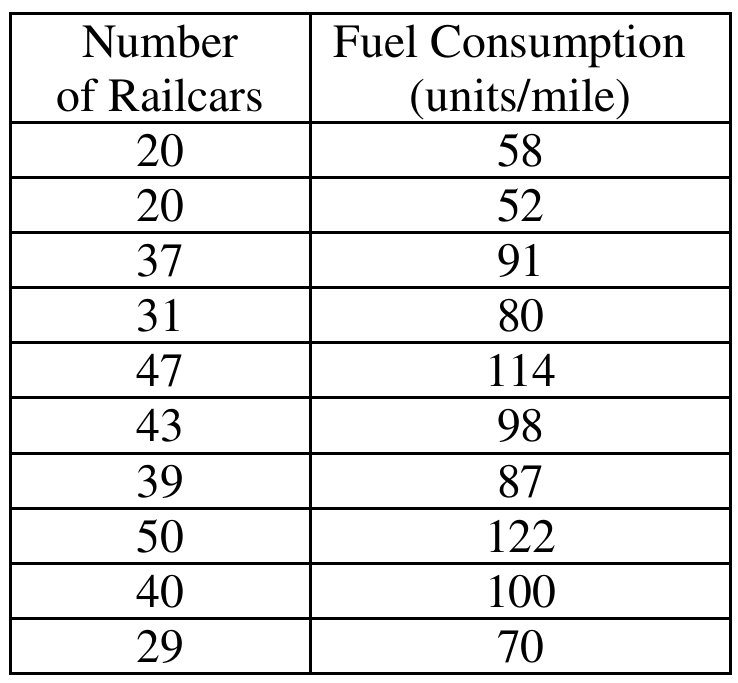
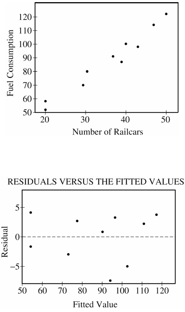
Yes, a linear model is appropriate. The scatterplot of fuel consumption versus number of railcars shows a strong, positive, linear pattern with points falling close to a line. The residual plot backs this up — the residuals are scattered randomly above and below zero with no obvious curve or pattern, which means a straight line is capturing the relationship well.
\( \boxed{\text{Yes — strong linear pattern in scatterplot and no pattern in residual plot}} \)
(b)
The slope of the regression line tells us how much fuel consumption changes per railcar:
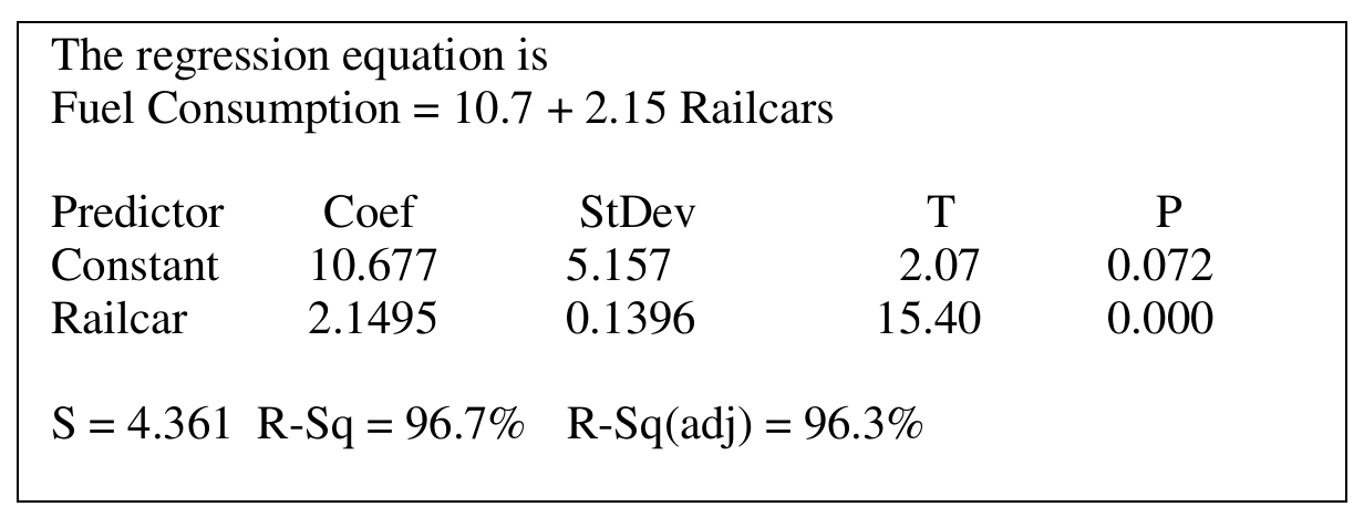
\( \text{slope} = 2.15 \text{ units/mile per railcar} \)
Each unit of fuel costs \$25, so multiply the slope by the cost per unit:
\( \text{cost change} = 2.15 \times \$25 \)
\( \text{cost change} = \$53.75 \)
\( \boxed{\$53.75 \text{ per additional railcar}} \)
(c)
The value \(r^2=96.7\%\) tells us how much of the variation in fuel consumption is accounted for by the linear relationship with the number of railcars. Putting it in plain terms:
\( \boxed{96.7\%\text{ of the variation in fuel consumption is explained by the linear relationship with number of railcars}} \)
(d)
No, it would not be reasonable. Looking at the data table, the number of railcars only ranges from 20 to 50, and 65 falls well outside that range. Using the regression line to predict fuel consumption at 65 railcars means extrapolating beyond the data we actually collected, and there’s no guarantee the same linear relationship continues to hold out there.
\( \boxed{\text{No — 65 railcars is outside the observed range (20 to 50), so this would be extrapolation}} \)
Question
Most-appropriate topic codes (AP Statistics):
• Topic 5.2 — Correlation (Part b)
• Topic 5.3 — Linear Regression Models (Parts b, c)
• Topic 5.4 — Residuals (Part c)
▶️ Answer/Explanation
(a)
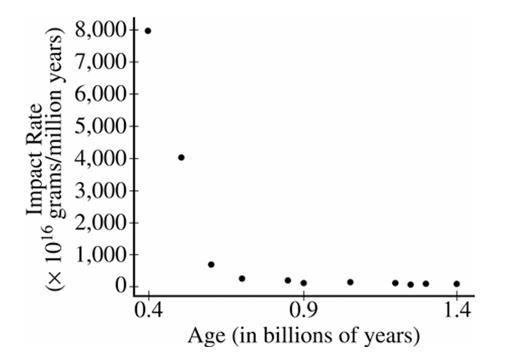
The relationship between impact rate and age is negative and nonlinear (curved). As age increases, impact rate decreases, but not at a constant rate — the decrease is very steep for craters with ages less than about 0.7 billion years, and then the impact rate levels off and remains close to zero for older craters. The spread of the data also decreases as age increases, suggesting a fan-shaped, non-constant variance pattern.
(b)
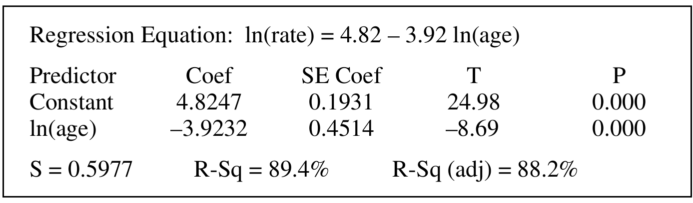
The value of \(r^2 = 0.894\), or \(89.4\%\).
This means that approximately \(89.4\%\) of the variability in \(\ln(\text{rate})\) is explained by the linear relationship with \(\ln(\text{age})\). In other words, after taking logarithms of both variables, the linear model accounts for nearly \(89.4\%\) of the variation seen in the log-transformed impact rate values among the 11 craters studied.
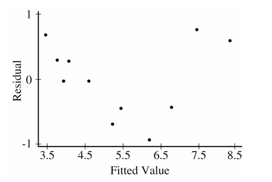
(c)
The linear regression model is appropriate for the log-transformed variables. Here’s the reasoning:
First, the residual plot shows no obvious curved pattern — the residuals appear to be scattered roughly randomly around zero, with no systematic curvature, which supports linearity.
Second, the residuals do not show a clear fan shape (no dramatic increase in spread), so the equal variance condition appears reasonably satisfied.
Third, the \(R^2\) value of \(89.4\%\) is quite high, indicating the linear model fits the transformed data well.
However, one concern is that the residual plot shows a slight tendency for residuals to be negative in the middle range of fitted values and positive at the extremes, hinting at a mild pattern. Given the small sample size of only 11 observations, this could simply be due to natural sampling variability. Overall, the linear model on the log-transformed data is a reasonable fit.