
AP Statistics 5.3 Linear Regression Models- Exam Style Questions - FRQs - New Syllabus
Question
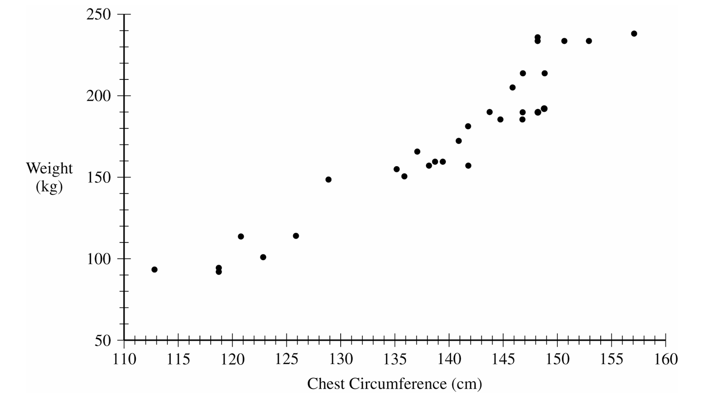
(ii) Calculate the residual for this male tule elk. Show your work.
$H_a: \beta \ne 4.5$
(ii) At a significance level of $\alpha = 0.05$, what conclusion should the wildlife biologist make regarding the slope of the population regression line for male tule elk? Justify your response.
Most-appropriate topic codes (AP Statistics):
• Topic \(5.3\) — Linear Regression Models (Parts \( \mathrm{b} \), \( \mathrm{c} \))
• Topic \(5.4\) — Residuals (Part \( \mathrm{d} \))
• Topic \(5.5\) — Least-Squares Regression (Part \( \mathrm{d} \))
▶️ Answer/Explanation
(a)
The relationship between chest circumference and weight of male tule elk is strong, positive, and linear. As the chest circumference of male tule elk increases, their weight tends to increase.
When describing a scatterplot, always cover the Direction, Form, and Strength (DFS), and make sure to include context by explicitly naming the variables (chest circumference and weight).
(b) (i)
$\text{predicted weight} = -350.3 + 3.7455(145.9)$
$\text{predicted weight} = 196.168 \text{ kg}$
(b) (ii)
$\text{residual} = \text{actual weight} – \text{predicted weight}$
$\text{residual} = 204.3 – 196.168$
$\text{residual} = 8.132 \text{ kg}$
(c)
For each additional centimeter increase in chest circumference, the predicted weight of a male tule elk increases by $3.7455$ kilograms.
(d) (i)
The degrees of freedom for regression slope inference is $df = n – 2$. With a sample size of $n = 30$, $df = 30 – 2 = 28$.
Using the t-distribution table with $df = 28$ and a test statistic of $t = 3.408$, the one-tail area is exactly $0.001$.
Since the alternative hypothesis ($H_a: \beta \ne 4.5$) is two-sided, the p-value is $2 \times 0.001 = 0.002$.
(d) (ii)
Because the p-value of $0.002$ is less than the significance level of $\alpha = 0.05$, we reject the null hypothesis.
There is convincing statistical evidence to conclude that the slope of the population regression line relating chest circumference to weight for male tule elk is different than $4.5$ kg/cm.
Question
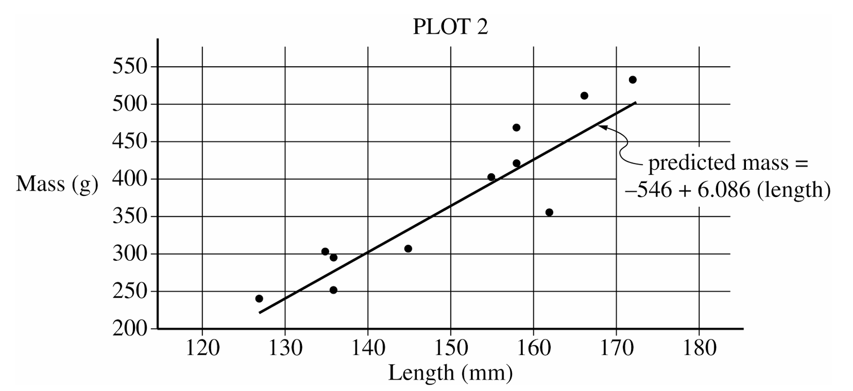
(ii) Does the least-squares regression line overestimate or underestimate the mass of the bullfrog identified in part (d-i)? Explain your answer.
Most-appropriate topic codes (AP Statistics):
• Topic \(5.3\) — Linear Regression Models (Parts \( \mathrm{b} \), \( \mathrm{c} \), \( \mathrm{d} \))
▶️ Answer/Explanation
(a)
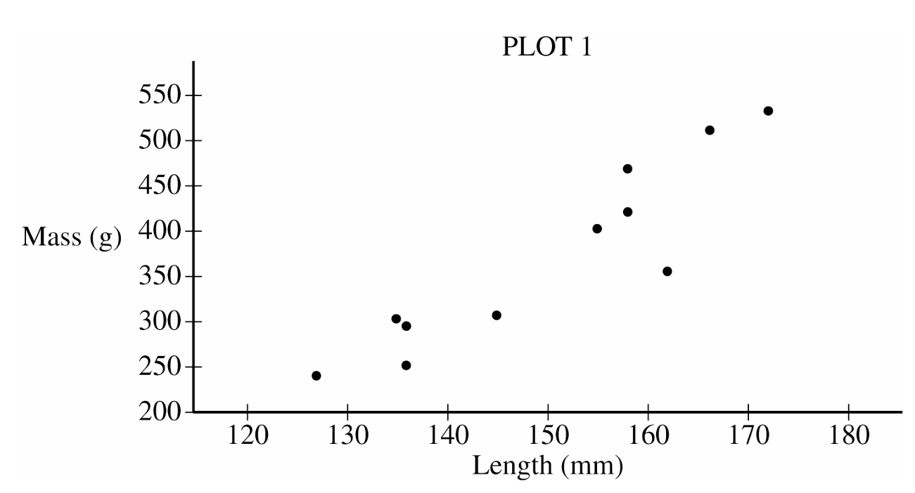
The scatterplot reveals a strong, positive, roughly linear association between the mass and length of bullfrogs. There are no points that seriously deviate from the straight-line pattern of the points in the plot.
(b)
The value of the slope of the least-squares regression line is 6.086. This value indicates that the predicted mass of a bullfrog increases by 6.086 grams for each additional millimeter of length.
(c)
The coefficient of determination is $r^2 \approx 0.819$. This value indicates that 81.9% of the variation in bullfrog mass can be explained by variation in bullfrog length as described by the least-squares line.
(d)(i)
The largest residual in absolute value belongs to the bullfrog with length 162 mm and mass 356 grams.
(d)(ii)
The least-squares regression line overestimates the mass of the bullfrog with length 162 mm. Plot 2 shows that the point for the bullfrog with length 162 mm is below the least-squares regression line.
Question
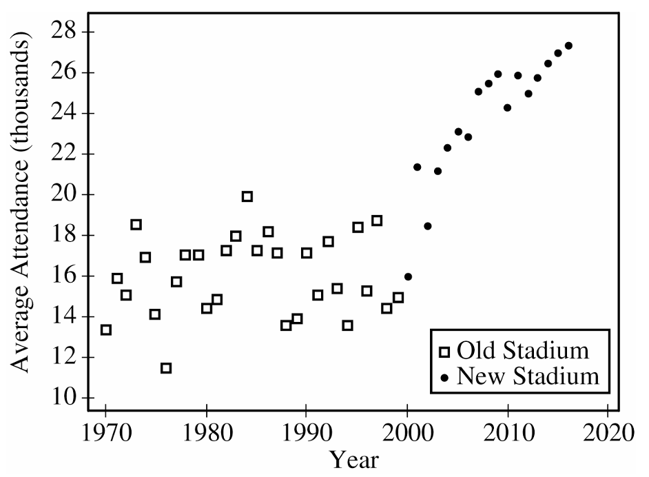
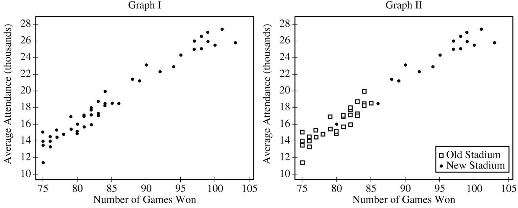
ii. Graph II shows the same information as Graph I, but also indicates the old and new stadiums. Does Graph II suggest that the rate at which attendance changes as number of games won increases is different in the new stadium compared to the old stadium? Explain your reasoning.
Most-appropriate topic codes (AP Statistics):
• Topic \(5.1\) — Graphical Representations Between Two Quantitative Variables (Parts \( \mathrm{b} \), \( \mathrm{c} \))
• Topic \(5.3\) — Linear Regression Models (Parts \( \mathrm{c} \), \( \mathrm{d} \))
▶️ Answer/Explanation
(a)
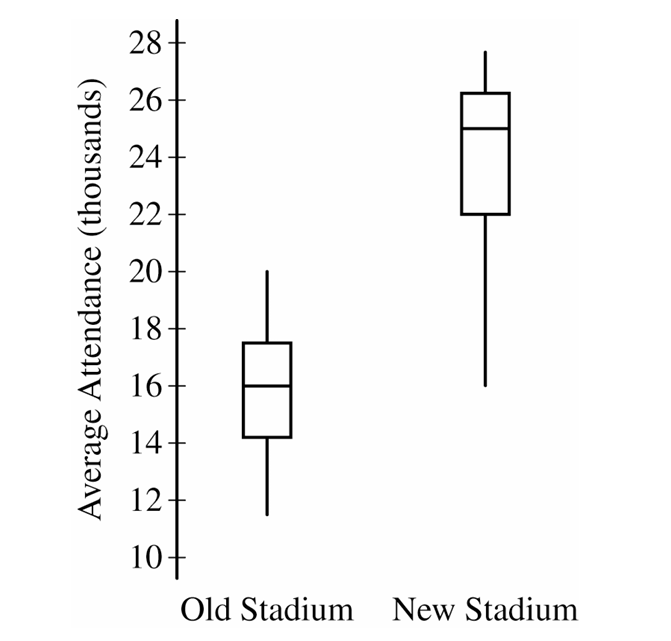
The median average attendance is noticeably higher in the new stadium (around \(25,000\)) compared to the old stadium (around \(16,000\)).
While the interquartile ranges are fairly similar, indicating comparable variability in the middle \(50\%\) of attendance figures, the overall range is slightly wider for the new stadium.
Neither stadium’s distribution shows any clear outliers.
(b)
Average attendance in the old stadium remained relatively flat over time with no clear upward or downward trend.
In contrast, the new stadium exhibits a strong, positive, upward trend in average attendance over the years it was actively used.
(c)(i)
There is a strong, positive, linear relationship between the number of games won and the average attendance for each year.
(c)(ii)
No, the rate of change appears to be roughly the same for both stadiums.
If you drew separate lines of best fit through the points representing the old stadium and the new stadium, the slopes of both lines would be nearly identical, meaning attendance increases at a similar rate per win regardless of the venue.
(d)
The number of games won could serve as a confounding variable when assessing the relationship between the stadium type and average attendance.
Since the team won significantly more games playing in the new stadium, and winning is strongly associated with higher attendance, it’s impossible to tell if the attendance spike was caused by the appeal of the new stadium or simply because the team was performing better on the field.
Question
Most-appropriate topic codes (AP Statistics):
• Topic \(5.3\) — Linear Regression Models (Parts \( \mathrm{a} \), \( \mathrm{b} \))
▶️ Answer/Explanation
(a)
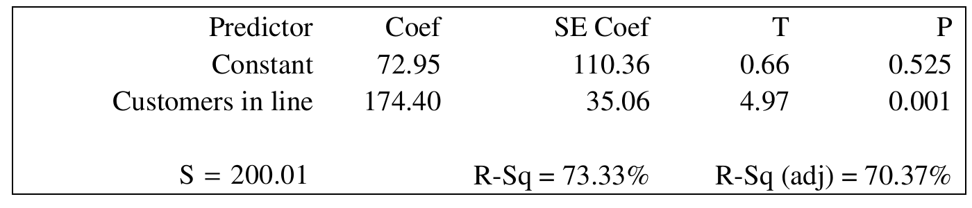
The estimate of the intercept is $72.95$.
Detailed Solution:
To find the intercept, we look at the computer output table under the “Coef” column right next to “Constant”, which is $72.95$.
In the context of the problem, the $y$-intercept represents the predicted $y$-value when $x=0$.
Therefore, if a customer gets into a line with $0$ people ahead of them, we predict their checkout process will take an average of $72.95$ seconds.
(b)
The coefficient of determination is $r^{2}=73.33\%$.
Detailed Solution:
The coefficient of determination is clearly labeled as “$R\text{-}Sq$” in the given computer output, which reads $73.33\%$.
This metric tells us the proportion of variance in the response variable that is predictable from the explanatory variable.
So, we can comfortably say that about $73.33\%$ of the changes in the total checkout time are directly accounted for by the linear relationship with the number of customers waiting in line.
(c)
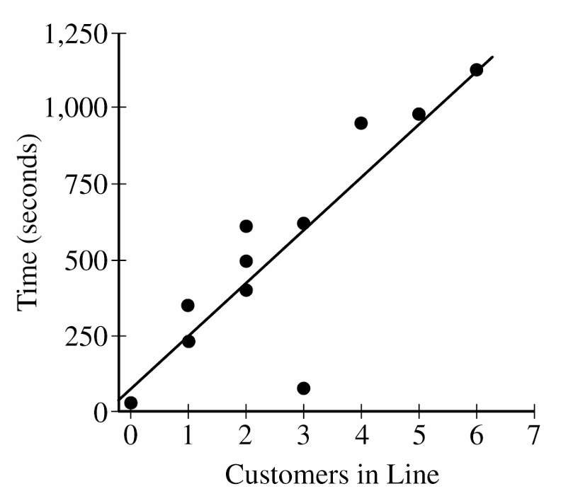
The outlier is the point with $x=3$ and $y$ close to $100$ (this point should be circled on the scatterplot).
This point is considered an outlier because the combination of $x$ and $y$ values differs from the pattern of the rest of the data. Specifically, the value of $y$ (time to finish checkout) is much lower than would be expected when there are $x=3$ customers in line in front of the selected customer, given the remaining data.
Detailed Solution:
When observing the scatterplot, most data points cluster relatively close to the least-squares regression line, showing a clear positive trend.
However, there is one distinct point at $(3, \sim 100)$ that sits far below the regression line.
This point is considered an outlier because the checkout time is unusually fast for having $3$ customers in front, severely breaking the linear pattern established by the rest of the sample.
Question
Most-appropriate topic codes (AP Statistics):
• Topic \(5.3\) — Linear Regression Models (Part \( \mathrm{b} \))
• Topic \(5.4\) — Residuals (Part \( \mathrm{c} \))
▶️ Answer/Explanation
(a)(i) Positive:
A positive relationship means that wolves with greater length also tend to have greater weight — so as one variable goes up, so does the other. Think of it visually: the data points on the scatterplot trend upward from left to right when length \(x\) is plotted on the horizontal axis and weight \(y\) on the vertical axis.
(a)(ii) Linear:
A linear relationship means that as the length of a wolf increases by one meter, the weight tends to change by a roughly constant amount on average. In other words, the pattern of the data follows a straight-line shape rather than a curve.
(a)(iii) Strong:
A strong relationship means that the data points fall close to the regression line, so there is little scatter around it. Equivalently, the observed weights are close to the predicted weights — the residuals are generally small.
(b)
The least-squares regression equation is
\(\hat{y} = -16.46 + 35.02x\)
The slope \(35.02\) means that for every one-meter increase in the length of a wolf, the predicted weight increases by \(35.02\) kilograms, on average. In other words, two wolves that differ by one meter in length are predicted to differ by \(35.02\) kg in weight, with the longer wolf expected to be heavier.
\(\boxed{\text{For each 1-meter increase in length, predicted weight increases by } 35.02 \text{ kg}}\)
(c)
Recall the residual formula:
\(\text{Residual} = \text{Actual weight} – \text{Predicted weight}\)
First, find the predicted weight for \(x = 1.4\) meters:
\(\hat{y} = -16.46 + 35.02(1.4)\)
\(\hat{y} = -16.46 + 49.028 = 32.568 \text{ kg}\)
Now use the residual to find the actual weight:
\(\text{Actual weight} = \hat{y} + \text{Residual}\)
\(\text{Actual weight} = 32.568 + (-9.67)\)
\(\boxed{\text{Actual weight} = 22.898 \approx 22.9 \text{ kg}}\)
Question
Most-appropriate topic codes (AP Statistics):
• Topic \(5.2\) — Correlation (Part \( \mathrm{e} \))
• Topic \(5.3\) — Linear Regression Models (Part \( \mathrm{b} \))
• Topic \(1.9\) — Comparisons of the Distributions for One Quantitative Variable (Part \( \mathrm{d} \))
▶️ Answer/Explanation
(a)
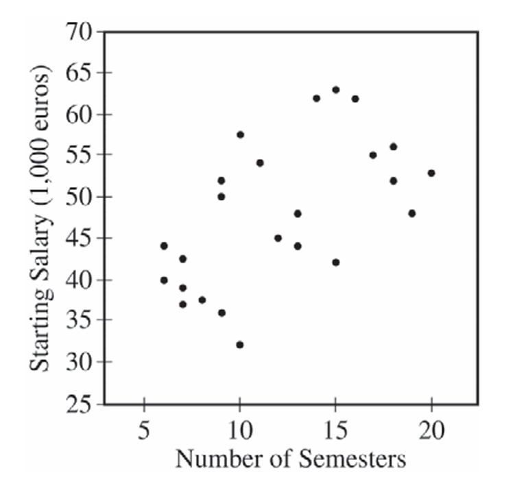
Yes, the scatterplot supports the newspaper report. The scatterplot shows a positive association between the number of semesters needed to complete an academic program and starting salary — as the number of semesters increases, starting salary tends to increase as well. This is consistent with the newspaper’s claim that more semesters are associated with a greater starting salary.
(b)
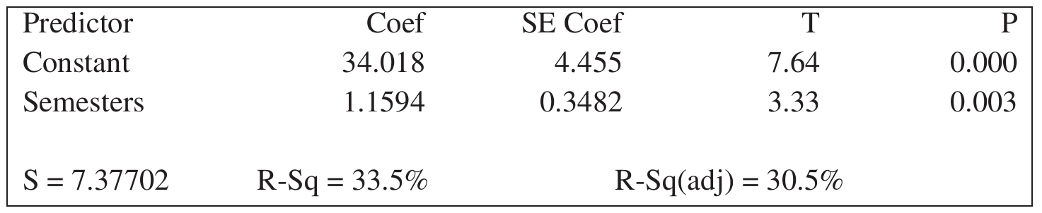
The slope of the least-squares regression line is \(b_1 = 1.1594\).
The least-squares regression equation is:
\( \hat{y} = 34.018 + 1.1594x \)
Interpretation: For each additional semester needed to complete an academic program, the predicted starting salary in the first year of a job increases by approximately €1,159.40 (i.e., 1.1594 thousand euros).
(c)
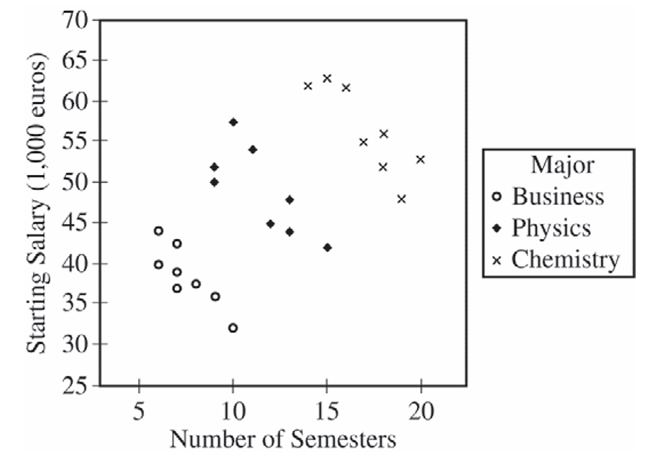
For the business majors alone, there is a strong, negative, linear association between the number of semesters and starting salary. Business majors who need more semesters to complete their academic program tend to have lower starting salaries — which is the opposite direction from the overall trend seen in the combined scatterplot.
(d)
Business majors have the lowest median starting salary, at approximately €38,000. Physics majors have the next highest median starting salary, at approximately €48,000. Chemistry majors have the highest median starting salary, at approximately €55,000.
So in order from lowest to highest median starting salary: Business \(\approx\) €38,000 < Physics \(\approx\) €48,000 < Chemistry \(\approx\) €55,000.
(e)
The newspaper report should be modified to account for the major of each person. The overall positive association in the original report is largely explained by the fact that different majors — chemistry, physics, and business — tend to require different numbers of semesters and also have very different starting salary levels. Chemistry majors take more semesters on average and also earn the highest salaries; business majors take fewer semesters and earn the lowest salaries. This creates an apparent positive association when all three majors are pooled together.
However, within each individual major, students who take a greater number of semesters to complete their program tend to have lower starting salaries, not higher. The newspaper report should therefore be revised to state that, while majors requiring more semesters overall tend to have higher starting salaries (chemistry highest, physics next, business lowest), within any given major, taking more semesters to complete the program is associated with a lower starting salary.
Question
RSquare 0.250401
Root Mean Square Error 0.902382
Observations 66

Most-appropriate topic codes (AP Statistics):
• Topic \(5.4\) — Residuals (Parts \( \mathrm{a} \), \( \mathrm{b} \), \( \mathrm{c} \), \( \mathrm{d} \))
• Topic \(5.5\) — Least-Squares Regression (Part \( \mathrm{a} \))
▶️ Answer/Explanation
(a)
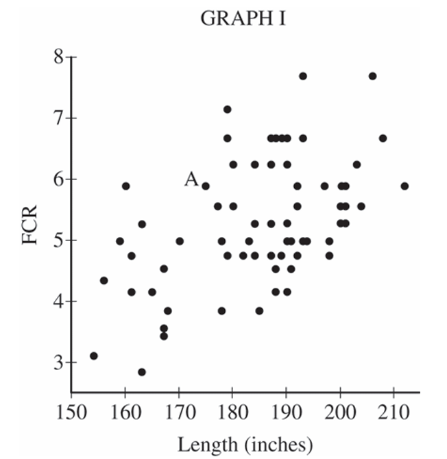
Plug the length of 175 inches into the least squares regression equation to get the predicted FCR:
\(\widehat{\text{FCR}} = -1.595789 + 0.0372614 \times 175\)
\(\widehat{\text{FCR}} \approx 4.92 \text{ gallons per 100 miles}\)
Now compute the residual using the formula \(\text{residual} = \text{observed} – \text{predicted}\):
\(\text{residual} = 5.88 – 4.92 = 0.96\)
\(\boxed{\text{residual} \approx 0.96 \text{ gallons per 100 miles}}\)
The residual of \(0.96\) means that this car’s actual FCR is \(0.96\) gallons per 100 miles higher than what the least squares regression line would predict for a car of length 175 inches — so the model underestimates the fuel consumption for this particular car.
(b)(i)
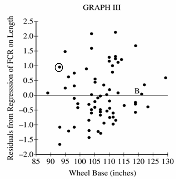
Point A has a wheel base of 93 inches and a residual of approximately \(0.96\) gallons per 100 miles (from part a). So on Graph III, the point to circle is the one located at approximately \((93,\ 0.96)\).
\(\boxed{\text{Circle the point at wheel base} = 93 \text{ in., residual} \approx 0.96}\)
(b)(ii)
A residual very close to 0 means the observed FCR and the predicted FCR (from the regression of FCR on length) are nearly equal for that car — in other words, the length-based regression model predicts that car’s fuel consumption almost perfectly, leaving very little unexplained.
\(\boxed{\text{The car’s actual FCR} \approx \text{its FCR predicted by the length-based regression line}}\)
(c)
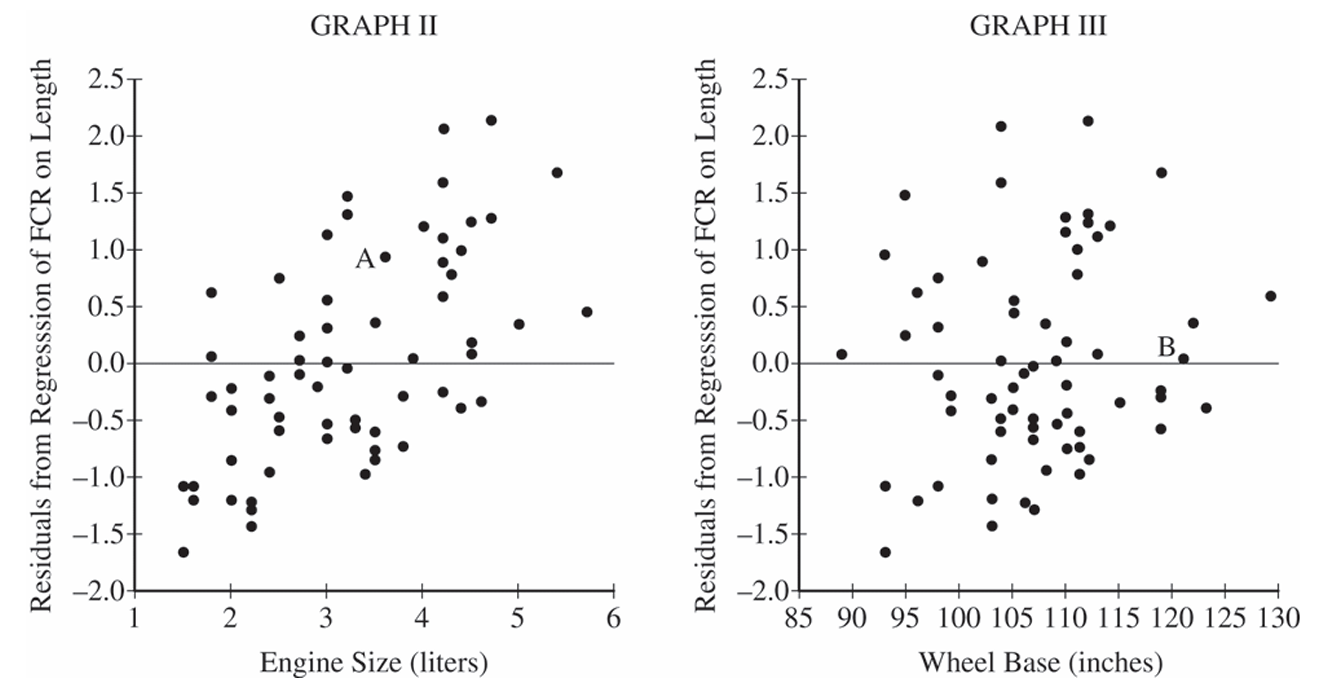
Graph II shows a moderate, positive, linear association between engine size and the residuals from the regression of FCR on length — as engine size increases, the residuals tend to increase as well. Graph III, on the other hand, shows little to no discernible pattern between wheel base and those same residuals; the points are scattered without any clear direction or trend. Overall, the association in Graph II is noticeably stronger than in Graph III.
(d)
Jamal should add engine size to the model along with length.
Because Graph II shows a stronger association between engine size and the residuals from the length-only regression, adding engine size will explain more of the leftover variability that length alone cannot account for. Wheel base shows almost no relationship with those residuals (Graph III), so including it would do little to improve the model’s predictions.
\(\boxed{\text{Choose engine size — it has a stronger association with the residuals, reducing unexplained variability more effectively.}}\)
Question
Most-appropriate topic codes (AP Statistics):
• Topic 5.3 — Linear Regression Models (Part b)
• Topic 5.2 — Correlation (Part c)
▶️ Answer/Explanation
(a)
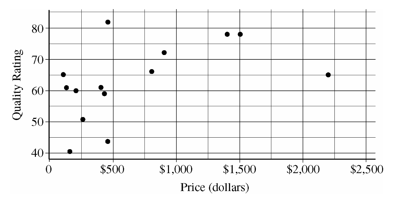
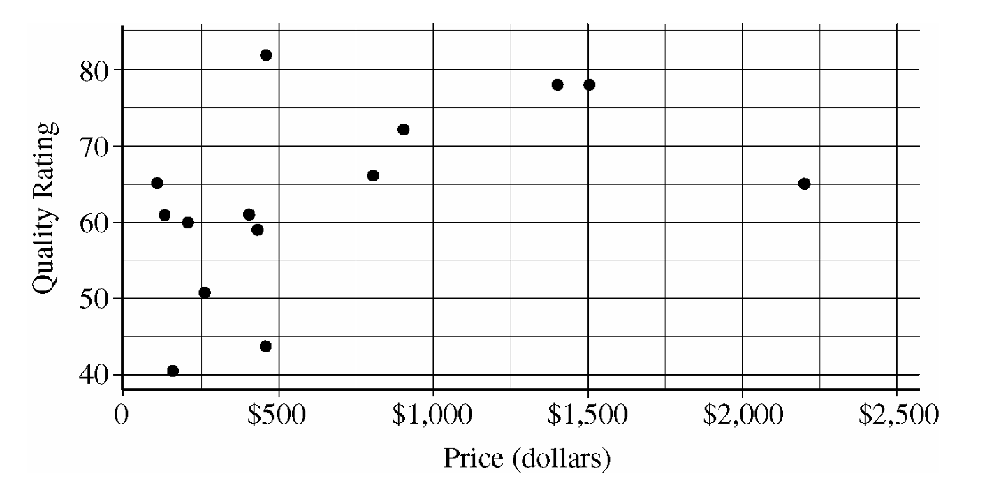
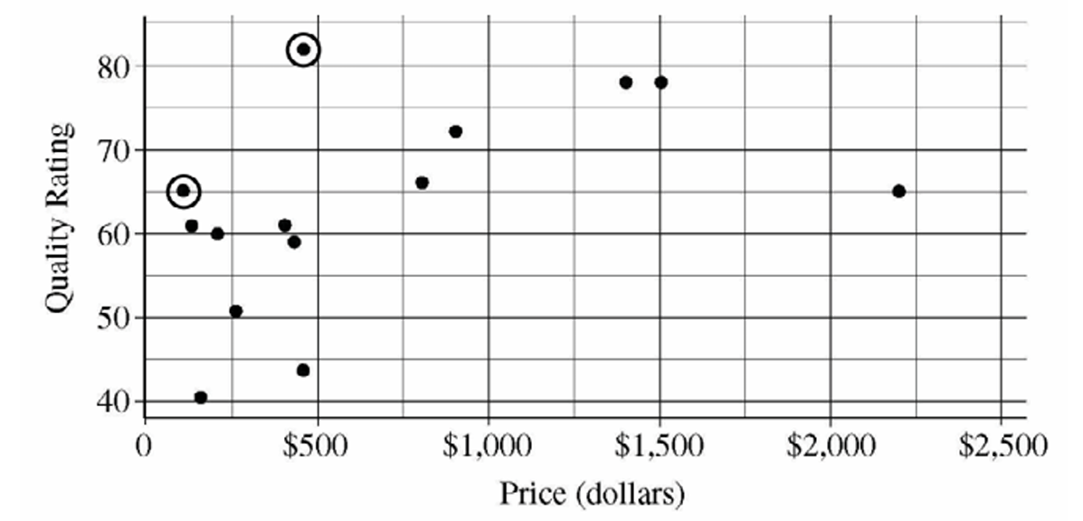
The data show a weak to moderate, positive association between price and quality rating for these sewing machines.
The overall form of the relationship is curved or nonlinear rather than a straight line.
Among the machines costing under \$500, there appears to be little to no visible association between price and quality rating.
However, machines costing above \$500 generally tend to achieve much higher quality ratings than the cheaper group, which creates the overall positive direction.
(b)
The machine that most heavily influences and reduces the appropriateness of a linear regression model is the one located at an approximate price of \(\$2,200\) with a quality rating of approximately \(65\).
The general trend among the other four machines priced over \$500 suggests that quality starts to level off or approach a maximum potential limit rather than increasing continuously with price.
This particular \(\$2,200\) sewing machine is the absolute most expensive model in the entire dataset, yet its quality rating drops significantly compared to the models around \$1,500.
Including this point in a linear regression model would heavily drag the least-squares line down toward it, creating a poor overall fit for the rest of the data points.
(c)
According to Chris’s rule, he wants a machine only if there isn’t another choice available that is both cheaper and higher in quality. Following this strategy, only two models fit his standard and should be circled on the scatterplot:
1. The model positioned at a price slightly above \(\$100\) with a quality rating of \(65\).
2. The model positioned at a price slightly below \(\$500\) with a quality rating of \(81\) (or \(82\)).
The data points corresponding to these two machines have been circled on the scatterplot below.
Question
Most-appropriate topic codes (AP Statistics):
• Topic 5.5 — Least-Squares Regression (Part c)
• Topic 5.3 — Linear Regression Models (Part d)
▶️ Answer/Explanation
(a)
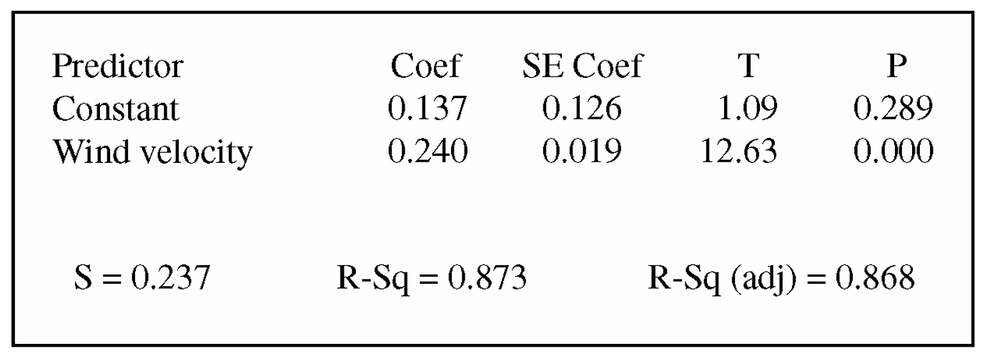
From the table, the $y$-intercept (constant coefficient) is $0.137$ and the slope coefficient (wind velocity coefficient) is $0.240$.
$\widehat{\text{Electricity Production}} = 0.137 + 0.240 \times (\text{Wind Velocity})$
(b)
The slope coefficient, $b_1 = 0.240$, indicates that each additional mph of wind speed increases expected electricity generation by $0.240$ amperes.
The difference in wind velocities is $25 – 15 = 10 \text{ mph}$.
$\text{Expected Increase} = 10 \times 0.240 = 2.40 \text{ amperes}$
Alternatively, calculating predicted values individually gives $\hat{y}_{25} = 0.137 + 0.240(25) = 6.137$ and $\hat{y}_{15} = 0.137 + 0.240(15) = 3.737$, yielding a difference of $6.137 – 3.737 = 2.40 \text{ amperes}$.
(c)
The proportion of variation in the response variable explained by the linear model is given by the coefficient of determination, $R^2$.
From the output, $R\text{-Sq} = 87.3\%$.
Therefore, $0.873$ (or $87.3\%$) of the variation in electricity production is explained by the linear relationship with wind speed.
(d)
Yes, there is statistically significant evidence of a linear relationship.
The row for the “Wind Velocity” explanatory variable shows a $t$-test statistic of $12.63$ and a corresponding $p$-value of $0.000$.
Because the $p$-value is essentially $0$, which is less than any common significance level (such as $\alpha = 0.05$ or $\alpha = 0.01$), we reject the null hypothesis that the true population slope is zero ($\beta_1 = 0$) and conclude that wind velocity is a useful linear predictor of electricity output.
Question
Most-appropriate topic codes (AP Statistics):
• Topic 4.1 — Sampling Distributions for Sample Means (Parts c, d)
• Topic 5.5 — Least-Squares Regression (Part e)
• Topic 1.13 — Experimental Design (Part f)
▶️ Answer/Explanation
(a)
(b)
(c)
(d)
(e)
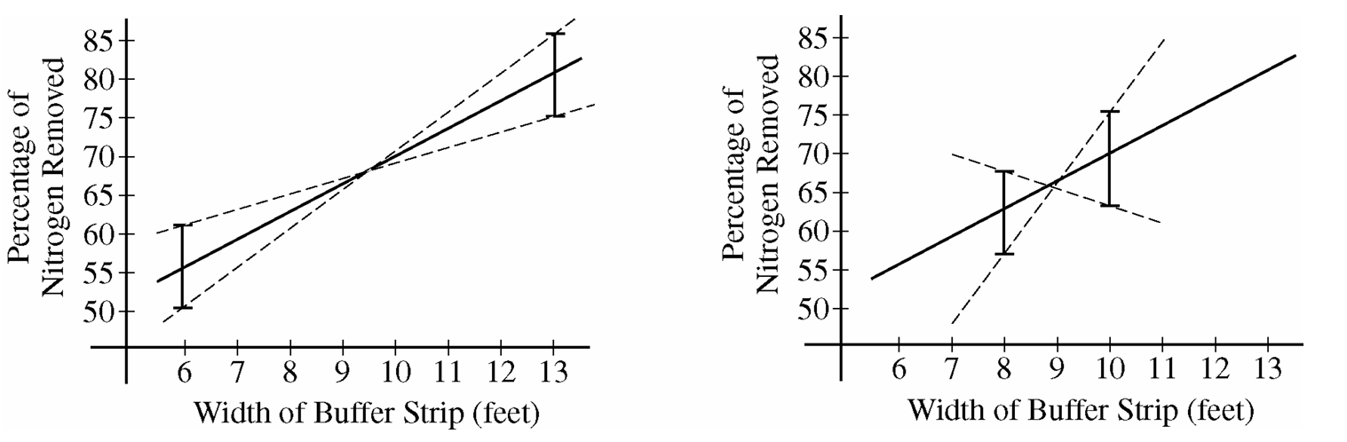
(f)
Question
ii. the experimental units
iii. the response that will be measured

ii. Based on your graph, do you think a linear regression model is appropriate? Explain.
Most-appropriate topic codes (AP Statistics):
• Topic 5.1 — Graphical Representations Between Two Quantitative Variables (Part b.i)
• Topic 5.3 — Linear Regression Models (Part b.ii)
▶️ Answer/Explanation
(a)
i. The treatments: The five different concentrations of garlic oil infused into the food granules, which are 0%, 2%, 10%, 25%, and 50%.
ii. The experimental units: The 40 individual European starlings (or the individual cages housing each bird).
iii. The response that will be measured: The number of food granules consumed by an individual bird during the two-hour period.
(b)
i. Graph construction:
To investigate linearity, we construct a scatterplot with Garlic Oil Concentration (%) on the horizontal $x$-axis and Mean Number of Food Granules Consumed on the vertical $y$-axis.
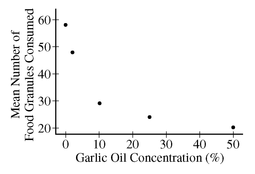
The points to plot are $(0, 58)$, $(2, 48)$, $(10, 29)$, $(25, 24)$, and $(50, 20)$.
ii. Linearity Assessment:
No, a linear regression model is not appropriate.
The scatterplot reveals a clear, distinct curved pattern rather than a straight line trend.
As the garlic oil concentration increases, the mean number of food granules consumed drops sharply at first and then begins to level off, indicating a non-linear relationship.
Question
Most-appropriate topic codes (AP Statistics):
• Topic \(5.4\) — Residuals (Parts \(\mathrm{b}\), \(\mathrm{c}\))
• Topic \(5.5\) — Least-Squares Regression (Parts \(\mathrm{a}\), \(\mathrm{b}\), \(\mathrm{c}\), \(\mathrm{e}\))
• Topic \(4.8\) — Justifying a Claim Based on a Confidence Interval for the Difference Between Two Population Means (Part \(\mathrm{d}\))
▶️ Answer/Explanation
(a)
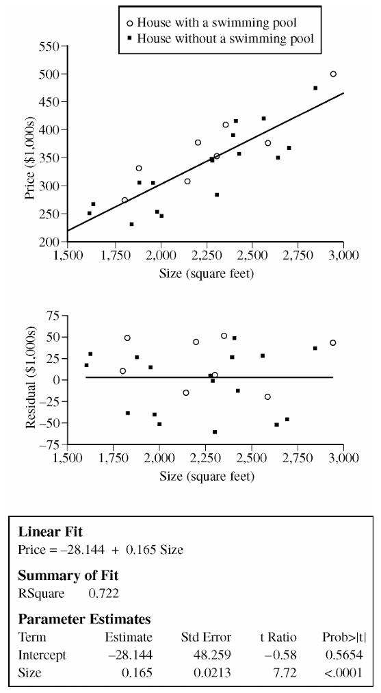
The slope of the least squares regression line is \(0.165\) (in thousands of dollars per square foot).
In context: for each additional square foot of house size, the predicted price of the house increases by \(0.165\) thousand dollars, or \$165, on average.
The slope tells us the rate at which the model expects price to grow with size — not a guarantee for any individual house, but the average trend across houses in this part of the city.
(b)
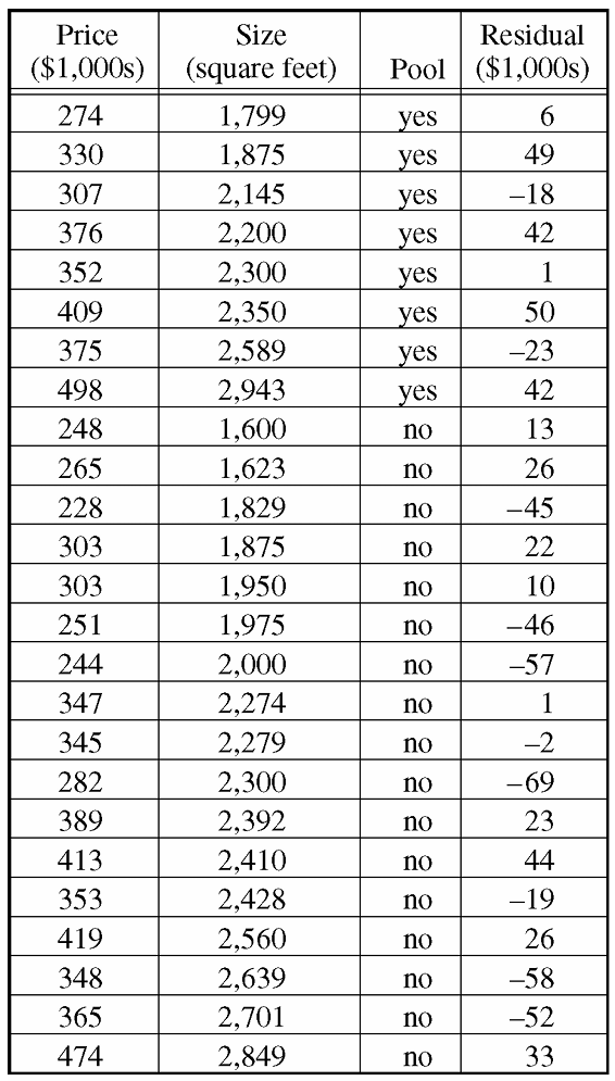
The residual value of 49 for this house indicates that its actual price is 49 thousand dollars higher than the model would predict for a house of its size.
(c)
We estimate the pool premium by comparing the average residuals of the two groups. If a group’s residuals average positive, the model consistently underestimates their prices; if negative, it overestimates.
Houses with a swimming pool (8 houses, residuals: \(6, 49, -18, 42, 1, 50, -23, 42\)):
\(\bar{e}_{\text{pool}} = \frac{6 + 49 + (-18) + 42 + 1 + 50 + (-23) + 42}{8} = \frac{149}{8} = 18.625 \text{ thousand dollars}\)
Houses without a swimming pool (17 houses, residuals: \(13, 26, -45, 22, 10, -46, -57, 1, -2, -69, 23, 44, -19, 26, -58, -52, 33\)):
\(\bar{e}_{\text{no pool}} = \frac{13 + 26 + (-45) + 22 + 10 + (-46) + (-57) + 1 + (-2) + (-69) + 23 + 44 + (-19) + 26 + (-58) + (-52) + 33}{17} = \frac{-150}{17} \approx -8.824 \text{ thousand dollars}\)
The estimated price premium for a swimming pool is the difference between these two averages:
\(\bar{e}_{\text{pool}} – \bar{e}_{\text{no pool}} = 18.625 – (-8.824) = \boxed{27.4 \text{ thousand dollars}}\)
This tells us that, for two houses of the same size, the one with a swimming pool is estimated to cost about \$27,400 more. The logic: pool houses have residuals that average \$18,625 above the model’s predictions, while no-pool houses sit \$8,824 below — that gap reflects the pool’s unmodeled contribution to price.
(d)
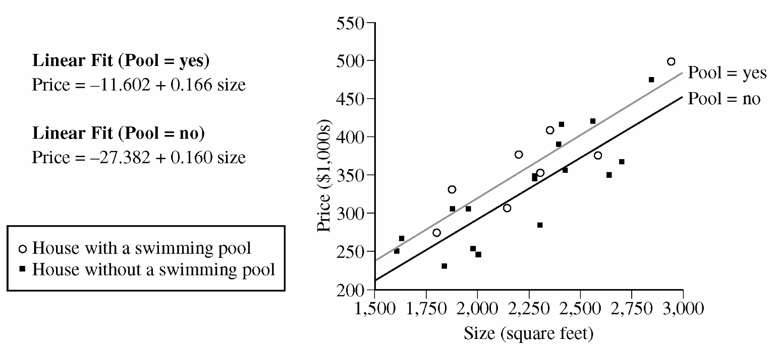
The 95% confidence interval for the true difference in slopes is \((-0.099,\ 0.110)\).
Since this interval contains zero, we cannot conclude there is a statistically significant difference between the two slopes at the 5% significance level. Zero is a plausible value for the true difference, which means it is entirely possible that the two population regression lines have the same slope.
In practical terms: the rate at which price increases with size appears to be the same for pool homes and non-pool homes — a pool shifts the price up by a roughly constant amount, but doesn’t change how sensitive the price is to square footage.
(e)
Since the two slopes are not significantly different, we pick a house size within the data range — say, \(\text{size} = 2{,}250\) sq ft (near the center of the distribution) — and compare predicted prices from both models.
Predicted price with pool:
\(\widehat{\text{Price}}_{\text{pool}} = -11.602 + 0.166 \times 2250 = -11.602 + 373.500 = 361.898 \text{ thousand dollars}\)
Predicted price without pool:
\(\widehat{\text{Price}}_{\text{no pool}} = -27.382 + 0.160 \times 2250 = -27.382 + 360.000 = 332.618 \text{ thousand dollars}\)
Estimated price premium for a pool:
\(361.898 – 332.618 = \boxed{29.280 \text{ thousand dollars} \approx \$29{,}280}\)
Comparison with part (c): The estimate from part (e), approximately \$29,280, is quite similar to the \$27,400 estimate obtained in part (c) from the residual averages. Both methods point to a pool adding roughly \$27,000–\$29,000 to the price of a house, giving us confidence that this is a reasonable estimate of the pool’s effect regardless of which approach we use.
Note — Alternative approach (difference in intercepts): Because the slopes were found not to be significantly different, we can also subtract the two fitted equations directly:
\((-11.602 + 0.166 \cdot x) – (-27.382 + 0.160 \cdot x) = 15.780 + 0.006 \cdot x\)
This gives the price difference as a function of size. For \(x = 2250\): \(15.780 + 0.006 \times 2250 = 15.780 + 13.500 = 29.280\), consistent with the calculation above.
Question
(b)
Most-appropriate topic codes (AP Statistics):
• Topic 4.5 — Carrying Out a Test for a Population Mean or Population Mean Difference (Part \(\mathrm{a}\))
• Topic 5.3 — Linear Regression Models (Part \(\mathrm{b}\))
• Topic 5.2 — Correlation (Part \(\mathrm{c}\))
• Topic 5.5 — Least-Squares Regression (Parts \(\mathrm{b}\), \(\mathrm{c}\), \(\mathrm{d}\))
▶️ Answer/Explanation
(a)
Step 1 — Hypotheses
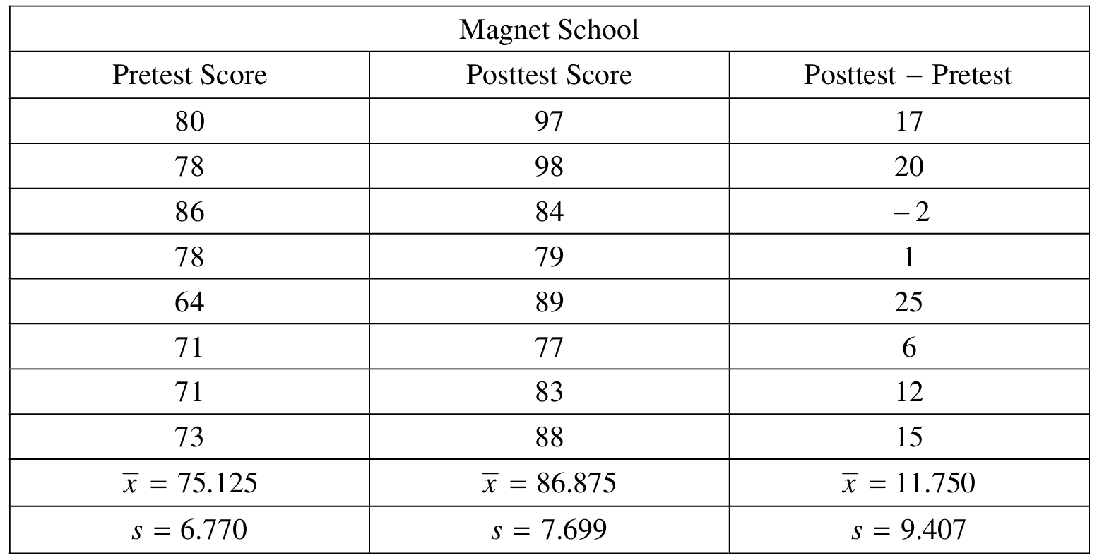
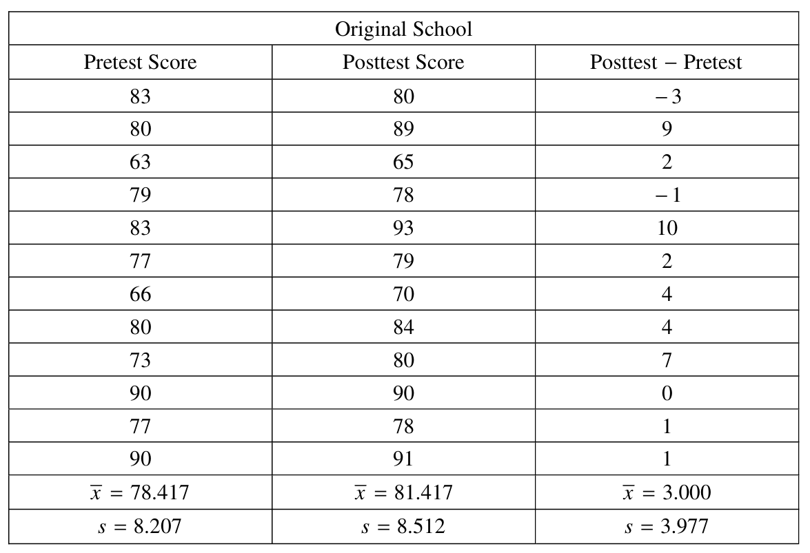
Let \(\mu_{\text{DiffM}}\) = the mean difference (posttest \(-\) pretest) for all students at the magnet school, and \(\mu_{\text{DiffO}}\) = the mean difference for all students who applied but were not selected and attended their original school.
\(H_0: \mu_{\text{DiffM}} = \mu_{\text{DiffO}}\)
\(H_a: \mu_{\text{DiffM}} > \mu_{\text{DiffO}}\)
Step 2 — Test and Conditions
We use a two-sample \(t\)-test for the difference of two means:
\(t = \dfrac{\bar{x}_M – \bar{x}_O}{\sqrt{\dfrac{s_M^2}{n_M} + \dfrac{s_O^2}{n_O}}}\)
- We need to assume randomness of the sampling used. It was stated in the stem that the students from the two different schools were randomly selected.
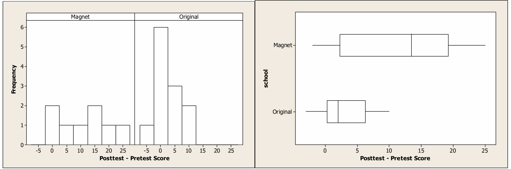
- We need to check the assumption that the distributions of differences (posttest – pretest) for each of the two schools are normally distributed. Based on histograms and boxplots of these differences, there are no outliers or extreme skewness. Because these graphs reveal no obvious departures from normality, it appears reasonable to proceed with the t-test.
Step 3 — Test Statistic and \(p\)-value
\(t = \dfrac{11.750 – 3.000}{\sqrt{\dfrac{(9.407)^2}{8} + \dfrac{(3.977)^2}{12}}} = \dfrac{8.750}{\sqrt{11.062 + 1.318}} = \dfrac{8.750}{\sqrt{12.380}} = \dfrac{8.750}{3.518} \approx 2.487\)
\(df \approx 8.69\), \(\quad p\text{-value} \approx 0.0177\)
Step 4 — Conclusion
Since \(p = 0.0177 < \alpha = 0.05\), we reject \(H_0\). There is convincing evidence that students who attend the magnet school have a higher mean improvement in science test scores than students who attended their original school.
(b)(i)
The regression equation for the magnet school is:
\(\hat{y} = 73.27 + 0.1811x\)
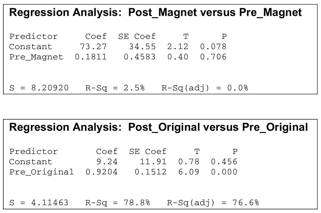
where \(x\) is the pretest score and \(\hat{y}\) is the predicted posttest score. The slope of \(0.1811\) means that for each additional point scored on the pretest by a magnet school student, the posttest score is predicted to increase by \(0.1811\) points, on average. The slope is positive but very close to zero, suggesting that pretest performance has almost no predictive power for posttest performance at the magnet school.
(b)(ii)
The regression equation for the original school is:
\(\hat{y} = 9.24 + 0.9204x\)
where \(x\) is the pretest score and \(\hat{y}\) is the predicted posttest score. The slope of \(0.9204\) means that for each additional point scored on the pretest by an original school student, the posttest score is predicted to increase by approximately \(0.9204\) points, on average — a nearly one-for-one relationship.
(c)(i) — Magnet School
From the regression output, the test statistic is \(t = 0.40\) with \(p\text{-value} = 0.706\).
Since \(0.706 > 0.05\), we fail to reject \(H_0\). There is insufficient evidence to conclude that there is a significant correlation between pretest score and posttest score at the magnet school. Pretest score is not a useful linear predictor of posttest score for magnet school students.
(c)(ii) — Original School
From the regression output, the test statistic is \(t = 6.09\) with \(p\text{-value} = 0.000\).
Since \(0.000 < 0.05\), we reject \(H_0\). There is strong evidence of a significant correlation between pretest score and posttest score at the original school. Pretest score is a very strong linear predictor of posttest score for original school students.
(d)
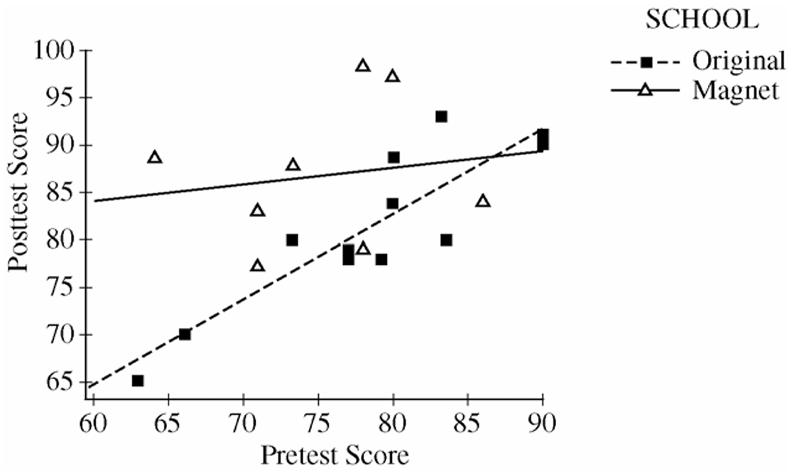
The two-sample \(t\)-test in part (a) told us only that the magnet school group had a higher average improvement — but it didn’t explain who benefited or by how much depending on their initial ability. The regression analyses reveal something much more interesting:
• At the magnet school, the slope is nearly zero (\(0.1811\)), and \(R^2 = 2.5\%\) — this means students score high on the posttest regardless of how they did on the pretest. A student who entered the magnet school with a low pretest score of 64 scored 89 on the posttest (an improvement of 25 points), while a student with a higher pretest score of 86 actually dropped 2 points. The magnet school appears to level the playing field and disproportionately benefits students who start with lower ability.
• At the original school, the slope is close to 1 (\(0.9204\)) and \(R^2 = 78.8\%\) — students essentially maintained their relative ranking, with high pretest scorers also achieving high posttest scores. There is very little “boost” effect for any student regardless of their starting point.
In short, the regression analyses reveal that the magnet school benefits students with low pretest scores the most, while the original school produces predictable but modest gains proportional to where students started.
Question
Most-appropriate topic codes (AP Statistics):
• Topic 5.5 — Least-Squares Regression (Part \(\mathrm{b}\))
• Topic 5.3 — Linear Regression Models (Part \(\mathrm{c}\))
• Topic 5.2 — Correlation (Part \(\mathrm{c}\))
• Topic 5.3 — Linear Regression Models (Parts \(\mathrm{d}\), \(\mathrm{e}\))
▶️ Answer/Explanation
(a)
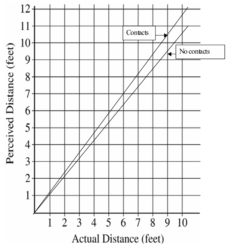
The estimated slope of \(1.080\) in Model 1 means that for each additional foot of actual distance between the two objects, the perceived (estimated) distance is expected to increase by about \(1.080\) feet on average.
In other words, as the objects are placed farther apart in reality, subjects in dim light tend to perceive the distance as growing slightly faster than the true distance — at a rate of roughly \(1.080\) feet of perceived distance per foot of actual distance.
\( \boxed{\text{For every 1 ft increase in actual distance, perceived distance increases by approximately } 1.080 \text{ ft on average.}}\)
(b)
Model 2 is preferable because it has a \(y\)-intercept of zero, which makes physical sense in this context — if two objects are placed in the same location (actual distance \(= 0\)), a subject would be expected to perceive a distance of zero feet, not \(0.238\) feet as Model 1 would predict.
Since the intercept in Model 1 is not meaningfully different from zero (it is small relative to its standard error of \(0.260\)), removing it and using the simpler through-the-origin Model 2 produces a more interpretable and contextually appropriate model.
\(\boxed{\text{Model 2 is preferred because a zero intercept is physically sensible when actual distance} = 0.}\)
(c)
Let \(\beta\) be the true slope of the linear relationship between perceived distance and actual distance in Model 2. The researcher’s hypothesis that subjects overestimate with the overestimation growing as distance grows is equivalent to \(\beta > 1\).
Step 1 — Hypotheses:
\(H_0: \beta = 1\) (perceived distance increases at the same rate as actual distance — no overestimation growth)
\(H_a: \beta > 1\) (perceived distance increases faster than actual distance — overestimation grows with distance)
Step 2 — Test Statistic:
We use a \(t\)-test for the slope:
\(t = \dfrac{b – \beta_0}{s_b} = \dfrac{1.102 – 1}{0.393} = \dfrac{0.102}{0.393} \approx 0.260\)
\(\text{degrees of freedom} = n – 1 = 40 – 1 = 39\)
\(p\text{-value} = P(t_{39} > 0.260) \approx 0.398\)
Step 3 — Conclusion:
Since the \(p\)-value of \(0.398\) is much greater than \(\alpha = 0.05\), we fail to reject \(H_0\). We do not have statistically significant evidence to conclude that subjects overestimate the distance with the overestimation increasing as the actual distance increases.
\(\boxed{t \approx 0.260,\quad p\text{-value} \approx 0.398 > 0.05 \Rightarrow \text{Fail to reject } H_0.}\)
(d)
Substituting the two values of the indicator variable into Model 3:
For contact wearers (\(\text{contact} = 1\)):
\(\hat{y} = 1.05(\text{actual distance}) + 0.12(1)(\text{actual distance}) = 1.17 \times (\text{actual distance})\)
For noncontact wearers (\(\text{contact} = 0\)):
\(\hat{y} = 1.05(\text{actual distance}) + 0.12(0)(\text{actual distance}) = 1.05 \times (\text{actual distance})\)
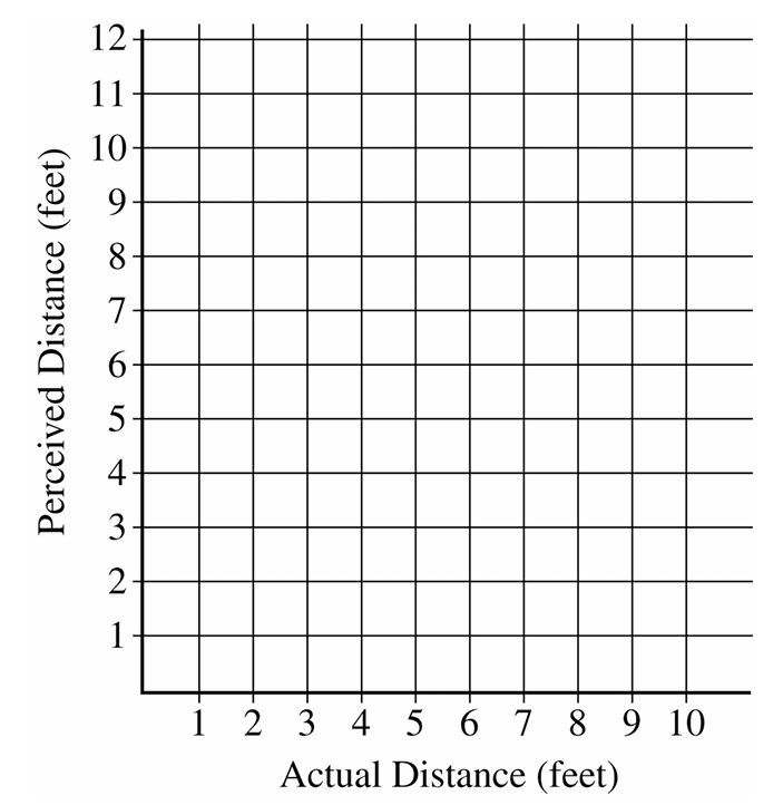
Both lines pass through the origin. The contact wearers’ line has a steeper slope (\(1.17\)) than the noncontact wearers’ line (\(1.05\)), as shown in the graph above.
\(\boxed{\text{Contact: } \hat{y} = 1.17x;\quad \text{Noncontact: } \hat{y} = 1.05x \text{ (both through origin)}}\)
(e)
The coefficient \(1.05\) estimates the average increase in perceived distance (in feet) for each one-foot increase in actual distance for noncontact wearers — that is, for every foot farther apart the objects actually are, a noncontact wearer perceives them as about \(1.05\) feet farther apart on average.
The coefficient \(0.12\) estimates the additional average increase in perceived distance (in feet) for each one-foot increase in actual distance specifically for contact wearers, above and beyond the \(1.05\) rate for noncontact wearers — so contact wearers perceive distance as growing at a rate of \(1.05 + 0.12 = 1.17\) feet per foot of actual distance on average.
Taken together, the model tells us that both groups overestimate distance in dim light, but contact wearers overestimate by a slightly greater amount per foot of actual distance than noncontact wearers do.
\(\boxed{1.05: \text{ per-foot slope for noncontact wearers};\quad 0.12: \text{ additional per-foot slope for contact wearers.}}\)
Question
Most-appropriate topic codes (AP Statistics):
• Topic 5.3 — Linear Regression Models (Parts \(\mathrm{a}\), \(\mathrm{b}\), \(\mathrm{c}\))
• Topic 5.4 — Residuals (Part \(\mathrm{b}\))
▶️ Answer/Explanation
(a)
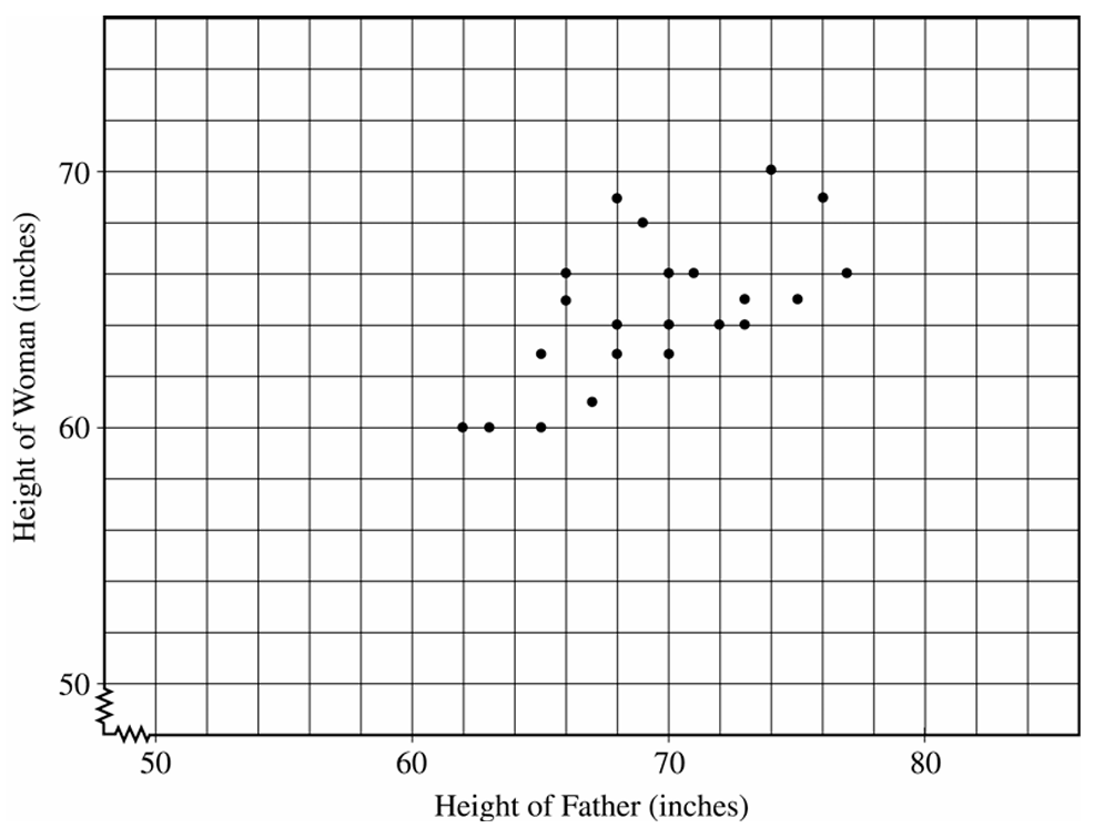
To draw the least squares regression line \(\hat{y} = 35.1 + 0.427x\), compute two points on the line and connect them. For example:
At \(x = 55\): \(\quad \hat{y} = 35.1 + 0.427(55) = 35.1 + 23.485 = 58.585\)
At \(x = 80\): \(\quad \hat{y} = 35.1 + 0.427(80) = 35.1 + 34.16 = 69.26\)
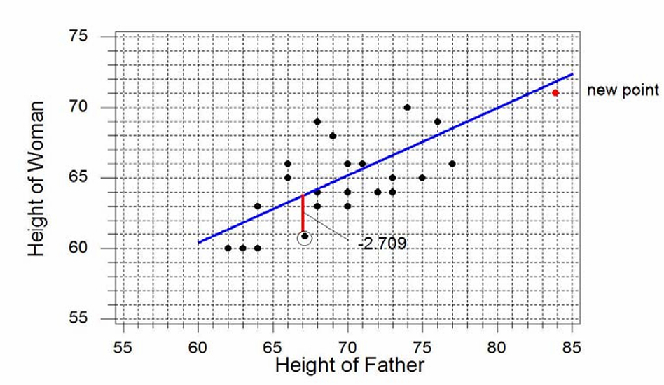
Plot the points \((55,\ 58.6)\) and \((80,\ 69.3)\) on the scatterplot and draw a straight line through them. The line is shown in the scatterplot above (blue line).
(b)
The point \((67,\ 61)\) is circled on the scatterplot. The predicted value at \(x = 67\) is:
\(\hat{y} = 35.1 + 0.427(67) = 35.1 + 28.609 = 63.709\)
The residual is the vertical distance from the actual point down to the regression line:
\(\text{Residual} = y – \hat{y} = 61 – 63.709\)
\(\boxed{\text{Residual} = -2.709 \text{ inches}}\)
The negative sign tells us the actual daughter’s height is about \(2.709\) inches below what the regression line predicts — the vertical dashed segment on the scatterplot drops from the line down to the actual point.
(c) — Slope:
The slope would remain about the same. The new point \((84,\ 71)\) falls very close to the existing regression line — substituting \(x = 84\) gives \(\hat{y} = 35.1 + 0.427(84) = 70.97\), which is just about \(0.03\) away from the actual \(y = 71\). Since the new point is nearly on the line, it is consistent with the existing linear pattern and will not pull the regression line in a new direction.
(c) — Correlation:
The correlation would increase. We know the relationship between slope, correlation, and the standard deviations:
\(b = r \cdot \dfrac{s_y}{s_x}\)
Adding the new point at \(x = 84\) extends the range of \(x\) values far to the right, increasing \(s_x\) considerably more than it increases \(s_y\). So the ratio \(\dfrac{s_y}{s_x}\) decreases. Since the slope \(b\) stays about the same but \(\dfrac{s_y}{s_x}\) gets smaller, \(r\) must increase to compensate. Intuitively, the new point fits the linear pattern well and sits far out in the \(x\)-direction, which strengthens the apparent linear relationship and pulls \(r\) closer to \(1\).
Question
Most-appropriate topic codes (AP Statistics):
• Topic 5.4 — Residuals (Part \(\mathrm{b}\))
• Topic 5.5 — Least-Squares Regression (Part \(\mathrm{c}\))
▶️ Answer/Explanation
(a)
Reading the coefficients directly from the computer output, the fitted regression line is:
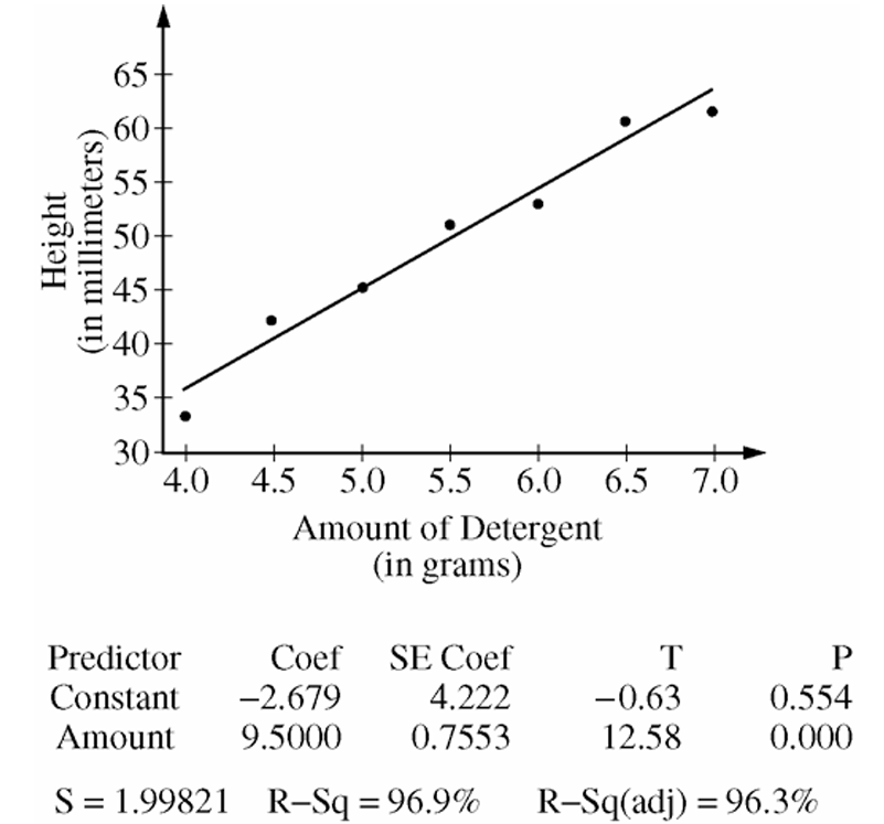
\(\hat{y} = -2.679 + 9.5x\)
where \(\hat{y}\) represents the predicted (estimated) mean height of the soapsuds (in millimeters), and \(x\) represents the amount of detergent added to the pan (in grams).
\(\boxed{\hat{y} = -2.679 + 9.5x}\)
(b)
The value \(s = 1.99821\,\text{mm}\) is the standard deviation of the residuals.
In the context of this study, it measures a typical amount of variation in the observed heights of soapsuds from the heights predicted by the regression line — that is, for a given amount of detergent, the actual suds height typically differs from the predicted suds height by about \(1.998\,\text{mm}\).
\(\boxed{s = 1.99821\,\text{mm}}\)
(c)
The standard error of the slope is identified from the computer output as the SE Coef for the Amount row:
\(SE_b = 0.7553\,\text{mm per gram}\)
This value estimates the standard deviation of the sampling distribution of the estimated slope — in other words, it tells us how much the estimated slope \(\hat{b}_1\) would be expected to vary from experiment to experiment if the same study were repeated many times under identical conditions.
A small \(SE_b = 0.7553\) relative to the slope of \(9.5\) indicates that the estimated slope is very stable and reliable across repeated samples.
\(\boxed{SE_b = 0.7553\,\text{mm/g}}\)
Question
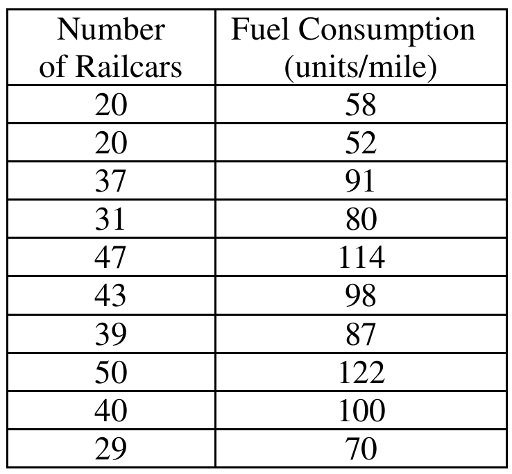
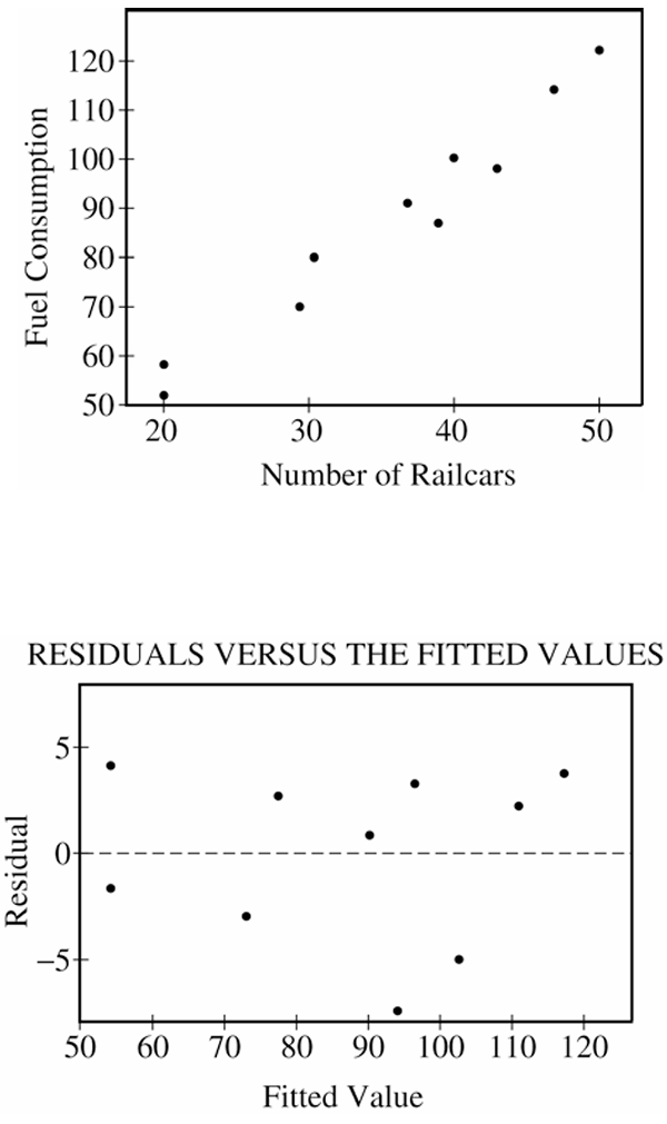
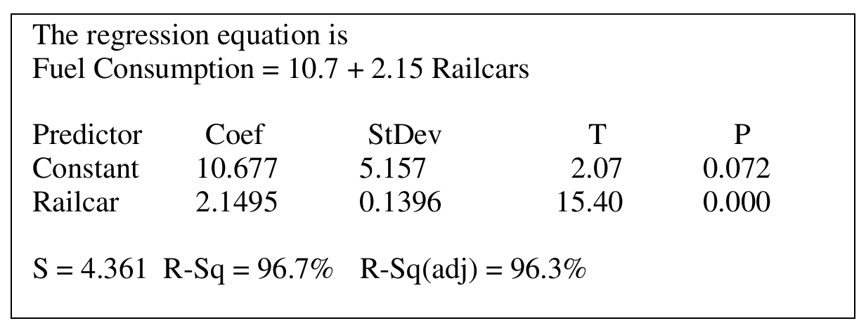
Most-appropriate topic codes (AP Statistics):
• Topic 5.4 — Residuals (Part \(\mathrm{a}\))
• Topic 5.2 — Correlation (Part \(\mathrm{c}\))
▶️ Answer/Explanation
(a)
Yes, a linear model is appropriate. The scatterplot of fuel consumption versus number of railcars shows a strong, positive, linear pattern with points falling close to a line. The residual plot backs this up — the residuals are scattered randomly above and below zero with no obvious curve or pattern, which means a straight line is capturing the relationship well.
\( \boxed{\text{Yes — strong linear pattern in scatterplot and no pattern in residual plot}} \)
(b)
The slope of the regression line tells us how much fuel consumption changes per railcar:
\( \text{slope} = 2.15 \text{ units/mile per railcar} \)
Each unit of fuel costs \$25, so multiply the slope by the cost per unit:
\( \text{cost change} = 2.15 \times \$25 \)
\( \text{cost change} = \$53.75 \)
\( \boxed{\$53.75 \text{ per additional railcar}} \)
(c)
The value \(r^2=96.7\%\) tells us how much of the variation in fuel consumption is accounted for by the linear relationship with the number of railcars. Putting it in plain terms:
\( \boxed{96.7\%\text{ of the variation in fuel consumption is explained by the linear relationship with number of railcars}} \)
(d)
No, it would not be reasonable. Looking at the data table, the number of railcars only ranges from 20 to 50, and 65 falls well outside that range. Using the regression line to predict fuel consumption at 65 railcars means extrapolating beyond the data we actually collected, and there’s no guarantee the same linear relationship continues to hold out there.
\( \boxed{\text{No — 65 railcars is outside the observed range (20 to 50), so this would be extrapolation}} \)
Question
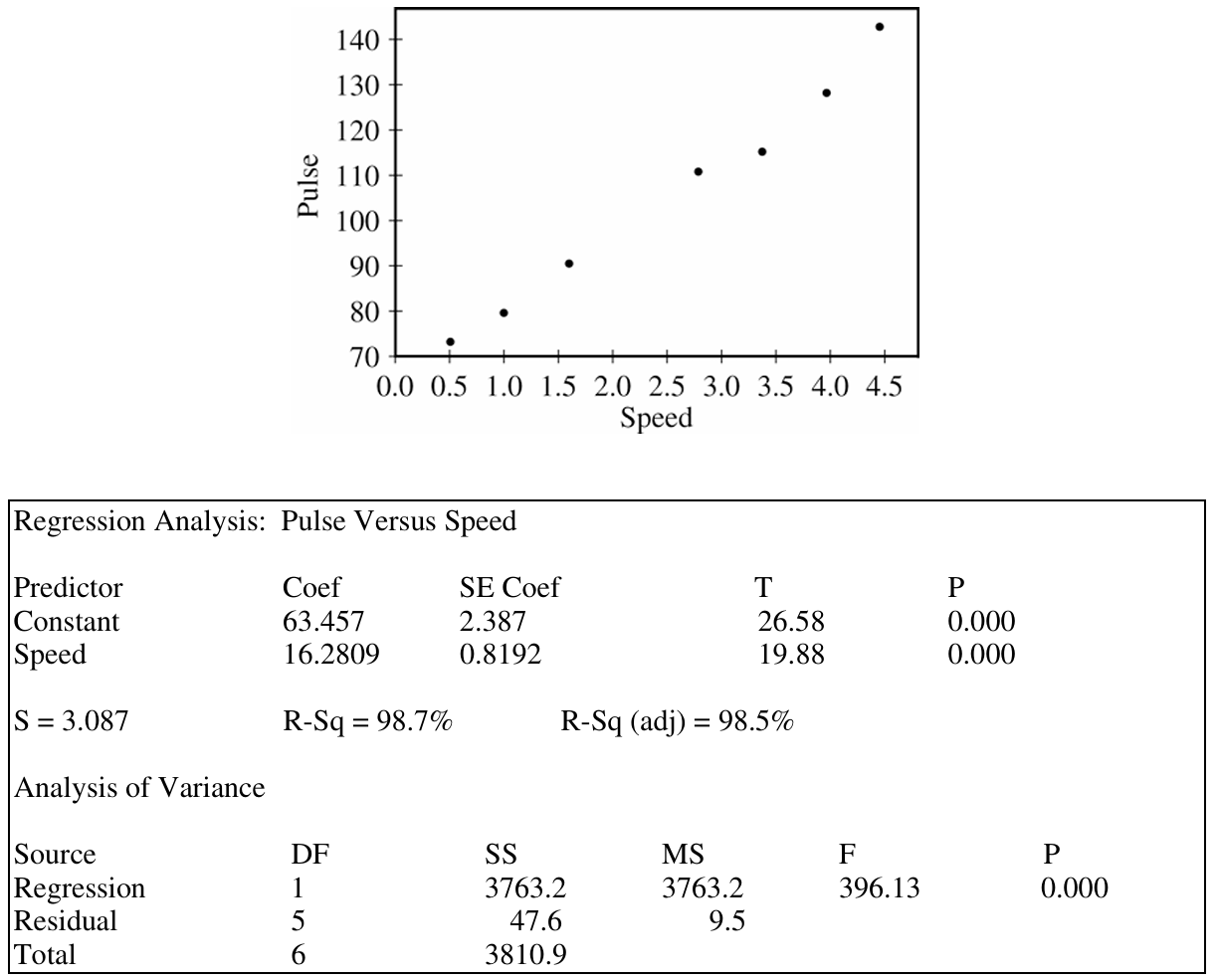
Most-appropriate topic codes (AP Statistics):
• Topic 5.5 — Least-Squares Regression (Parts a, b)
• Topic 5.4 — Residuals (Regression output interpretation)
▶️ Answer/Explanation
(a)
Reading directly from the regression output, the fitted regression equation is: \[ \widehat{\text{Pulse}} = 63.457 + 16.2809 \times \text{Speed} \] where Pulse is measured in beats per minute (bpm) and Speed is measured in miles per hour (mph).
(b)
Both estimates have meaningful interpretations in this context.
Slope interpretation:
The slope \(b_1 = 16.2809\) bpm/mph means that for each additional 1 mile per hour increase in John’s walking speed, his predicted pulse rate increases by approximately 16.28 beats per minute on average.
Intercept interpretation:
The intercept \(b_0 = 63.457\) bpm means that when John’s walking speed is 0 mph — that is, when he is standing still — his predicted pulse rate is approximately 63.5 beats per minute. This is a reasonable estimate of John’s resting pulse rate, so the intercept does carry a meaningful real-world interpretation here (unlike many regression contexts where the intercept falls outside the range of observed data).
(c)
The margin of error for a confidence interval for the slope is:
\( \text{Margin of error} = t^* \times SE_{b_1} \)
From the regression output, the standard error of the slope is \(SE_{b_1} = 0.8192\).
For a 98% confidence interval, the degrees of freedom are \(df = n – 2 = 7 – 2 = 5\).
From the \(t\)-table with \(df = 5\) and a 98% confidence level (tail probability \(= 0.01\)):
\( t^* = 3.365 \)
Therefore, the margin of error is:
\( \text{Margin of error} = 3.365 \times 0.8192 \)
\( \boxed{\text{Margin of error} \approx 2.757 \text{ bpm/mph}} \)
This means John’s 98% confidence interval for the true slope would be \(16.2809 \pm 2.757\), or approximately \((13.524,\ 19.038)\) bpm per mph. The relatively narrow interval, combined with the very high \(R^2 = 98.7\%\), confirms that speed is an extremely strong linear predictor of John’s pulse rate.
Question
Most-appropriate topic codes (AP Statistics):
• Topic 5.2 — Correlation (Part b)
• Topic 5.3 — Linear Regression Models (Parts b, c)
• Topic 5.4 — Residuals (Part c)
▶️ Answer/Explanation
(a)
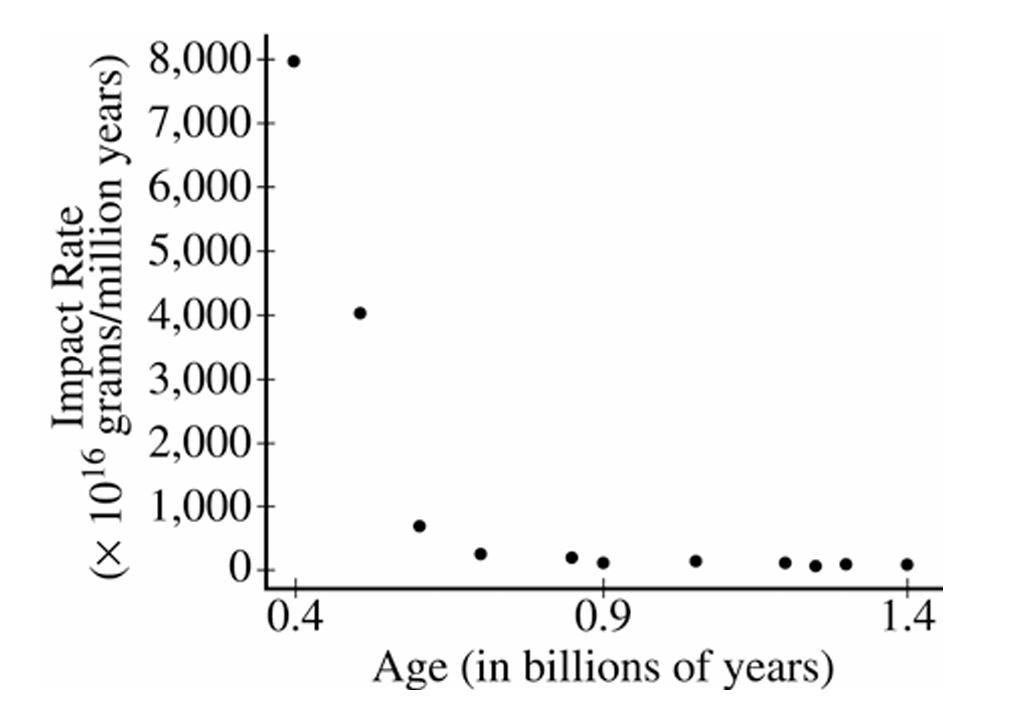
The relationship between impact rate and age is negative and nonlinear (curved). As age increases, impact rate decreases, but not at a constant rate — the decrease is very steep for craters with ages less than about 0.7 billion years, and then the impact rate levels off and remains close to zero for older craters. The spread of the data also decreases as age increases, suggesting a fan-shaped, non-constant variance pattern.
(b)
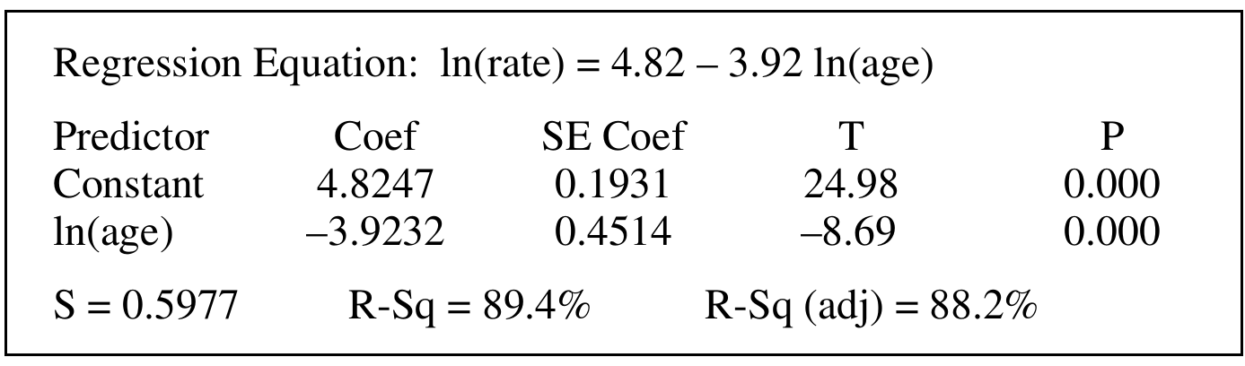
The value of \(r^2 = 0.894\), or \(89.4\%\).
This means that approximately \(89.4\%\) of the variability in \(\ln(\text{rate})\) is explained by the linear relationship with \(\ln(\text{age})\). In other words, after taking logarithms of both variables, the linear model accounts for nearly \(89.4\%\) of the variation seen in the log-transformed impact rate values among the 11 craters studied.
(c)
The linear regression model is appropriate for the log-transformed variables. Here’s the reasoning:
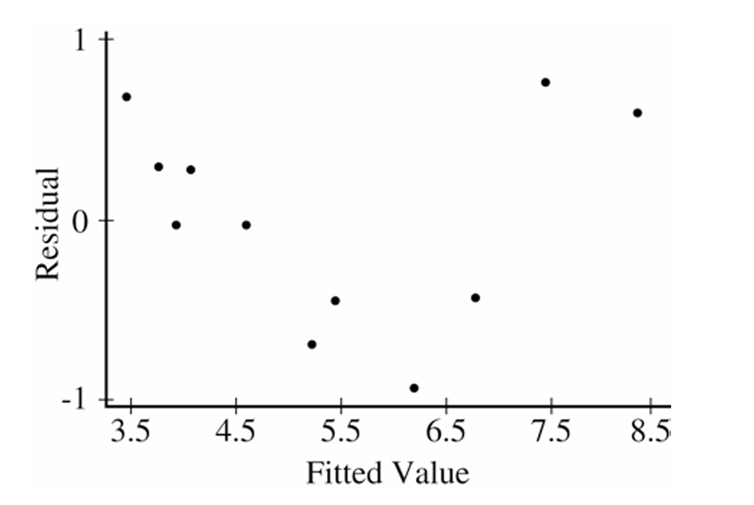
First, the residual plot shows no obvious curved pattern — the residuals appear to be scattered roughly randomly around zero, with no systematic curvature, which supports linearity.
Second, the residuals do not show a clear fan shape (no dramatic increase in spread), so the equal variance condition appears reasonably satisfied.
Third, the \(R^2\) value of \(89.4\%\) is quite high, indicating the linear model fits the transformed data well.
However, one concern is that the residual plot shows a slight tendency for residuals to be negative in the middle range of fitted values and positive at the extremes, hinting at a mild pattern. Given the small sample size of only 11 observations, this could simply be due to natural sampling variability. Overall, the linear model on the log-transformed data is a reasonable fit.
Question


Most-appropriate topic codes (AP Statistics):
• Topic 5.4 — Residuals (Part a)
• Topic 5.5 — Least-Squares Regression (Parts a, b)
• Topic 5.1 — Graphical Representations Between Two Quantitative Variables (Part b)
▶️ Answer/Explanation
(a)
Yes, point \(P\) does exercise a large influence on the regression line.
When point \(P\) is included, the slope of the regression line is \(b_1 = 0.4919\), and it is statistically significant (\(p = 0.040\)).
When point \(P\) is removed, the slope drops dramatically to \(b_1 = 0.1500\), which is no longer statistically significant (\(p = 0.709\)).
The intercept also changes from \(8.107\) to \(11.123\), and \(R^2\) falls sharply from \(47.6\%\) to only \(2.5\%\).
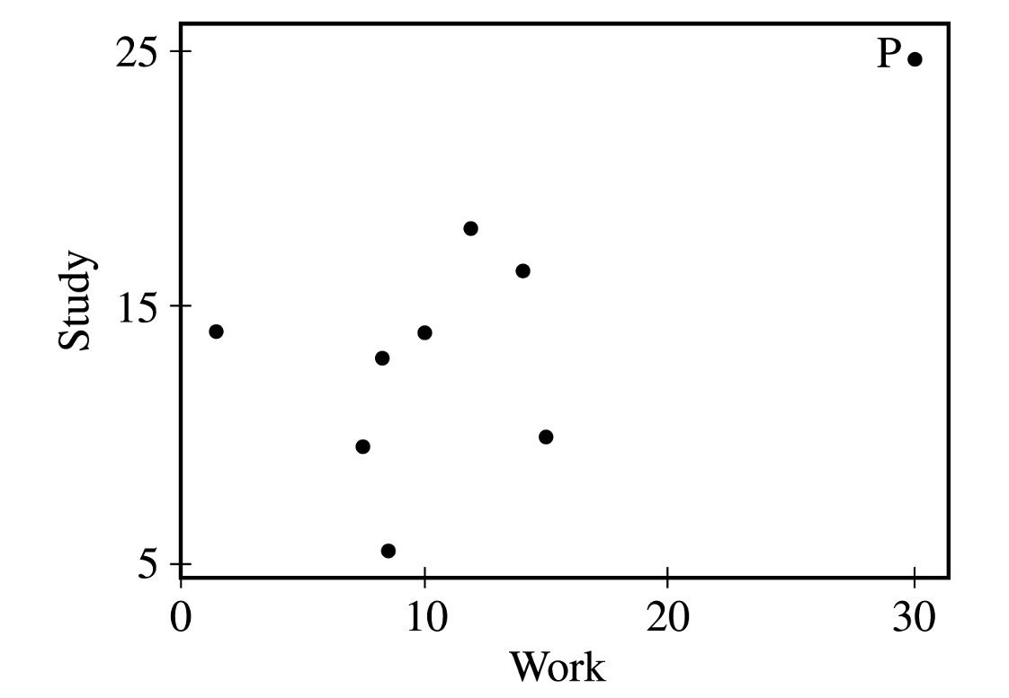
Because removing a single point caused such substantial changes in the slope, intercept, statistical significance, and \(R^2\), point \(P\) is clearly an influential point — it is extreme in the \(x\)-direction (a work value of about 30, far beyond the rest of the data), which gives it high leverage and strong pull on the regression line.
(b)
In the original data, point \(P\) is at approximately \((\text{Work} = 30,\ \text{Study} = 25)\), which is high on both variables and pulls the regression line upward to the right, producing a positive slope.
The corrected data point \(Q\) is at approximately \((\text{Work} = 30,\ \text{Study} = 6)\), which is far below the trend of the other data points at that work value.
With \(Q\) replacing \(P\), the regression line for the corrected data will have a negative slope rather than a positive slope — the corrected point now pulls the line downward on the right side.
The intercept would also be considerably larger for the corrected data, since the line must start higher on the \(y\)-axis to accommodate the negative slope while passing near the rest of the data.