AP Statistics 1.4 Representing a Categorical Variable with Graphs MCQs - Exam Style Questions
Question

Students from a high school with a large student population were asked whether they regularly ride the bus to school. The bar chart provided shows the relative frequencies of students in each grade level (9th, 10th, 11th, and 12th) who indicated that they regularly rode the bus to school.
(B) At least \(20\%\) of students from each grade level indicated that they regularly rode the bus to school.
(C) The number of students from the 9th grade who indicated that they regularly rode the bus to school is greater than the number of students from the 10th grade who indicated that they regularly rode the bus to school.
(D) The 12th graders had the least number of students who indicated that they regularly rode the bus to school.
(E) The 9th graders had the greatest percentage of students who indicated that they regularly rode the bus to school.
▶️ Answer/Explanation
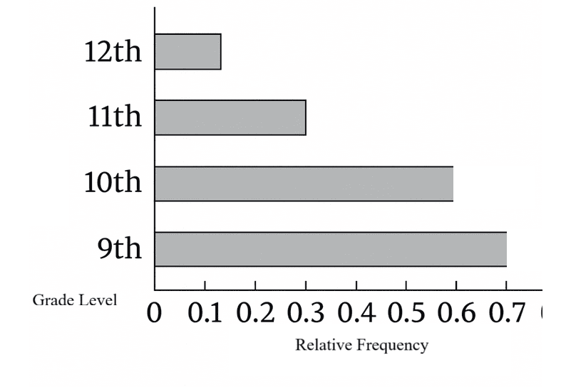
Read the relative frequencies (heights) of the bars for grades 9, 10, 11, and 12.
The 9th-grade bar is tallest, so it represents the largest percentage riding the bus.
(C) and (D) compare numbers of students, which cannot be concluded from relative frequencies alone because grade sizes may differ.
(A) is false since the 10th-grade bar appears above \(0.5\).
(B) is not guaranteed if the 12th-grade bar is below \(0.20\).
Therefore, the statement that must be true is that the 9th graders had the greatest percentage of students who indicated that they regularly rode the bus to school.
✅ Answer: (E)
Question

A certain university has three dining halls—A, B, and C—that serve a variety of dessert dishes. Steven went to each dining hall on a specific day and counted the number of dessert dishes that were being served and classified them as cookie, cake, pie, brownie, or ice cream. The graph shows the relative frequency distribution of the type of dessert dishes being served at each dining hall.
(B) There were fewer cake dishes served at Dining Hall B than at Dining Hall A.
(C) There were the same number of pie dishes served at Dining Hall B as there were at Dining Hall C.
(D) At Dining Hall A, there were more cake dishes served than brownie dishes.
(E) The total number of dessert dishes served at all three dining halls is the same.
▶️ Answer/Explanation
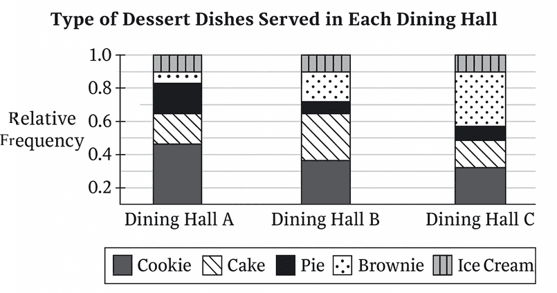
The plot displays relative frequencies (proportions) within each dining hall, so we can compare categories within the same hall but not the numbers across halls because totals may differ.
Options (A), (B), and (C) compare numbers across different halls ⇒ not guaranteed by relative frequencies alone.
Option (E) asserts equal totals across halls ⇒ not supported by a relative-frequency chart.
From the graph (within Dining Hall A), the bar for cake is higher than the bar for brownie ⇒ more cake than brownie at Hall A.
✅ Answer: (D)