AP Statistics 1.3 Representing a Categorical Variable with Tables Study Notes
AP Statistics 1.3 Representing a Categorical Variable with Tables- New syllabus
AP Statistics 1.3 Representing a Categorical Variable with Tables Study Notes -As per latest AP Statistics Syllabus.
LEARNING OBJECTIVE
- Graphical representations and statistics allow us to identify and represent key features of data.
Key Concepts:
- Representing a Categorical Variable with Tables
Representing a Categorical Variable with Tables
Purpose of Tables:
- To organize raw categorical data into a clear and interpretable format.
- Helps identify patterns, compare categories, and prepare data for graphical representation (bar graphs, pie charts).
- Summarizes large amounts of data in a compact structure.
Types of Tables for Categorical Data:
Frequency Table:
- Lists each category of the variable.
- Shows the count (frequency) of observations that fall into each category.
- Good for showing raw numbers but less useful for comparisons when sample sizes differ.
Relative Frequency Table:
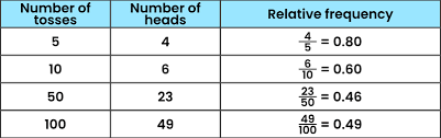
- Lists each category along with the proportion (or percentage) of the total sample in that category.
- Formula: \( \text{Relative Frequency} = \dfrac{\text{Category Frequency}}{\text{Total Frequency}} \)
- Relative frequencies can be expressed as decimals, fractions, or percentages.
- Useful for comparing distributions across groups of different sizes.
Cumulative Frequency Table:
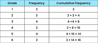
- Shows the running total of frequencies up to a certain category.
- More often used with ordered categorical or quantitative data.
Two-Way (Contingency) Table:
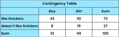
- Summarizes the relationship between two categorical variables.
- Displays joint frequencies (counts of individuals that fall into a combination of categories).
- Forms the basis for conditional relative frequencies and association analysis.
Steps in Creating a Frequency/Relative Frequency Table:
- Identify all unique categories of the variable.
- Count the number of individuals in each category (frequency).
- Compute relative frequency by dividing each frequency by the total number of observations.
- Verify that the sum of relative frequencies equals 1 (or 100%).
Key Advantages of Using Tables:
- Organizes data systematically for analysis.
- Relative frequency tables allow fair comparison between datasets of different sizes.
- Provides the foundation for constructing graphs (bar graphs, pie charts, segmented bar charts).
- Helps detect dominant and less common categories quickly.
Example:
A survey asked 30 students about their favorite type of movie. Results: 12 chose Action, 8 chose Comedy, 6 chose Drama, and 4 chose Horror. Create a frequency and relative frequency table.
▶️ Answer/Explanation
Step 1: Organize into a frequency table.
Movie Type | Frequency | Relative Frequency |
---|---|---|
Action | 12 | \( \dfrac{12}{30} = 0.40 \) → 40% |
Comedy | 8 | \( \dfrac{8}{30} \approx 0.27 \) → 26.7% |
Drama | 6 | \( \dfrac{6}{30} = 0.20 \) → 20% |
Horror | 4 | \( \dfrac{4}{30} \approx 0.13 \) → 13.3% |
Total | 30 | 100% |
Step 2: Interpretation.
- 40% of students prefer Action movies, the most popular category.
- Only 13.3% prefer Horror movies, the least popular.
Final Point: Frequency tables summarize raw counts, while relative frequency tables allow comparisons across groups of different sizes.
Example:
A class survey of 25 students asked for their preferred type of smartphone: 10 chose Apple, 7 chose Samsung, 5 chose OnePlus, and 3 chose Other. Create a frequency and relative frequency table.
▶️ Answer/Explanation
Step 1: Organize into a frequency table with relative frequencies.
Smartphone Brand | Frequency | Relative Frequency |
---|---|---|
Apple | 10 | \( \dfrac{10}{25} = 0.40 \) → 40% |
Samsung | 7 | \( \dfrac{7}{25} = 0.28 \) → 28% |
OnePlus | 5 | \( \dfrac{5}{25} = 0.20 \) → 20% |
Other | 3 | \( \dfrac{3}{25} = 0.12 \) → 12% |
Total | 25 | 100% |
Step 2: Interpretation.
- 40% of students prefer Apple, the most popular choice.
- Only 12% prefer Other brands, the least popular category.
Final Point: Frequency tables show raw counts, while relative frequency tables highlight proportions, making comparisons easier across different sample sizes.
Example:
A group of 40 students was asked how many books they read last month.
The data were grouped into categories: 0–1 books (8 students), 2–3 books (12 students), 4–5 books (10 students), 6–7 books (6 students), and 8+ books (4 students). Construct a cumulative frequency table.
▶️ Answer/Explanation
Step 1: Start with the frequency distribution.
Books Read | Frequency | Cumulative Frequency |
---|---|---|
0–1 | 8 | 8 |
2–3 | 12 | 20 |
4–5 | 10 | 30 |
6–7 | 6 | 36 |
8+ | 4 | 40 |
Step 2: Interpretation.
- 20 students read 3 or fewer books.
- 30 students read 5 or fewer books.
- All 40 students are included by the final row.
Final Point: Cumulative frequency tables are especially useful when analyzing medians, quartiles, or percentiles of grouped data.
Example:
A survey of 50 students recorded their preferred mode of transport to school (Car, Bus, Walk) and whether they live in the City or Suburb. Construct a two-way table.
▶️ Answer/Explanation
Step 1: Organize the joint frequencies.
Transport | City | Suburb | Total |
---|---|---|---|
Car | 8 | 12 | 20 |
Bus | 10 | 5 | 15 |
Walk | 8 | 7 | 15 |
Total | 26 | 24 | 50 |
Step 2: Interpretation.
- Among City students, the most common transport is Bus (10 students).
- Among Suburb students, the most common transport is Car (12 students).
- Overall, Car is the most popular mode (20 students).
Final Point: Two-way tables allow analysis of joint, marginal, and conditional distributions, which are essential for studying associations between categorical variables.