
1.3.A Construct Categorical One-Variable Tabular Representations
Categorical data are often organized into tables so that the distribution of the data can be easily understood.
A one-variable categorical data set contains observations for a single categorical variable.
Tabular representations help statisticians:
- Summarize data clearly
- Compare categories
- Identify patterns
- Calculate proportions and percentages
Two important tabular representations for categorical variables are:
- Frequency tables
- Relative frequency tables
1.3.A.1 Frequency Tables
A frequency table shows the number of observational units that fall into each category of a categorical variable.
The count for each category is called the frequency.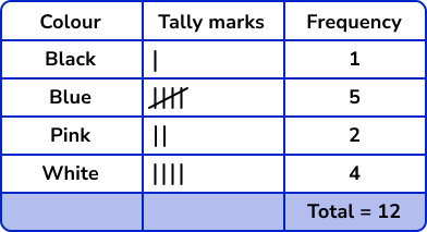
Frequency tables organize raw data into a simpler form so that the distribution of categories can be quickly analyzed.
The total of all frequencies equals the total number of observational units in the data set.
Frequency tables are useful for:
- Summarizing survey results
- Comparing categories
- Preparing data for graphs such as bar charts or pie charts
| Favorite Sport | Frequency |
|---|---|
| Soccer | 12 |
| Basketball | 9 |
| Tennis | 5 |
In this table:
- 12 students selected soccer
- 9 students selected basketball
- 5 students selected tennis
Example
A teacher surveys students about their preferred type of music.
The responses are:
Pop, Rock, Pop, Jazz, Rock, Pop, Jazz, Pop, Rock, Pop
Construct a frequency table for the data.
▶️ Answer / Explanation
| Music Type | Frequency |
|---|---|
| Pop | 5 |
| Rock | 3 |
| Jazz | 2 |
The table shows the number of students in each music category.
1.3.A.2 Relative Frequency Tables
A relative frequency table shows the proportion or percentage of observational units in each category of a categorical variable.
Relative frequency is calculated using: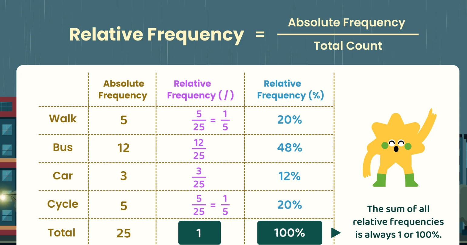
\( \mathrm{\dfrac{Frequency}{Total\ Number\ of\ Observations}} \)
Relative frequencies may be written:
- As decimals
- As fractions
- As percentages
Relative frequency tables are useful because they show the size of each category compared to the whole data set.
The sum of all relative frequencies equals:
\( \mathrm{1} \) or \( \mathrm{100\%} \)
| Favorite Sport | Frequency | Relative Frequency |
|---|---|---|
| Soccer | 12 | \( \mathrm{0.46} \) |
| Basketball | 9 | \( \mathrm{0.35} \) |
| Tennis | 5 | \( \mathrm{0.19} \) |
This table shows both the counts and proportions for each category.
Example
A survey records the favorite fruit of 20 students.
| Fruit | Frequency |
|---|---|
| Apple | 8 |
| Banana | 5 |
| Orange | 7 |
Construct a relative frequency table for the data.
▶️ Answer / Explanation
Total number of students:
\( \mathrm{20} \)
| Fruit | Relative Frequency |
|---|---|
| Apple | \( \mathrm{\dfrac{8}{20}=0.40} \) |
| Banana | \( \mathrm{\dfrac{5}{20}=0.25} \) |
| Orange | \( \mathrm{\dfrac{7}{20}=0.35} \) |
The relative frequencies show the proportion of students who selected each fruit.
1.3.B Describe Categorical One-Variable Tabular Representations with Summary Statistics
Categorical data tables provide information about how observational units are distributed among categories.
After constructing frequency tables and relative frequency tables, statisticians interpret the data using summary measures such as:
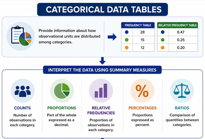
These summaries help describe patterns in the data and support conclusions in context.
By analyzing categorical tables, statisticians can:
- Identify the most common category
- Compare categories
- Support statistical claims
- Describe trends within the population or sample
1.3.B.1 Percentages, Relative Frequencies, Ratios, and Proportions
Percentages, relative frequencies, ratios, and proportions all describe relationships between category counts and the total number of observations.
Although they may appear in different forms, they communicate the same basic information.
The following mathematical formulas are commonly used for categorical one-variable tabular representations:
| Representation | Formula |
|---|---|
| Proportion | \( \mathrm{Proportion=\dfrac{Category\ Frequency}{Total\ Frequency}} \) |
| Relative Frequency | \( \mathrm{Relative\ Frequency=\dfrac{Category\ Frequency}{Total\ Frequency}} \) |
| Percentage | \( \mathrm{Percentage=\dfrac{Category\ Frequency}{Total\ Frequency}\times100\%} \) |
| Ratio | \( \mathrm{Ratio=Category\ Frequency:Total\ Frequency} \) |
Suppose:
\( \mathrm{15} \) out of \( \mathrm{60} \) students prefer online learning.
This information can be expressed in several equivalent ways:
| Representation | Value |
|---|---|
| Proportion | \( \mathrm{\dfrac{15}{60}=0.25} \) |
| Relative Frequency | \( \mathrm{0.25} \) |
| Percentage | \( \mathrm{25\%} \) |
| Ratio | \( \mathrm{15:60} \) |
Each representation describes the same relationship between the category count and the total number of observations.
Different representations may be more useful in different contexts.
- Percentages are often easier to interpret in reports.
- Ratios are common in comparisons.
- Relative frequencies are useful in statistical calculations.
Example
In a survey of \( \mathrm{80} \) students, \( \mathrm{32} \) students prefer studying in the library.
Express this information as:
- A proportion
- A relative frequency
- A percentage
- A ratio
▶️ Answer / Explanation
Proportion:
\( \mathrm{\dfrac{32}{80}=0.40} \)
Relative Frequency:
\( \mathrm{0.40} \)
Percentage:
\( \mathrm{40\%} \)
Ratio:
\( \mathrm{32:80} \)
All four representations describe the same information about the data.
1.3.B.2 Interpreting Counts and Relative Frequencies in Context
Counts and relative frequencies help statisticians describe and compare categories in a data set.
These summaries can be used to support statistical claims and conclusions about the variables being studied.
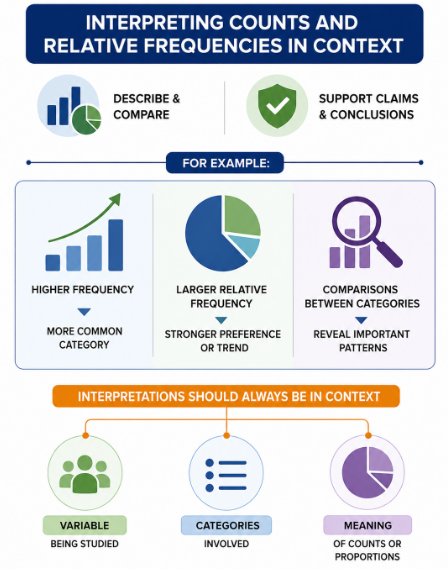
For example:
- A higher frequency may indicate a more common category.
- A larger relative frequency may show a stronger preference or trend.
- Comparisons between categories may reveal important patterns.
Interpretations should always be stated in context.
This means conclusions should clearly describe:
- The variable being studied
- The categories involved
- The meaning of the counts or proportions
For example:
Incorrect interpretation:
“\( \mathrm{0.65} \) is the largest value.”
Correct interpretation:
“\( \mathrm{65\%} \) of surveyed students preferred online assignments.”
Including context makes the conclusion meaningful and understandable.
| Category | Frequency | Relative Frequency |
|---|---|---|
| Online Learning | 26 | \( \mathrm{0.52} \) |
| In-Person Learning | 18 | \( \mathrm{0.36} \) |
| Hybrid Learning | 6 | \( \mathrm{0.12} \) |
From this table, statisticians can conclude that online learning was the most preferred option among the surveyed students.
Example
A survey asks \( \mathrm{50} \) students about their preferred school lunch option.
| Lunch Option | Frequency |
|---|---|
| Pizza | 22 |
| Sandwich | 15 |
| Salad | 13 |
Use the table to justify a claim about student lunch preferences.
▶️ Answer / Explanation
Pizza was the most preferred lunch option among the surveyed students.
\( \mathrm{22} \) out of \( \mathrm{50} \) students selected pizza.
The relative frequency for pizza is:
\( \mathrm{\dfrac{22}{50}=0.44} \)
This means \( \mathrm{44\%} \) of the surveyed students preferred pizza.
Because pizza has the highest frequency and relative frequency, the data support the claim that pizza was the most popular lunch option in this sample.