
1.4.A Construct Categorical One-Variable Graphical Representations
Categorical data can be displayed visually using graphs.
Graphical representations help statisticians:
- Compare categories easily
- Identify patterns and trends
- Understand proportions and frequencies
- Communicate data clearly
For one-variable categorical data, the two most common graphical displays are:
- Bar charts
- Pie charts
Both graphs display frequencies or relative frequencies for the categories of a categorical variable.
1.4.A.1 Bar Charts
A bar chart, also called a bar graph, displays the frequencies or relative frequencies for categories of a single categorical variable.
Each bar represents one category.
The height or length of each bar corresponds to:
- The frequency (count)
- Or the relative frequency (proportion or percentage)
Important features of a bar chart:
- Bars are separated by spaces because categories are distinct.
- Bars may be vertical or horizontal.
- All bars should have equal width.
- The graph should include labels and a title.
Bar charts are useful for:
- Comparing category sizes
- Identifying the most common category
- Displaying survey results
| Category | Frequency |
|---|---|
| Soccer | 14 |
| Basketball | 10 |
| Tennis | 6 |
In a bar chart:
- The soccer bar would have the greatest height.
- The tennis bar would have the smallest height.
Bar charts may also display relative frequencies instead of counts.
For example:
\( \mathrm{Relative\ Frequency=\dfrac{Category\ Frequency}{Total\ Frequency}} \)
Example
A survey asks \( \mathrm{40} \) students about their favorite type of pet.
| Pet Type | Frequency |
|---|---|
| Dog | 18 |
| Cat | 12 |
| Fish | 10 |
Describe how a bar chart for these data would appear.
▶️ Answer / Explanation
The bar chart would contain three separate bars:
- Dog
- Cat
- Fish
The dog bar would be the tallest because it has the greatest frequency:
\( \mathrm{18} \)
The fish bar would be the shortest because it has the smallest frequency:
\( \mathrm{10} \)
The bars would be separated by spaces because the categories are distinct.
1.4.A.2 Pie Charts
A pie chart displays frequencies or relative frequencies for categorical data using slices of a circle.
- Each slice represents one category of the categorical variable.
- The area of each slice corresponds to the category’s relative frequency or percentage of the total data set.
The sum of all slices equals:
\( \mathrm{1} \) or \( \mathrm{100\%} \)
Pie charts are useful for showing:
- Parts of a whole
- Category proportions
- Percentage comparisons
The size of each slice is determined using:
\( \mathrm{Relative\ Frequency=\dfrac{Category\ Frequency}{Total\ Frequency}} \)
To find the angle of a slice:
\( \mathrm{Slice\ Angle=Relative\ Frequency\times360^\circ} \)
| Category | Relative Frequency | Slice Angle |
|---|---|---|
| Soccer | \( \mathrm{0.50} \) | \( \mathrm{180^\circ} \) |
| Basketball | \( \mathrm{0.30} \) | \( \mathrm{108^\circ} \) |
| Tennis | \( \mathrm{0.20} \) | \( \mathrm{72^\circ} \) |
Larger relative frequencies produce larger slices in the pie chart.
Example
A survey asks \( \mathrm{50} \) students about their favorite school subject.
| Subject | Frequency |
|---|---|
| Math | 20 |
| Science | 15 |
| English | 15 |
Determine the relative frequency and slice angle for each category.
▶️ Answer / Explanation
Math:
\( \mathrm{Relative\ Frequency=\dfrac{20}{50}=0.40} \)
\( \mathrm{Slice\ Angle=0.40\times360^\circ=144^\circ} \)
Science:
\( \mathrm{Relative\ Frequency=\dfrac{15}{50}=0.30} \)
\( \mathrm{Slice\ Angle=0.30\times360^\circ=108^\circ} \)
English:
\( \mathrm{Relative\ Frequency=\dfrac{15}{50}=0.30} \)
\( \mathrm{Slice\ Angle=0.30\times360^\circ=108^\circ} \)
The slice sizes represent the proportions of students selecting each subject.
1.4.B Justify a Claim Using Categorical One-Variable Graphical Representations
Graphical representations such as bar charts and pie charts help statisticians interpret categorical data visually.
These graphs make it easier to:
- Compare categories
- Identify patterns and trends
- Recognize the largest or smallest categories
- Support statistical claims using evidence from the graph
When using a graph to justify a claim, the conclusion should always be stated in context.
This means the explanation should clearly describe:
- The variable being studied
- The categories involved
- The evidence shown in the graph
Claims supported by graphical representations should use:
- Frequencies
- Relative frequencies
- Percentages
- Visual comparisons between categories
For example:
- A taller bar in a bar chart represents a greater frequency.
- A larger slice in a pie chart represents a greater proportion of the data.
Graphical displays help justify claims because visual patterns are often easier to recognize than raw numerical data alone.
1.4.B.1 Using Graphical Representations to Support Claims
Bar charts and pie charts reveal information about the distribution of a categorical variable.
This information can be used to justify statistical claims in context.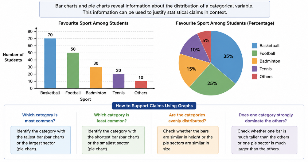
For example, a graph may help determine:
- Which category is most common
- Which category is least common
- Whether categories are evenly distributed
- Whether one category strongly dominates the others
A valid justification should:
- Reference the graph directly
- Use numerical or visual evidence
- Clearly connect the evidence to the claim
Weak justification:
“Basketball is popular.”
Strong justification:
“Basketball is the most popular sport because its bar is the tallest and represents the greatest frequency in the graph.”
| Graph Feature | Interpretation |
|---|---|
| Tallest bar | Largest frequency or proportion |
| Smallest slice | Smallest relative frequency |
| Equal-sized bars | Categories occur at similar frequencies |
Statistical claims should always be supported by evidence from the graphical representation.
Example
A bar chart displays the favorite school subjects of \( \mathrm{100} \) students.
| Subject | Frequency |
|---|---|
| Math | 38 |
| Science | 27 |
| English | 20 |
| History | 15 |

Use the graphical information to justify a claim about student subject preferences.
▶️ Answer / Explanation
Math appears to be the most preferred subject among the surveyed students.
Its bar would be the tallest in the bar chart because it has the greatest frequency:
\( \mathrm{38} \)
This means:
\( \mathrm{38\%} \)
of the students selected math as their favorite subject.
Because math has the highest frequency and relative frequency, the graphical representation supports the claim that math is the most popular subject in this sample.
1.4.C Compare Multiple Categorical One-Variable Tabular and Graphical Representations
Statisticians often compare two or more data sets that involve the same categorical variable.
Comparing multiple categorical data sets helps identify:
- Differences between groups
- Similarities in distributions
- Changes in preferences or behaviors
- Patterns across populations or samples
Common tools used for comparisons include:
- Frequency tables
- Relative frequency tables
- Bar charts
- Pie charts
When comparing multiple data sets, relative frequencies are often more useful than raw counts because the groups may have different total sizes.
For example:
- A school with \( \mathrm{500} \) students should not be directly compared to a school with \( \mathrm{100} \) students using only frequencies.
- Relative frequencies allow fair comparisons because they show proportions rather than totals.
1.4.C.1 Comparing Multiple Data Sets Using Tables and Graphs
Frequency tables, relative frequency tables, bar charts, and pie charts can all be used to compare distributions for the same categorical variable across different groups.
These comparisons help determine:
- Which categories are most common in each group
- Whether groups have similar distributions
- How proportions differ between groups
When comparing graphs:
- Taller bars indicate larger frequencies or proportions.
- Larger pie slices indicate larger relative frequencies.
- Differences in graph shapes may reveal important trends.
Relative frequency tables are especially helpful because they standardize data for comparison.
The formula for relative frequency is:
\( \mathrm{Relative\ Frequency=\dfrac{Category\ Frequency}{Total\ Frequency}} \)
| Group | Most Common Category | Relative Frequency |
|---|---|---|
| School A | Basketball | \( \mathrm{0.45} \) |
| School B | Soccer | \( \mathrm{0.52} \) |
This comparison shows that the most popular sport differs between the two schools.
Bar charts are especially useful for side-by-side comparisons because differences between categories can be seen quickly.
In this graph:
- School A has a higher preference for basketball.
- School B has a higher preference for soccer.
- Tennis is the least preferred category in both schools.
Example
Two classes were surveyed about their preferred method of learning.
| Learning Method | Class A | Class B |
|---|---|---|
| Online | 12 | 18 |
| In-Person | 20 | 10 |
| Hybrid | 8 | 12 |
Compare the distributions of the two classes.
▶️ Answer / Explanation
Class A preferred in-person learning the most because it had the highest frequency:
\( \mathrm{20} \)
Class B preferred online learning the most because it had the highest frequency:
\( \mathrm{18} \)
Hybrid learning was less common in both classes compared to the most preferred category.
The distributions are different because the most common learning method changes between the two groups.