Home / AP Statistics 1.4 Representing a Categorical Variable with Graphs Study Notes

AP Statistics 1.4 Representing a Categorical Variable with Graphs Study Notes

AP Statistics 1.4 Representing a Categorical Variable with Graphs- New syllabus

AP Statistics 1.4 Representing a Categorical Variable with Graphs Study Notes -As per latest AP Statistics Syllabus.

LEARNING OBJECTIVE

  • Graphical representations and statistics allow us to identify and represent key features of data.

Key Concepts:

  • Representing a Categorical Variable with Graphs
  • How to Describe Graphical Representations
  • Compare Multiple Sets of Categorical Data

AP Statistics -Concise Summary Notes- All Topics

Representing a Categorical Variable with Graphs

Purpose of Graphical Representation:

  • To visually display the distribution of a categorical variable.
  • Makes comparisons between categories easier to interpret than raw tables.
  • Highlights patterns such as the most/least common categories and differences in proportions.

Main Graphical Displays for Categorical Variables:

Bar Chart

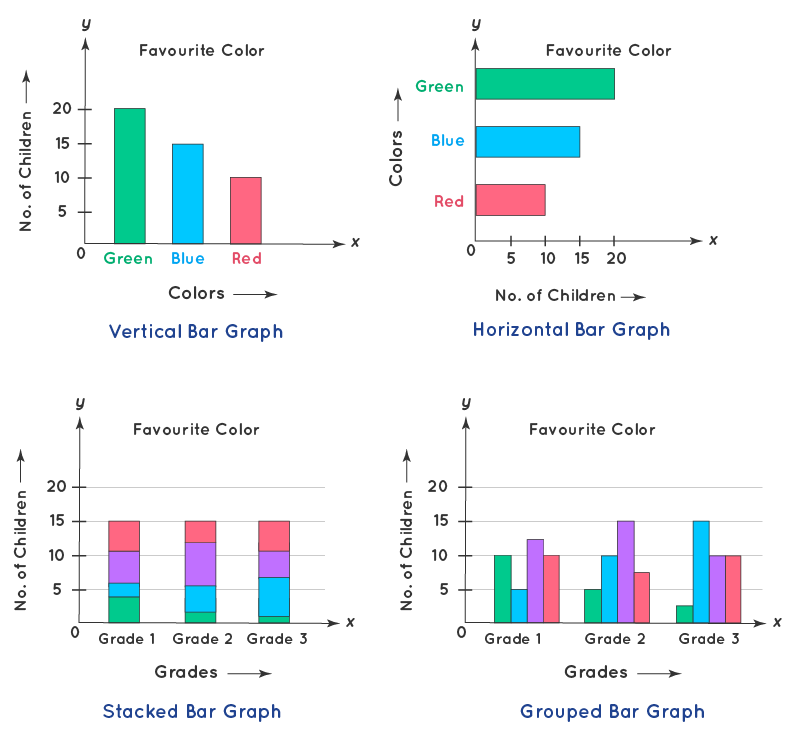
  • Displays categories along the horizontal axis and frequencies/relative frequencies on the vertical axis.
  • Each category is represented by a bar of equal width; bar height represents frequency or relative frequency.
  • Bars must be separated (no touching), since the data are categorical, not continuous.
  • Variations:
    • Simple Bar Chart: Each bar shows one category.
    • Segmented Bar Chart: Each bar represents a group, subdivided into segments that represent proportions within the group.
    • Side-by-Side Bar Chart: Bars for different groups are placed next to each other to compare distributions.

Pie Chart

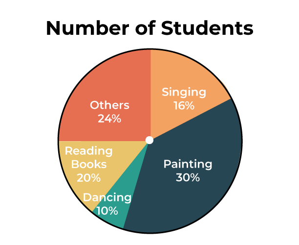
  • Displays each category as a slice of a circle, with size proportional to relative frequency.
  • Emphasizes part-to-whole relationships (percentages out of 100%).
  • Less effective than bar charts for making direct comparisons between categories.
  • Not recommended when there are many categories or small differences in size.

Guidelines for Graphing Categorical Data:

  • Label axes clearly and provide a title.
  • For bar charts: ensure consistent bar width and spacing between bars.
  • For pie charts: display percentages or proportions for clarity.
  • Avoid misleading scales (bars should always start at zero).
  • Use relative frequencies (percentages) when comparing groups of different sizes.

Choosing the Best Graph:

  • Bar Chart: Best for comparing sizes of categories.
  • Pie Chart: Best for showing proportion of each category relative to the whole.
  • Segmented/Side-by-Side Bar Chart: Best for comparing categorical distributions across groups.

Example:

A survey of 40 students asked about their favorite sport. Results: 15 chose Football, 10 chose Basketball, 8 chose Cricket, and 7 chose Tennis. Construct a bar chart to represent the data.

▶️ Answer/Explanation

Step 1: Identify categories: Football, Basketball, Cricket, Tennis.

Step 2: Plot categories on the horizontal axis and frequencies on the vertical axis.

Step 3: Draw four separate bars with heights 15, 10, 8, and 7.

Interpretation: Football is the most popular sport, while Tennis is the least preferred.

Note: Bars must be equally wide and separated since the data are categorical.

How to Describe Graphical Representations

How to Describe Graphical Representations:

  • Identify the most and least common categories based on bar or slice size.
  • Look for patterns or trends (e.g., whether one category dominates or all are similar).
  • Compare proportions or percentages visually.
  • Comment on the overall shape and balance of the graph (even or uneven distribution).
  • Highlight outliers or categories that stand out clearly.

Example:

A class of 30 students was asked about their preferred mode of learning: 12 chose Online, 10 chose In-person, and 8 chose Hybrid. Construct a pie chart representation and describe the data.

▶️ Answer/Explanation

Step 1: Find relative frequencies.

  • Online: \( \dfrac{12}{30} = 0.40 \) → 40%
  • In-person: \( \dfrac{10}{30} \approx 0.33 \) → 33.3%
  • Hybrid: \( \dfrac{8}{30} \approx 0.27 \) → 26.7%

Step 2: Convert to central angles (multiply by 360°).

  • Online: \( 0.40 \times 360^\circ = 144^\circ \)
  • In-person: \( 0.333 \times 360^\circ \approx 120^\circ \)
  • Hybrid: \( 0.267 \times 360^\circ \approx 96^\circ \)

Step 3: Draw a circle and divide into slices of 144°, 120°, and 96°.

Interpretation: Online learning is the most preferred mode (40%), while Hybrid is the least (26.7%). The chart shows a clear preference for Online over other modes.

Compare Multiple Sets of Categorical Data

Compare Multiple Sets of Categorical Data

Purpose:

  • To visually compare distributions of the same categorical variable across different groups.
  • Helps identify differences or similarities in patterns between categories across populations.
  • Best displayed using side-by-side bar charts or segmented bar charts.

Guidelines for Comparison:

  • Use the same categorical order for all groups being compared.
  • Use consistent scales or percentages for fair comparison.
  • For side-by-side bar charts — compare bar heights directly.
  • For segmented bar charts — compare proportions within the same total height (100%).

Example:

A survey recorded favorite drink preferences (Tea, Coffee, Juice) among 20 boys and 20 girls. The results are: Boys → Tea (6), Coffee (8), Juice (6); Girls → Tea (10), Coffee (5), Juice (5). Construct a segmented bar chart to compare preferences.

▶️ Answer/Explanation

Step 1: Convert each group’s frequencies into relative frequencies (proportions of each group).

  • Boys (total = 20): Tea \( \dfrac{6}{20} = 0.30 \), Coffee \( \dfrac{8}{20} = 0.40 \), Juice \( \dfrac{6}{20} = 0.30 \).
  • Girls (total = 20): Tea \( \dfrac{10}{20} = 0.50 \), Coffee \( \dfrac{5}{20} = 0.25 \), Juice \( \dfrac{5}{20} = 0.25 \).

Step 2: Draw two bars of equal height (100%), one for Boys and one for Girls.

Step 3: Subdivide each bar into segments for Tea, Coffee, and Juice according to their percentages.

Interpretation:

  • Among boys, Coffee (40%) is the most popular.
  • Among girls, Tea (50%) dominates.
  • The segmented bar chart highlights how preferences differ between genders.
Scroll to Top