
1.5.A Construct Quantitative One-Variable Graphical Representations
Quantitative variables contain numerical values that can be counted or measured.
To better understand quantitative data, statisticians use graphical representations that display the distribution of the values.
These graphs help reveal:
- Patterns in the data
- Clusters of values
- Gaps in the data
- Shape of the distribution
- Spread of the values
- Possible outliers
Unlike categorical graphs, quantitative graphs maintain the natural numerical order of the data from smallest to largest.
Common graphical displays for quantitative variables include:
- Histograms
- Stem-and-leaf plots
- Dotplots
1.5.A.1 Quantitative Graphical Representations
Histograms, stem-and-leaf plots, and dotplots visually represent the distribution of quantitative data.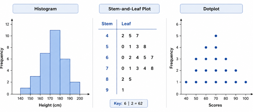
These graphs display:
- Frequencies
- Relative frequencies
- Intervals of values
- Individual observations
An important feature of quantitative graphs is that the data values remain ordered from smallest to largest.
This ordering allows statisticians to observe:
- Center of the distribution
- Variability
- Symmetry or skewness
- Unusual observations
| Graph Type | Main Feature | Best Use |
|---|---|---|
| Histogram | Groups data into intervals | Large data sets |
| Stem-and-Leaf Plot | Shows individual values | Small to medium data sets |
| Dotplot | Represents each observation with a dot | Identifying clusters and gaps |
Each graph displays the same quantitative data in a different way.
Example
A teacher records the quiz scores of students:
\( \mathrm{62,\ 65,\ 68,\ 70,\ 72,\ 72,\ 75,\ 78,\ 81,\ 84} \)
Explain why histograms, stem-and-leaf plots, and dotplots are appropriate graphical displays for these data.
▶️ Answer / Explanation
The data are quantitative because the quiz scores are numerical measurements.
A histogram can group the scores into intervals to show the distribution of the scores.
A stem-and-leaf plot can display the individual score values while keeping the data ordered.
A dotplot can represent each score using dots and help identify repeated values such as:
\( \mathrm{72} \)
All three graphs maintain the natural order of the quantitative data from smallest to largest.
1.5.A.2 Histograms
A histogram is a graph that displays quantitative data using intervals called bins.
The bins are placed along the horizontal axis in numerical order.
Each bar represents a range of values, and the height of the bar shows: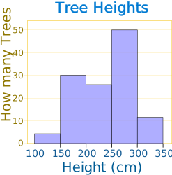
- The frequency
- Or the relative frequency
of observations within that interval.
Unlike bar charts for categorical data:
- Histogram bars touch each other because quantitative intervals are continuous.
- The horizontal axis represents numerical intervals.
The appearance of a histogram depends on the chosen bin widths.
Changing the bin widths may:
- Reveal different patterns
- Hide clusters or gaps
- Change the apparent shape of the distribution
For example:
- Narrow bins show more detail.
- Wide bins produce a smoother appearance.
Histograms may also be drawn horizontally, with bins on the vertical axis.
The frequency for each interval is calculated using:
\( \mathrm{Frequency=Number\ of\ observations\ within\ a\ bin} \)
| Score Interval | Frequency |
|---|---|
| \( \mathrm{60-69} \) | 3 |
| \( \mathrm{70-79} \) | 5 |
| \( \mathrm{80-89} \) | 2 |
In the histogram:
- The \( \mathrm{70-79} \) interval would have the tallest bar.
- The bars would touch because the intervals are continuous.
Example
The following data represent the number of minutes students spent exercising in one day:
\( \mathrm{12,\ 18,\ 22,\ 25,\ 27,\ 30,\ 33,\ 35,\ 38,\ 41,\ 44,\ 48} \)
Construct a frequency table using the intervals:
- \( \mathrm{10-19} \)
- \( \mathrm{20-29} \)
- \( \mathrm{30-39} \)
- \( \mathrm{40-49} \)
Then describe the histogram for the data.
▶️ Answer / Explanation
| Interval | Frequency |
|---|---|
| \( \mathrm{10-19} \) | 2 |
| \( \mathrm{20-29} \) | 3 |
| \( \mathrm{30-39} \) | 4 |
| \( \mathrm{40-49} \) | 3 |
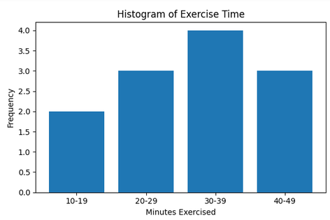
The histogram would contain four connected bars representing the intervals.
The interval: \( \mathrm{30-39} \) would have the tallest bar because it contains the greatest frequency: \( \mathrm{4} \)
The bars would touch because the intervals represent continuous quantitative data.
1.5.A.3 Stem-and-Leaf Plots
A stem-and-leaf plot displays quantitative data by separating each value into two parts:
- A stem
- A leaf
The stem usually contains the leading digit or digits.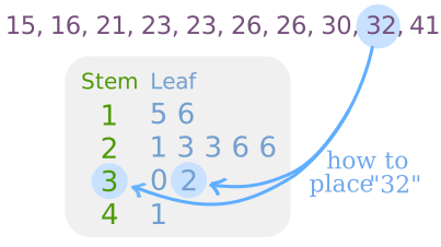
The leaf usually contains the final digit.
For example:
\( \mathrm{74} \)
can be split into:
- Stem: \( \mathrm{7} \)
- Leaf: \( \mathrm{4} \)
Stem-and-leaf plots preserve the original data values while organizing the data from smallest to largest.
This makes them useful for:
- Identifying clusters
- Finding gaps
- Detecting outliers
- Observing the shape of the distribution
Both stems and leaves are arranged in ascending order.
A key is often included to explain the meaning of the stems and leaves.
For example:
\( \mathrm{7|4=74} \)
This means:
- \( \mathrm{7} \) is the stem
- \( \mathrm{4} \) is the leaf
- The complete value is \( \mathrm{74} \)
| Stem | Leaves |
|---|---|
| 6 | 2 5 8 |
| 7 | 0 2 2 5 8 |
| 8 | 1 4 |
The plot above represents the data values:
\( \mathrm{62,\ 65,\ 68,\ 70,\ 72,\ 72,\ 75,\ 78,\ 81,\ 84} \)
Stem-and-leaf plots are most effective for small or medium-sized data sets.
Example
The following test scores were recorded:
\( \mathrm{54,\ 57,\ 61,\ 63,\ 65,\ 68,\ 72,\ 74,\ 76,\ 79} \)
Construct a stem-and-leaf plot for the data.
▶️ Answer / Explanation
Separate each value into stems and leaves.
| Stem | Leaves |
|---|---|
| 5 | 4 7 |
| 6 | 1 3 5 8 |
| 7 | 2 4 6 9 |
Key:
\( \mathrm{6|5=65} \)
The stems and leaves are ordered from smallest to largest.
The plot preserves all original data values.
1.5.A.4 Dotplots
A dotplot represents each observation in a quantitative data set using a dot.
Each dot is placed directly above a value on a horizontal axis or beside a value on a vertical axis.
If multiple observations have the same value, the dots are stacked on top of each other.
Dotplots help visualize: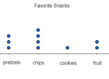
- Clusters
- Gaps
- Outliers
- Shape of the distribution
- Repeated values
Dotplots are especially useful for:
- Small data sets
- Comparing frequencies of individual values
- Preserving exact observations
Unlike histograms, dotplots show every individual data value directly.
For example, the data:
\( \mathrm{2,\ 3,\ 3,\ 4,\ 5,\ 5,\ 5,\ 6} \)
would place:
- One dot above \( \mathrm{2} \)
- Two dots above \( \mathrm{3} \)
- Three dots above \( \mathrm{5} \)
Stacked dots show repeated observations clearly.
| Value | Number of Dots |
|---|---|
| 2 | 1 |
| 3 | 2 |
| 5 | 3 |
Dotplots maintain the natural ordering of quantitative data from smallest to largest.
Example
A teacher records the number of books read by students during a semester:
\( \mathrm{1,\ 2,\ 2,\ 3,\ 4,\ 4,\ 4,\ 5,\ 6} \)
Describe how a dotplot for the data would appear.
▶️ Answer / Explanation
The dotplot would place dots above each number from:
\( \mathrm{1} \) to: \( \mathrm{6} \)
There would be:
- One dot above \( \mathrm{1} \)
- Two dots above \( \mathrm{2} \)
- One dot above \( \mathrm{3} \)
- Three dots above \( \mathrm{4} \)
- One dot above \( \mathrm{5} \)
- One dot above \( \mathrm{6} \)
The tallest stack would occur at:
\( \mathrm{4} \)
because \( \mathrm{4} \) appears most frequently in the data set.