Representing a Quantitative Variable with Graphs
To display the distribution of a quantitative variable (numerical data) so that features such as center, spread, and shape can be analyzed.
Common Graphical Representations:
Dotplot:
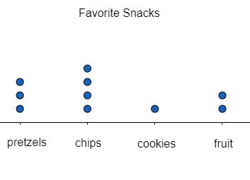
- Each observation is shown as a dot placed above its value on a number line.
- Effective for small to moderate data sets.
- Displays clusters, gaps, and outliers clearly.
Histogram:

- Data are grouped into intervals (called bins) along the horizontal axis.
- The height of each bar represents the frequency (or relative frequency) of observations in that interval.
- Good for large data sets.
- Shape (symmetric, skewed, uniform, bimodal) becomes visible.
- Note: Unlike bar charts for categorical data, histogram bars touch because the variable is continuous or ordered.
Stem-and-Leaf Plot:

- Splits each value into a “stem” (leading digit(s)) and a “leaf” (final digit).
- Retains actual data values while showing distribution.
- Useful for moderately sized data sets.
- Can quickly show spread, clusters, and outliers.
Boxplot (Box-and-Whisker Plot):
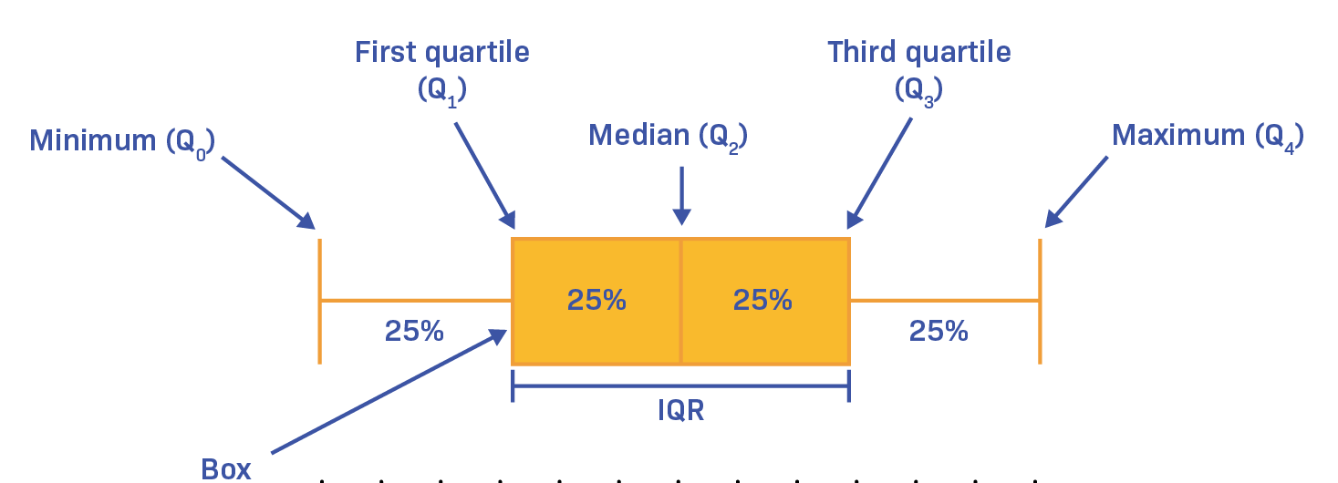
- Summarizes a distribution using five-number summary: minimum, \( Q_1 \), median, \( Q_3 \), maximum.
- Box shows the interquartile range (IQR = \( Q_3 – Q_1 \)).
- Line inside the box marks the median.
- Whiskers extend to min and max (excluding outliers).
- Outliers are shown as individual points.
- Useful for comparing distributions across groups.
Key Differences Between Categorical and Quantitative Graphs:
- Categorical → Use bar graphs, pie charts, tables (order of categories not numeric).
- Quantitative → Use dotplots, histograms, stemplots, boxplots (order is meaningful and numerical scale is used).
Steps in Constructing a Graph for Quantitative Data:
- Identify the type of quantitative variable (discrete vs continuous).
- Choose an appropriate graph (dotplot for small sets, histogram for large, boxplot for summary comparison).
- Label axes and scales clearly.
- Look for distribution features: center, spread, shape, unusual features (outliers, gaps, clusters).
What to Look For in the Distribution:
- Shape: symmetric, skewed left, skewed right, uniform, bimodal.
- Center: mean or median.
- Spread: range, IQR, standard deviation.
- Outliers: unusually large or small values.
Example:
The math test scores of 10 students were: 72, 75, 78, 72, 80, 85, 88, 75, 90, 95.
Construct a dotplot of the data.
▶️ Answer/Explanation
Step 1: Place a number line covering the range (70–100).
Step 2: For each score, place a dot above its value.
- 72 → 2 dots
- 75 → 2 dots
- 78 → 1 dot
- 80 → 1 dot
- 85 → 1 dot
- 88 → 1 dot
- 90 → 1 dot
- 95 → 1 dot
Step 3: The dotplot shows clusters at 72 and 75, with scores spread up to 95.
Interpretation: Most students scored in the low-to-mid 70s, while fewer scored near 90 and above.
Example:
A factory recorded the weights (in kg) of 30 packages: 41, 43, 45, 46, 47, 49, 50, 51, 52, 52, 53, 54, 54, 55, 56, 57, 58, 58, 59, 60, 61, 62, 62, 63, 64, 65, 66, 67, 68, 70.
Construct a histogram with bin width = 5.
▶️ Answer/Explanation
Step 1: Define intervals (bins) of width 5:
- 40–44
- 45–49
- 50–54
- 55–59
- 60–64
- 65–69
- 70–74
Step 2: Count frequencies:
- 40–44 → 2
- 45–49 → 3
- 50–54 → 6
- 55–59 → 6
- 60–64 → 5
- 65–69 → 4
- 70–74 → 1
Step 3: Draw bars with heights matching frequencies.
Interpretation: The histogram shows a roughly symmetric distribution, centered around 55–60 kg, with fewer lighter and heavier packages.
Example:
The daily study hours of 12 students were: 1, 2, 2, 3, 3, 4, 4, 4, 5, 6, 7, 8.
Construct a boxplot of the data.
▶️ Answer/Explanation
Step 1: Order data (already ordered).
Step 2: Find the five-number summary.
- Minimum = 1
- Q1 = 2
- Median = 3.5 (average of 3 and 4)
- Q3 = 5
- Maximum = 8
Step 3: Draw box from Q1 (2) to Q3 (5), mark median (3.5) inside the box. Draw whiskers to 1 and 8.
Interpretation: Half of students study between 2–5 hours. The distribution is slightly right-skewed, with some students studying much longer (7–8 hours).
Example:
The daily study hours of 12 students were: 1, 2, 2, 3, 3, 4, 4, 4, 5, 6, 7, 8. Construct a stem-and-leaf plot of the data.
▶️ Answer/Explanation
Step 1: Identify stems and leaves. Since data are single-digit hours, the stem will be the tens place (0), and the leaf will be the ones digit.
Step 2: Organize data into stem-and-leaf format.
Stem | Leaves 0 | 1 2 2 3 3 4 4 4 5 6 7 8
Step 3: Since all values are in the 0–9 range, only one stem (0) is needed. Each leaf corresponds to a study hour.
Step 4: Interpretation.
- Most students studied between 3–5 hours (cluster visible in leaves).
- The distribution is slightly right-skewed because of higher values (7, 8).
- A stem-and-leaf plot preserves actual data values while also showing distribution shape.