
1.6.A Describe Distributions of Quantitative One-Variable Graphical Representations
Graphs of quantitative data help statisticians understand how the values in a data set are distributed.
A distribution describes the overall pattern of the data shown in a graph.
When describing a quantitative distribution, statisticians focus on:
- Shape
- Center
- Variability (spread)
- Unusual features
Unusual features may include:
- Outliers
- Gaps
- Clusters
Describing distributions helps statisticians compare data sets and identify important patterns in context.
1.6.A.1 Describing Quantitative Distributions
A complete description of a quantitative distribution should include: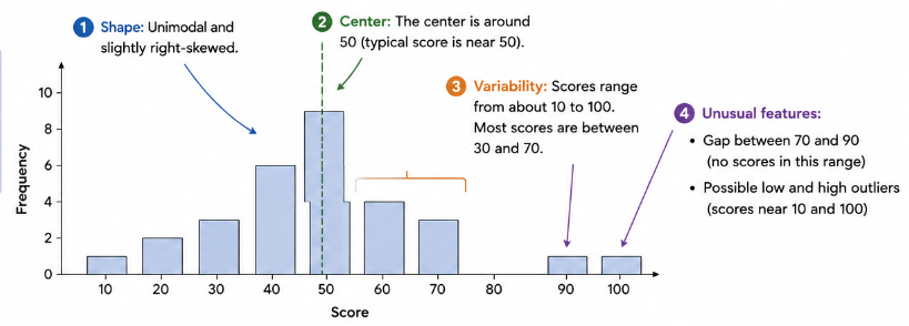
- Shape of the distribution
- Center of the data
- Variability or spread of the data
- Unusual features such as outliers, gaps, or clusters
These characteristics help summarize the behavior of the data set.
| Characteristic | Meaning |
|---|---|
| Shape | Overall appearance of the distribution |
| Center | Typical or middle value |
| Variability | How spread out the data are |
| Unusual Features | Outliers, gaps, or clusters |
Descriptions should always be written in context.
For example:
Weak description:
“The distribution is spread out.”
Strong description:
“The distribution of student test scores is spread out from approximately \( \mathrm{50} \) to \( \mathrm{100} \).”
Including context helps explain what the values represent in the real-world situation.
Example
A histogram displays the number of minutes students spend exercising each day.
Most values fall between: \( \mathrm{20} \) and: \( \mathrm{50} \)
There is one unusually large value at: \( \mathrm{95} \)
Describe the distribution in context.
▶️ Answer / Explanation
The distribution of daily exercise times is centered between approximately:
\( \mathrm{20} \)
and:
\( \mathrm{50} \)
minutes.
The data show variability because the exercise times are spread across several intervals.
There is an unusual feature at:
\( \mathrm{95} \)
minutes, which may be an outlier because it is much larger than the rest of the data.
1.6.A.2 Shapes of Distributions
The shape of a quantitative distribution describes the overall pattern formed by the data.
Three common distribution shapes are:
- Skewed right
- Skewed left
- Approximately symmetric
The direction of skewness is determined by the longer tail of the distribution.
| Shape | Description |
|---|---|
| Skewed Right | Longer tail toward larger values |
| Skewed Left | Longer tail toward smaller values |
| Approximately Symmetric | Left and right sides are roughly mirror images |
Skewed Right (Positively Skewed)
A distribution is skewed right if the tail extends farther toward larger values.
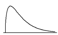
This often occurs when a few unusually large values pull the distribution to the right.
Examples:
- Income distributions
- House prices
- Waiting times
Skewed Left (Negatively Skewed)
A distribution is skewed left if the tail extends farther toward smaller values.
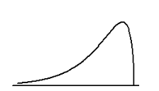
This occurs when a few unusually small values pull the distribution to the left.
Approximately Symmetric
A distribution is approximately symmetric if the left and right halves are roughly mirror images.
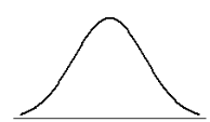
In symmetric distributions:
- The center is near the middle of the graph.
- The tails extend about equally in both directions.
Example
A histogram of household incomes shows that most households earn between:
\( \mathrm{\$40,000} \) and: \( \mathrm{\$70,000} \) but a few households earn very large incomes above: \( \mathrm{\$200,000} \)
Describe the shape of the distribution.
▶️ Answer / Explanation
The distribution is skewed right.
Most incomes are concentrated in the lower and middle ranges.
A small number of very large incomes create a long tail toward larger values.
The right side of the distribution extends farther than the left side.
1.6.A.3 Modal Shape of Distributions
The number of prominent peaks in a distribution helps describe its overall shape.
Common modal descriptions include:
- Unimodal
- Bimodal
- Approximately uniform
| Distribution Type | Description |
|---|---|
| Unimodal | One main peak |
| Bimodal | Two prominent peaks |
| Approximately Uniform | Frequencies are roughly equal across intervals |
Unimodal Distribution
A unimodal distribution has one clear peak where the frequency is greatest.
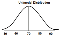
Most common quantitative distributions are unimodal.
Bimodal Distribution
A bimodal distribution has two noticeable peaks.
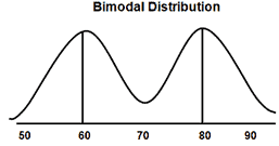
This may occur when two different groups are combined into one data set.
For example:
- Heights of children and adults combined
- Scores from two different classrooms
Approximately Uniform Distribution
A distribution is described as approximately uniform when the frequencies across intervals are fairly even, even though they are not exactly the same. Since real-world data often contain natural variation, perfect uniformity is uncommon.
Characteristics of an approximately uniform distribution include:
- Frequencies are spread fairly evenly across the intervals.
- The graph appears relatively level or flat.
Unlike unimodal distributions, which have one prominent peak, or bimodal distributions, which have two distinct peaks, a uniform distribution is characterized by the lack of any dominant high point. Its overall shape remains fairly consistent across the range of data.
Example
A histogram of movie ratings shows two large peaks:
- One peak near \( \mathrm{3} \)
- Another peak near \( \mathrm{9} \)
Describe the distribution.
▶️ Answer / Explanation
The distribution is bimodal.
The histogram contains two prominent peaks.
One cluster of movie ratings is centered near:
\( \mathrm{3} \)
while another cluster is centered near:
\( \mathrm{9} \)
The two peaks suggest that the ratings may come from two different groups of opinions.
1.6.A.4 Outliers
An outlier is a data value that is unusually small or unusually large compared to the rest of the data set.
Outliers appear separated from the main cluster of observations in a graph.
Outliers are important because they may: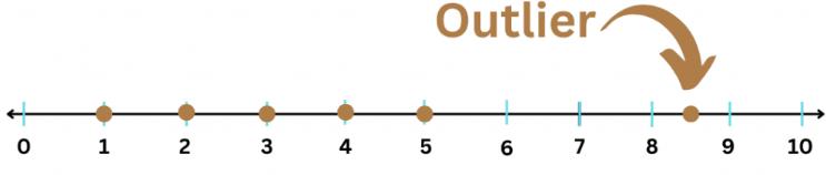
- Strongly affect the mean
- Increase variability
- Indicate unusual conditions
- Suggest possible data errors
Outliers can appear in:
- Histograms
- Dotplots
- Stem-and-leaf plots
For example:
Most test scores may fall between: \( \mathrm{70} \) and: \( \mathrm{90} \) but one score of: \( \mathrm{25} \) would likely be considered an outlier.
| Feature | Description |
|---|---|
| Outlier | An unusually small or large value |
| Effect on Mean | Can pull the mean toward the extreme value |
| Graph Appearance | Appears isolated from the main data cluster |
Outliers should always be interpreted in context because some unusual values may still be valid observations.
Example
A dotplot shows the following daily temperatures:
\( \mathrm{68,\ 70,\ 71,\ 72,\ 73,\ 74,\ 75,\ 101} \)
Identify any possible outlier and explain your reasoning.
▶️ Answer / Explanation
The value:
\( \mathrm{101} \)
appears to be a possible outlier.
Most temperatures are clustered between:
\( \mathrm{68} \)
and:
\( \mathrm{75} \)
The value:
\( \mathrm{101} \)
is much larger than the rest of the data and appears separated from the main distribution.
1.6.A.5 Gaps
A gap is a region in a distribution where no observations occur.
Gaps appear as empty spaces in a graph between groups of data values.
Gaps may suggest: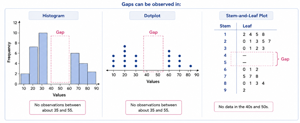
- Different groups within the data
- Missing observations
- Natural separation between values
Gaps can be observed in:
- Histograms
- Dotplots
- Stem-and-leaf plots
For example:
If data values occur mostly between: \( \mathrm{10-20} \) and: \( \mathrm{40-50} \) with no observations between: \( \mathrm{21-39} \) then the distribution contains a gap.
| Feature | Description |
|---|---|
| Gap | A region with no observations |
| Graph Appearance | Empty interval between values |
| Possible Meaning | Separate groups or missing values |
Gaps help statisticians identify unusual patterns in the distribution.
Example
A histogram shows student ages at a summer camp. Most ages are between: \( \mathrm{8-12} \) and: \( \mathrm{16-18} \) There are no observations between: \( \mathrm{13-15} \)
Describe the unusual feature in the distribution.
▶️ Answer / Explanation
The distribution contains a gap.
There are no observations between:
\( \mathrm{13} \)
and:
\( \mathrm{15} \)
The empty interval separates the two groups of ages in the distribution.
1.6.A.6 Clusters
A cluster is a concentration of data values within a particular region of a distribution.
Clusters occur where observations are grouped closely together.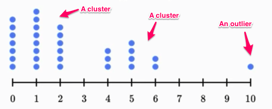
A distribution may contain:
- One cluster
- Multiple clusters
Clusters are often separated by gaps.
Clusters help identify regions where data values are most common.
For example:
If many observations fall between:
\( \mathrm{60} \) and: \( \mathrm{75} \) then the distribution has a cluster in that interval.
| Feature | Description |
|---|---|
| Cluster | Region with many observations grouped together |
| Graph Appearance | Dense concentration of values |
| Possible Meaning | Common range of observations |
Clusters often indicate the most typical values in a distribution.
Example
A dotplot of daily sales shows that most sales values fall between: \( \mathrm{45} \) and: \( \mathrm{60} \) with only a few observations outside this interval.
Describe the distribution in terms of clusters.
▶️ Answer / Explanation
The distribution contains a cluster between:
\( \mathrm{45} \)
and:
\( \mathrm{60} \)
because many observations are concentrated in this interval.
This interval represents the most common daily sales values in the data set.
1.6.B Justify a Claim Using Distributions of Quantitative One-Variable Graphical Representations
Graphs of quantitative data provide visual evidence that can be used to support statistical claims.
Quantitative graphical representations such as:
- Histograms
- Dotplots
- Stem-and-leaf plots
help statisticians identify important characteristics of a distribution.
These characteristics may include:
- Shape
- Center
- Spread
- Clusters
- Gaps
- Outliers
By analyzing these features, statisticians can justify claims about the quantitative variable in context.
A strong statistical justification should:
- Reference specific graphical evidence
- Describe the distribution accurately
- Explain the conclusion in context
Weak justification:
“The data are large.”
Strong justification:
“The histogram shows that most student test scores are concentrated between: \( \mathrm{80} \) and: \( \mathrm{95} \), indicating that most students performed well on the test.”
1.6.B.1 Using Quantitative Graphical Representations to Support Claims
Quantitative graphs reveal patterns that help support statistical conclusions.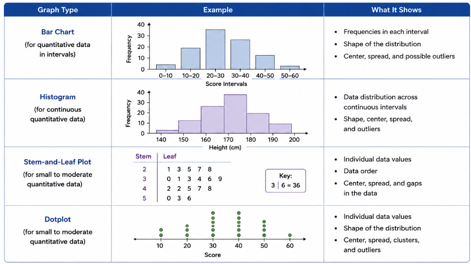
These graphs may justify claims about:
- Typical values
- Variability
- Skewness
- Unusual observations
- Concentrations of data
For example:
- A right-skewed distribution may suggest that a few unusually large values exist.
- A cluster may identify the most common range of observations.
- An outlier may indicate an unusual event or possible error.
When interpreting graphs:
- Always describe the evidence shown in the graph.
- Always explain the conclusion in context.
| Graph Feature | Possible Claim |
|---|---|
| Right Skew | A few unusually large values exist |
| Cluster | Most observations occur in a specific interval |
| Gap | No observations occur in a region |
| Outlier | An unusually small or large observation exists |
Statistical claims should always be supported using visible evidence from the graphical representation.
Example
A histogram displays the number of hours students spend studying each week. Most observations fall between: \( \mathrm{8} \) and: \( \mathrm{15} \) hours. A few observations appear between: \( \mathrm{20} \) and: \( \mathrm{25} \) hours.
Use the graphical information to justify a claim about student study habits.
▶️ Answer / Explanation
The histogram suggests that most students study between:
\( \mathrm{8} \) and: \( \mathrm{15} \) hours per week because the majority of observations are concentrated in this interval.
The distribution appears slightly skewed right because a few students study much longer hours between:
\( \mathrm{20} \) and: \( \mathrm{25} \) hours.
These larger values create a tail extending toward higher study times.
The graph supports the claim that typical study times are moderate, with a few students studying substantially more than the rest.