
1.8.A.1 Five-Number Summary
The five-number summary consists of five important values that describe the distribution of a quantitative data set.
These values divide the distribution into sections and provide information about center and spread.
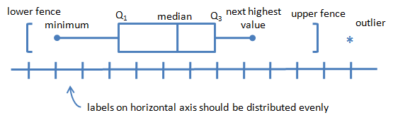
The Five Numbers Are:
- Minimum
- First Quartile (\(Q_1\))
- Median (\(Q_2\))
- Third Quartile (\(Q_3\))
- Maximum
| Statistic | Description |
|---|---|
| Minimum | Smallest value |
| \(Q_1\) | 25th percentile |
| Median (\(Q_2\)) | 50th percentile |
| \(Q_3\) | 75th percentile |
| Maximum | Largest value |
The five-number summary divides the distribution into four approximately equal parts.
Each quartile contains approximately: \( \mathrm{25\%} \) of the observations.
Summary Format
\( \text{Minimum},\ Q_1,\ Median,\ Q_3,\ Maximum \)
These five values provide the information needed to construct a boxplot.
Example
Consider the ordered data set:
\( \mathrm{4,\ 6,\ 8,\ 10,\ 12,\ 14,\ 16,\ 18,\ 20} \)
Determine the five-number summary.
▶️ Answer / Explanation
Step 1: Find the median.
\( \mathrm{Median=12} \)
Step 2: Find \(Q_1\).
Lower half:
\( \mathrm{4,\ 6,\ 8,\ 10} \)
\( \mathrm{Q_1=\frac{6+8}{2}=7} \)
Step 3: Find \(Q_3\).
Upper half:
\( \mathrm{14,\ 16,\ 18,\ 20} \)
\( \mathrm{Q_3=\frac{16+18}{2}=17} \)
Step 4: Identify minimum and maximum.
Minimum:
\( \mathrm{4} \)
Maximum:
\( \mathrm{20} \)
Therefore, the five-number summary is:
\( \mathrm{(4,\ 7,\ 12,\ 17,\ 20)} \)
1.8.A.2 Boxplots
A boxplot (also called a box-and-whisker plot) is a graphical display of the five-number summary.
Boxplots provide a visual summary of:
- Center
- Spread
- Quartiles
- Potential outliers
A boxplot is constructed using the five-number summary.
Parts of a Boxplot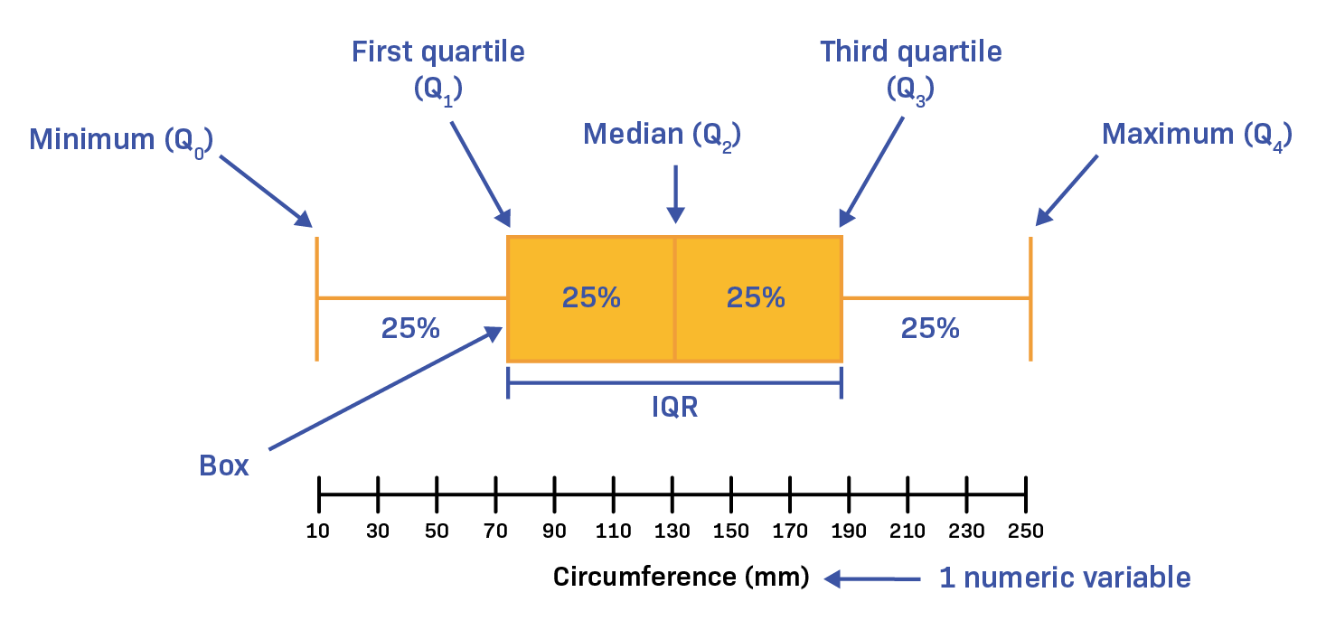
- The left edge of the box is \(Q_1\).
- The right edge of the box is \(Q_3\).
- The line inside the box represents the median.
- The box contains the middle \(50\%\) of the data.
- The whiskers extend toward the minimum and maximum values.
When no outliers are present:
The whiskers extend from:
- \(Q_1\) to the minimum
- \(Q_3\) to the maximum
When outliers are present:
- The whiskers stop at the most extreme non-outlier values.
- Outliers are shown separately using symbols such as asterisks or dots.
| Boxplot Component | Represents |
|---|---|
| Left Whisker End | Minimum (or smallest non-outlier) |
| Left Edge of Box | \(Q_1\) |
| Line Inside Box | Median |
| Right Edge of Box | \(Q_3\) |
| Right Whisker End | Maximum (or largest non-outlier) |
Important AP Statistics Fact
The box itself contains: \( \mathrm{50\%} \) of all observations because it extends from: \(Q_1\) to: \(Q_3\) which defines the middle half of the distribution.
Example
A data set has the following five-number summary:
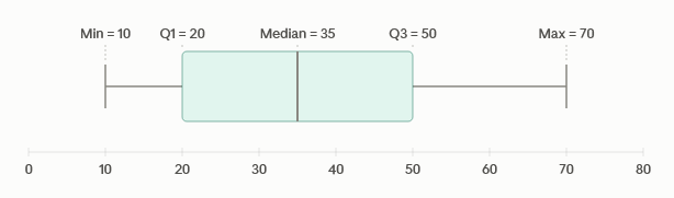
\( \mathrm{(10,\ 20,\ 35,\ 50,\ 70)} \)
Describe the boxplot that would be constructed from these values.
▶️ Answer / Explanation
Minimum: \( \mathrm{10} \) will be the left whisker endpoint.
\(Q_1\): ( \mathrm{20} \) will form the left edge of the box.
Median: \( \mathrm{35} \) will appear as a vertical line inside the box.
\(Q_3\): \( \mathrm{50} \) will form the right edge of the box.
Maximum: \( \mathrm{70} \) will be the right whisker endpoint.
The box from: \( \mathrm{20} \) to: \( \mathrm{50} \) contains the middle: \( \mathrm{50\%} \) of the observations.
1.8.B Describe Quantitative One-Variable Graphical Representations Based on the Relationship of the Mean and Median
The shape of a distribution can often be determined by comparing the values of the mean and median.
Because the mean uses every observation in a data set, it is affected by unusually large or unusually small values.
The median depends only on the position of values and is resistant to outliers.
As a result, the relationship between the mean and median provides important information about the shape of a distribution.
This relationship is frequently used when interpreting:
- Histograms
- Dotplots
- Stem-and-leaf plots
- Boxplots
Understanding how the mean and median compare helps statisticians determine whether a distribution is:
- Symmetric
- Skewed Right
- Skewed Left
1.8.B.1 Relationship Between Mean and Median
The relative positions of the mean and median provide clues about the shape of a distribution.
Symmetric Distributions
A distribution is approximately symmetric when the left and right sides are roughly mirror images of each other.
In a symmetric distribution:
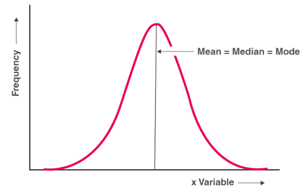
\( \mathrm{Mean \approx Median} \)
Since there is no long tail pulling the mean in either direction, the two measures of center tend to be very close.
Right-Skewed Distributions
A distribution is skewed right when the right tail extends farther toward larger values.
Large observations pull the mean toward the right tail.
Therefore:
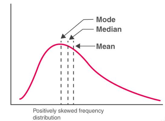
\( \mathrm{Mean > Median} \)
Left-Skewed Distributions
A distribution is skewed left when the left tail extends farther toward smaller values.
Small observations pull the mean toward the left tail.
Therefore:
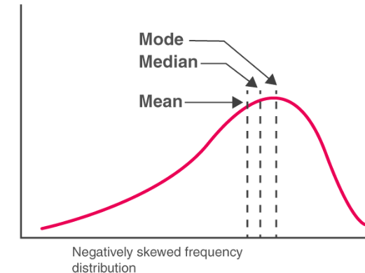
\( \mathrm{Mean < Median} \)
| Shape of Distribution | Relationship | Reason |
|---|---|---|
| Symmetric | \( \mathrm{Mean \approx Median} \) | No long tail affects the mean |
| Skewed Right | \( \mathrm{Mean > Median} \) | Large values pull the mean right |
| Skewed Left | \( \mathrm{Mean < Median} \) | Small values pull the mean left |
AP Statistics Memory Trick
The mean is always pulled in the direction of the longer tail.
- Right Tail → Mean moves right → \( \mathrm{Mean > Median} \)
- Left Tail → Mean moves left → \( \mathrm{Mean < Median} \)
Many AP Statistics questions ask students to identify distribution shape using only the mean and median.
The following summarizes the relationship:
Negative values indicate the mean is less than the median, positive values indicate the mean is greater than the median, and zero indicates they are approximately equal.
Example
A distribution has:
- Mean = \( \mathrm{82} \)
- Median = \( \mathrm{75} \)
Describe the shape of the distribution and justify your answer.
▶️ Answer / Explanation
Since:
\( \mathrm{82>75} \)
the mean is greater than the median.
This suggests that unusually large observations are pulling the mean to the right.
Therefore, the distribution is:
Skewed Right (Positively Skewed)
The larger values create a longer right tail, causing the mean to exceed the median.
Example
A boxplot represents a distribution where the mean is approximately equal to the median.
What can be concluded about the shape of the distribution?
▶️ Answer / Explanation
When the mean and median are approximately equal:
\( \mathrm{Mean \approx Median} \)
the distribution is likely approximately symmetric.
Neither tail is long enough to pull the mean noticeably away from the median.
Therefore, the graphical representation likely shows a symmetric distribution.