Purpose
In AP Statistics, when comparing two or more distributions, you must describe similarities and differences using a structured approach. This is often remembered by the acronym SOCS: Shape, Outliers, Center, Spread.
1. Shape
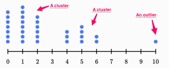
Look for symmetry, skewness, modality (number of peaks), clusters, and gaps.
- Distributions can be:

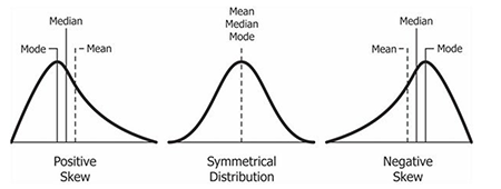
- Symmetric (bell-shaped, uniform).
- Skewed right (longer right tail).
- Skewed left (longer left tail).
- Unimodal, bimodal, or roughly uniform.
- When comparing → note whether one group is more skewed, more symmetric, or shows multiple modes.
2. Outliers
Report unusual observations (extremely high or low values) or clusters separated by gaps.
- Identify using the IQR rule:
Outlier if \( x < Q_1 – 1.5 \times IQR \) or \( x > Q_3 + 1.5 \times IQR \).
- In comparisons → note if one group has more outliers than another, since outliers can distort measures of center and spread.
3. Center
Describe the typical value using media n or mean.
- Which group tends to have higher (or lower) values?
- Choice of summary statistic depends on shape:
- If symmetric with no outliers → use mean.
- If skewed or has outliers → use median.
4. Spread (Variability)
Describe how spread out the data are.
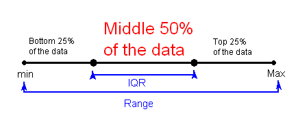
- Numerical summaries:
- Range = max – min.
- IQR = \( Q_3 – Q_1 \) → resistant measure of spread.
- Standard deviation → sensitive to skew and outliers.
- When comparing → state which distribution is more variable and by how much.
5. How to Write a Comparison
- Always mention both groups explicitly (don’t describe them separately in isolation).
- Example phrasing: “Group A has a higher median score than Group B, but Group B is more spread out with an outlier.”
- A complete comparison uses all of SOCS: Shape, Outliers, Center, Spread.
Example
Two classes took the same test. Their scores were summarized in boxplots:
- Class A: Min = 55, Q1 = 65, Median = 75, Q3 = 85, Max = 95
- Class B: Min = 50, Q1 = 60, Median = 70, Q3 = 80, Max = 100
Compare the two classes’ test score distributions using SOCS (Shape, Outliers, Center, Spread).
▶️ Answer / Explanation
- Shape: Both appear roughly symmetric (median near the center of each box, whiskers of similar length). No clear skewness.
- Outliers: None are indicated by the five-number summaries.
- Center: Class A median = 75, Class B median = 70. Class A’s typical score is higher.
- Spread:
- Class A IQR = 85 – 65 = 20; Range = 95 – 55 = 40.
- Class B IQR = 80 – 60 = 20; Range = 100 – 50 = 50.
- Both have equal IQR, but Class B is more variable overall because its range is wider.
Final Comparison: Class A scored higher on average (median 75 vs 70), while Class B’s scores are more spread out with a wider range.
Example
Students in two grade levels reported their daily screen time (in hours). The data were summarized:
- Grade 9: Min = 1, Q1 = 2, Median = 3, Q3 = 4, Max = 8
- Grade 12: Min = 2, Q1 = 3, Median = 4, Q3 = 5, Max = 12 (with an outlier at 12)
Compare the distributions of screen time for Grade 9 and Grade 12 students using SOCS.
▶️ Answer / Explanation
- Shape: Grade 9 appears slightly right-skewed (longer whisker to the right). Grade 12 is also right-skewed due to the high outlier at 12.
- Outliers: Grade 9 has none. Grade 12 has one outlier (12 hours).
- Center: Grade 9 median = 3 hours, Grade 12 median = 4 hours. On average, Grade 12 students spend more time on screens.
- Spread:
- Grade 9 IQR = 4 – 2 = 2; Range = 8 – 1 = 7.
- Grade 12 IQR = 5 – 3 = 2; Range = 12 – 2 = 10.
- Both groups have equal IQRs, but Grade 12 has a larger overall range due to the outlier.
Final Comparison: Grade 12 students generally spend more time on screens (median 4 vs 3 hours), but their data are more variable and include an outlier.
Example
Two track teams recorded their 5k race times (in minutes):
- Team X: Min = 16, Q1 = 17, Median = 18, Q3 = 20, Max = 24
- Team Y: Min = 15, Q1 = 18, Median = 21, Q3 = 25, Max = 35
Use SOCS to compare the 5k times of Team X and Team Y.
▶️ Answer / Explanation
- Shape: Team X appears slightly right-skewed (longer whisker on the right). Team Y is strongly right-skewed (long upper whisker, possible high extreme value at 35).
- Outliers: Not explicitly indicated, but 35 is unusually large and could be an outlier by IQR rule.
- Center: Team X median = 18 minutes, Team Y median = 21 minutes. Team X is generally faster.
- Spread:
- Team X IQR = 20 – 17 = 3; Range = 24 – 16 = 8.
- Team Y IQR = 25 – 18 = 7; Range = 35 – 15 = 20.
- Team Y is more variable, with a wider spread of times.
Final Comparison: Team X is faster on average (median 18 vs 21) and more consistent (smaller spread). Team Y has more variation and slower typical times.