
1.9.A.1 Comparing Quantitative Distributions Using Graphical Representations
Graphical representations reveal important characteristics that help compare distributions.
Different types of graphs provide different information.
Histograms, dotplots, and stem-and-leaf plots are especially useful for examining: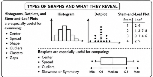
- Center
- Spread
- Shape
- Outliers
- Clusters
- Gaps
Boxplots are especially useful for comparing:
- Center
- Spread
- Outliers
- Skewness or Symmetry
Comparing Center
The center represents the typical value of a distribution.
When comparing graphs:
- A distribution located farther to the right generally has a larger center.

- A distribution located farther to the left generally has a smaller center.
Measures often used:
- Mean
- Median
Comparing Variability (Spread)
Spread describes how dispersed the data values are.
- A distribution with a wider spread has greater variability.
- A distribution with a narrower spread has less variability.
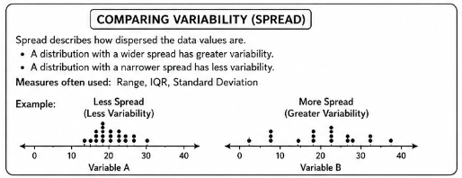
Measures often used:
- Range
- IQR
- Standard Deviation
Comparing Shape
The shape of a distribution may be: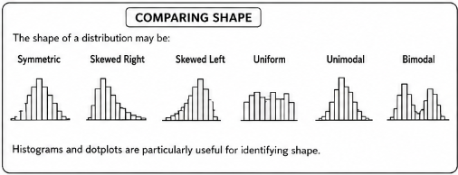
- Symmetric
- Skewed Right
- Skewed Left
- Uniform
- Unimodal
- Bimodal
Histograms and dotplots are particularly useful for identifying shape.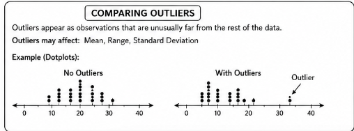
Comparing Outliers
Outliers appear as observations that are unusually far from the rest of the data.
Outliers may affect:
- Mean
- Range
- Standard Deviation
When comparing distributions, mention any unusual observations that appear.
Comparing Clusters and Gaps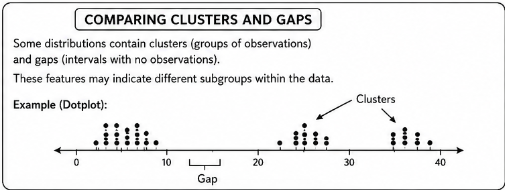
Some distributions contain:
- Clusters (groups of observations)
- Gaps (intervals with no observations)
These features may indicate different subgroups within the data.
| Graph Type | Features Best Compared |
|---|---|
| Histogram | Center, Spread, Shape, Clusters, Gaps, Outliers |
| Dotplot | Center, Spread, Shape, Clusters, Gaps, Outliers |
| Back-to-Back Stem-and-Leaf Plot | Center, Spread, Shape, Outliers |
| Boxplot | Center, Spread, Outliers, Skewness |
AP Statistics Comparison Template
When comparing two quantitative distributions, use the following order:
Center → Spread → Shape → Outliers
This structure appears frequently on AP Free-Response Questions.
A strong comparison should describe:
- Which distribution has the larger center
- Which distribution has greater variability
- How the shapes differ
- Whether outliers are present
Example
Two boxplots summarize test scores from two classes.
Class A:
\( \mathrm{Median=85,\ IQR=10} \)
Class B:
\( \mathrm{Median=78,\ IQR=18} \)
No outliers are shown on either boxplot.
Compare the two distributions.
▶️ Answer / Explanation
Center:
Class A has the larger median. Since: \( \mathrm{85>78} \)
Class A generally achieved higher test scores.
Spread:
Class B has the larger IQR.
Since:
\( \mathrm{18>10} \)
Class B’s scores are more variable.
Shape:
The shape cannot be determined from the information provided.
A complete boxplot would be needed to evaluate skewness or symmetry.
Outliers:
No outliers are present in either distribution.
Overall, Class A performed better on average, while Class B showed greater variability in scores.
Example
Two histograms display the daily exercise times of two groups of adults.
Group A has a roughly symmetric distribution centered around:
\( \mathrm{45} \) minutes.
Group B has a right-skewed distribution centered around:
\( \mathrm{35} \) minutes with several large values above: \( \mathrm{90} \) minutes.
Compare the two distributions.
▶️ Answer / Explanation
Center:
Group A has the larger center because its typical exercise time is around: \( \mathrm{45} \) minutes compared with: \( \mathrm{35} \) minutes for Group B.
Spread:
Group B appears to have greater variability because its values extend much farther to the right.
Shape:
Group A is approximately symmetric.
Group B is skewed right.
Outliers:
The unusually large exercise times above:
\( \mathrm{90} \)
minutes may be potential outliers in Group B.
Therefore, Group A has a higher typical exercise time, while Group B is more variable and more strongly skewed.
1.9.D.1 Standardized Scores (z-Scores)
A standardized score, or z-score, measures the number of standard deviations a data value lies above or below the population mean.
A z-score converts an original data value into a standardized value.
The z-score formula is: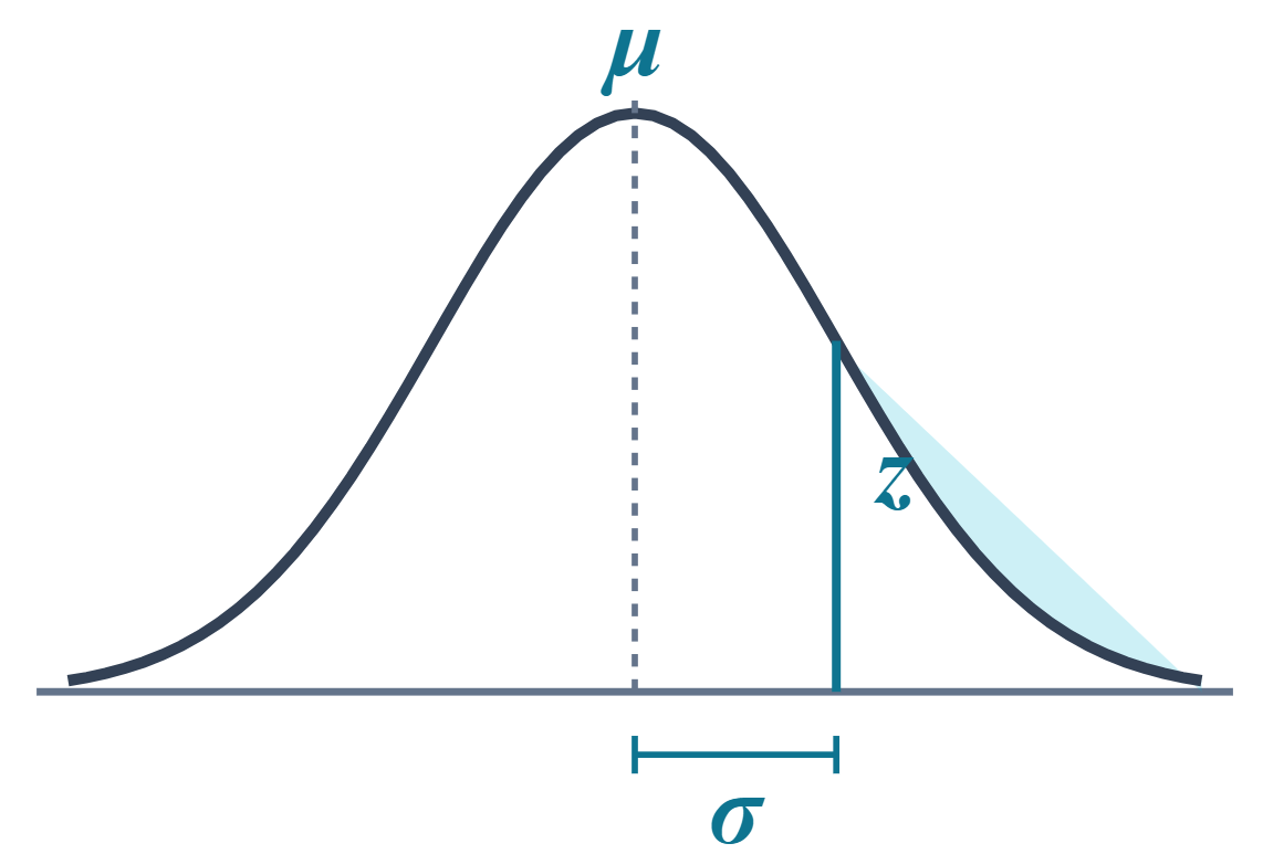
\( z=\frac{x-\mu}{\sigma} \)
where:
- \( z \) = z-score
- \( x \) = observed data value
- \( \mu \) = population mean
- \( \sigma \) = population standard deviation
Important AP Statistics Ideas
- A positive z-score means the observation is above the mean.
- A negative z-score means the observation is below the mean.
- The farther the z-score is from 0, the more unusual the observation is.
- Z-scores allow comparisons between different distributions.
For example:
- \( z=2 \) means the value is 2 standard deviations above the mean.
- \( z=-1.5 \) means the value is 1.5 standard deviations below the mean.
| Position Relative to Mean | Sign of z-Score |
|---|---|
| Above Mean | Positive |
| At Mean | Zero |
| Below Mean | Negative |
Example
A population of exam scores has:
- Population Mean: \( \mu=70 \)
- Population Standard Deviation: \( \sigma=10 \)
A student earns a score of:
\( x=85 \)
Calculate the student’s z-score.
▶️ Answer / Explanation
Step 1: Use the z-score formula.
\( z=\frac{x-\mu}{\sigma} \)
Step 2: Substitute the values.
\( z=\frac{85-70}{10} \)
\( z=\frac{15}{10} \)
\( z=1.5 \)
Therefore:
\( \mathrm{z=1.5} \)
Interpretation:
The student’s score is:
\( \mathrm{1.5} \)
standard deviations above the population mean.
Example
A population of adult heights has:
- Population Mean: \( \mu=170 \) cm
- Population Standard Deviation: \( \sigma=8 \) cm
A person has a height of:
\( x=158 \) cm
Calculate the z-score and interpret its meaning.
▶️ Answer / Explanation
Step 1: Apply the z-score formula.
\( z=\frac{x-\mu}{\sigma} \)
\( z=\frac{158-170}{8} \)
\( z=\frac{-12}{8} \)
\( z=-1.5 \)
Therefore:
\( \mathrm{z=-1.5} \)
Interpretation:
The person’s height is:
\( \mathrm{1.5} \)
standard deviations below the population mean.
The negative z-score indicates the observation lies below average.
1.9.D.2 Calculating and Interpreting z-Scores
A z-score is a standardized score that measures how many standard deviations a data value lies above or below the mean.
The z-score is calculated by subtracting the population mean from the data value and then dividing by the population standard deviation.
z-Score Formula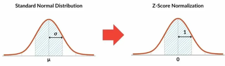
\( z=\frac{x_i-\mu}{\sigma} \)
where:
- \( x_i \) = data value (observation)
- \( \mu \) = population mean
- \( \sigma \) = population standard deviation
- \( z \) = standardized score
The z-score tells us how far a data value is from the mean in units of standard deviations.
Interpretation of z-Scores
- A positive z-score indicates the value is above the mean.
- A negative z-score indicates the value is below the mean.
- A z-score of 0 indicates the value is exactly equal to the mean.
| z-Score | Meaning |
|---|---|
| \( z=0 \) | At the mean |
| \( z=1 \) | 1 standard deviation above the mean |
| \( z=-1 \) | 1 standard deviation below the mean |
| \( z=2 \) | 2 standard deviations above the mean |
| \( z=-2 \) | 2 standard deviations below the mean |
Using Sample Statistics
Sometimes the population mean and population standard deviation are unknown.
In that situation, the sample mean and sample standard deviation may be used to calculate an approximate z-score.
Sample z-Score Formula
\( z=\frac{x_i-\bar{x}}{s} \)
where:
- \( x_i \) = data value
- \( \bar{x} \) = sample mean
- \( s \) = sample standard deviation
This formula standardizes observations relative to the sample rather than the entire population.
Important AP Statistics Idea
The sign of the z-score tells the direction from the mean:
- Positive → Above the mean
- Negative → Below the mean
The magnitude of the z-score tells how unusual the observation is:
- Small absolute value → Close to the mean
- Large absolute value → Far from the mean
Example
The weights of a population of dogs have:
- Population Mean: \( \mu=40 \) pounds
- Population Standard Deviation: \( \sigma=5 \) pounds
A dog weighs:
\( x=50 \)
pounds.
Calculate the z-score and interpret its meaning.
▶️ Answer / Explanation
Step 1: Use the z-score formula.
\( z=\frac{x-\mu}{\sigma} \)
Step 2: Substitute the values.
\( z=\frac{50-40}{5} \)
\( z=\frac{10}{5} \)
\( z=2 \)
Interpretation:
The dog’s weight is:
\( \mathrm{2} \)
standard deviations above the population mean.
Example
A sample of students has:
- Sample Mean: \( \bar{x}=72 \)
- Sample Standard Deviation: \( s=8 \)
One student scored: \( x=60 \) on the exam.
Calculate the student’s z-score using the sample statistics.
▶️ Answer / Explanation
Step 1: Use the sample z-score formula.
\( z=\frac{x-\bar{x}}{s} \)
Step 2: Substitute the values.
\( z=\frac{60-72}{8} \)
\( z=\frac{-12}{8} \)
\( z=-1.5 \)
Interpretation:
The student’s score is:
\( \mathrm{1.5} \)
standard deviations below the sample mean.
The negative sign indicates that the score falls below average.
1.9.E Compare z-Scores as Measures of Relative Position for Distributions
A raw data value by itself does not always indicate how unusual or impressive an observation is.
For example, a score of: \( \mathrm{85} \) might be outstanding in one class but average in another.
To make meaningful comparisons, statisticians use z-scores.
Because z-scores measure distance from the mean in standard deviation units, they provide a standardized way to compare observations.
This allows comparisons:
- Within the same distribution
- Between different distributions
1.9.E.1 Using z-Scores to Compare Relative Position
A z-score describes an observation’s relative position within a distribution.
The z-score formula is:
\( z=\frac{x-\mu}{\sigma} \)
or when population parameters are unknown:
\( z=\frac{x-\bar{x}}{s} \)
A z-score indicates how many standard deviations an observation lies above or below the mean.
Because all z-scores are measured on the same scale, they can be used to compare observations from completely different distributions.
Comparing Relative Position Within a Distribution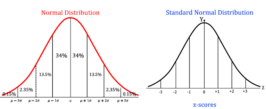
Within a single distribution:
- A larger z-score indicates a higher relative position.
- A smaller z-score indicates a lower relative position.
Example:
- Student A: \( z=2.0 \)
- Student B: \( z=1.2 \)
Student A performed better relative to the rest of the group because Student A’s score is farther above the mean.
Comparing Relative Position Between Different Distributions
Z-scores are especially useful when comparing observations from different distributions.
Even if the original scales are different, z-scores place observations on a common standardized scale. The observation with the larger z-score has the stronger relative performance.
| z-Score | Relative Position |
|---|---|
| \( z=0 \) | At the mean |
| \( z=1 \) | Above average |
| \( z=2 \) | Far above average |
| \( z=-1 \) | Below average |
| \( z=-2 \) | Far below average |
Important AP Statistics Idea
When comparing observations from different distributions:
The larger z-score corresponds to the stronger relative position.
The original data values should not be compared directly because the distributions may have different centers and spreads.
| Observation | Raw Value | z-Score | Better Relative Position? |
|---|---|---|---|
| A | Higher | Smaller | No |
| B | Lower | Larger | Yes |
Example
Two students take the same exam.
Student A has:
\( z=1.8 \)
Student B has:
\( z=0.9 \)
Which student performed better relative to the rest of the class?
▶️ Answer / Explanation
The larger z-score indicates the stronger relative performance.
Since:
\( \mathrm{1.8>0.9} \)
Student A’s score is farther above the class mean.
Therefore, Student A performed better relative to the rest of the class.
Example
Maria scored: \( \mathrm{88} \) on a mathematics exam.
The mathematics scores have:
- \( \mu=80 \)
- \( \sigma=4 \)
Her z-score is:
\( z=\frac{88-80}{4}=2 \)
James scored: \( \mathrm{92} \) on a science exam.
The science scores have:
- \( \mu=90 \)
- \( \sigma=2 \)
His z-score is: \( z=\frac{92-90}{2}=1 \)
Who performed better relative to their classmates?
▶️ Answer / Explanation
Compare the z-scores:
Maria:
\( z=2 \)
James:
\( z=1 \)
Since:
\( \mathrm{2>1} \)
Maria’s score is farther above the mean of her distribution.
Therefore, Maria performed better relative to her classmates, even though James had the larger raw score.
This example shows why z-scores are useful when comparing observations from different distributions.