
2.1.A.1 Two-Way Tables (Contingency Tables)
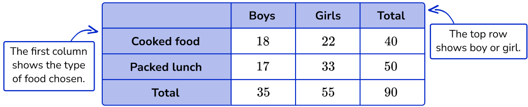
When studying the relationship between two categorical variables, statisticians organize the data using a two-way table, also called a contingency table.
- A two-way table displays the categories (levels) of one categorical variable in the rows and the categories of a second categorical variable in the columns.
- Each cell in the table contains either a frequency (count) or a relative frequency (proportion or percentage) for the corresponding combination of categories.
Two-way tables help statisticians summarize data, compare groups, and determine whether an association exists between two categorical variables.
Structure of a Two-Way Table
| Variable 1 | Category A | Category B | Row Total |
|---|---|---|---|
| Category X | Cell | Cell | Total |
| Category Y | Cell | Cell | Total |
| Column Total | Total | Total | Grand Total |
Types of Entries in a Two-Way Table
| Entry Type | Meaning |
|---|---|
| Frequency | The actual number (count) of observations in each cell. |
| Relative Frequency | The proportion or percentage of observations in each cell. |
Frequency Formula
Frequency = Number of observations in the category
Relative Frequency Formula
\( \text{Relative Frequency}=\dfrac{\text{Cell Frequency}}{\text{Total Number of Observations}} \)
Why Use a Two-Way Table?
- Summarizes data for two categorical variables.
- Displays frequencies or relative frequencies for every combination of categories.
- Makes comparisons between groups easier.
- Provides evidence for determining whether an association exists between the two variables.
Important AP Exam Notes
- A two-way table is also called a contingency table.
- Both variables must be categorical.
- Cells may contain either counts (frequencies) or relative frequencies (proportions or percentages).
- Row totals, column totals, and the grand total help calculate relative frequencies.
- Two-way tables are often the starting point for comparing conditional distributions and determining whether an association exists between two categorical variables.
Example
A random sample of 200 students was asked whether they prefer Online or In-Person learning. The students were also classified by grade level.
| Grade Level | Online | In-Person | Total |
|---|---|---|---|
| Freshmen | 50 | 30 | 80 |
| Sophomores | 40 | 80 | 120 |
| Total | 90 | 110 | 200 |
Identify the two categorical variables and explain what information is contained in each cell of the table.
▶️ Answer / Explanation
Variable 1: Grade Level (Freshmen or Sophomores)
Variable 2: Preferred Learning Method (Online or In-Person)
Each cell contains the frequency (count) of students belonging to both categories.
For example, the value 50 indicates that 50 freshmen prefer online learning.
Because the table summarizes two categorical variables using frequencies, it is a two-way (contingency) table.
2.1.A.2 Graphical Displays for Two Categorical Variables
After organizing data in a two-way table, statisticians often use graphs to visualize the relationship between two categorical variables.
Graphs make it easier to compare categories, identify patterns, and determine whether an association may exist between the variables.
The three most common graphical displays for two categorical variables are:
- Side-by-Side Bar Charts
- Segmented Bar Charts
- Mosaic Plots
Each graph displays the frequency (count) or relative frequency (proportion or percentage) of one categorical variable for each category (level) of the other categorical variable.
1. Side-by-Side Bar Chart
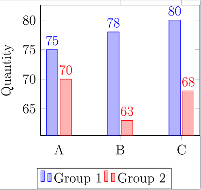
A side-by-side bar chart displays separate bars for each category of one variable within every category of the second variable.
This graph is useful for comparing frequencies or relative frequencies across different groups.
Characteristics
- Bars for each category are placed next to one another.
- All bars have the same width.
- Bar heights represent frequencies or relative frequencies.
- Makes comparisons between groups straightforward.
2. Segmented Bar Chart
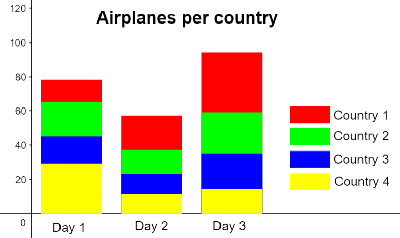
A segmented bar chart represents each category of one variable with a single bar divided into segments.
Each segment represents the proportion (or percentage) of observations in each category of the second variable.
Characteristics
- Each bar represents one category of a variable.
- Each bar is divided into colored or shaded segments.
- Bars usually have equal height (100%) when relative frequencies are displayed.
- Useful for comparing conditional distributions.
3. Mosaic Plot
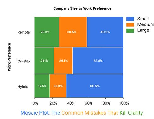
A mosaic plot displays the relationship between two categorical variables using adjacent rectangles.
The width of each rectangle represents the proportion of one categorical variable, while the height represents the conditional proportion of the second variable.
The area of each rectangle is proportional to the frequency or relative frequency of that category combination.
Characteristics
- Rectangle widths vary according to category frequencies.
- Rectangle heights represent conditional proportions.
- Total area represents the entire data set.
- Useful for visualizing associations between two categorical variables.
Comparison of Graphical Displays
| Graph | Displays | Best Use |
|---|---|---|
| Side-by-Side Bar Chart | Separate bars for each category | Compare frequencies or proportions between groups |
| Segmented Bar Chart | Bars divided into proportional segments | Compare conditional distributions |
| Mosaic Plot | Rectangles with varying widths and heights | Display associations using areas proportional to frequencies |
Important AP Exam Notes
- These graphs are used only for two categorical variables.
- Graphs may display either frequencies (counts) or relative frequencies (proportions or percentages).
- Side-by-side bar charts are best for directly comparing categories across groups.
- Segmented bar charts are useful for comparing conditional distributions because each bar represents 100% of a group.
- Mosaic plots use the area of rectangles to represent frequencies or proportions.
- All three graphical displays help determine whether an association may exist between two categorical variables.
Example
A researcher collects data on students’ grade level (Freshman or Sophomore) and their preferred learning method (Online or In-Person).
Which graphical display would be most appropriate for comparing the proportion of students who prefer online learning within each grade level?
▶️ Answer / Explanation
A segmented bar chart is the most appropriate display.
Each bar represents one grade level, and each segment shows the proportion of students preferring each learning method.
Because each bar represents 100% of a grade level, it is easy to compare the conditional distributions between freshmen and sophomores.
A side-by-side bar chart could also be used, but a segmented bar chart is generally better for comparing proportions across groups.
2.1.A.3 Using Graphs to Determine Whether Two Categorical Variables Are Associated
Graphs such as side-by-side bar charts, segmented bar charts, and mosaic plots allow statisticians to compare the relationship between two categorical variables.
These graphical displays help determine whether the variables are associated or not associated (independent).
An association exists when the distribution of one categorical variable changes across the categories (levels) of the other variable.
If the distributions are approximately the same for every category, there is little or no evidence of an association.
How to Determine an Association from a Graph
- Compare the relative frequencies (proportions or percentages), not just the counts.
- Examine whether the distributions are similar or different across the categories of the other variable.
- If the distributions differ noticeably, the variables are likely associated.
- If the distributions are approximately the same, the variables are likely not associated.
Interpreting Graphs
| What You Observe | Conclusion |
|---|---|
| Conditional distributions are very similar across all groups. | Little or no evidence of an association between the variables. |
| Conditional distributions differ noticeably between groups. | Evidence that the variables are associated. |
| Large differences in proportions across categories. | Stronger evidence of an association. |
Example
Suppose a segmented bar chart compares students’ preferred learning method by grade level.
- Among Freshmen, 70% prefer Online learning.
- Among Sophomores, only 35% prefer Online learning.
Because the conditional distributions are very different, there is evidence of an association between grade level and preferred learning method.
If both grade levels had approximately 70% Online and 30% In-Person preferences, there would be little evidence of an association.
Important AP Exam Notes
- Always compare conditional distributions (relative frequencies), not raw counts.
- Graphs are used to determine whether an association exists between two categorical variables.
- If the conditional distributions differ across categories, conclude that there is an association.
- If the conditional distributions are approximately the same, conclude that there is little or no association.
- An association does not imply that one variable causes changes in the other.
Common AP Exam Mistakes
| Incorrect Interpretation | Correct Interpretation |
|---|---|
| Comparing only the counts in each category. | Compare the conditional percentages or relative frequencies. |
| Concluding that one variable causes the other. | Conclude only that an association may exist. |
| Looking only at one category. | Compare the entire distributions across all categories. |
Example
A segmented bar chart compares students’ preferred learning method by grade level.
| Grade Level | Online | In-Person |
|---|---|---|
| Freshmen | 70% | 30% |
| Sophomores | 35% | 65% |
Use the graph to justify whether grade level and preferred learning method are associated.
▶️ Answer / Explanation
The conditional distributions are noticeably different.
Approximately 70% of freshmen prefer online learning, while only 35% of sophomores prefer online learning.
Because the conditional distributions differ substantially across the two grade levels, there is evidence of an association between grade level and preferred learning method.
This graph suggests that learning preference varies by grade level. However, the graph alone does not establish a cause-and-effect relationship.