Representing Two Categorical Variables
When we have two categorical variables, we want to examine whether they are associated. Association means that knowing the value of one variable helps us predict the value of the other. If the distribution of one variable differs across categories of the other, then the two variables are related.
1. Two-Way (Contingency) Tables 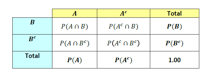
- A two-way table shows the counts (or relative frequencies) for all combinations of two categorical variables.
- The totals for rows and columns are called marginal totals, which show the distribution of each variable separately.
- The counts in the inner cells show the joint distribution.
- Row percentages or column percentages show the conditional distribution of one variable given the other.
Types of Frequencies in a Two-Way Table
Joint Relative Frequency:
Proportion of individuals in a specific cell, out of the total sample. Formula: \( \text{Joint RF} = \dfrac{\text{Cell Count}}{\text{Total}} \).
Marginal Relative Frequency: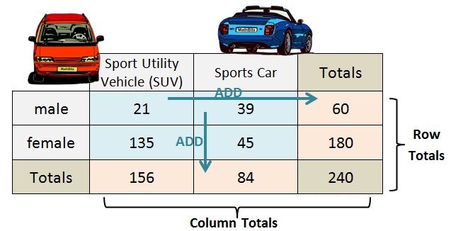
Proportion of individuals in a row total or column total, out of the total sample. Formula: \( \text{Marginal RF} = \dfrac{\text{Row (or Column) Total}}{\text{Total}} \).
Conditional Relative Frequency:
Proportion of individuals in a category of one variable, given a specific value of the other variable. Formula: \( \text{Conditional RF} = \dfrac{\text{Cell Count}}{\text{Row or Column Total}} \).
Graphical Representations
Side-by-Side Bar Graphs:
Each bar represents a category of one variable, and heights of bars within groups represent the second variable.
Segmented (Stacked) Bar Graphs:
Each bar represents 100% of a category, divided into proportional segments for the second variable. Useful for comparing relative distributions.
Mathematical Interpretation
- Conditional probability: \( P(A \mid B) = \dfrac{\text{Count of (A and B)}}{\text{Total in category B}} \).
- If conditional distributions differ across groups, then the variables are associated.
- If the conditional distributions are the same, then the variables are independent (no association).
Example
A survey asked 100 students about gender (male/female) and whether they prefer sports (yes/no). The results are shown:
| Sports: Yes | Sports: No | Total | |
|---|---|---|---|
| Male | 30 | 10 | 40 |
| Female | 20 | 40 | 60 |
| Total | 50 | 50 | 100 |
Is there an association between gender and sports preference?
▶️ Answer / Explanation
Compute conditional distributions:
- For males: \( P(\text{Yes} \mid \text{Male}) = \dfrac{30}{40} = 0.75 \).
- For females: \( P(\text{Yes} \mid \text{Female}) = \dfrac{20}{60} = 0.33 \).
Since \(0.75 \neq 0.33\), the conditional proportions differ, which shows an association between gender and sports preference.
Example
A study records pet ownership (dog/cat/none) and residence type (urban/rural). Side-by-side bar graphs compare proportions of pet types across urban and rural students.
How can side-by-side bar graphs help detect an association?
▶️ Answer / Explanation
In an urban sample, the tallest bar corresponds to “cat.” In a rural sample, the tallest bar corresponds to “dog.” Since the distribution of pet type differs by residence, the variables are associated.
Example
Researchers study exercise frequency (low/medium/high) among smokers vs. non-smokers. Each group is shown as a segmented bar that totals 100%.
How does the segmented bar graph show association?
▶️ Answer / Explanation
Suppose:
- Smokers: 60% low, 30% medium, 10% high.
- Non-smokers: 20% low, 50% medium, 30% high.
Conditional distributions are clearly different:
\( P(\text{Low} \mid \text{Smoker}) = 0.60 \) vs. \( P(\text{Low} \mid \text{Non-Smoker}) = 0.20 \).
Since the proportions are not equal, there is an association between smoking status and exercise frequency.