Representing Bivariate Quantitative Data with Scatterplots
A scatterplot is a graph that represents two quantitative variables measured on the same individuals. Each individual is shown as a point with coordinates \((x, y)\), where:
- The horizontal axis (x-axis) represents the explanatory variable (independent variable).
- The vertical axis (y-axis) represents the response variable (dependent variable).
Purpose: Scatterplots are used to visually identify patterns, trends, clusters, or unusual observations in the relationship between two quantitative variables.
Example:
A researcher records data for 10 students on two quantitative variables their hours of sleep per night (x) and their daily productivity score (y). The data are plotted on a scatterplot where:
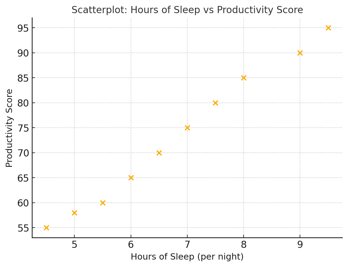
- The x-axis represents Hours of Sleep (from 4 to 10 hours).
- The y-axis represents Productivity Score (from 50 to 100 points).
The scatterplot shows that students who sleep more hours generally have higher productivity scores. The points rise upward from left to right, forming a clear upward trend.
▶️ Answer / Explanation
- Each point represents one student’s data pair \((x, y)\).
- The horizontal axis (x) shows Hours of Sleep — the explanatory variable.
- The vertical axis (y) shows Productivity Score — the response variable.
- The overall pattern shows a positive trend — as sleep increases, productivity increases.
- The scatterplot effectively represents the relationship between the two quantitative variables visually.
Characteristics of a Scatterplot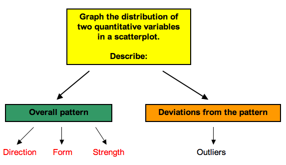
When describing a scatterplot, focus on the following features:
Direction: The overall trend of the data.
- Positive association: As \(x\) increases, \(y\) tends to increase.
- Negative association: As \(x\) increases, \(y\) tends to decrease.
- No association: No clear pattern is visible.
Form: The shape of the relationship.
- Linear (points follow a straight-line pattern).
- Nonlinear (curved relationship).
Strength: How closely the points follow a clear form.
- Strong: Points are close to the line/curve.
- Weak: Points are widely scattered.
Outliers: Individual points that fall outside the general pattern.
Example
A researcher records the number of hours studied (x) and the exam scores (y) of 20 students. A scatterplot shows that as hours studied increase, exam scores generally increase, with points lying close to a straight line.
How would you describe the scatterplot?
▶️ Answer / Explanation
Direction: Positive (more hours studied → higher scores).
Form: Linear pattern.
Strength: Strong (points close to the line).
Outliers: One student studied for 10 hours but scored very low, which does not fit the overall pattern.
Conclusion: The scatterplot shows a strong, positive, linear association between hours studied and exam scores.
Example
A health researcher measures shoe size (x) and math test score (y) for a group of 50 students. The scatterplot shows points scattered randomly with no clear upward or downward trend.
How would you describe the scatterplot?
▶️ Answer / Explanation
Direction: None (as shoe size increases, math score does not systematically change).
Form: No clear form (neither linear nor curved).
Strength: Very weak — points are widely scattered.
Outliers: A few extreme shoe sizes, but they do not affect the lack of relationship.
Conclusion: The scatterplot shows no association between shoe size and math score. The variables are unrelated.