
5.1.A.1 Bivariate Quantitative Data and Scatterplots
In many statistical studies, researchers want to investigate the relationship between two quantitative variables. Instead of analyzing one variable at a time, they collect paired measurements for each observational unit.
A bivariate quantitative data set consists of observations of ordered pairs from two quantitative variables, collected from the same individuals in a sample or population.
Each ordered pair contains: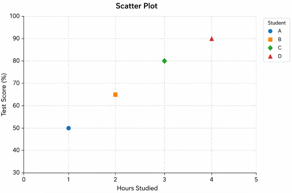
- The value of the first quantitative variable.
- The corresponding value of the second quantitative variable measured on the same observational unit.
Because both values come from the same individual, each ordered pair represents a single observation in the data set.
Bivariate quantitative data are commonly used to investigate:
- Whether two quantitative variables are related.
- The direction and strength of a relationship.
- Whether one variable may help predict another.
The most common graphical display for bivariate quantitative data is a scatterplot.
A scatterplot is constructed by plotting each ordered pair as a single point on a coordinate plane.
| Student | Hours Studied | Exam Score | Ordered Pair |
|---|---|---|---|
| A | 2 | 68 | (2, 68) |
| B | 4 | 76 | (4, 76) |
| C | 6 | 89 | (6, 89) |
| D | 8 | 95 | (8, 95) |
Each ordered pair represents one student’s hours studied and corresponding exam score. Plotting all ordered pairs creates a scatterplot that can be used to examine the relationship between the two quantitative variables.
Example
A teacher records the number of hours each student studied for an exam and the student’s exam score.
| Hours Studied | Exam Score |
|---|---|
| 3 | 72 |
| 5 | 81 |
| 7 | 90 |
Identify the ordered pairs in the data set and explain why this is considered a bivariate quantitative data set.
▶️ Answer / Explanation
The ordered pairs are:
- (3, 72)
- (5, 81)
- (7, 90)
This is a bivariate quantitative data set because each observation contains two quantitative variables measured on the same student: the number of hours studied and the corresponding exam score. These ordered pairs can be plotted to construct a scatterplot.
5.1.A.2 Scatterplots
A scatterplot is a graph that displays the relationship between two quantitative variables. Each observation in a bivariate quantitative data set is represented by a single point on a coordinate plane.
Each point corresponds to an ordered pair \( \mathrm{(x,\;y)} \), where: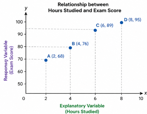
- The x-coordinate represents the value of the explanatory variable.
- The y-coordinate represents the value of the response variable.
When constructing a scatterplot:
- The explanatory variable is placed on the x-axis.
- The response variable is placed on the y-axis.
- Each ordered pair is plotted as a single point.
- The points are not connected by lines.
Explanatory Variable
The explanatory variable is the variable whose values are used to explain or predict changes in another variable. It is also called the independent variable and is always placed on the x-axis.
Response Variable
The response variable is the variable whose values may change in response to the explanatory variable. It is also called the dependent variable and is always placed on the y-axis.
Scatterplots allow statisticians to:
- Visualize the relationship between two quantitative variables.
- Identify trends or patterns.
- Detect clusters, gaps, and possible outliers.
- Determine whether a relationship appears to exist between the variables.
| Component | Description |
|---|---|
| Explanatory Variable | Placed on the x-axis and used to explain or predict another variable. |
| Response Variable | Placed on the y-axis and may change in response to the explanatory variable. |
| Ordered Pair | Represents one observation plotted as a point on the graph. |
Example
A researcher collects data on the number of hours students study each week and their scores on a mathematics test. The researcher plans to construct a scatterplot.
Identify the explanatory variable, the response variable, and specify which axis each variable should be placed on.
▶️ Answer / Explanation
Explanatory Variable: Number of hours studied each week.
This variable is placed on the x-axis because it is used to explain or predict students’ mathematics test scores.
Response Variable: Mathematics test score.
This variable is placed on the y-axis because it may respond to changes in the number of hours studied.
Each student is represented by one ordered pair \( \mathrm{(Hours\ Studied,\; Test\ Score)} \), and each ordered pair is plotted as a single point on the scatterplot.
5.1.B.1 Describing the Characteristics of a Scatterplot
After constructing a scatterplot, statisticians describe the association between the two quantitative variables. Describing the association helps determine whether a relationship exists and how the variables are related.
When describing a scatterplot on the AP Statistics Exam, always examine the following four characteristics:
- Form
- Direction
- Strength
- Unusual Features
A common way to remember these characteristics is the acronym FDSU:
| Characteristic | What to Look For |
|---|---|
| Form | Does the pattern appear linear or non-linear? |
| Direction | Does the relationship increase (positive) or decrease (negative)? |
| Strength | How closely do the points follow the overall pattern? |
| Unusual Features | Are there outliers, clusters, or gaps? |
These four characteristics provide a complete description of the relationship shown in a scatterplot and are frequently tested on the AP Statistics Exam.
AP Exam Tip:
When asked to describe a scatterplot, avoid simply stating whether the variables are related. Instead, describe the scatterplot using all four characteristics whenever they are applicable:
- Form
- Direction
- Strength
- Unusual Features
Example
A scatterplot displays the relationship between the number of hours students study each week and their mathematics test scores.
What four characteristics should be described when interpreting this scatterplot?
▶️ Answer / Explanation
When describing the scatterplot, examine the following characteristics:
- Form – Determine whether the relationship is linear or non-linear.
- Direction – Determine whether the association is positive or negative.
- Strength – Describe how closely the points follow the overall pattern (strong, moderate, or weak).
- Unusual Features – Identify any outliers, clusters, or gaps that differ from the general pattern.
Using all four characteristics provides a complete description of the association shown in the scatterplot.
5.1.B.2 Form of a Scatterplot
The form of a scatterplot describes the overall shape or pattern of the relationship between two quantitative variables.
When examining the form, determine whether the points follow a pattern that is approximately a straight line or a curve.
The form of the association can be described as:
- Linear
- Non-linear
Linear Association
A scatterplot has a linear association when the points follow an overall straight-line pattern. Although the points may not fall exactly on a straight line, they cluster around an imaginary line.
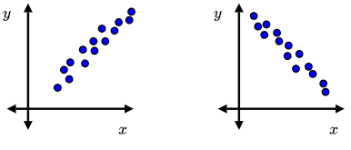
Linear relationships are commonly modeled using a linear regression line.
Non-linear Association
A scatterplot has a non-linear association when the points follow a curved or changing pattern instead of a straight line.
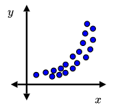
In a non-linear relationship, the rate of change between the variables is not constant, so a straight line does not adequately describe the pattern.
| Form | Description |
|---|---|
| Linear | The points follow an overall straight-line pattern. |
| Non-linear | The points follow a curved or changing pattern rather than a straight line. |
AP Exam Tip:
- If the points generally follow a straight-line pattern, describe the form as linear.
- If the points follow a curved pattern, describe the form as non-linear.
- Avoid saying a relationship is “perfectly linear” unless all points lie exactly on a straight line.
Example
A scatterplot displays the relationship between the number of hours students study and their exam scores. The plotted points cluster closely around an upward-sloping straight line.
Describe the form of the association shown in the scatterplot.
▶️ Answer / Explanation
The scatterplot has a linear form because the points follow an overall straight-line pattern.
Although the points do not all lie exactly on a single line, they cluster around an imaginary straight line, indicating a linear relationship.
5.1.B.3 Direction of a Scatterplot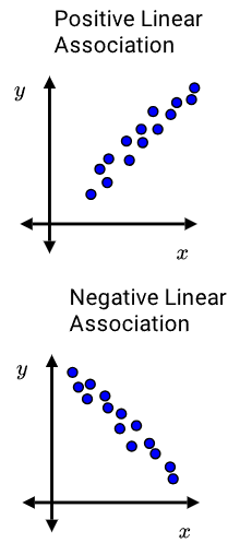
The direction of a scatterplot describes how the response variable changes as the explanatory variable increases.
If an association exists, its direction can be described as:
- Positive
- Negative
Positive Association
A positive association occurs when, as the values of the explanatory variable increase, the values of the response variable also tend to increase.
On a scatterplot, the points generally move upward from left to right.
Negative Association
A negative association occurs when, as the values of the explanatory variable increase, the values of the response variable tend to decrease.
On a scatterplot, the points generally move downward from left to right.
| Direction | Interpretation | Visual Pattern |
|---|---|---|
| Positive | As the explanatory variable increases, the response variable tends to increase. | ↗ Upward from left to right |
| Negative | As the explanatory variable increases, the response variable tends to decrease. | ↘ Downward from left to right |
AP Exam Tip:
Describe the direction using the explanatory and response variables rather than simply stating “the graph goes up” or “the graph goes down.”
Example
A scatterplot shows the relationship between the number of hours students study and their exam scores. As study time increases, exam scores also tend to increase.
Describe the direction of the association.
▶️ Answer / Explanation
The association is positive because, as the number of hours studied (the explanatory variable) increases, the exam scores (the response variable) also tend to increase.
On the scatterplot, the points generally rise from left to right.
5.1.B.4 Strength of a Scatterplot
The strength of an association describes how closely the points in a scatterplot follow the overall pattern or trend.
Strength measures the consistency of the relationship between the explanatory variable and the response variable.
If the points lie very close to the overall pattern, the association is stronger. If the points are widely scattered around the pattern, the association is weaker.
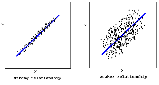
The strength of an association is commonly described as:
- Strong
- Moderate
- Weak
| Strength | Description |
|---|---|
| Strong | The points lie very close to the overall pattern or trend. |
| Moderate | The points generally follow the overall pattern but show some scatter. |
| Weak | The points are widely scattered and only loosely follow the overall pattern. |
AP Exam Tip:
- Strength describes how closely the points follow the pattern, not whether the relationship is positive or negative.
- A scatterplot may have a strong positive, strong negative, weak positive, or weak negative association.
AP Exam Example
A scatterplot shows the relationship between the number of hours students study and their exam scores. The points lie very close to an upward-sloping line, with very little scatter.
Describe the strength of the association.
▶️ Answer / Explanation
The association is strong because the points closely follow the overall linear pattern.
The small amount of scatter indicates a consistent relationship between the explanatory variable and the response variable.
5.1.B.5 Unusual Features of a Scatterplot
When describing a scatterplot, statisticians should also identify any unusual features that differ from the overall pattern of association.
Common unusual features include: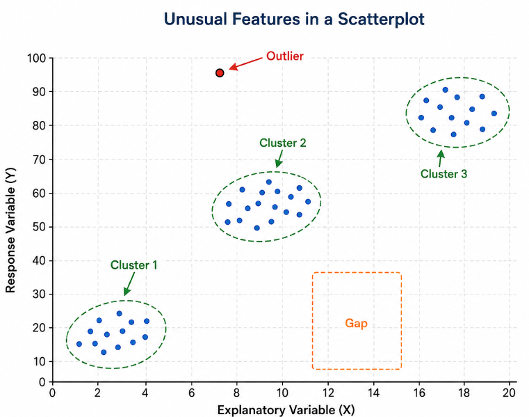
- Clusters
- Outliers
- Gaps
Clusters
A cluster is a group of points that are close together and separated from other groups of points. Clusters may indicate the presence of different subgroups within the data.
Outliers
An outlier is a point that does not fit the overall pattern of the scatterplot. Outliers may occur because of unusual observations, measurement errors, or natural variation.
Gaps
A gap is an area of the scatterplot where few or no observations occur. Gaps may separate clusters or indicate missing ranges of data.
| Unusual Feature | Description |
|---|---|
| Cluster | A group of points that are close together and separated from other groups. |
| Outlier | A point that does not follow the overall pattern of the data. |
| Gap | A region of the graph with few or no observations. |
AP Exam Tip:
Always mention unusual features when describing a scatterplot. An outlier or cluster can affect the interpretation of the relationship between the variables.
Example
A scatterplot shows a positive linear association between hours studied and exam scores. Most points follow the overall trend, but one point is far below the rest of the data.
Identify the unusual feature shown in the scatterplot.
▶️ Answer / Explanation
The unusual feature is an outlier.
This point does not follow the overall positive linear pattern shown by the other observations and may influence the interpretation of the relationship.