Tables & Graphs
On the DIGITAL SAT, many math questions include a table, bar graph, line graph, or scatterplot. The math is usually simple. The challenge is correctly reading the data.
You are not just calculating. You are interpreting information presented visually.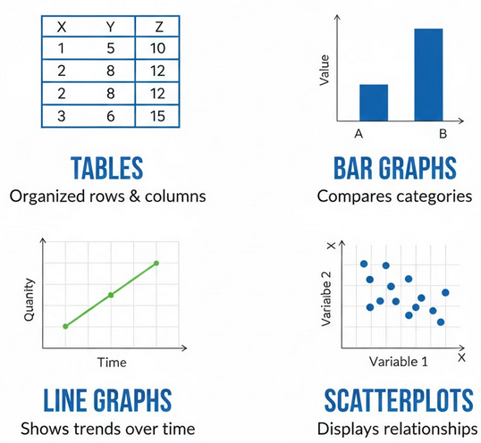
Common Graph Types
- Tables
- Bar graphs
- Line graphs
- Scatterplots
Step-by-Step Strategy
- Read the title
- Check axis labels
- Check units
- Then answer the question
Important DIGITAL SAT Warning
Students often skip reading the labels and immediately calculate. Most mistakes happen because of misreading what the numbers represent.
Key Skills Tested
- Finding a value from a graph
- Comparing categories
- Finding totals or differences
- Reading coordinates
Example 1 (Reading a Table):
A bookstore recorded the number of books sold each day.
Monday: 42
Tuesday: 55
Wednesday: 48
Thursday: 65
Friday: 70
How many more books were sold on Friday than Wednesday?
▶️ Answer/Explanation
\( 70 – 48 = 22 \)
Conclusion: 22 more books were sold.
Example 2 (Reading a Graph Value):
A line graph shows a runner’s distance over time. At 4 hours, the graph shows 20 miles.
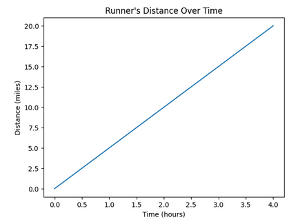
What does this represent?
▶️ Answer/Explanation
The coordinate (4, 20) means after 4 hours, the runner had traveled 20 miles.
Conclusion: The runner covered 20 miles in 4 hours.
Example 3 (Comparing Categories):
A bar graph shows students’ favorite subjects: 30 prefer math, 18 science, and 12 history. How many more students prefer math than history?
▶️ Answer/Explanation
\( 30 – 12 = 18 \)
Conclusion: 18 more students prefer math.
Trends & Conclusions
The DIGITAL SAT often does not ask you to calculate anything. Instead, it asks what the data means. You must interpret patterns, trends, and relationships shown in a graph or table.
What is a Trend?
A trend describes the general direction the data is moving.
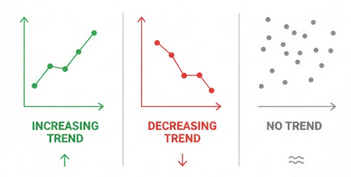
- Increasing trend → values go up
- Decreasing trend → values go down
- No trend → random scatter
Association
When two variables are related, the graph shows an association.
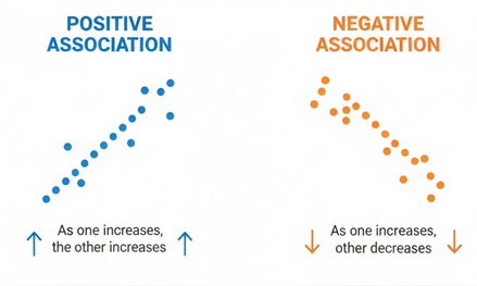
- Positive association: as one increases, the other increases
- Negative association: as one increases, the other decreases
Important SAT Rule
Association does not mean causation.
A graph showing two values rising together does not prove one causes the other. The SAT frequently tests this idea.
Outliers
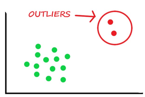
An outlier is a point far away from the pattern of the rest of the data. Outliers can affect conclusions.
Extrapolation Warning
Using a graph to predict values far outside the data range is unreliable. The SAT often includes incorrect answer choices that extrapolate too far.
Example 1 (Identifying Trend):
A graph shows the number of hours studied and test scores. As study hours increase, scores also increase. What conclusion is supported?
▶️ Answer/Explanation
The graph shows a positive association.
Conclusion: Students who study more tend to have higher scores.
Example 2 (Outlier):
A scatterplot shows most students score between 70 and 90, but one student scored 30. What is this point called?
▶️ Answer/Explanation
The point is far from the rest of the data.
Conclusion: This is an outlier.
Example 3 (Causation Trap):
A study shows students who carry water bottles have higher grades. Does carrying a water bottle cause higher grades?
▶️ Answer/Explanation
The graph shows association but not cause.
Conclusion: No. The data does not prove causation.
Units in Graphs
On the DIGITAL SAT, many students lose points not because of algebra, but because they ignore units. The test frequently includes graphs where the numbers are correct but the units change the meaning.
Always check the axis labels before calculating.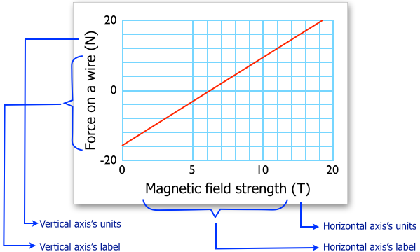
Common Unit Traps
- Minutes vs hours
- Thousands vs actual values
- Percent vs decimal
- Distance vs speed
Scaled Axes
Sometimes graphs use scaling. For example:
“Population (in thousands)”
If the graph shows 8, the real value is
\( 8{,}000 \)
Rate Interpretation
The slope of a graph represents a rate. Its units come from:
\( \dfrac{\mathrm{vertical\ axis\ units}}{\mathrm{horizontal\ axis\ units}} \)
Example: miles per hour, dollars per item, liters per minute.
DIGITAL SAT Warning
The SAT often places a correct calculation as a wrong answer because the unit is incorrect.
Example 1 :
A graph shows company revenue labeled “Revenue (in thousands of dollars).” The graph shows a value of 12. What is the actual revenue?
▶️ Answer/Explanation
\( 12 \times 1{,}000 = 12{,}000 \)
Conclusion: The revenue is \$12,000.
Example 2:
A graph shows distance (miles) vs time (hours). The line rises 120 miles in 2 hours. What does the slope represent?
▶️ Answer/Explanation
Slope \( = \dfrac{120}{2} = 60 \)
Units:
miles per hour
Conclusion: The slope represents a speed of 60 miles per hour.
Example 3:
A graph shows a machine produces 30 items in 5 minutes. What is the production rate per hour?
▶️ Answer/Explanation
First find items per minute:
\( \dfrac{30}{5} = 6 \) items per minute
Convert to per hour:
\( 6 \times 60 = 360 \)
Conclusion: The machine produces 360 items per hour.