Scatter Plots
Two-variable data studies the relationship between two quantities.
Each observation is written as an ordered pair:
\( (x,y) \)
A scatter plot is a graph that shows these ordered pairs on the coordinate plane.
Purpose
Scatter plots help us see whether two variables are related.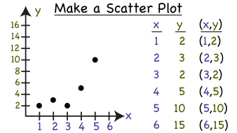
Axes Meaning
- x-axis → independent variable (input)
- y-axis → dependent variable (output)
Real SAT Contexts
- study hours vs test score
- temperature vs ice cream sales
- age vs height
Reading a Scatter Plot
- Each dot = one observation
- Clusters show patterns
- A point far away = possible outlier
DIGITAL SAT Tip
Always check units on axes. The question often asks you to interpret what a point represents.
Example 1:
A point on a scatter plot is \( (5, 72) \) where x = study hours and y = test score. What does this point represent?
▶️ Answer/Explanation
Answer: a student who studied 5 hours scored 72.
Example 2:
On a scatter plot of temperature vs ice cream sales, the x-axis shows temperature. Which variable is dependent?
▶️ Answer/Explanation
Sales depend on temperature.
Answer: ice cream sales
Example 3:
A scatter plot shows one point far away from all others. What is this called?
▶️ Answer/Explanation
Answer: an outlier
Correlation
Correlation describes how two variables change together.
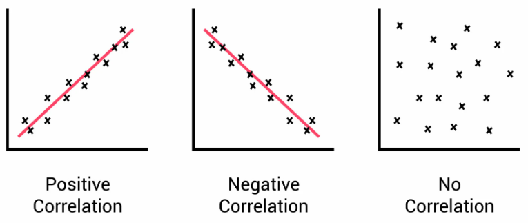
We determine correlation by looking at the trend in a scatter plot.
1. Positive Correlation
As \( x \) increases, \( y \) also increases.
Example: study time and test score
2. Negative Correlation
As \( x \) increases, \( y \) decreases.
Example: speed and travel time (fixed distance)
3. No Correlation
No clear pattern between variables.
Example: shoe size and exam score
Strength of Correlation
- Strong → points closely follow a line
- Weak → points scattered
Very Important Rule
Correlation does NOT mean causation.
Two variables moving together does not mean one causes the other.
DIGITAL SAT Tip
SAT often asks: positive, negative, or no correlation. Just check the direction of the pattern.
Example 1:
As outdoor temperature increases, ice cream sales increase. What type of correlation?
▶️ Answer/Explanation
Answer: positive correlation
Example 2:
As a car’s speed increases, travel time for a fixed distance decreases. What type?
▶️ Answer/Explanation
Answer: negative correlation
Example 3:
A study compares hair color and math score and shows no pattern. What type?
▶️ Answer/Explanation
Answer: no correlation
Line of Best Fit
A line of best fit is a straight line drawn through a scatter plot that best represents the trend of the data.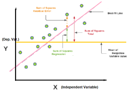
It is also called a trend line.
Purpose
- summarizes the relationship
- helps make predictions
How It Is Drawn
The line should:
- follow the overall pattern
- have about equal points above and below
- not pass through every point
Equation of the Line
The trend line is written:
\( y=mx+b \)
- \( m \) = rate of change
- \( b \) = starting value
Prediction (Interpolation vs Extrapolation)
- Interpolation: predicting inside the data range (reliable)
- Extrapolation: predicting outside the data range (less reliable)
DIGITAL SAT Tip
SAT usually asks you to estimate a value using the trend line, not calculate an exact answer.
Example 1 (Meaning of Slope):
A line of best fit models study hours vs test score. What does the slope represent?
▶️ Answer/Explanation
Answer: how much the test score increases per extra study hour.
Example 2 (Prediction):
A trend line predicts 70 at 4 hours and 80 at 6 hours. Estimate the score at 5 hours.
▶️ Answer/Explanation
5 hours is halfway.
Answer: about 75
Example 3 (Type of Prediction):
Data ranges from 2–10 hours of study. Predicting for 20 hours is what type?
▶️ Answer/Explanation
Answer: extrapolation