Standard Deviation (Basic Idea)
The standard deviation measures how spread out the data values are from the mean (average).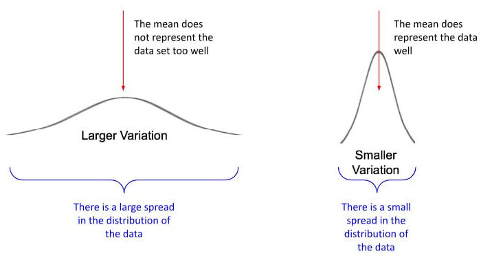
It tells us how consistent the data is.
Interpretation
- Small standard deviation → values are close to the mean
- Large standard deviation → values are spread out
Important SAT Point
You are usually not asked to compute standard deviation. You are asked to compare data sets.
Visual Meaning
Two data sets may have the same mean but different spreads.
- clustered data → lower standard deviation
- scattered data → higher standard deviation
DIGITAL SAT Tip
If scores are very similar, standard deviation is small. If scores vary a lot, it is large.
Example 1:
Set A: 70, 71, 72, 73, 74
Set B: 50, 60, 70, 80, 90
Which has larger standard deviation?
▶️ Answer/Explanation
Set B values are more spread out.
Answer: Set B
Example 2:
Two classes have the same average test score. One class has scores very close together. What does this mean?
▶️ Answer/Explanation
Answer: smaller standard deviation
Example 3:
A data set has very different values (10, 30, 70, 95). Is the standard deviation high or low?
▶️ Answer/Explanation
Answer: high standard deviation
Data Interpretation
On the DIGITAL SAT, many questions do not require heavy calculations. Instead, you must read and interpret data from graphs or tables. The test measures whether you understand what the information means, not just whether you can compute.
Common Displays
- tables
- bar graphs
- line graphs
- histograms
- box plots
Key Skills Tested
- finding values from a display
- comparing groups
- identifying trends
- estimating from a graph
Very Important Rules
- Always read axis labels
- Check units
- Check scale (many SAT traps are scale tricks)
Understanding Each Display
Line Graph
Shows how a quantity changes over time. The slope represents a rate of change.
Bar Graph
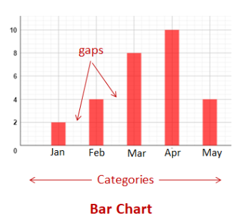
Used to compare categories. The tallest bar represents the greatest amount.
Histogram
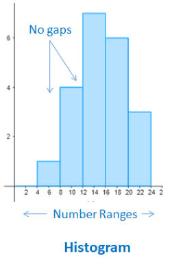
Shows frequency of data intervals. You read how many values fall within each range.
Box Plot
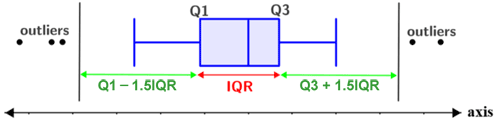
Displays distribution using the five-number summary. The box length represents the interquartile range (IQR), the spread of the middle 50% of the data.
DIGITAL SAT Tip
Before calculating anything, pause and interpret what the graph actually represents. Many wrong answers come from computing correctly but interpreting incorrectly.
Example 1 (Line Graph Interpretation):
A graph shows water in a tank (liters) versus time (minutes). The line rises steadily from 10 liters at 0 minutes to 70 liters at 10 minutes. What does the slope represent?
▶️ Answer/Explanation
Slope = change in vertical ÷ change in horizontal
\( \dfrac{70 – 10}{10 – 0} = \dfrac{60}{10} = 6 \)
Units: liters per minute.
Conclusion: The slope represents the rate the tank is filling, 6 liters per minute.
Example 2 (Bar Graph Comparison):
A bar graph shows the number of hours four students studied: Alex 5 hours, Brianna 8 hours, Carlos 6 hours, and Dana 3 hours. Who studied the most and by how many hours more than the least?
▶️ Answer/Explanation
Greatest value: 8 hours (Brianna)
Least value: 3 hours (Dana)
\( 8 – 3 = 5 \)
Conclusion: Brianna studied the most, 5 hours more than Dana.
Example 3 (Box Plot Interpretation):
Two box plots show test scores for Class A and Class B. The box for Class A is noticeably longer than the box for Class B. What does this indicate?
▶️ Answer/Explanation
Box length represents the interquartile range (IQR).
Conclusion: Class A has a larger spread in the middle 50% of scores, meaning scores vary more in Class A.