Pictograms, Bar Charts and Pie Charts
Data can be shown visually using statistical diagrams. These diagrams make information easier to understand and compare.
Three common methods are:
- Pictograms
- Bar charts
- Pie charts
Pictograms
A pictogram uses pictures or symbols to represent data.
A key is always given to show how many items each symbol represents.
Half symbols may be used to represent smaller values.
Bar Charts
A bar chart shows data using rectangular bars.
The height (or length) of each bar represents the frequency. All bars must have equal width and equal spacing.
Important features:
- A labelled horizontal axis (categories)
- A labelled vertical axis (frequency)
- A suitable scale
Pie Charts
A pie chart is a circle divided into sectors to show proportions of a whole.
The full circle represents \( 360^\circ \).
To find the angle for a category:
\( \mathrm{Angle} = \dfrac{\mathrm{frequency}}{\mathrm{total}} \times 360^\circ \)
Example 1:
In a pictogram, one symbol represents 4 books. A category has 5 symbols. How many books does it represent?
▶️ Answer/Explanation
\( 5 \times 4 = 20 \)
Conclusion: 20 books.
Example 2:
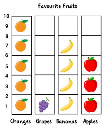
A class survey recorded favourite fruits: Apples 12, Bananas 8, Oranges 10. How many students were surveyed?
▶️ Answer/Explanation
\( 12+8+10=30 \)
Conclusion: 30 students.
Example 3:
In a survey, 15 students prefer football out of 60 students. Find the angle for the football sector in a pie chart.
▶️ Answer/Explanation
\( \dfrac{15}{60}\times360^\circ \)
\( \dfrac{1}{4}\times360^\circ=90^\circ \)
Conclusion: \( 90^\circ \).
Tabulating Data for Statistical Diagrams
Before drawing statistical diagrams such as bar charts or pie charts, data is first organised into a table. This is called tabulation.
A table helps to:
- organise raw data
- count frequencies
- prepare information for charts
Frequency Tables
A frequency table shows each category and how many times it occurs.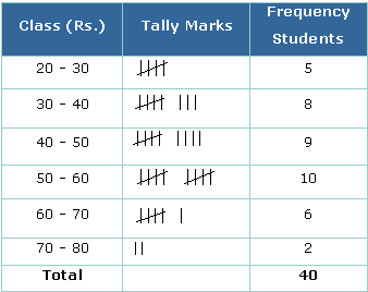
It normally contains:
- Category or value
- Tally marks
- Frequency
Tally Marks
Tally marks are used to count quickly. Every fifth mark crosses the previous four.
\( |||| = 4 \)
\( ||||\!/\! = 5 \)
Why Tabulation is Important
A pie chart requires totals and a bar chart requires frequencies. These come directly from a frequency table.
Calculating Totals
The total frequency is the sum of all frequencies.
\( \mathrm{Total} = \mathrm{sum\ of\ all\ frequencies} \)
Example 1:
The favourite pets of students are recorded: Dog, Cat, Dog, Fish, Dog, Cat, Bird, Dog. Complete the frequency table.
▶️ Answer/Explanation
| Pet | Tally | Frequency |
|---|---|---|
| Dog | |||| | 4 |
| Cat | || | 2 |
| Fish | | | 1 |
| Bird | | | 1 |
Conclusion: The frequencies are Dog 4, Cat 2, Fish 1, Bird 1.
Example 2:
The scores are: 1, 2, 2, 3, 1, 4, 2, 3, 1, 2. Find the total frequency.
▶️ Answer/Explanation
Count all values.
Total \( = 10 \)
Conclusion: Total frequency is 10.
Example 3:
The table shows numbers of favourite drinks: Juice 6, Milk 4, Water 10.
Find the total number of students.
▶️ Answer/Explanation
\( 6 + 4 + 10 = 20 \)
Conclusion: 20 students.
Interpreting Statistical Diagrams
To interpret a statistical diagram means to read information from charts and use it to answer questions.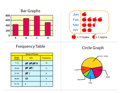
You may be given a bar chart, pie chart or pictogram and asked to find totals, differences or proportions.
Reading a Pictogram
Always read the key first. The key tells you how many items each symbol represents.
If 1 symbol = 5 students, then 3 symbols = \( 3\times5=15 \) students.
Reading a Bar Chart
The height of each bar shows the frequency. Use the vertical scale to read the value accurately.
Check the scale carefully. Each grid line may not represent 1 unit.
Reading a Pie Chart
A pie chart shows parts of a whole.
The full circle equals \( 360^\circ \).
To find the number in a category:
\( \mathrm{Number} = \dfrac{\mathrm{sector\ angle}}{360^\circ}\times\mathrm{total} \)
Common Questions
- Find the total
- Find the largest or smallest category
- Find the difference between two categories
- Find a fraction or percentage
Key Idea
Always check the scale, labels and key before answering.
Example 1:
In a pictogram, one symbol represents 6 cars. A row shows 4 symbols. How many cars are represented?
▶️ Answer/Explanation
\( 4\times6=24 \)
Conclusion: 24 cars.
Example 2:
A bar chart shows 18 students like football and 12 like cricket. How many more students like football?
▶️ Answer/Explanation
\( 18-12=6 \)
Conclusion: 6 students.
Example 3:
A pie chart shows a sector of \( 90^\circ \) out of a total of 40 students. How many students does it represent?
▶️ Answer/Explanation
\( \dfrac{90}{360}\times40 \)
\( \dfrac{1}{4}\times40=10 \)
Conclusion: 10 students.