Constructing Cumulative Frequency Diagrams
A cumulative frequency diagram shows the total number of data values up to a given point.
It is sometimes called an ogive.
The graph helps us understand how data builds up across class intervals.
Step 1: Start with a Frequency Table
You are given grouped data such as:
| Class Interval | Frequency |
|---|---|
| 0–10 | 3 |
| 10–20 | 5 |
| 20–30 | 7 |
| 30–40 | 5 |
Step 2: Calculate Cumulative Frequency
Add frequencies as you go down the table.
| Upper Class Boundary | Cumulative Frequency |
|---|---|
| 10 | 3 |
| 20 | 8 |
| 30 | 15 |
| 40 | 20 |
Important Rule
Always use the upper class boundary when plotting the graph.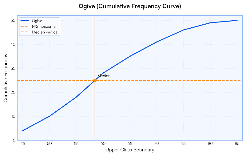
Step 3: Plot the Graph
- Horizontal axis → upper class boundaries
- Vertical axis → cumulative frequency
Start at the lowest boundary with cumulative frequency 0.
Join points with a smooth curve.
Why a Curve?
Because the data is continuous, so the graph must be smooth, not straight line segments.
Example 1:
The frequencies are 4, 6, 5 for three consecutive classes. Find the cumulative frequencies.
▶️ Answer/Explanation
First: 4
Second: 4+6=10
Third: 10+5=15
Conclusion: 4, 10, 15.
Example 2:
Why do we use the upper class boundary instead of the lower boundary?
▶️ Answer/Explanation
Cumulative frequency counts values up to that point.
The upper boundary represents the maximum value included.
Conclusion: So the graph shows “less than” values correctly.
Example 3:
The table shows the time (minutes) students spent on homework.
| Time (minutes) | Frequency |
|---|---|
| 0–10 | 5 |
| 10–20 | 7 |
| 20–30 | 6 |
| 30–40 | 2 |
Construct a cumulative frequency diagram.
▶️ Answer/Explanation
Step 1: Calculate cumulative frequencies
5
5+7=12
12+6=18
18+2=20
Step 2: Use upper class boundaries
- 10 → 5
- 20 → 12
- 30 → 18
- 40 → 20
Step 3: Plot these points and join them with a smooth curve.
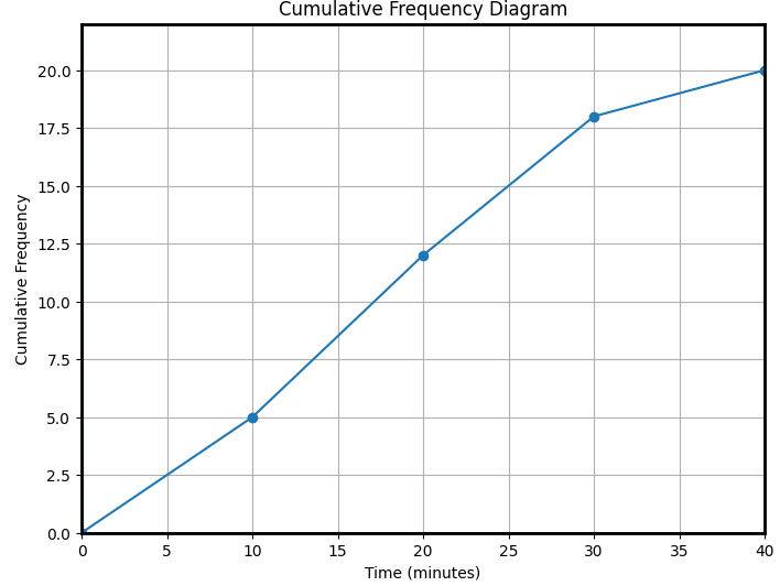
Conclusion: The cumulative frequency diagram is drawn using upper class boundaries against cumulative frequency.
Using Cumulative Frequency Diagrams
After drawing a cumulative frequency graph, we can use it to estimate important statistics.
The graph allows us to read values directly rather than calculating them from the table.
Finding the Median
The median is the middle value of the data.
Steps:
- Find the total frequency \( N \)
- Calculate \( \dfrac{N}{2} \)
- Locate this value on the vertical axis
- Draw a horizontal line to the curve
- Drop a vertical line to the horizontal axis
The x-value read is the median.
Finding Quartiles
- Lower quartile \( Q_1 \) → \( \dfrac{N}{4} \)
- Upper quartile \( Q_3 \) → \( \dfrac{3N}{4} \)
Read these from the graph the same way as the median.
Interquartile Range (IQR)
\( \mathrm{IQR}=Q_3-Q_1 \)
This measures the spread of the middle 50% of the data.
Finding Percentiles
We can also estimate any percentage.
- 10th percentile → \( 0.1N \)
- 90th percentile → \( 0.9N \)
These are found using the same reading method.
Example 1:
A cumulative frequency graph has total frequency 80. Find the median position.
▶️ Answer/Explanation
\( \dfrac{80}{2}=40 \)
Conclusion: 40th value.
Example 2:
For total frequency 60, find the positions of \( Q_1 \) and \( Q_3 \).
▶️ Answer/Explanation
\( Q_1=\dfrac{60}{4}=15 \)
\( Q_3=\dfrac{3\times60}{4}=45 \)
Conclusion: 15th and 45th values.
Example 3:
A cumulative frequency graph represents 60 students’ test scores.
Use the graph to estimate the median score.
▶️ Answer/Explanation
Step 1: Find median position
\( \dfrac{60}{2}=30 \)
Step 2: Locate cumulative frequency 30 on the vertical axis.
Step 3: Draw a horizontal line to the curve and then drop vertically to the score axis.
Suppose the reading is 24.
Conclusion: Median score ≈ \( 24 \) marks.