
Measuring Economic Inequality
Economists use different methods to measure the degree of economic inequality within a country.
The two most important measures are:
- Lorenz curve
- Gini coefficient (Gini index)
These measures help governments and economists analyse how evenly or unevenly income or wealth is distributed.
The Lorenz Curve
The Lorenz curve is a graphical representation of income or wealth distribution in an economy.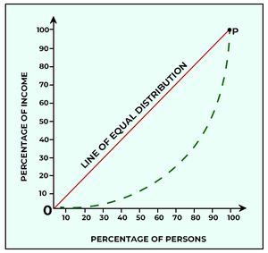
It compares:
- The cumulative percentage of the population
- The cumulative percentage of income or wealth received
Structure of the Lorenz Curve
The graph contains:
- Horizontal axis:
- Cumulative percentage of population
- Vertical axis:
- Cumulative percentage of income or wealth
Line of Perfect Equality
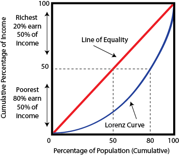
The Lorenz diagram includes a straight 45° line called the line of perfect equality.
Under perfect equality:
- Each percentage of the population receives the same percentage of income.
Example:
Actual Lorenz Curve
In reality, income is usually distributed unequally.
The Lorenz curve therefore lies below the line of perfect equality.
Interpretation of the Lorenz Curve
- The farther the Lorenz curve is from the line of perfect equality, the greater the inequality.
- A curve closer to the equality line indicates more equal distribution.
Greater distance from equality line → Greater inequality
Example of Interpretation
If:
- The poorest 50% of the population receive only 20% of income
then income inequality is relatively high.
Uses of the Lorenz Curve
- Comparing inequality between countries
- Comparing inequality over time
- Evaluating effects of government policies
Limitations of the Lorenz Curve
- Provides a graphical measure only.
- Different curves may sometimes cross, making comparison difficult.
- Does not explain causes of inequality.
The Gini Coefficient (Gini Index)
The Gini coefficient is a numerical measure of inequality derived from the Lorenz curve.
It measures the degree of inequality in income or wealth distribution.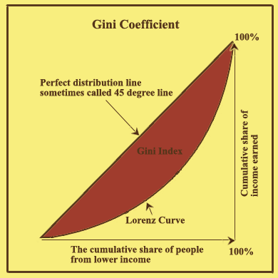
Range of the Gini Coefficient
The Gini coefficient ranges from:
\( \mathrm{0} \rightarrow \mathrm{1} \)
or sometimes:
\( \mathrm{0} \rightarrow \mathrm{100} \)
Meaning of Values
- \( \mathrm{0} \) represents perfect equality.
- \( \mathrm{1} \) (or 100) represents perfect inequality.
Perfect Equality
Under perfect equality:
- Everyone receives exactly the same income or wealth.
Result:
\( \mathrm{Gini = 0} \)
Perfect Inequality
Under perfect inequality:
- One person receives all income or wealth.
- Everyone else receives nothing.
Result:
\( \mathrm{Gini = 1} \)
Calculation of the Gini Coefficient
The Gini coefficient is calculated using areas within the Lorenz curve diagram.
\( \mathrm{Gini\ Coefficient = \dfrac{Area\ between\ equality\ line\ and\ Lorenz\ curve}{Total\ area\ under\ equality\ line}} \)
Interpretation of the Gini Coefficient
- A higher Gini coefficient indicates greater inequality.
- A lower Gini coefficient indicates more equal distribution.
Example of Interpretation
- A country with a Gini coefficient of \( \mathrm{0.60} \) has greater inequality than a country with \( \mathrm{0.30} \).
Advantages of the Gini Coefficient
- Provides a single numerical measure.
- Easy to compare between countries.
- Useful for analysing changes over time.
Limitations of the Gini Coefficient
- Does not show where inequality occurs within the distribution.
- Different distributions may produce the same Gini value.
- Does not explain causes of inequality.
- Data collection methods may differ between countries.
Relationship Between Lorenz Curve and Gini Coefficient
The Gini coefficient is derived from the Lorenz curve.
- More curved Lorenz curve → Higher Gini coefficient
- Lorenz curve closer to equality line → Lower Gini coefficient
Government Use of Inequality Measures
Governments use these measures to:
- Design tax and welfare policies
- Monitor poverty and inequality
- Evaluate redistribution programs
- Assess social and economic conditions
Comparison Between Lorenz Curve and Gini Coefficient
| Aspect | Lorenz Curve | Gini Coefficient |
|---|---|---|
| Type | Graphical measure | Numerical measure |
| Purpose | Shows distribution visually | Measures degree of inequality |
| Equality Indicator | Closer to equality line | Lower Gini value |
| High Inequality Indicator | Large curve deviation | Higher Gini value |
Key Ideas:
- The Lorenz curve graphically represents income or wealth distribution.
- The Gini coefficient numerically measures inequality.
- Greater distance from the equality line indicates greater inequality.
- A higher Gini coefficient means more unequal distribution.
Example 1
Explain what it means if a Lorenz curve lies far from the line of perfect equality.
▶️ Answer / Explanation
A large distance from the line of perfect equality indicates that income or wealth is distributed unevenly.
A small percentage of the population receives a large share of total income or wealth.
This means economic inequality is high.
Example 2
Using an example, explain how the Gini coefficient measures inequality.
▶️ Answer / Explanation
If Country A has a Gini coefficient of \( \mathrm{0.25} \) and Country B has \( \mathrm{0.60} \), Country B has greater inequality.
This means income or wealth is distributed less equally in Country B.
Example 3 (HL) — Constructing a Lorenz Curve
The table below shows the distribution of income across five quintile groups in Country X.
| Quintile | % of Total Income Received |
|---|---|
| 1st (Poorest 20%) | 4% |
| 2nd | 9% |
| 3rd | 16% |
| 4th | 24% |
| 5th (Richest 20%) | 47% |
(a) Using the data, calculate the cumulative income share for each quintile.
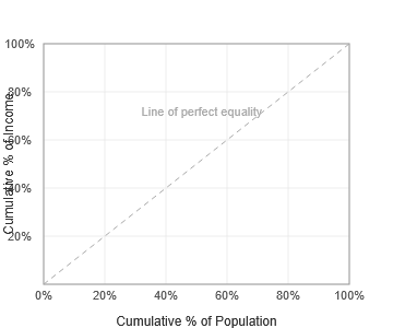
(b) Construct a fully labelled Lorenz curve for Country X, plotting each cumulative point.
(c) State what the Gini coefficient measures and explain what a Gini coefficient closer to 1 would indicate about Country X.
▶️ Answer / Explanation
(a) Cumulative Income Shares
| Quintile | Cumulative % of Population | Cumulative % of Income | Line of Equality |
|---|---|---|---|
| Origin | 0% | 0% | 0% |
| 1st | 20% | 4% | 20% |
| 2nd | 40% | 13% | 40% |
| 3rd | 60% | 29% | 60% |
| 4th | 80% | 53% | 80% |
| 5th | 100% | 100% | 100% |
Cumulative income = running total: 4 → 13 → 29 → 53 → 100
(b) Lorenz Curve (plotted)
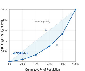
The blue curve is the Lorenz curve. The dashed line is the line of perfect equality. Area A (between the two) divided by Area A+B (total triangle) gives the Gini coefficient.
(c) Gini Coefficient
The Gini coefficient measures the degree of income inequality within an economy:
Gini = Area A ÷ (Area A + Area B)
A value closer to 1 indicates highly unequal income distribution — a small share of the population earns the vast majority of income. Country X’s Lorenz curve bows significantly below the line of equality, suggesting a relatively high degree of inequality. A Gini of 0 = perfect equality; a Gini of 1 = perfect inequality.