
9.1 – Collecting, Classifying, Organising and Representing Data
Statistics is the process of collecting, organising, representing, analysing and interpreting data. Data helps us answer questions and make decisions about people, objects, events or situations.
A statistical investigation usually follows a logical process:
| Step | What happens? |
|---|---|
| 1. Ask | Decide what you want to investigate and identify the information needed. |
| 2. Collect | Gather the required data. |
| 3. Classify | Identify the type of data collected. |
| 4. Organise | Arrange the data using tables, tallies or suitable categories. |
| 5. Represent | Display the data using an appropriate graph or chart. |
| 6. Interpret | Look for patterns and use the data to answer the original question. |
What Is Data?
Data is a collection of facts, measurements, observations or information. A single piece of data is called a datum.
Examples of data include: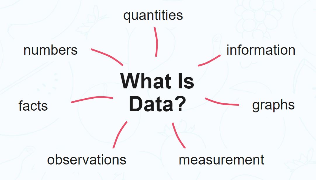
- the heights of students
- the favourite sports of students
- the number of goals scored in a match
- the temperature recorded each day
- the colours of cars in a car park
Population and Sample
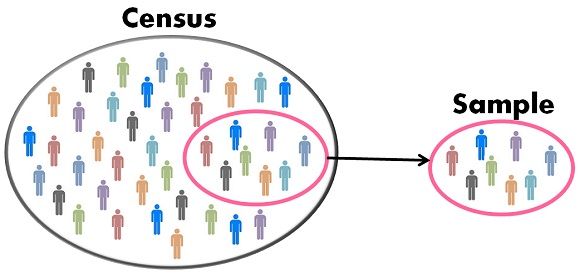
The population is the complete group that we are interested in studying. A sample is a smaller part of the population that is selected for investigation.

| Term | Meaning | Example |
|---|---|---|
| Population | The entire group being studied. | All students in a school. |
| Sample | A smaller group selected from the population. | 80 students selected from the school. |
A sample should be chosen carefully so that it gives useful information about the population. A sample that does not properly represent the population can lead to an unreliable conclusion.
Census and Sample
A census collects information from every member of the population. A sample investigation collects information from only part of the population.
| Census | Sample |
|---|---|
| Studies everyone in the population. | Studies only part of the population. |
| Can provide exact information about the population. | Provides an estimate about the population. |
| Can require more time and resources. | Usually quicker and less expensive. |
Bias in Data Collection
Bias occurs when the method used to collect data tends to favour certain results. A biased sample may not represent the population fairly.
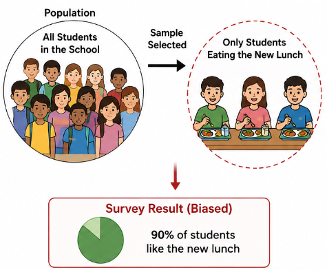
For example, suppose a school wants to know whether students like the new school lunch. If the school asks only students who are eating the new lunch, the results may not represent all students.
A useful sample should be as representative of the population as possible. Random selection can help reduce bias because members of the population have a fair opportunity to be selected.
Classifying Data
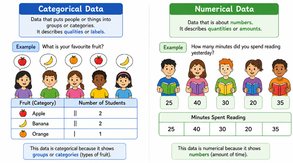
Data can be classified according to the type of information it contains. Two important types are categorical data and numerical data.
| Type | Meaning | Examples |
|---|---|---|
| Categorical | Data placed into groups or categories. | Eye colour, favourite sport, type of transport. |
| Numerical | Data represented by numbers that describe a quantity. | Height, age, number of siblings, temperature. |
A number does not automatically mean that the data is numerical. For example, a student’s jersey number is a label rather than a measurement, so it is categorical data.
Tally and Frequency Tables
A frequency tells us how many times a particular value or category occurs. A tally is a quick way of counting observations. Groups of five are commonly used when making tally marks.
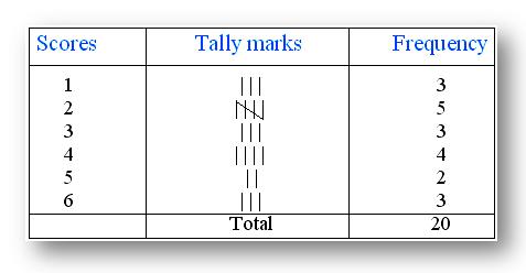
The total frequency tells us the total number of observations:
\( \text{Total frequency} = \text{number of observations} \)
Representing Categorical Data
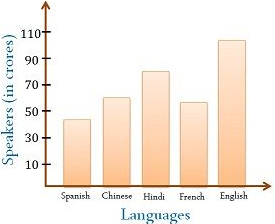
Categorical data can be represented using several types of graphs.
| Graph | Best used for |
|---|---|
Bar / Column Graph
| Comparing frequencies of different categories. |
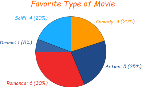
Pie Chart
| Showing how a whole is divided into categories. |
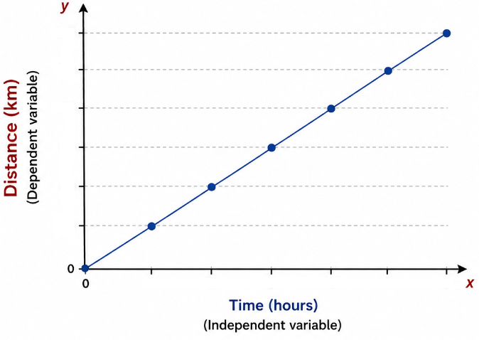
Line Graph
| Showing how a numerical quantity changes over time or another ordered variable. |
Pie Charts
A pie chart represents a whole circle of \(360^\circ\). The angle of each sector depends on the fraction or percentage of the data in that category.
\( \text{Sector angle} = \frac{\text{frequency}}{\text{total frequency}} \times 360^\circ \)
If a category represents \(25\%\) of the data:
\( \text{Sector angle} = 25\% \times 360^\circ = 90^\circ \)
Line Graphs
A line graph is useful when the data values have a natural order, especially when showing how something changes over time. The points are plotted and then connected with straight line segments.
For a line graph:
- Give the graph a clear title.
- Label both axes.
- Include suitable units.
- Choose an appropriate scale.
- Plot each point accurately.
- Join consecutive points when appropriate.
Choosing the Correct Representation
| Situation | Suitable representation |
|---|---|
| Favourite colours of students | Bar chart or pie chart |
| Number of students choosing each sport | Bar chart |
| Monthly temperature over one year | Line graph |
| How a whole group is divided into categories | Pie chart |
Reading and Interpreting Graphs
When interpreting a graph, do not simply state a number. Explain what the number means in the context of the problem.
For example, instead of writing:
\( 18 \)
write:
\( \text{18 students chose basketball.} \)
Always check the title, axes, labels, units and scale before reading a graph. A scale that increases by \(2\), \(5\), \(10\), or another interval can easily lead to an incorrect answer if it is ignored.
Misleading Graphs
Graphs can sometimes give a misleading impression if they are poorly designed. Common problems include:
- using a vertical axis that does not start at zero when comparison of bar heights is important;
- using unequal intervals on an axis;
- leaving out labels or units;
- using an inappropriate scale;
- using a graph type that does not suit the data;
- making small differences appear much larger than they really are.
A good statistical graph should present the data clearly, accurately and fairly.
Summary
| Concept | Key Point |
|---|---|
| Data | Information collected for investigation. |
| Population | The complete group being studied. |
| Sample | A smaller part of the population. |
| Census | Data collected from every member of the population. |
| Categorical data | Data grouped into categories. |
| Numerical data | Data describing quantities using numbers. |
| Frequency | The number of times a value or category occurs. |
| Bar chart | Useful for comparing categories. |
| Pie chart | Shows parts of a whole. |
| Line graph | Shows change in an ordered variable, especially over time. |
Example 1:
A school asks 40 randomly selected students how they travel to school. The results are:
| Transport | Frequency |
|---|---|
| Walk | 12 |
| Bus | 15 |
| Car | 8 |
| Bicycle | 5 |
a) What type of data is being collected?
b) Identify the population and sample.
c) What is the most common method of transport?
d) What percentage of the students travel by bus?
e) Calculate the angle needed for the bus sector of a pie chart.
f) Which type of graph would be suitable for comparing the four categories? Explain.
▶️ Answer/Explanation
a) Data type
The data is categorical because students are placed into categories according to their method of transport.
b) Population and sample
The population is all students in the school. The sample is the 40 randomly selected students.
c) Most common method
The highest frequency is \(15\), so the most common method is bus.
d) Percentage travelling by bus
\( \frac{15}{40} \times 100 = 37.5\% \)
Therefore, 37.5% of the students travel by bus.
e) Pie-chart angle
\( \frac{15}{40} \times 360^\circ = 135^\circ \)
The bus sector should have an angle of \(135^\circ\).
f) Suitable graph
A bar chart is suitable because it makes it easy to compare the frequencies of the four transport categories. A pie chart could also be used to show how the total group is divided.
Example 2:
A student records the temperature at midday for seven consecutive days.
| Day | Monday | Tuesday | Wednesday | Thursday | Friday | Saturday | Sunday |
|---|---|---|---|---|---|---|---|
| Temperature (°C) | 24 | 26 | 25 | 29 | 31 | 30 | 27 |
a) Is the temperature data categorical or numerical?
b) What is the highest temperature recorded?
c) By how many degrees did the temperature increase from Monday to Friday?
d) What type of graph would be most suitable for showing how the temperature changed during the week?
e) Describe the overall trend from Monday to Sunday.
f) Explain why the graph should have labelled axes and units.
▶️ Answer/Explanation
a) Data type
The data is numerical because temperature is a quantity measured using numbers.
b) Highest temperature
The highest recorded temperature is \(31^\circ\text{C}\), on Friday.
c) Increase from Monday to Friday
\(31 – 24 = 7^\circ\text{C}\)
The temperature increased by \(7^\circ\text{C}\).
d) Suitable graph
A line graph is most suitable because the days are in a natural order and the graph is being used to show how temperature changes over time.
e) Trend
The temperature generally increased from Monday to Friday, reaching a maximum of \(31^\circ\text{C}\), and then decreased slightly over the weekend.
f) Labels and units
The horizontal axis should identify the days, while the vertical axis should identify temperature in degrees Celsius. Labels and units make the graph clear and prevent the data from being misinterpreted.