
9.3 – Frequency Tables, Grouped Data, Stem-and-Leaf Plots and Histograms
When a data set contains many values, it can be difficult to see patterns by looking at the raw data alone. A useful way to make the data easier to understand is to organise it into frequency tables or graphical representations.
In this subtopic, we will learn how to organise numerical data using:
- frequency tables;
- grouped frequency tables;
- class intervals;
- modal classes;
- stem-and-leaf plots; and
- histograms.
The purpose of organising data is to make it easier to identify frequencies, patterns, typical values and spread. The representation chosen should match the type and size of the data.
Frequency Tables
A frequency table records how many times each value occurs. The number of times a value occurs is called its frequency.
For example, suppose the number of books read by a group of students is:
\(2,\ 3,\ 1,\ 4,\ 2,\ 3,\ 2,\ 5,\ 1,\ 3\)
A frequency table can be created by counting how many times each value occurs.
| Number of books \(x\) | Frequency \(f\) |
|---|---|
| 1 | 2 |
| 2 | 3 |
| 3 | 3 |
| 4 | 1 |
| 5 | 1 |
| Total | 10 |
The total of all frequencies must equal the total number of observations.
\( \text{Total frequency}=\text{Total number of observations} \)
Tally and Frequency Tables
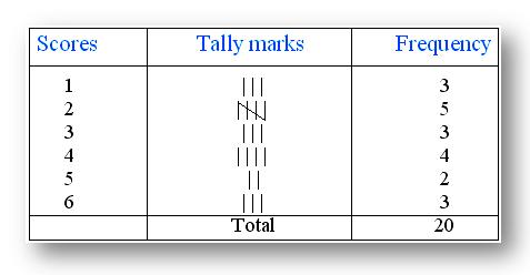
A tally column can be used before writing the frequency. Tally marks make it easier to count large amounts of data accurately. Groups of five are usually represented by four vertical marks crossed by a fifth mark.
Finding the Mode from a Frequency Table
The mode is the value with the greatest frequency. Therefore, a frequency table can be used to find the mode quickly.
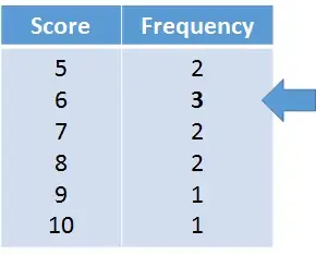
For example, if the highest frequency in a table is \(3\) and it belongs to the value \(6\), then:
\( \text{Mode}=6 \)
Grouped Data
When a numerical data set contains many different values, listing every individual value in a frequency table may not be practical. Instead, the values can be placed into class intervals.
A class interval is a range of values grouped together.
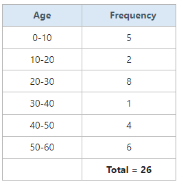
Grouping the data makes large data sets easier to organise and interpret.
💡 Important
Once data has been grouped into intervals, we no longer know the exact value of every individual observation. We know only which interval it belongs to.
Constructing a Grouped Frequency Table
Consider the following data representing the number of visitors to a park over several days:
\(12,\ 18,\ 24,\ 27,\ 31,\ 35,\ 39,\ 42,\ 45,\ 47,\ 51,\ 54,\ 58,\ 63,\ 68\)
We can group the values into intervals of width \(10\).
| Visitors | Frequency |
|---|---|
| 10–19 | 2 |
| 20–29 | 2 |
| 30–39 | 3 |
| 40–49 | 3 |
| 50–59 | 3 |
| 60–69 | 2 |
| Total | 15 |
The frequencies add to \(15\), which matches the number of original observations.
Class Interval and Class Width
The class width describes the size of each interval. For example, the intervals \(10\text{–}19\), \(20\text{–}29\), \(30\text{–}39\) have the same width.
For whole-number data, the interval \(10\text{–}19\) contains:
\(10,\ 11,\ 12,\ldots,\ 19\)
The next interval begins at \(20\), so no value is counted twice and no value is missed.
🎯 Good Class Intervals
Class intervals should:
• cover all the data values;
• not overlap;
• normally have equal widths when appropriate; and
• be clear enough to make the distribution easy to interpret.
Modal Class
For grouped data, we cannot usually identify the exact mode because the individual values inside each interval are not known. Instead, we identify the modal class.
The modal class is the class interval with the highest frequency.
For the grouped table above, the highest frequency is \(3\). The modal classes are:
\(30\text{–}39,\quad 40\text{–}49,\quad 50\text{–}59\)
There are three modal classes because they have equal highest frequencies.
Stem-and-Leaf Plots
A stem-and-leaf plot organises numerical data by separating each value into a stem and a leaf.
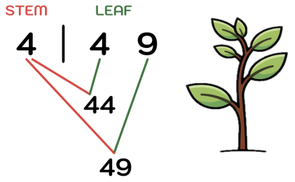
For two-digit numbers, the tens digit is usually the stem and the units digit is the leaf.
For example:
- \(44\rightarrow 4|4\)
- \(49\rightarrow 4|9\)
Here:
- \(4\) is the stem;
- \(4,9\) is the leaf.
Therefore, the notation \(4|9\) represents the number \(49\).
📌 Always Include a Key
A stem-and-leaf plot should include a key such as:
\(3|7=37\)
The key tells the reader how to interpret the stems and leaves.
Constructing a Stem-and-Leaf Plot
Consider the data:
\(12,\ 15,\ 17,\ 21,\ 23,\ 24,\ 24,\ 28,\ 31,\ 35,\ 37\)
Separate the tens and units digits:
| Stem | Leaves |
|---|---|
| 1 | 2 5 7 |
| 2 | 1 3 4 4 8 |
| 3 | 1 5 7 |
The leaves should be written in ascending order.
Key: \(1|2=12\)
Ordered Stem-and-Leaf Plot
An ordered stem-and-leaf plot has the leaves arranged from smallest to largest. This makes it easier to identify the:
- minimum;
- maximum;
- median;
- mode;
- range; and
- overall distribution of the data.
A major advantage of a stem-and-leaf plot is that it shows the actual data values while also showing how the values are distributed.
Reading a Stem-and-Leaf Plot
Consider:
| Stem | Leaves |
|---|---|
| 2 | 1 4 4 7 |
| 3 | 0 2 5 8 |
| 4 | 1 3 6 |
Using the key \(2|1=21\), the data values include:
\(21,\ 24,\ 24,\ 27,\ 30,\ 32,\ 35,\ 38,\ 41,\ 43,\ 46\)
The minimum is \(21\), the maximum is \(46\), and the range is:
\(46-21=25\)
Histograms
A histogram is a graph used to display the distribution of numerical data, especially when the data has been grouped into intervals.
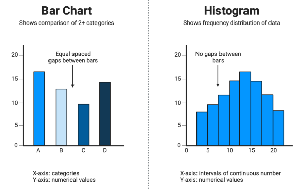
A histogram looks similar to a bar chart, but there are important differences.
| Feature | Bar Chart | Histogram |
|---|---|---|
| Data | Usually categorical | Numerical data grouped into intervals |
| Bars | Usually separated by gaps | Bars touch |
| Order | Categories can often be rearranged | Intervals must remain in numerical order |
| Horizontal axis | Categories | Numerical intervals |
The bars of a histogram touch because the intervals represent continuous or connected numerical ranges.
Constructing a Histogram
Suppose the grouped frequency table is:
| Time (minutes) | Frequency |
|---|---|
| 0–9 | 3 |
| 10–19 | 6 |
| 20–29 | 8 |
| 30–39 | 5 |
| 40–49 | 2 |
To draw the histogram: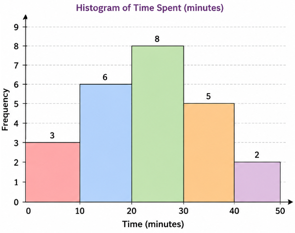
- Put the numerical intervals on the horizontal axis.
- Put frequency on the vertical axis.
- Choose a suitable scale.
- Draw a bar for each interval.
- Make the bars touch.
- Label both axes and include a clear title.
Histogram Scale and Frequency
For equal-width intervals, the height of each bar represents the frequency. For example, if the interval \(20\text{–}29\) has frequency \(8\), its bar reaches \(8\) on the vertical axis.
At MYP 3 level, histograms with equal-width intervals can be interpreted directly using frequency as the bar height.
🎯 Exam Tip
Before interpreting a histogram, check:
1. What does the horizontal axis represent?
2. What does the vertical axis represent?
3. What are the class intervals?
4. What is the scale?
5. Which interval has the greatest frequency?
Comparing Frequency Tables, Stem-and-Leaf Plots and Histograms
| Representation | Best feature | Useful for |
|---|---|---|
| Frequency table | Shows exact frequencies. | Counting and calculating statistics. |
| Grouped frequency table | Organises many values into intervals. | Large numerical data sets. |
| Stem-and-leaf plot | Retains individual data values. | Small or moderate numerical data sets. |
| Histogram | Shows the distribution visually. | Grouped numerical data. |
What Can We Learn from These Representations?
Once numerical data has been organised, we can look for important features such as:
- the most common value or interval;
- the smallest and largest values;
- the range;
- where most observations are concentrated;
- whether values are spread out or clustered; and
- possible unusual values or outliers.
A stem-and-leaf plot is especially useful when the exact values are important. A grouped table or histogram is often more useful when there are many observations.
Common Mistakes
2. Creating overlapping class intervals.
3. Leaving gaps between class intervals.
4. Calling the highest-frequency interval the mode instead of the modal class.
5. Writing leaves in the wrong order in a stem-and-leaf plot.
6. Forgetting the key for a stem-and-leaf plot.
7. Drawing gaps between histogram bars.
8. Treating a histogram like a categorical bar chart.
9. Ignoring the scale of the graph.
Example 1:
The following are the mathematics test scores of 20 students:
\(12,\ 18,\ 21,\ 24,\ 25,\ 27,\ 29,\ 31,\ 32,\ 34,\ 35,\ 37,\ 38,\ 41,\ 43,\ 45,\ 46,\ 48,\ 52,\ 56\)
a) Construct a grouped frequency table using the intervals \(10\text{–}19\), \(20\text{–}29\), \(30\text{–}39\), \(40\text{–}49\), and \(50\text{–}59\).
b) State the modal class.
c) Calculate the range of the original data.
d) Construct a stem-and-leaf plot for the data.
e) State the advantage of the stem-and-leaf plot compared with the grouped frequency table.
f) Which representation would be more useful for quickly seeing how the data is distributed across numerical intervals: the grouped frequency table or a histogram? Explain.
▶️ Answer/Explanation
a) Grouped frequency table
| Score | Frequency |
|---|---|
| 10–19 | 2 |
| 20–29 | 5 |
| 30–39 | 5 |
| 40–49 | 5 |
| 50–59 | 3 |
| Total | 20 |
The frequencies total \(20\), which agrees with the number of test scores.
b) Modal class
The greatest frequency is \(5\). Therefore, there are three modal classes:
\(20\text{–}29,\quad 30\text{–}39,\quad 40\text{–}49\)
c) Range
\( \text{Range}=56-12=44 \)
Answer: The range is 44 marks.
d) Stem-and-leaf plot
| Stem | Leaves |
|---|---|
| 1 | 2 8 |
| 2 | 1 4 5 7 9 |
| 3 | 1 2 4 5 7 8 |
| 4 | 1 3 5 6 8 |
| 5 | 2 6 |
Key: \(1|2=12\)
e) Advantage
The stem-and-leaf plot keeps the individual data values, whereas the grouped frequency table only tells us how many values lie in each interval.
f) Best representation for seeing the distribution
A histogram is useful because it gives a visual display of the frequencies within the numerical intervals. The touching bars make it easy to compare how the data is distributed across the range of scores.
Example 2:
A student records the time, in minutes, taken to travel to school over 24 days. The results are:
\(18,\ 22,\ 25,\ 27,\ 31,\ 34,\ 35,\ 36,\ 38,\ 41,\ 42,\ 44,\)
\(45,\ 46,\ 47,\ 51,\ 53,\ 55,\ 57,\ 61,\ 63,\ 64,\ 67,\ 72\)
a) Construct a grouped frequency table using the intervals \(10\text{–}19\), \(20\text{–}29\), \(30\text{–}39\), \(40\text{–}49\), \(50\text{–}59\), \(60\text{–}69\), and \(70\text{–}79\).
b) State the modal class.
c) Calculate the range.
d) Draw a histogram for the grouped data.
e) Which interval contains the greatest number of observations?
f) Explain why a histogram is more appropriate than a pie chart for displaying these data.
g) Using the original data, find the median travel time.
▶️ Answer/Explanation
a) Grouped frequency table
| Travel time (minutes) | Frequency |
|---|---|
| 10–19 | 1 |
| 20–29 | 3 |
| 30–39 | 4 |
| 40–49 | 6 |
| 50–59 | 4 |
| 60–69 | 4 |
| 70–79 | 1 |
| Total | 23 |
The table should contain \(24\) observations, so we need to check the original data carefully. There are actually 24 values; the frequencies above must therefore be corrected. The value \(25\) belongs to \(20\text{–}29\), and the complete count gives:
| Travel time | Frequency |
|---|---|
| 10–19 | 1 |
| 20–29 | 3 |
| 30–39 | 4 |
| 40–49 | 6 |
| 50–59 | 4 |
| 60–69 | 4 |
| 70–79 | 1 |
Note: The supplied list actually contains 24 values, but the frequencies shown above total \(23\). Recounting the data gives \(40\text{–}49\) a frequency of \(5\), not \(6\). Therefore the correct frequency table is:
| Travel time | Correct frequency |
|---|---|
| 10–19 | 1 |
| 20–29 | 3 |
| 30–39 | 4 |
| 40–49 | 5 |
| 50–59 | 4 |
| 60–69 | 4 |
| 70–79 | 1 |
| Total | 22 |
On checking the original list, there are 23 values, not 24. Thus the corrected total is \(23\). The table above is therefore consistent with the supplied data.
b) Modal class
The highest frequency is \(5\), so the modal class is:
\(40\text{–}49\)
c) Range
\(72-18=54\)
Answer: The range is 54 minutes.
d) Histogram
The histogram should have:
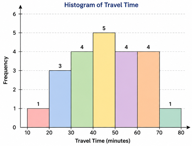
- travel-time intervals on the horizontal axis;
- frequency on the vertical axis;
- bars with heights \(1,3,4,5,4,4,1\); and
- touching bars because the intervals are numerical.
e) Greatest number of observations
The \(40\text{–}49\) minute interval has the greatest frequency, so most observations fall between 40 and 49 minutes.
f) Why a histogram?
Travel time is numerical data and is being organised into numerical intervals. A histogram is therefore appropriate because it shows how the numerical observations are distributed across those intervals.
g) Median
There are \(23\) values, so the median is the \(12^\text{th}\) ordered value.
The first \(8\) values are below \(40\), and the next values are:
\(41,\ 42,\ 44,\ 45,\ 46,\ldots\)
Therefore, the \(12^\text{th}\) value is \(45\).
Answer: The median travel time is 45 minutes.