
9.4 – Scatter Plots, Correlation and Lines of Best Fit
When two numerical variables are measured for the same set of individuals or objects, we can investigate whether there is a relationship between them. For example, we might investigate the relationship between:
- hours studied and test score;
- height and mass;
- age of a car and its value; or
- temperature and ice-cream sales.
Data involving two variables is called bivariate data. A useful way to display bivariate numerical data is a scatter plot.
A scatter plot helps us investigate whether two numerical variables are related. We can look for the direction, strength and form of the relationship.
Bivariate Data
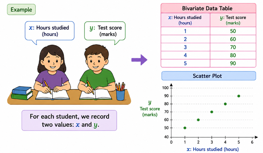
Bivariate data consists of two values recorded for each observation. The two variables are usually called \(x\) and \(y\).
For example, a teacher records the number of hours students study and their test scores.
Independent and Dependent Variables
When investigating two variables, it is useful to decide which variable is the explanatory variable and which is the response variable.
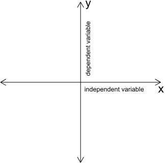
- The explanatory variable is placed on the horizontal \(x\)-axis.
- The response variable is placed on the vertical \(y\)-axis.
For example, when studying the relationship between study time and test score:
\(x=\text{study time}\)
\(y=\text{test score}\)
💡 Remember
The variable used to explain or predict the other variable is usually placed on the \(x\)-axis, while the variable being predicted or observed is placed on the \(y\)-axis.
Scatter Plots
A scatter plot displays pairs of numerical data as individual points on a coordinate grid. Each point represents one observation.
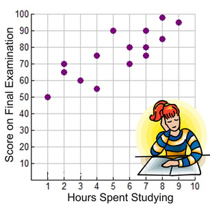
For example, the ordered pair \( (3,60) \) represents a student who studied for \(3\) hours and achieved a score of \(60\).
To construct a scatter plot:
- Identify the two variables.
- Choose suitable scales for the \(x\)- and \(y\)-axes.
- Label both axes, including units.
- Plot each ordered pair.
- Add a clear title.
🎯 Scatter Plot Checklist
Horizontal axis: explanatory variable
Vertical axis: response variable
Each point: one pair of observations
Title: describes the relationship being investigated
Positive Correlation
A scatter plot shows positive correlation when larger values of one variable tend to be associated with larger values of the other variable.
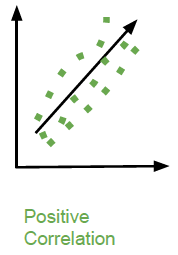
The points generally rise from left to right.
For example, if students who study for more hours generally achieve higher test scores, the two variables have a positive correlation.
\(\text{Study time} \uparrow \quad \Rightarrow \quad \text{Test score tends to} \uparrow\)
Negative Correlation
A scatter plot shows negative correlation when larger values of one variable tend to be associated with smaller values of the other variable.
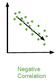
The points generally fall from left to right.
For example, as the age of a car increases, its value may tend to decrease.
\(\text{Car age} \uparrow \quad \Rightarrow \quad \text{Car value tends to} \downarrow\)
No Correlation
There is no correlation when there is no clear relationship between the two variables. The points appear scattered without a clear upward or downward pattern.
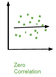
For example, a person’s shoe size and the number of books they read in a month would not normally be expected to have a meaningful relationship.
Strength of Correlation
Correlation is not only about whether a relationship is positive or negative. We can also describe its strength.
A strong correlation occurs when the points lie close to a clear pattern. A weak correlation occurs when the points are more widely scattered.
| Relationship | Description |
|---|---|
| Strong positive | Points are close to an upward trend. |
| Weak positive | Points show a general upward trend but are quite scattered. |
| Strong negative | Points are close to a downward trend. |
| Weak negative | Points show a general downward trend but are quite scattered. |
| No correlation | There is no clear trend. |
Describing Correlation
A complete description should state both the direction and strength of the relationship.
For example:
Good description:
“The scatter plot shows a strong positive correlation between study time and test score. Students who study for more hours generally achieve higher scores.”
Avoid simply saying “the graph goes up”. A mathematical description should identify the direction and strength of the relationship.
Lines of Best Fit
When a scatter plot shows a clear linear trend, we can draw a line of best fit.
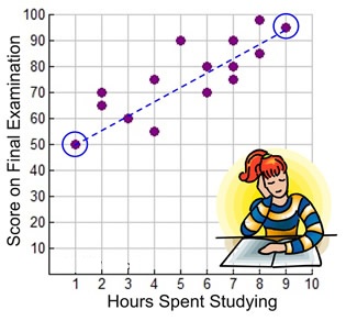
A line of best fit is a straight line that represents the overall trend of the data. It does not usually pass through every point.
🎯 Purpose of a Line of Best Fit
A line of best fit helps us:
• see the overall trend;
• estimate values;
• make predictions; and
• describe how two variables are related.
Drawing a Line of Best Fit
A reasonable line of best fit should pass through the middle of the data. There should be approximately as many points above the line as below it, although the numbers do not need to be exactly equal.
The line should represent the overall trend rather than joining individual points.
- Look at the overall pattern of the points.
- Identify the direction of the relationship.
- Draw a straight line through the centre of the data.
- Try to balance the points above and below the line.
- Do not force the line through every point.
Making Predictions Using a Line of Best Fit
Once a line of best fit has been drawn, it can be used to estimate the value of one variable when the other variable is known.
For example, suppose a line of best fit for study time and test score passes approximately through the point:
\( (3,60) \)
This suggests that a student who studies for approximately \(3\) hours might be expected to score about \(60\) marks.
⚠️ Important
A prediction from a line of best fit is an estimate, not a guaranteed result. Individual observations may lie above or below the line.
Interpolation and Extrapolation
Predictions can be made in two different ways.
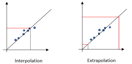
- Interpolation means making a prediction within the range of the observed data.
- Extrapolation means making a prediction outside the range of the observed data.
| Type | Meaning | Reliability |
|---|---|---|
| Interpolation | Prediction within the observed range. | Usually more reliable. |
| Extrapolation | Prediction outside the observed range. | Less reliable because the trend may not continue. |
Equation of a Straight Line
A line of best fit can sometimes be represented using the equation of a straight line:
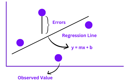
where:
- \(y\) is the predicted value;
- \(x\) is the explanatory variable;
- \(m\) is the gradient of the line; and
- \(b\) is the \(y\)-intercept.
For example, suppose a line of best fit is:
\(y=6x+45\)
If \(x=5\):
\(y=6(5)+45\)
\(y=30+45=75\)
The predicted value of \(y\) is 75.
Gradient of a Line of Best Fit
The gradient tells us how much the predicted \(y\)-value changes when \(x\) increases by one unit.
For:
\(y=4x+20\)
the gradient is \(4\). This means that for every increase of \(1\) in \(x\), the predicted \(y\)-value increases by \(4\).
A positive gradient represents an upward trend, while a negative gradient represents a downward trend.
Correlation Does Not Mean Causation
If two variables are correlated, this does not automatically mean that one variable causes the other.
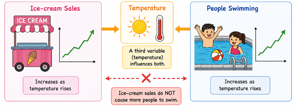
For example, ice-cream sales and the number of people swimming at a pool may both increase during warmer weather. The two variables are related, but increased ice-cream sales do not necessarily cause more people to swim. A third variable, such as temperature, may influence both.
Correlation: two variables show a relationship.
Causation: a change in one variable directly produces a change in another.
Correlation alone does not prove causation.
Interpreting a Scatter Plot Step by Step
- Identify the two variables.
- Identify which variable is on the \(x\)-axis and which is on the \(y\)-axis.
- Look for the general direction of the points.
- Decide whether the correlation is positive, negative or absent.
- Decide whether the relationship is strong or weak.
- Look for unusual points or possible outliers.
- If a line of best fit is present, use it to make reasonable estimates.
Comparing Types of Correlation
| Type | Pattern | Example |
|---|---|---|
| Strong positive | Points closely follow an upward trend. | Study time and test score |
| Weak positive | General upward trend with considerable scatter. | Height and hand span in a small group |
| Strong negative | Points closely follow a downward trend. | Age of a car and its value |
| Weak negative | General downward trend with considerable scatter. | Some environmental data |
| No correlation | No clear upward or downward pattern. | Shoe size and favourite colour |
🚨 Common Mistakes
1. Putting the wrong variable on the \(x\)-axis.
2. Forgetting to label axes and units.
3. Calling every upward-looking scatter plot “strong positive correlation”.
4. Confusing negative correlation with “no correlation”.
5. Assuming a line of best fit must pass through every point.
6. Treating a prediction as an exact value rather than an estimate.
7. Making predictions far outside the observed data without considering the danger of extrapolation.
8. Assuming correlation proves that one variable causes the other.
Example 1:
A teacher records the number of hours \(x\) that students study for a test and their test scores \(y\).
| Study time \(x\) (hours) | Test score \(y\) |
|---|---|
| 1 | 48 |
| 2 | 55 |
| 3 | 61 |
| 4 | 69 |
| 5 | 75 |
| 6 | 82 |
| 7 | 88 |
a) Write the ordered pair representing the student who studied for \(4\) hours.
b) Identify the explanatory and response variables.
c) Describe the correlation between study time and test score.
d) Explain what the correlation suggests about students who study for more hours.
e) A line of best fit is approximated by \(y=6x+43\). Use the equation to predict the test score for a student who studies for \(5\) hours.
f) Use the equation to predict the score for a student who studies for \(8\) hours.
g) Explain why the prediction in part (f) should be treated with some caution.
h) Does the positive correlation prove that studying more hours causes a higher test score? Explain.
▶️ Answer/Explanation
a) Ordered pair
The student studied for \(4\) hours and scored \(69\).
\( (4,69) \)
Answer: \( (4,69) \)
b) Variables
The explanatory variable is the number of hours studied because it is being used to help explain or predict the test score.
The response variable is the test score.
Answer:
\(x=\text{study time}\)
\(y=\text{test score}\)
c) Correlation
As study time increases, test scores generally increase. The points would therefore show a strong positive correlation.
d) Interpretation
The data suggests that students who study for more hours tend to achieve higher test scores.
e) Prediction for \(5\) hours
\(y=6x+43\)
\(y=6(5)+43\)
\(y=30+43=73\)
Answer: The predicted test score is 73.
f) Prediction for \(8\) hours
\(y=6(8)+43\)
\(y=48+43=91\)
Answer: The predicted test score is 91.
g) Why should the prediction be treated cautiously?
The observed study times range from \(1\) to \(7\) hours. A prediction for \(8\) hours is outside the observed range, so it is an extrapolation. The relationship may not continue in exactly the same way beyond the observed data.
h) Correlation and causation
No. Positive correlation does not by itself prove causation. Other factors, such as previous knowledge, sleep, teaching quality or motivation, could also affect test scores.
Final conclusion: The data shows a positive relationship, but the data alone does not prove that studying more hours directly causes higher scores.
Example 2:
A bicycle shop records the age of several used bicycles and their selling prices.
| Age \(x\) (years) | Price \(y\) ($\$$) |
|---|---|
| 1 | 520 |
| 2 | 470 |
| 3 | 430 |
| 4 | 380 |
| 5 | 340 |
| 6 | 295 |
| 7 | 250 |
A line of best fit for the data is:
\(y=-45x+570\)
a) Identify the explanatory and response variables.
b) Describe the direction and strength of the correlation shown by the data.
c) Explain the meaning of the negative gradient in the line of best fit.
d) Use the line of best fit to estimate the price of a bicycle that is \(4\) years old.
e) Use the line of best fit to estimate the price of a bicycle that is \(8\) years old.
f) State whether the prediction in part (e) is interpolation or extrapolation.
g) Explain one limitation of using the line of best fit to predict the exact selling price of an individual bicycle.
▶️ Answer/Explanation
a) Variables
The explanatory variable is the age of the bicycle. The response variable is the selling price.
\(x=\text{age of bicycle}\)
\(y=\text{selling price}\)
b) Correlation
As the age of the bicycle increases, its price generally decreases. The data shows a strong negative correlation.
c) Meaning of the negative gradient
The gradient is \(-45\). This means that according to the model, the predicted price decreases by approximately $45 for each additional year of age.
d) Price for a \(4\)-year-old bicycle
\(y=-45(4)+570\)
\(y=-180+570\)
\(y=390\)
Answer: The estimated price is $390.
e) Price for an \(8\)-year-old bicycle
\(y=-45(8)+570\)
\(y=-360+570\)
\(y=210\)
Answer: The estimated price is $210.
f) Interpolation or extrapolation?
The observed bicycle ages range from \(1\) to \(7\) years. An age of \(8\) years lies outside this range. Therefore, this is an extrapolation.
g) Limitation of the prediction
The line of best fit represents the overall trend, not every individual bicycle. Factors such as brand, condition, model, maintenance and demand could cause the actual price to be different from the predicted price.
Final conclusion: The line of best fit provides a useful estimate of the general relationship between age and price, but it cannot guarantee the exact price of a particular bicycle.
⭐ 9.4 Quick Summary
Bivariate data:
Two numerical variables recorded for the same observations.
Scatter plot:
A graph showing pairs of numerical data as points.
Positive correlation:
As one variable increases, the other tends to increase.
Negative correlation:
As one variable increases, the other tends to decrease.
No correlation:
There is no clear relationship between the variables.
Strong correlation:
Points are closely grouped around a clear trend.
Weak correlation:
Points show a trend but are more widely scattered.
Line of best fit:
A straight line representing the overall trend of a scatter plot.
Equation of a line: \(y=mx+c\)
Interpolation:
Prediction within the observed range.
Extrapolation:
Prediction outside the observed range and therefore generally less reliable.
Important:
Correlation does not automatically prove causation.