Correlation
Correlation is a statistical measure that describes the strength and direction of a relationship between two variables.
Types of Correlation:
- Positive Correlation: As one variable increases, the other also increases (e.g., height and weight).
- Negative Correlation: As one variable increases, the other decreases (e.g., speed and travel time).
- No Correlation: No predictable relationship between variables.
Methods to Represent Correlation:
- Scatter graphs with a line of best fit.
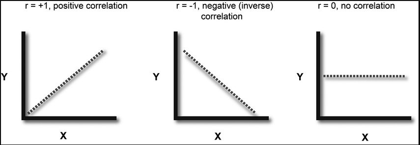
- Correlation coefficient (\( r \)) values from -1 to +1:
- \( r \approx +1\): Strong positive correlation
- \( r \approx -1\): Strong negative correlation
- \( r \approx 0\): No correlation
Example:
The table shows the hours studied and marks scored by 6 students:
| Hours Studied | Marks Scored |
|---|---|
| 2 | 40 |
| 3 | 50 |
| 4 | 55 |
| 5 | 65 |
| 6 | 70 |
| 7 | 80 |
What type of correlation exists between hours studied and marks scored?
▶️Answer/Explanation
Observation: As hours studied increase, marks scored also increase.
Conclusion: Positive correlation exists between hours studied and marks scored.
Example:
The scatter graph below shows the relationship between English Marks and Maths Marks for a Exam.

What is the type of correlation?
▶️Answer/Explanation
Observation: As Maths Marks increases, English Marks decreases.
Conclusion: Negative correlation exists between English Marks and Maths Marks.
Qualitative Data Handling
Qualitative data refers to non-numeric information describing categories or attributes (e.g., colors, brands, opinions).
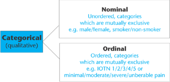
It can be classified into:
- Nominal: Categories with no natural order (e.g., blood group, eye color).
- Ordinal: Categories with an order but no fixed difference (e.g., satisfaction: Poor, Fair, Good).
Methods to Handle Qualitative Data:
- Frequency Table: Lists each category and its frequency (number of occurrences). Useful for summarizing raw data.
- Bar Chart: Uses rectangular bars with lengths proportional to frequencies. Gaps between bars indicate categories are discrete.
- Pie Chart: Represents data as sectors of a circle. Each sector’s angle = \( \dfrac{\text{frequency}}{\text{total}} \times 360^\circ \).
- Pictogram: Uses pictures or symbols to represent frequency. Each symbol represents a fixed number of items.
Example :
20 students were asked their favorite sport. The results were:
Football, Basketball, Football, Cricket, Cricket, Football, Basketball, Football, Tennis, Cricket, Football, Basketball, Tennis, Football, Cricket, Football, Basketball, Football, Tennis, Cricket.
▶️Answer/Explanation
Step 1: Count each category:
| Sport | Frequency |
|---|---|
| Football | 8 |
| Basketball | 4 |
| Cricket | 5 |
| Tennis | 3 |
Example :
Using the same data (favorite sports), draw a bar chart.
▶️Answer/Explanation
Step 1: Sports on the x-axis, frequencies on y-axis.
Step 2: Draw bars: Football (8), Basketball (4), Cricket (5), Tennis (3). Leave gaps between bars.
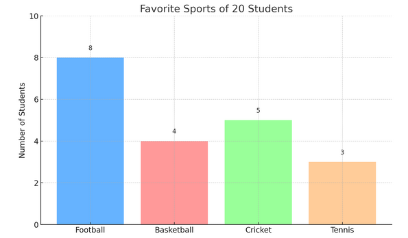
Interpretation: Football is the most popular sport.
Example :
Convert the sports data into a pie chart.
▶️Answer/Explanation
Total: 20 (8 + 4 + 5 + 3).
Angles:
- Football: \( \dfrac{8}{20} \times 360^\circ \approx 144^\circ \)
- Basketball: \( \dfrac{4}{20} \times 360^\circ \approx 72^\circ \)
- Cricket: \( \dfrac{5}{20} \times 360^\circ \approx 90^\circ \)
- Tennis: \( \dfrac{3}{20} \times 360^\circ \approx 54^\circ \)

Example :
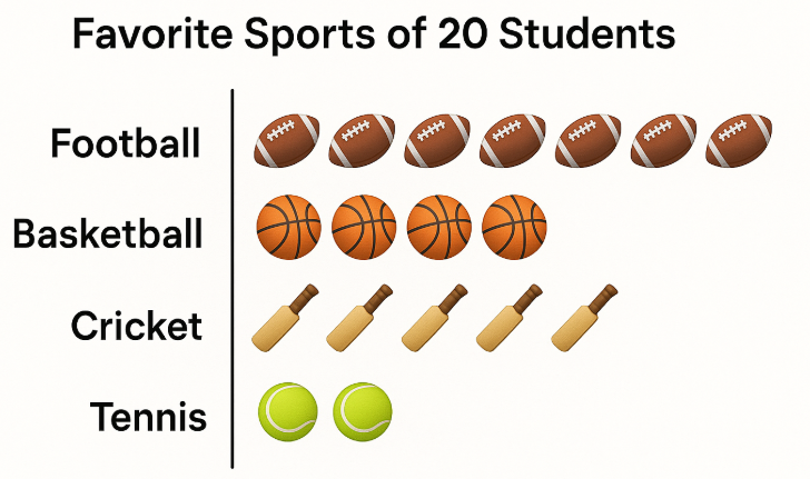
Represent the same data as a pictogram where one Sports symbol = 1 students.
▶️Answer/Explanation
Symbols required:
- Football: 8 ÷ 1 = 8 symbols
- Basketball: 4 ÷ 1 = 4 symbols
- Cricket: 5 ÷ 1 = 5 symbols
- Tennis: 3 ÷ 1 = 3 symbols