Bivariate Graphs
A bivariate graph shows the relationship between two variables plotted on a coordinate plane. One variable is placed on the x-axis (independent) and the other on the y-axis (dependent).
Key Features:
- Helps visualize the connection between two quantities.
- Usually plotted as points or a line graph when the data is continuous.
- Common in real-life: time vs speed, age vs height.
Example:
The table shows time (minutes) and distance (km) traveled by a cyclist:
| Time (minutes) | Distance (km) |
|---|---|
| 0 | 0 |
| 10 | 5 |
| 20 | 10 |
| 30 | 15 |
| 40 | 20 |
Draw a bivariate graph and describe the relationship.
▶️Answer/Explanation
Step 1: Plot time on the x-axis and distance on the y-axis.
Step 2: Plot points (0,0), (10,5), (20,10), (30,15), (40,20).
Step 3: Join with a straight line – this shows a linear relationship.
Answer: The graph shows direct proportionality: as time increases, distance increases at a constant rate.
Example:
The table shows the temperature at different times of the day:
| Time | Temperature (°C) |
|---|---|
| 6 am | 16 |
| 9 am | 20 |
| 12 pm | 26 |
| 3 pm | 24 |
| 6 pm | 18 |
Plot a bivariate line graph and interpret the pattern.
▶️Answer/Explanation
Step 1: Convert time into numerical values (6, 9, 12, 15, 18).
Step 2: Plot points and connect smoothly.
Interpretation: Temperature rises in the morning, peaks at noon, then decreases towards evening.
Scatter Graphs
A scatter graph (or scatter plot) shows the relationship between two numerical variables by plotting points on a coordinate plane. It is used to check for correlation between variables.

Key Features:
- Each point represents one pair of values (x, y).
- Used to check for a correlation between two variables.
- We can draw a line of best fit to show the trend.
Types of Correlation:
- Positive correlation: As one variable increases, the other also increases.
- Negative correlation: As one variable increases, the other decreases.
- No correlation: No pattern or relationship between the two variables.
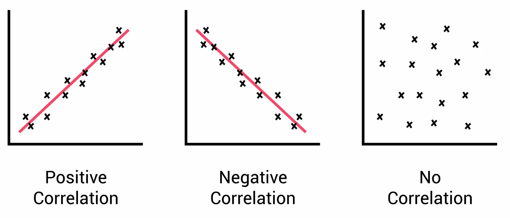
Line of Best Fit:
- A straight line drawn through the points, showing the overall trend.
- Helps predict values of one variable based on the other.
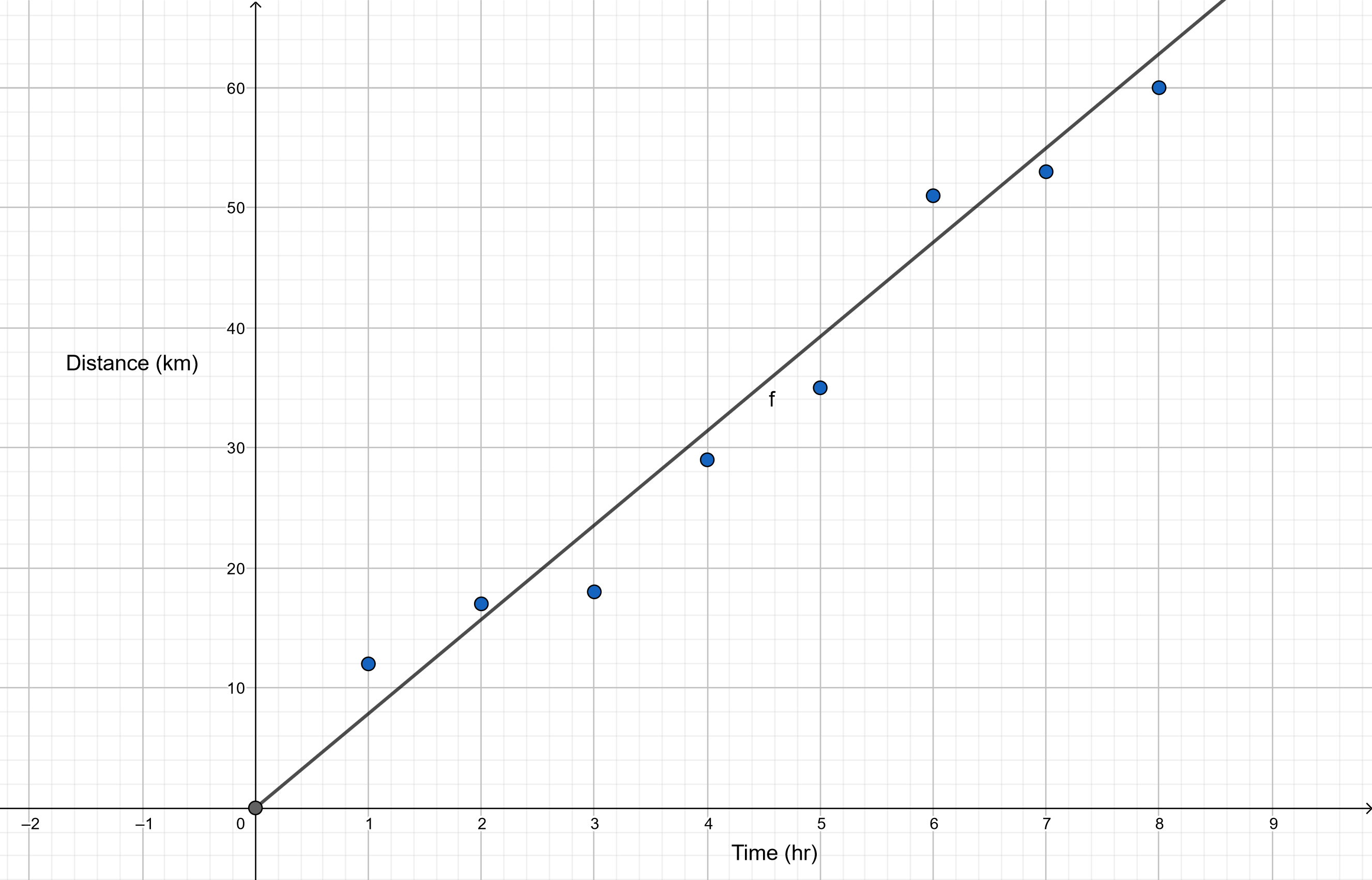
Example:
The table shows the number of hours studied and the marks scored by 8 students:
| Hours Studied | Marks (%) |
|---|---|
| 1 | 45 |
| 2 | 50 |
| 3 | 58 |
| 4 | 62 |
| 5 | 70 |
| 6 | 74 |
| 7 | 78 |
| 8 | 85 |
Draw a scatter graph and describe the correlation.
▶️Answer/Explanation
Step 1: Plot points (Hours, Marks) on a graph.
Step 2: Observe the pattern: points rise upwards from left to right.
Step 3: Draw a line of best fit through the data points.
Answer: There is a strong positive correlation between hours studied and marks scored.
Example:
The table shows the daily temperature and the number of hot drinks sold:
| Temperature (°C) | Hot Drinks Sold |
|---|---|
| 5 | 120 |
| 8 | 110 |
| 10 | 95 |
| 12 | 85 |
| 15 | 70 |
| 18 | 55 |
Draw a scatter graph and describe the correlation.
▶️Answer/Explanation
Step 1: Plot points (Temperature, Drinks sold) on a graph.
Step 2: Observe pattern: as temperature increases, hot drink sales decrease.
Step 3: Draw a downward-sloping line of best fit.
Answer: There is a strong negative correlation between temperature and hot drinks sold.
Box Plots (Box-and-Whisker)
A box plot is a diagram that shows the distribution of a data set using five key values: minimum, lower quartile (Q1), median (Q2), upper quartile (Q3), and maximum. It helps visualize the spread and detect outliers.
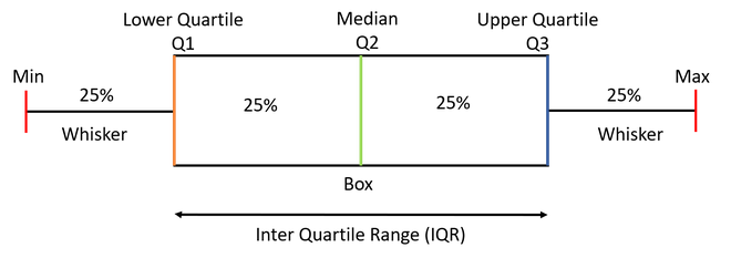
Key Features:
- The box represents the interquartile range (IQR) = Q3 − Q1.
- A line inside the box marks the median.
- Whiskers extend to the smallest and largest data values.
- Shows symmetry, skewness, and spread of data.
Steps to Draw a Box Plot:
- Arrange data in ascending order.
- Find:
- Minimum and Maximum
- Median (Q2)
- Lower quartile (Q1): median of the lower half
- Upper quartile (Q3): median of the upper half
- Draw a scale and plot these five values.
- Draw the box from Q1 to Q3 and whiskers to min and max.
Example:
The marks (out of 50) scored by 9 students are:
| Marks |
|---|
| 12 |
| 15 |
| 18 |
| 20 |
| 24 |
| 26 |
| 28 |
| 32 |
| 36 |
Draw a box plot for this data.
▶️Answer/Explanation
Step 1: Arrange data (already sorted): 12, 15, 18, 20, 24, 26, 28, 32, 36.
Step 2: Find five-number summary:
Min = 12
Q1 = 18 (middle of first 4 values)
Median (Q2) = 24
Q3 = 28 (middle of last 4 values)
Max = 36
Step 3: Draw box from 18 to 28, line at 24, whiskers at 12 and 36.
Example:
The times (in minutes) taken by 11 students to complete a puzzle:
| Times |
|---|
| 6 |
| 8 |
| 9 |
| 10 |
| 12 |
| 13 |
| 14 |
| 15 |
| 18 |
| 20 |
| 22 |
Construct a box plot and comment on the spread.
▶️Answer/Explanation
Step 1: Sorted data: 6, 8, 9, 10, 12, 13, 14, 15, 18, 20, 22.
Step 2: Five-number summary:
Min = 6
Q1 = 9.5 (average of 9 and 10)
Median = 13
Q3 = 17 (average of 15 and 18)
Max = 22
Step 3: Box: 9.5 to 17, line at 13, whiskers at 6 and 22.
Interpretation: Data is slightly skewed to the right (longer upper whisker).
Cumulative Frequency Graphs
A cumulative frequency graph shows how the cumulative total of a data set increases as the variable increases. It is useful for estimating medians, quartiles, and percentiles.

Key Features:
- The cumulative frequency is the running total of frequencies up to a certain point.
- The graph is usually drawn as an ogive (a smooth curve or straight lines connecting points).
- The horizontal axis shows the upper class boundaries, and the vertical axis shows cumulative frequency.

Steps to Draw a Cumulative Frequency Graph:
- Create a cumulative frequency table from the given data.
- Plot cumulative frequency against upper class boundary for each class.
- Draw a smooth curve or join with straight lines.
- Use the graph to estimate median, quartiles, and percentiles.
Example:
The table shows the marks of 40 students grouped into intervals:
| Marks | Frequency |
|---|---|
| 0–10 | 3 |
| 10–20 | 5 |
| 20–30 | 10 |
| 30–40 | 12 |
| 40–50 | 10 |
Draw a cumulative frequency graph and estimate the median.
▶️Answer/Explanation
Step: Calculate cumulative frequency:
| Upper Boundary | Cumulative Frequency |
|---|---|
| 10 | 3 |
| 20 | 8 |
| 30 | 18 |
| 40 | 30 |
| 50 | 40 |
Step 2: Plot these points (upper boundary, cumulative frequency) and draw a smooth curve.
Step 3: Median = 50% of 40 = 20th value. Read from the graph at 20 on the cumulative frequency axis → approx 32 marks.
Example:
The weights (in kg) of 50 students are given below:
| Weight (kg) | Frequency |
|---|---|
| 40–50 | 5 |
| 50–60 | 10 |
| 60–70 | 20 |
| 70–80 | 10 |
| 80–90 | 5 |
Draw the cumulative frequency graph and find the interquartile range (IQR).
▶️Answer/Explanation
Step 1: Calculate cumulative frequency:
| Upper Boundary | Cumulative Frequency |
|---|---|
| 50 | 5 |
| 60 | 15 |
| 70 | 35 |
| 80 | 45 |
| 90 | 50 |
Step 2: Plot the graph and read quartiles:
Q1 = 25% of 50 = 12.5th value ≈ 58 kg
Q3 = 75% of 50 = 37.5th value ≈ 72 kg
Step 3: IQR = Q3 − Q1 = 72 − 58 = 14 kg.