Linear correlation measures the strength and direction of the linear relationship between two quantitative variables. These variables are called bivariate data, as they come in pairs (e.g. height and weight, study hours and test scores).
Key Concepts
- Scatter diagram: A graph of points showing the relationship between two variables.
- Positive correlation: As one variable increases, the other tends to increase.
- Negative correlation: As one variable increases, the other tends to decrease.
- No correlation: There is no clear linear relationship between the variables.
-

- Correlation coefficient (r): A numerical measure of linear correlation, ranging from -1 to +1.


Interpretation of r
| Value of r | Interpretation |
|---|---|
| +1 | Perfect positive linear correlation |
| 0 | No linear correlation |
| -1 | Perfect negative linear correlation |
Note: A correlation coefficient close to +1 or -1 indicates a strong linear relationship. A value near 0 suggests a weak or no linear relationship. Correlation does not imply causation!
Example:
Given the data on hours studied (x) and marks obtained (y):
| Hours studied (x) | Marks obtained (y) |
|---|---|
| 2 | 50 |
| 4 | 60 |
| 6 | 70 |
| 8 | 80 |
▶️ Answer/Explanation
The data shows that as hours studied increase, marks obtained also increase consistently.
Using technology, the correlation coefficient is:
r ≈ +1 — indicating a perfect positive linear correlation.
GDC steps (TI-84 or similar):
- Press STAT → 1: Edit…
- Enter x-values in L1: 2, 4, 6, 8
- Enter y-values in L2: 50, 60, 70, 80
- Press STAT → CALC → 4: LinReg(ax + b)
- Press ENTER
The GDC output includes:
r = 1
Scatter Diagrams
A scatter diagram (or scatter plot) is a graph that shows the relationship between two variables. Each point represents a pair of values (x, y) from a set of data. Scatter diagrams help to identify patterns or relationships, such as:
- Positive correlation: As x increases, y tends to increase.
- Negative correlation: As x increases, y tends to decrease.
- No correlation: No clear pattern between x and y.
Lines of Best Fit (by eye)
A line of best fit is a straight line drawn through a scatter diagram to show the general trend of the data. When drawing a line of best fit by eye:
- The line should follow the general direction of the points.
- There should be roughly an equal number of points on either side of the line.
- The line should pass as close as possible to the points overall.
Passing through the mean point
When drawing a line of best fit by eye, it is good practice to make sure the line passes through the mean point (\( \bar{x}, \bar{y} \)), where:
\( \bar{x} = \frac{\sum x}{n}, \quad \bar{y} = \frac{\sum y}{n} \)
This ensures that the line represents the average trend of the data.
Purpose of line of best fit
- To show the type and strength of correlation.
- To estimate or predict values (interpolation and extrapolation).
Example:
Plot the scatter diagram for the following data, and determine the mean point. Sketch a line of best fit by eye that passes through the mean point.
| x (hours studied) | y (marks obtained) |
|---|---|
| 1 | 50 |
| 2 | 55 |
| 3 | 60 |
| 4 | 65 |
| 5 | 70 |
▶️ Answer/Explanation
\( \bar{x} = \frac{1 + 2 + 3 + 4 + 5}{5} = \frac{15}{5} = 3 \)
\( \bar{y} = \frac{50 + 55 + 60 + 65 + 70}{5} = \frac{300}{5} = 60 \)
So the mean point is (3, 60).
Scatter diagram and line of best fit
Plot the points (1,50), (2,55), (3,60), (4,65), (5,70).
The points lie approximately on a straight line. Draw a straight line that:
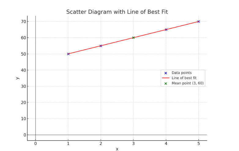
- Passes through the mean point (3, 60)
- Has roughly equal numbers of points above and below
The line of best fit represents a strong positive linear correlation.
Equation of the Regression Line of y on x
The regression line of y on x is a straight line that best fits the data points, minimizing the sum of the squares of the vertical distances of the points from the line. The equation of the regression line is:
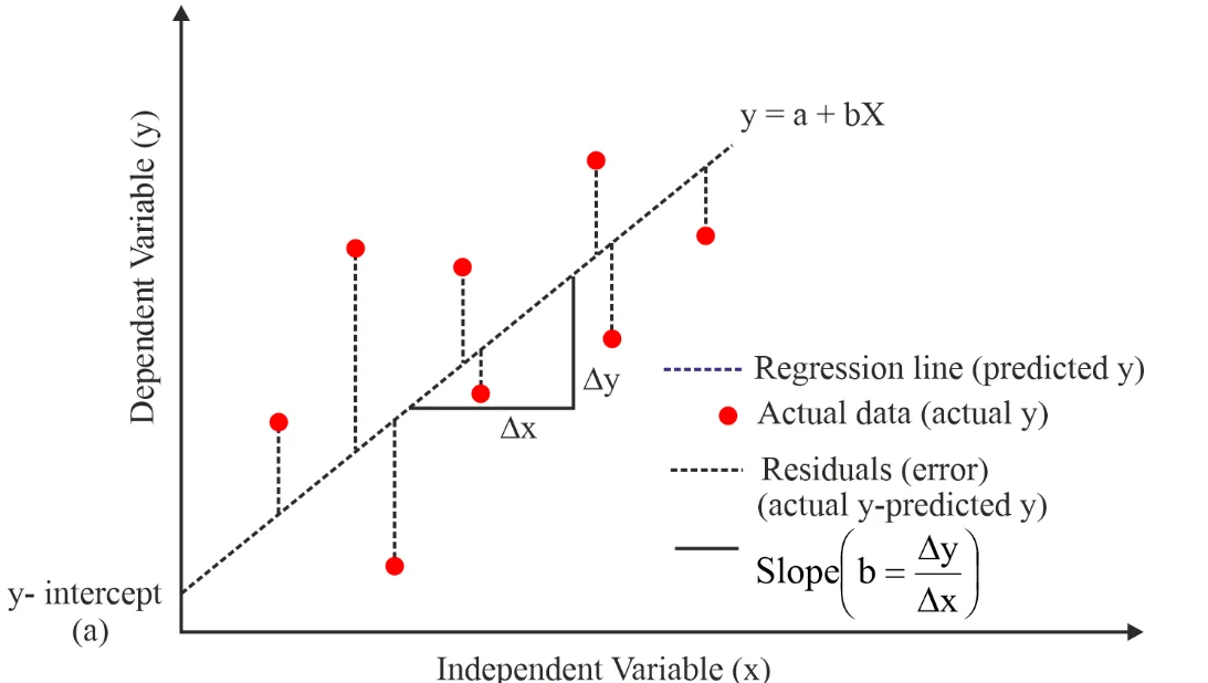
\( y = ax + b \)
where:
- \( a \) is the slope (gradient) of the line.
- \( b \) is the y-intercept of the line.
The formula for calculating \( a \) and \( b \) is:
\( a = \frac{ \sum (x – \bar{x})(y – \bar{y}) }{ \sum (x – \bar{x})^2 } \), \( b = \bar{y} – a \bar{x} \)
The regression line always passes through the point (\( \bar{x} \), \( \bar{y} \)) — the mean point of the data.
Use of the Equation of the Regression Line for Prediction Purposes
The regression line can be used to predict the value of \( y \) for a given value of \( x \). This is called interpolation if the x-value lies within the range of the data and extrapolation if the x-value lies outside the data range.
- Interpolation: Predictions made within the range of observed data are usually reliable.
- Extrapolation: Predictions made outside the range of observed data may be unreliable because the linear trend may not continue.
To predict, substitute the given x-value into the regression equation:
Example: Given \( y = 2x + 5 \), if \( x = 4 \), then \( y = 2 \times 4 + 5 = 13 \)
Interpret the Meaning of the Parameters, a and b, in a Linear Regression \( y = ax + b \)
- a (the slope or gradient): This represents the rate of change of y with respect to x. It tells us how much y is expected to change for a one-unit increase in x.
- b (the y-intercept): This is the value of y when x = 0. It is the point where the regression line crosses the y-axis.
Example interpretation: If the regression equation is \( y = 3x + 2 \):
- The slope \( a = 3 \) means that for each additional unit increase in x, y increases by 3 units.
- The intercept \( b = 2 \) means that when x = 0, the predicted value of y is 2.
Note: The actual interpretation of a and b depends on the context of the problem (e.g. x = hours studied, y = marks obtained).
Example:
The table below shows the number of hours studied (x) and the corresponding test scores (y) for 5 students:
| x (hours studied) | y (test score) |
|---|---|
| 1 | 52 |
| 2 | 55 |
| 3 | 59 |
| 4 | 62 |
| 5 | 65 |
Find the regression line of y on x, use it to predict the test score for 6 hours of study, and interpret the parameters a and b.
▶️ Answer/Explanation
\( \bar{x} = \frac{1 + 2 + 3 + 4 + 5}{5} = 3 \)
\( \bar{y} = \frac{52 + 55 + 59 + 62 + 65}{5} = \frac{293}{5} = 58.6 \)
\( a = \frac{\sum (x – \bar{x})(y – \bar{y})}{\sum (x – \bar{x})^2} \)
| x | y | (x – 𝑥̄) | (y – ȳ) | (x – 𝑥̄)(y – ȳ) | (x – 𝑥̄)² |
|---|---|---|---|---|---|
| 1 | 52 | -2 | -6.6 | 13.2 | 4 |
| 2 | 55 | -1 | -3.6 | 3.6 | 1 |
| 3 | 59 | 0 | 0.4 | 0 | 0 |
| 4 | 62 | 1 | 3.4 | 3.4 | 1 |
| 5 | 65 | 2 | 6.4 | 12.8 | 4 |
\( \sum (x – \bar{x})(y – \bar{y}) = 13.2 + 3.6 + 0 + 3.4 + 12.8 = 33 \)
\( \sum (x – \bar{x})^2 = 4 + 1 + 0 + 1 + 4 = 10 \)
\( a = \frac{33}{10} = 3.3 \)
\( b = \bar{y} – a \bar{x} = 58.6 – 3.3 \times 3 = 58.6 – 9.9 = 48.7 \)
Final regression line: \( y = 3.3x + 48.7 \)
Prediction
If \( x = 6 \):
\( y = 3.3 \times 6 + 48.7 = 19.8 + 48.7 = 68.5 \)
Predicted test score: 68.5
Interpretation of parameters
- The slope \( a = 3.3 \): For each additional hour studied, the test score increases on average by 3.3 marks.
- The intercept \( b = 48.7 \): When no hours are studied (x = 0), the expected test score is 48.7.