Frequency Histograms with Equal Class Intervals
A frequency histogram displays data using bars to represent the frequency of observations in each class interval.
- For equal class intervals, all bars will have the same width. The height of each bar corresponds to the frequency.
- The x-axis represents the class intervals (bins) and the y-axis represents frequency.

- Histograms are useful for visualizing the distribution of continuous data.

Example
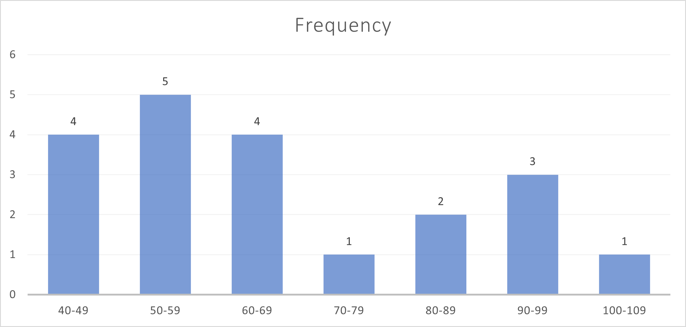
The test scores of 20 students were grouped into equal-width intervals:
| Score Interval | Frequency |
|---|---|
| 40 – 49 | 4 |
| 50 – 59 | 5 |
| 60 – 69 | 4 |
| 70 – 79 | 1 |
| 80 – 89 | 2 |
| 90 – 99 | 3 |
| 100 – 109 | 1 |
▶️ Answer/Explanation
The histogram would have:
- Bars of equal width (interval = 10 units).
- Heights of bars proportional to frequency (e.g., tallest bar at 5 for 50-59 interval).
- The x-axis labeled with score intervals, y-axis with frequency.
Example: The following table shows the distribution of test scores:
▶️ Answer/Explanation
|
Cumulative Frequency & Graphs
Cumulative frequency is the running total of frequencies up to and including a given class boundary.
A cumulative frequency graph (or ogive) is a plot of cumulative frequency against the upper class boundary.
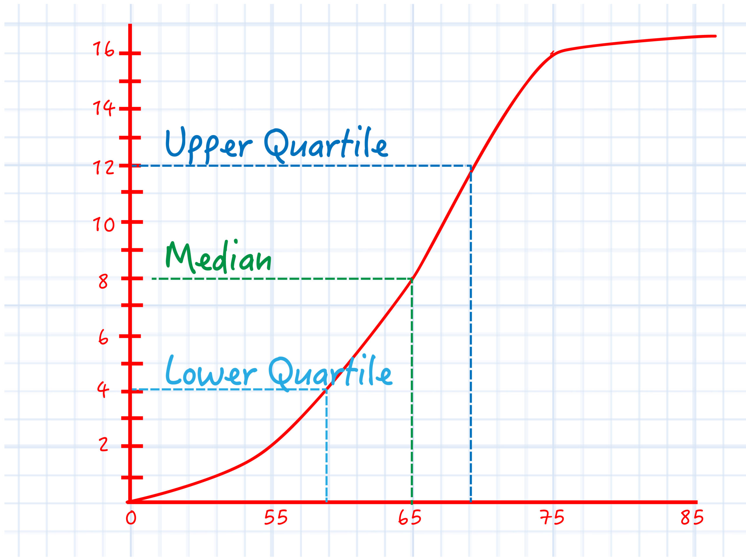
The graph can be used to estimate key statistics: median, quartiles (Q1, Q3), percentiles, range, and interquartile range (IQR).
- Median: The value at the 50th percentile (middle cumulative frequency).
- Lower quartile (Q1): The value at the 25th percentile.
- Upper quartile (Q3): The value at the 75th percentile.
- Interquartile range (IQR): Q3 – Q1; measures spread of middle 50% of data.
Example
The heights (in cm) of 20 students are:
145, 150, 152, 153, 155, 158, 160, 162, 163, 165, 166, 168, 170, 172, 173, 175, 178, 180, 182, 185
Group the data into class intervals of 10 cm and create a cumulative frequency table.
▶️ Answer/Explanation
| Height (cm) | Frequency | Cumulative Frequency |
|---|---|---|
| 140 – 149 | 1 | 1 |
| 150 – 159 | 4 | 5 |
| 160 – 169 | 5 | 10 |
| 170 – 179 | 5 | 15 |
| 180 – 189 | 5 | 20 |
The cumulative frequency shows how many students have heights up to the upper limit of each class interval.
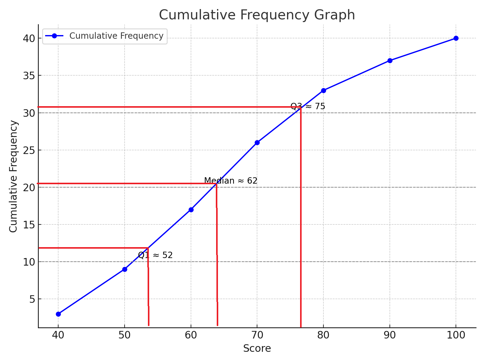
Example
The following table shows the test scores of 40 students:
| Score (≤) | Cumulative Frequency |
|---|---|
| 40 | 3 |
| 50 | 9 |
| 60 | 17 |
| 70 | 26 |
| 80 | 33 |
| 90 | 37 |
| 100 | 40 |
▶️ Answer/Explanation
Median: The 20th value (since $40 ÷ 2 = 20).$
Locate 20 on the cumulative frequency graph → estimate score $≈ 62$
Lower quartile (Q1): 10th value $(40 × 0.25 = 10)$
Estimate score $≈ 52$
Upper quartile (Q3): 30th value $(40 × 0.75 = 30)$
Estimate score $≈ 75$
IQR: $Q_3 – Q_1 = 75 – 52 = 23$
A cumulative frequency graph would plot the points:
- (40, 3), (50, 9), (60, 17), (70, 26), (80, 33), (90, 37), (100, 40)
Box and Whisker Diagrams
A box and whisker diagram (or box plot) is a graphical representation of data that shows the distribution’s central value, spread, and possible outliers. It is useful for comparing two or more data sets.
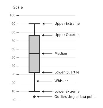
Key features of a box plot:
- Minimum value: the smallest data point (excluding outliers).
- Lower quartile (Q1): 25% of the data lies below this value.
- Median (Q2): the middle value that divides the data into two halves.
- Upper quartile (Q3): 75% of the data lies below this value.
- Maximum value: the largest data point (excluding outliers).
- Outliers: values that lie more than 1.5 IQR below Q1 or above Q3, often marked with a cross (×).
How to construct a box and whisker diagram:
- Order the data set from smallest to largest.
- Find the median, Q1, and Q3.
- Calculate the interquartile range (IQR = Q3 − Q1).
- Determine and mark any outliers (points beyond 1.5 × IQR from the quartiles).
- Draw a box from Q1 to Q3, mark the median inside the box.
- Extend “whiskers” from the box to the minimum and maximum values (excluding outliers).
How to compare two box plots:
- Symmetry: Check if the median is centered in the box and if whiskers are of equal length → indicates symmetry.
- Spread: Compare IQR and overall range to see which data set is more variable.
- Median: See which data set tends to have higher or lower values.
- Outliers: Identify data sets with unusual extreme values.
Link to Normal Distribution: If the box is roughly symmetric with no outliers and whiskers of similar length, the data may be normally distributed.
Example:
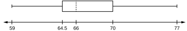
Draw Box Plot Diagra for The following data are the heights of 40 students in a statistics class:
$59, 60, 61, 62, 62, 63, 63, 64, 64, 65, 65, 65, 65, 65, 65, 66, 66, 66, 67, 68, 68, 69, 70, 70, 70, 70, 70, 71, 71, 72, 72, 73, 74, 74, 75, 77$
▶️ Answer/Explanation
- Minimum value: 59
- Maximum value: 77
- Q1 (First quartile): 64.5
- Q2 (Median): 66
- Q3 (Third quartile): 70
Key calculations:
- Range = 77 – 59 = 18
- IQR = Q3 – Q1 = 70 – 64.5 = 5.5
Interpretation:
- Each quarter contains about 25% of the data.
- 1st quarter spread = 64.5 – 59 = 5.5
- 2nd quarter spread = 66 – 64.5 = 1.5
- 3rd quarter spread = 70 – 66 = 4
- 4th quarter spread = 77 – 70 = 7
- The second quarter has the smallest spread, the fourth has the largest.
- The interval 59–65 has more than 25% of the data.
Box Plot Diagram:
Example:
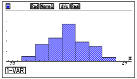
Construct a Box and Whisker Plot using TI-83/84
The following data are the ages of participants in a survey:
$23, 25, 30, 22, 28, 24, 26, 29, 30, 27, 25, 28, 31, 24, 22$
▶️ Answer/Explanation
- Press
STAT→ select 1:Edit. - Enter the data into
L1. Input: 23, 25, 30, 22, 28, 24, 26, 29, 30, 27, 25, 28, 31, 24, 22. - Press
2nd→Y=(STAT PLOT). - Choose 1:Plot1 → turn it ON.
- Select the box plot icon (with or without outliers, as required).
- Press
ZOOM→ choose 9:ZoomStat to automatically fit the data on the screen.
The calculator will display:
- Minimum = 22
- Q1 = 24
- Median (Q2) = 26
- Q3 = 29
- Maximum = 31
This box plot helps visualize the spread and symmetry of the age data.