Linear Correlation of Bivariate Data
Linear correlation describes the strength and direction of a linear relationship between two variables. It is only applicable when a linear pattern is observed in a scatter plot of the variables.
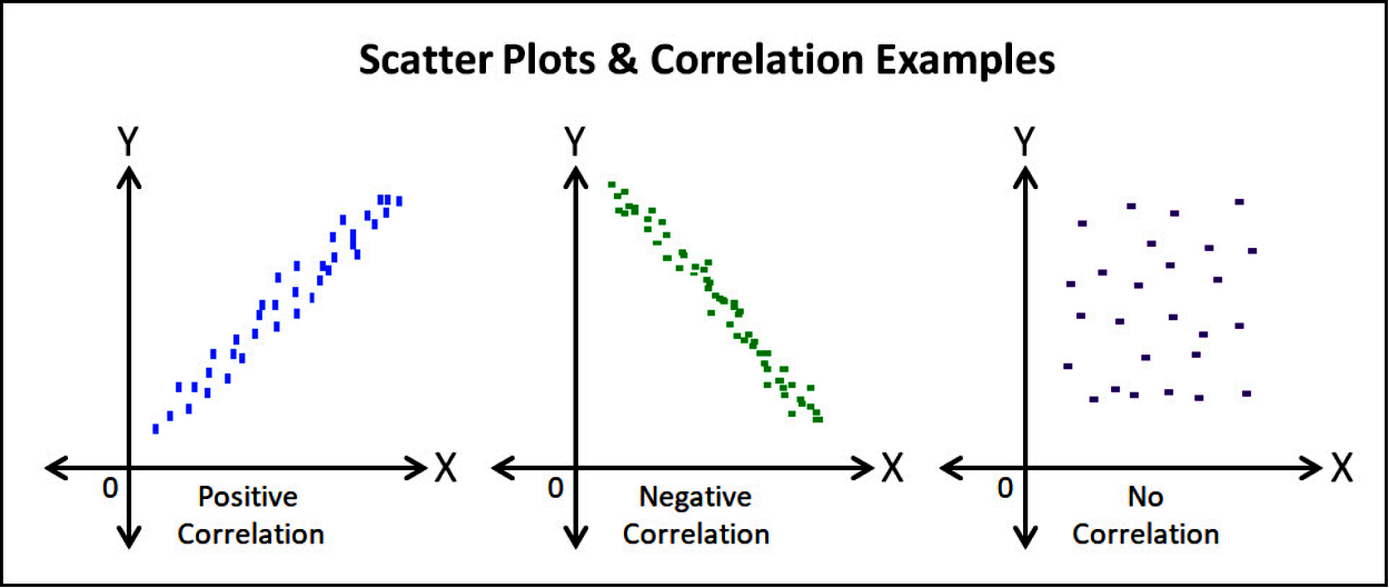
Types of Correlation:
- Positive correlation: As one variable increases, the other tends to increase.
- Negative correlation: As one variable increases, the other tends to decrease.
- No correlation: There is no apparent linear relationship between the variables.
Pearson’s Product-Moment Correlation Coefficient (r)
Pearson’s correlation coefficient, denoted by r, is a measure of the linear relationship between two quantitative variables.
Formula:
$r = \frac{ \sum (x_i – \bar{x})(y_i – \bar{y}) }{ \sqrt{ \sum (x_i – \bar{x})^2 } \sqrt{ \sum (y_i – \bar{y})^2 } } $
Where:
- \( x_i \) and \( y_i \) are the data values
- \( \bar{x} \) and \( \bar{y} \) are the means of the x-values and y-values respectively
- n is the number of data pairs
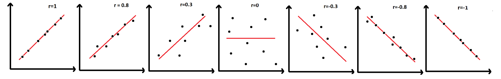
Interpretation of r:
| Value of r | Strength | Direction |
| r = 1 | Perfect | Positive |
| 0.7 ≤ r < 1 | Strong | Positive |
| 0.3 ≤ r < 0.7 | Moderate | Positive |
| 0 < r < 0.3 | Weak | Positive |
| r = 0 | No Linear Correlation | N/A |
| −0.3 < r < 0 | Weak | Negative |
| −0.7 < r ≤ −0.3 | Moderate | Negative |
| −1 < r ≤ −0.7 | Strong | Negative |
| r = −1 | Perfect | Negative |
Notes:
- Only meaningful for linear relationships.
- Not suitable for non-linear (curved) relationships.
- Technology (GDC or spreadsheet software) should be used to calculate r in exams.
- Critical values of r are used to assess significance in hypothesis testing (provided in formula booklets when needed).
Suppose you have two variables: study hours and test scores for 8 students. A strong positive correlation (e.g., r ≈ 0.95) would indicate that more study hours are associated with higher test scores.
Example
The following bivariate data represents the number of hours studied (x) and corresponding scores (y) on a test for five students:
| Hours Studied (x) | Test Score (y) |
|---|---|
| 2 | 65 |
| 4 | 70 |
| 6 | 75 |
| 8 | 85 |
| 10 | 95 |
Calculate Pearson’s correlation coefficient \( r \) for this data.
▶️ Answer/Explanation
Scatter Diagrams & Lines of Best Fit
A scatter diagram (or scatter plot) is a graph that shows the relationship between two quantitative variables. Each point represents an observation (x, y).
Line of Best Fit (by Eye)
A line of best fit is a straight line that best represents the data on a scatter plot. It may pass through or near most of the points and shows the trend of the data.
- It is drawn by eye — not calculated — unless specified.
- The line should pass through the mean point \((\bar{x}, \bar{y})\).
- The line should have approximately equal number of points above and below.
Note:
This method provides an estimate and may differ from the regression line generated by technology.
Types of Correlation
The pattern of points on the scatter diagram helps to identify the type of correlation:
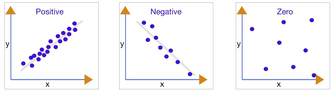
- Positive Correlation: As x increases, y tends to increase.
- Negative Correlation: As x increases, y tends to decrease.
- No Correlation: No clear trend or linear relationship between x and y.
Strength of Correlation:
- Strong: Points lie close to a straight line.
- Weak: Points are more spread out from the line.
- No Correlation: Points are randomly scattered.
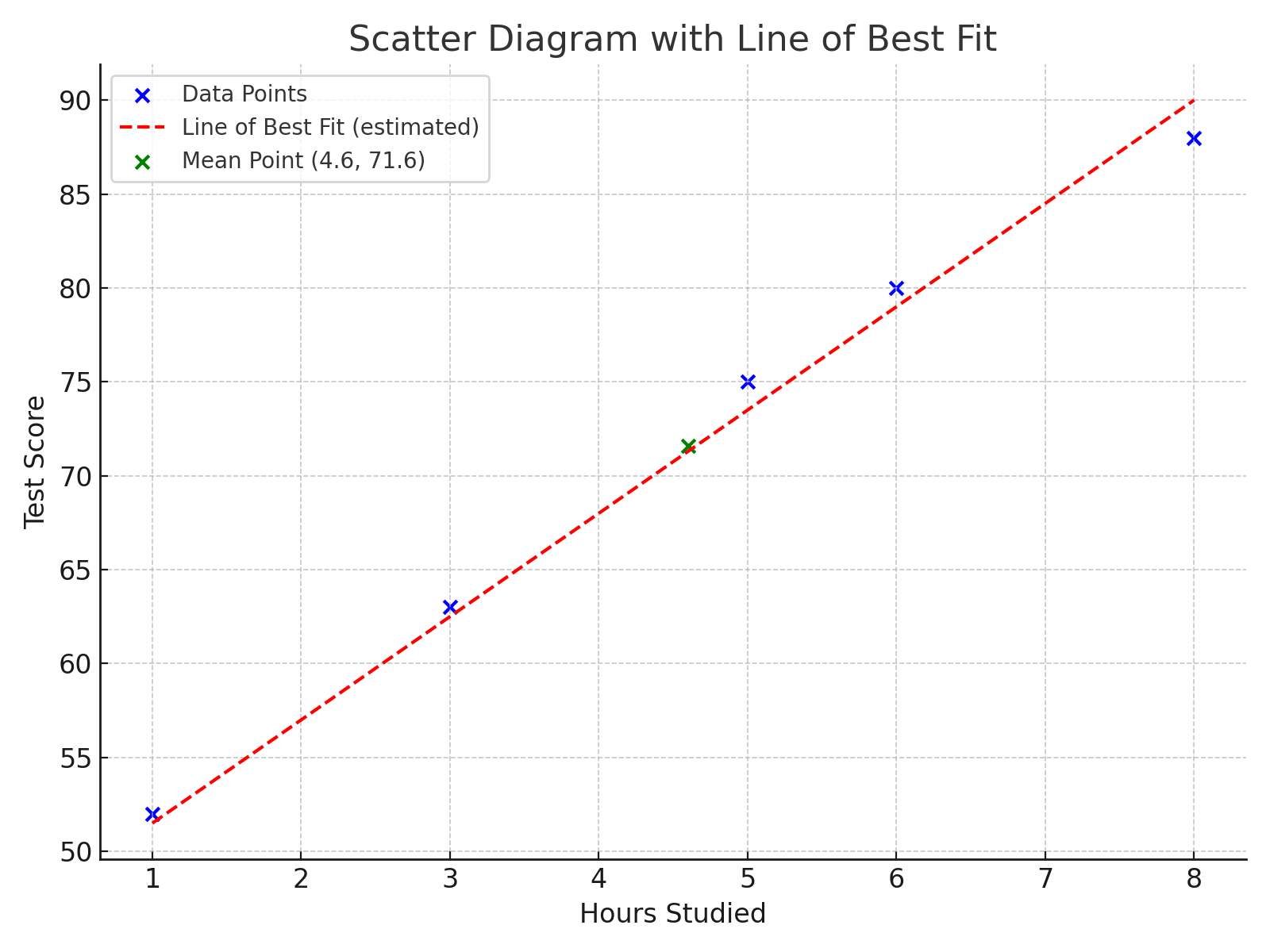
The table below shows the number of hours five students studied and their corresponding scores on a mathematics test.
| Hours Studied (x) | Test Score (y) |
| 1 | 52 |
| 3 | 63 |
| 5 | 75 |
| 6 | 80 |
| 8 | 88 |
(a) Plot a scatter diagram of the data.
(b) Draw a line of best fit by eye through the mean point.
(c) Comment on the type and strength of correlation.
▶️ Answer/Explanation
(a)
Plot each pair \((x, y)\) as a point on a graph. The x-axis represents hours studied, and the y-axis represents test scores.
(b)
Regression Line of y on x
The regression line of y on x is the best-fitting straight line that predicts values of the dependent variable \( y \) from the independent variable \( x \). It is usually written in the form:
\( y = ax + b \)
where:
- \( a \) is the gradient (slope) of the line
- \( b \) is the y-intercept (value of \( y \) when \( x = 0 \))
Using the Regression Line for Prediction
Once the regression equation \( y = ax + b \) is found using technology or calculation, it can be used to:
- Estimate the value of \( y \) for a given \( x \) (interpolation or extrapolation)
- Interpret how changes in \( x \) affect the predicted value of \( y \)
Example:

We assume that:
x is the independent variable (explanatory variable).
y is the dependent variable (response variable).
We can plot these points on a scatter diagram:

A parameter r, called the correlation coefficient (Pearson’s product-moment correlation coefficient), measures the strength and direction of this relationship. It
Important:
The line is valid for linear relationships. Predictions outside the range of the data (extrapolation) may be unreliable.
Interpretation of Parameters
- Slope (a): For each unit increase in \( x \), the predicted value of \( y \) increases (or decreases) by \( a \) units.
- Intercept (b): This is the predicted value of \( y \) when \( x = 0 \). It may not always be meaningful in context (e.g. if \( x = 0 \) is outside the data range)
Important Considerations
- Extrapolation Risk: Predictions outside the range of the data may be unreliable or misleading.
- Non-Reversible: The regression line of y on x should not be used to predict \( x \) from a given \( y \). A separate regression line of x on y would be needed for that.
- Linear Relationship: The regression model assumes a linear relationship. It may be inappropriate for non-linear patterns.
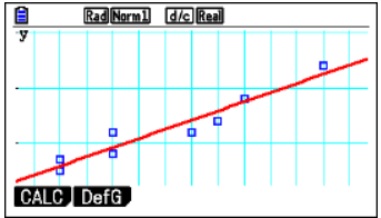
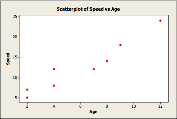
Example (USING GDC)
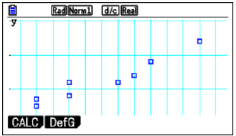
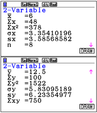
The following data are for the age (in years) of 8 randomly chosen children and how fast they could run (in km/hr).
| Age: x | 2 | 4 | 7 | 12 | 4 | 8 | 9 | 2 |
| Speed: y | 5 | 8 | 12 | 24 | 12 | 14 | 18 | 7 |
- Draw a scatter diagram of the data
- Write down the coordinates of the mean point \((\bar{x}, \bar{y})\)
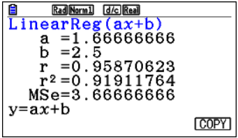
- Write down the value of \(r\), the Pearson’s product-moment correlation and interpret it
- Write down the regression equation and draw the line on your scatterplot
▶️ Answer/Explanation
- Scatter plot:

- Mean point:
$ \bar{x} = \frac{2 + 4 + 7 + 12 + 4 + 8 + 9 + 2}{8} = \frac{48}{8} = 6 \quad,\quad \bar{y} = \frac{5 + 8 + 12 + 24 + 12 + 14 + 18 + 7}{8} = \frac{100}{8} = 12.5$
Mean point = (6, 12.5) - Correlation coefficient \(r\): Using technology, \(r \approx 0.97\)
This shows a strong positive linear correlation between age and running speed. - Regression line (y on x):
From calculator/technology:
\(y = 1.665x + 2.5\)
This line can be used to predict running speed based on age.
GDC:
a. Enter data into List 1 and List 2
Press q for GRAPH, then u for SET, NqNq1lNq2lNq
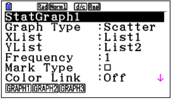
Note: You need to set Frequency to 1 before you continue!
Now press lq
b. While in the Graph window, press qq
c, d. From the lists screen, press weqq (wis also fine)
Now press u to copy the result, choose an empty Y and press l.
From the list window, press q for GRAPH and q again followed by wu