Data Presentation Methods
Discrete Data:
Data that can only take certain values is called discrete data or discrete values

- Values are distinct and separate (countable).
- Examples: {10, 20, 30}, {0, 1, 2, 3, …} (Finite or numerable set)

Continuous Data:
Continuous data represents measurements that can take on any value within a given range, including fractions and decimals.
- Values can be any number within a given range or interval (measurable).
- Examples: [40, 100], R (Real numbers – interval)

Once collected, data needs to be organized and presented in a clear and understandable way to highlight key features and patterns. Common methods include:
- Textual Presentation: Describing data within paragraphs of text, used to provide context or a narrative framework.
- Tabular Presentation: Arranging data systematically in rows and columns to facilitate comparisons and organization. This can include simple frequency tables or grouped frequency tables for larger datasets.
- Graphical Presentation: Using visual aids to display data, making trends and relationships easier to identify. Common graphs include:
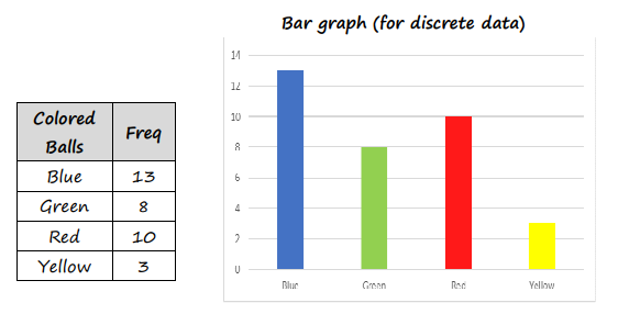
- Bar Charts: Used for comparing different categories of data.
- Pie Charts: Illustrating the relative proportions of different categories within a whole.
- Line Graphs: Showing how data changes over a continuous period or range.
- Scatter Plots: Exploring the relationship between two quantitative variables.
Data can be organized in several ways. Some examples below
 |  |
 |  |
Frequency Tables
A frequency table is a way of organizing data to show how often (frequently) each value or group of values occurs in a dataset. It is useful for summarizing large sets of data and identifying patterns.
Structure
A basic frequency table includes columns for the data values (or classes), their frequencies, and sometimes cumulative frequency or relative frequency.
Example: Given the test scores of 20 students: 45, 56, 67, 67, 45, 89, 90, 56, 56, 67, 78, 45, 56, 67, 90, 100, 89, 45, 56, 90 Create Frequency Table. ▶️ Answer/ExplanationFrequency Table:
Each row shows how many times a particular score appears. |
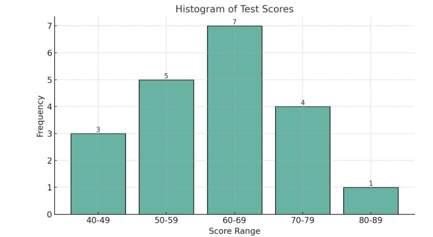
Histogram
A histogram is a graphical representation of data using bars to show the frequency of data intervals (also called “bins”). It is used to visualize the distribution of continuous numerical data.
Key Features
- The x-axis represents intervals (or class boundaries) of the data.
- The y-axis represents the frequency of values within each interval.
- There are no gaps between bars unless an interval has zero frequency.
Example: The following table shows the distribution of test scores:
▶️ Answer/Explanation
The histogram would have 5 bars representing the 5 score ranges. |
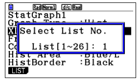
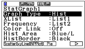
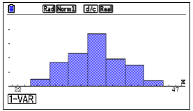
Example:(Use of GDC) The following table shows the distribution of test scores:
▶️ Answer/Explanation
|
Cumulative Frequency (CF):
Cumulative frequency is the total of a frequency and all frequencies in a frequency distribution until a certain defined class interval. The running total of frequencies starting from the first frequency till the end frequency is the cumulative frequency.
Example The data below shows the ages of participants in a certain summer camp: Create cumulative frequency table ▶️Answer/ExplanationSolution: To create the cumulative frequency table, we add the current frequency to the cumulative frequency of the previous age group.
As seen in the table, the cumulative frequency for age 10 is 3. For age 11, it’s the frequency at age 11 (18) added to the cumulative frequency at age 10 (3), totaling 21. This process continues for each age group, with the final cumulative frequency (80) representing the total number of participants in the summer camp. |


Cumulative Frequency Graph (Ogive):
- A graph plotting cumulative frequency (y-axis) against the upper class boundary (x-axis).
- Shows the overall pattern of the cumulative frequency distribution.
- Typically has an S-shape.
Example Plot the cumulative frequency curve for the data set below
▶️Answer/ExplanationSolution:
|

Using CF Graphs for Statistical Measures:
O – gives are used to estimate measures, especially for grouped data:

Median (Q2): Estimate the value on the x-axis corresponding to the cumulative frequency of $\frac{\text{Total Frequency}}{2}$ on the y-axis.
Quartiles Q1: Estimate the x-value at a cumulative frequency of $\frac{\text{Total Frequency}}{4}$.
Quartiles Q3: Estimate the x-value at a cumulative frequency of $\frac{3 \times \text{Total Frequency}}{4}$.
Interquartile Range (IQR): Calculate as $\text{IQR} = \text{Q3} – \text{Q1}$.
Percentiles: Estimate the x-value at a cumulative frequency of $\frac{p}{100} \times \text{Total Frequency}$ for the p-th percentile.
Number/Percentage Below/Above a Value:
- Find the CF for a value on the x-axis to get the count below it.
- Subtract the CF from the total frequency to get the count above it.
- Convert counts to percentages by dividing by the total frequency and multiplying by 100.
Example Find the First, Second and Third Quartiles of the data set below using the cumulative frequency curve. ▶️Answer/ExplanationSolution:
The total frequency is $f_c = 129$. The positions of the quartiles are calculated as follows: $Q_1 \text{ position} = \frac{(129 + 1)}{4} = \frac{130}{4} = 32.5$ $Q_2 \text{ position} = \frac{2(129 + 1)}{4} = \frac{2 \times 130}{4} = \frac{260}{4} = 65$ $Q_3 \text{ position} = \frac{3(129 + 1)}{4} = \frac{3 \times 130}{4} = \frac{390}{4} = 97.5$
From the Ogive, we can see the positions where the quartiles lie and thus can approximate them as follows: $Q_1 = 11.5$ $Q_2 = 14.5$ $Q_3 = 15.5$ These values are estimations read directly from the cumulative frequency graph corresponding to the 25th, 50th (median), and 75th percentiles of the data. |


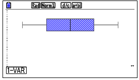
Box and Whisker Plots (Box Plots)
A Box Plot visually displays data distribution using quartiles.
Components:
Box: Extends from $Q_1$ to $Q_3$ (covers the IQR, middle 50%).
Median Line: Marks $Q_2$ inside the box.
Whiskers: Lines from the box to the min/max values within limits (often $1.5 \times \text{IQR}$ from quartiles).
Outliers: Points outside the whisker limits, plotted individually.

Features:
Can be vertical or horizontal.
Space-efficient, good for comparing multiple distributions.
Normal Distribution Indication
Box plots can give a hint about whether data might be normally distributed
Key values ($Q_1, Q_2, Q_3$, min, max within whiskers).
Presence and values of outliers.
Symmetry or skewness of the data.
How spread out the data is (variability).
Creating a Box Plot:
1. Order Data: Arrange data ascending.
2. Find 5-Number Summary: Calculate Minimum, $Q_1$, Median ($Q_2$), $Q_3$, Maximum.
3. Calculate IQR: $\text{IQR} = Q_3 – Q_1$.
4. Identify Outliers: Find limits (e.g., $Q_1 – 1.5 \times \text{IQR}$ and $Q_3 + 1.5 \times \text{IQR}$). Data outside limits are outliers.
5. Draw Box: From $Q_1$ to $Q_3$.
6. Draw Median Line: Inside the box at $Q_2$.
7. Draw Whiskers: From the box to the most extreme data points not considered outliers.
8. Plot Outliers: Mark outliers individually.
Example Suppose we have a dataset representing the test scores of a group of students: $\text{Data: } 78, 85, 90, 92, 95, 96, 97, 98, 99, 100, 105, 110, 120$ Calculate IQR , Draw box plot. ▶️Answer/ExplanationSolution: The data is already in ascending order. The minimum value is $78$. The median (second quartile, $Q_2$) is the middle value: The lower half (excluding the median) is: The upper half is: So, the five-number summary is: $\text{Minimum} = 78,\quad Q_1 = 91,\quad Q_2 = 97,\quad Q_3 = 102.5,\quad \text{Maximum} = 120$ To check for outliers, compute the interquartile range (IQR): $\text{IQR} = Q_3 – Q_1 = 102.5 – 91 = 11.5$ $\text{Lower Bound} = Q_1 – 1.5 \times \text{IQR} = 91 – 17.25 = 73.75$ $\text{Upper Bound} = Q_3 + 1.5 \times \text{IQR} = 102.5 + 17.25 = 119.75$ Since $120 > 119.75$, the value 120 is considered a mild outlier.
|

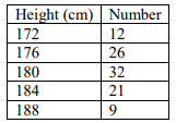
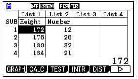
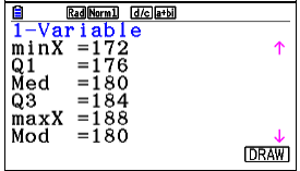
Example (Use of GDC) The heights of 100 students at a certain school are listed in the table below.
a. find the mean height ▶️Answer/ExplanationSolution: a. The mean height: $\bar{ x} =179.56$ cm GDC STEPS
|