CIE iGCSE Maths C9.2 Interpreting statistical data Questions- Paper 1
Mrs Salaman gives her class two mathematics tests. The scatter diagram shows information about the marks each student scored.

(a) Write down the highest mark scored on test 1.
(b) Write down the type of correlation shown in the scatter diagram.
(c) Draw a line of best fit on the scatter diagram.
(d) Hamish scored a mark of 40 on test 1. He was absent for test 2. Use your line of best fit to find an estimate for his mark on test 2.
▶️ Answer/Explanation
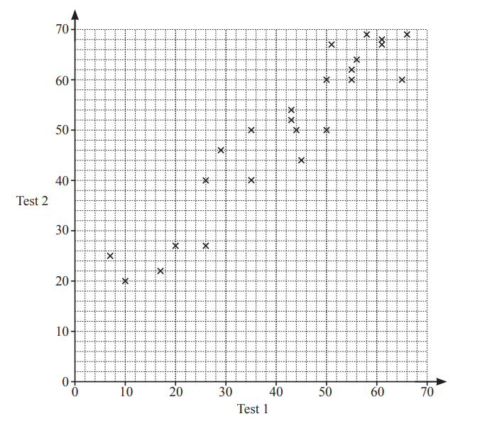
- 66 (Highest point on Test 1 axis)
- Positive (As Test 1 marks increase, Test 2 marks generally increase)
- Ruled line of best fit (A straight line passing through the middle of the data points)
- 46 to 50 (Extending the line of best fit at Test 1 = 40 gives an estimate for Test 2)
Explanation:
- (a) The rightmost point on the scatter plot corresponds to the highest Test 1 mark (66).
- (b) The upward trend shows positive correlation (higher Test 1 scores associate with higher Test 2 scores).
- (c) The line should balance the data points above and below it.
- (d) For Test 1 = 40, the line of best fit suggests Test 2 ≈ 48 (accept 46-50 due to estimation).
The scatter diagram shows the rainfall and the average temperature in a city for the month of June, over a period of 10 years.
(a) What type of correlation does this scatter diagram show?
(b) Describe the relationship between the rainfall and the average temperature.
▶️ Answer/Explanation
(a) Ans: Negative
The scatter plot shows a downward trend, meaning as rainfall increases, the average temperature tends to decrease. This indicates a negative correlation.
(b) Ans: More rain suggests lower temperature.
The relationship is inverse: higher rainfall corresponds to cooler temperatures, and lower rainfall corresponds to warmer temperatures.