CIE iGCSE Maths E9.5 Scatter diagrams Exam Style Practice Questions- Paper 2
Six students revise for a test.
The scatter diagram shows the time, in hours, each student spent revising and their mark in the test.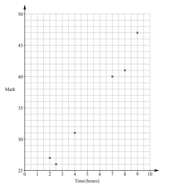
(a) The data for two more students is shown in the table.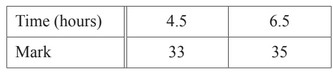
Plot these two points on the scatter diagram.
(b) What type of correlation is shown on the scatter diagram?
(c) Draw a line of best fit on the scatter diagram.
(d) Another student spent 5.5 hours revising.
Estimate a mark for this student.
▶️ Answer/Explanation
(a) Ans: Points plotted at (4.5, 33) and (6.5, 35)
Locate 4.5 on the x-axis and 33 on the y-axis, then mark the point. Repeat for (6.5, 35).
(b) Ans: Positive
As revision time increases, marks also increase, indicating a positive correlation.
(c) Ans: Correct ruled line
Draw a straight line that best fits the data points, balancing above and below.
(d) Ans: 33.5 to 37.5
From the line of best fit at x=5.5, the estimated mark lies between 33.5 and 37.5.

What type of correlation does the scatter diagram show?
▶️ Answer/Explanation
Ans: Negative
The scatter diagram shows a downward trend from left to right.
As the x-values increase, the y-values generally decrease.
This inverse relationship indicates negative correlation.
The points cluster around an imaginary line sloping downward.