CIE iGCSE Maths E9.7 Histograms Exam Style Practice Questions- Paper 2
For each of 10 people working in an office, the scatter diagram shows their salary and the value of their car.

(a) One of these people has a salary of $28,000. Find the value of their car.
(b) Another person starts to work in the office. Their salary is $54,000 and the value of their car is $6,100. Plot this information on the scatter diagram.
(c) What type of correlation is shown in the scatter diagram?
▶️ Answer/Explanation
(a) Ans: $4,800
From the scatter diagram:
- Locate $28,000 on the x-axis (salary)
- Find the corresponding point on the graph
- Read the y-value (car value) which is $4,800
(b) Ans: Point plotted at (54,000, 6,100)
To plot the new data point:
- Find $54,000 on the x-axis
- Locate $6,100 on the y-axis
- Mark a new point at the intersection
(c) Ans: Positive
The correlation type is positive because:
- As salary increases (moving right on x-axis), car value tends to increase (moving up on y-axis)
- The points show an upward trend from left to right
Key observations:
- Scatter diagrams show relationships between two variables
- Positive correlation means both variables increase together
- Exact values can be read from the axes
Six students revise for a test.
The scatter diagram shows the time, in hours, each student spent revising and their mark in the test.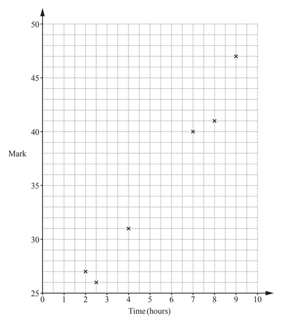
(a) The data for two more students is shown in the table.
Plot these two points on the scatter diagram.
(b) What type of correlation is shown on the scatter diagram?
(c) Draw a line of best fit on the scatter diagram.
(d) Another student spent 5.5 hours revising.
Estimate a mark for this student.
▶️ Answer/Explanation
(a) Ans: Points plotted at (4.5, 33) and (6.5, 35)
From the table, plot the additional points where:
• 4.5 hours revision corresponds to 33 marks
• 6.5 hours revision corresponds to 35 marks
(b) Ans: Positive correlation
The scatter diagram shows that as revision time increases, test marks tend to increase, indicating a positive relationship.
(c) Ans: Correct ruled line
The line of best fit should:
1. Pass through the middle of the data points
2. Have roughly equal numbers of points above and below the line
3. Follow the general upward trend of the data
(d) Ans: 33.5 to 37.5 marks
Using the line of best fit:
• Locate 5.5 hours on the x-axis
• Read across to the line, then down to the y-axis
• The estimated mark falls between 33.5 and 37.5