Cumulative Frequency Tables and Diagrams
Cumulative frequency helps to find how many values are less than or equal to a certain boundary. This is useful when estimating medians, quartiles, and drawing graphs to summarize data distribution.
Steps to draw a cumulative frequency diagram:
- Use the upper class boundaries to plot cumulative totals.
- Plot the points as small crosses (×).
- Join the points with a smooth curve.
Example :
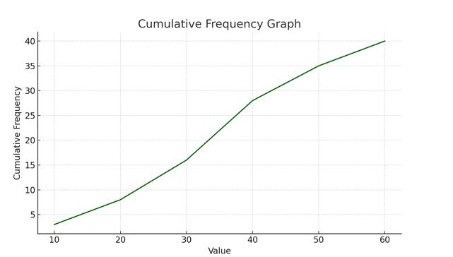
The table shows the marks out of 60 obtained by 40 students.
| Marks | Frequency |
|---|---|
| 0 < m ≤ 10 | 3 |
| 10 < m ≤ 20 | 5 |
| 20 < m ≤ 30 | 8 |
| 30 < m ≤ 40 | 12 |
| 40 < m ≤ 50 | 7 |
| 50 < m ≤ 60 | 5 |
Draw a cumulative frequency table and plot a cumulative frequency curve.
▶️ Answer/Explanation
Step 1: Create a cumulative frequency table
| Upper boundary | Cumulative Frequency |
|---|---|
| 10 | 3 |
| 20 | 3 + 5 = 8 |
| 30 | 8 + 8 = 16 |
| 40 | 16 + 12 = 28 |
| 50 | 28 + 7 = 35 |
| 60 | 35 + 5 = 40 |
Step 2: Plot cumulative frequency graph
- Plot points: (10, 3), (20, 8), (30, 16), (40, 28), (50, 35), (60, 40)
- Mark each point with a small cross (×)
- Join the points using a smooth curve
Estimating Median, Percentiles, Quartiles and IQR from Cumulative Frequency Diagrams
Cumulative frequency diagrams allow us to estimate summary statistics such as the:
- Median – the middle value (50th percentile)
- Lower quartile (Q1) – 25th percentile (1/4 of total frequency)
- Upper quartile (Q3) – 75th percentile (3/4 of total frequency)
- Interquartile Range (IQR) – Q3 − Q1
- Percentiles – positions such as 10th percentile (10% of data), 90th percentile (90% of data), etc.
How to estimate from a graph:
- Find the cumulative total (n).
- Locate the percentile or quartile position (e.g., Q1 = ¼ of n).
- Read across from the y-axis to the curve, then down to the x-axis.
Example:
The cumulative frequency curve below shows the times (in minutes) 80 students took to complete a puzzle.
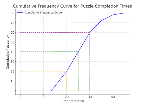
Estimate:
- (a) the median time
- (b) the lower quartile
- (c) the upper quartile
- (d) the interquartile range
▶️ Answer/Explanation
Total frequency = 80 students
(a) Median = 50% of 80 = 40th student
Read 40 on y-axis → across to curve → down to x-axis → approx. 26 minutes
(b) Q1 = 25% of 80 = 20th student → approx. 21 minutes
(c) Q3 = 75% of 80 = 60th student → approx. 31 minutes
(d) IQR = Q3 − Q1 = 31 − 21 = 10 minutes
Example :
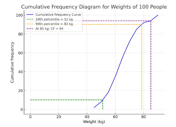
A cumulative frequency diagram shows the weights (in kg) of 100 people.
Estimate:
- (a) the 10th percentile
- (b) the 90th percentile
- (c) the percentage of people weighing more than 85 kg
▶️ Answer/Explanation
Total = 100 people
(a) 10th percentile → 10th person → Read from y = 10 → down to x-axis → approx. 52 kg
(b) 90th percentile → 90th person → y = 90 → down to x-axis → approx. 82 kg
(c) If CF at 85 kg = 94, then 100 − 94 = 6 people weigh more than 85 kg → 6%