1. Drawing and Interpreting Histograms
A histogram is a type of bar chart used to represent grouped continuous data. Unlike a bar chart:

- The bars touch (no gaps between them).
- Each bar represents a class interval (range of values).
- The area of each bar is proportional to the frequency (not just the height).
Key Concept: Frequency Density
When class widths are not equal, we cannot use frequency directly. Instead, we calculate the frequency density for each class:
Formula: \( \text{Frequency Density} = \dfrac{\text{Frequency}}{\text{Class Width}} \)
Then, we plot class intervals on the x-axis and frequency density on the y-axis. The area of each bar then represents the actual frequency.
Steps to Draw a Histogram:
- Calculate class widths (upper – lower boundary).
- Calculate frequency density for each class.
- Use class boundaries on the x-axis and frequency density on the y-axis.
- Draw bars for each class interval (bar width = class width, bar height = frequency density).
Interpreting Histograms:
- Height of bar = frequency density
- Width of bar = class width
- Area of bar = frequency
From a histogram, you can estimate:
- the modal class (tallest bar)
- total frequency (sum of all areas)
- estimate of the mean (using midpoints)
Example:
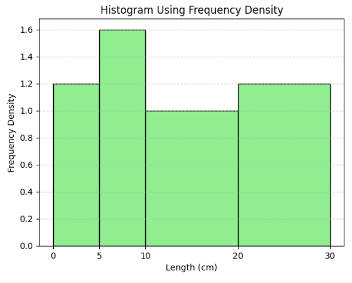
The table shows the distribution of the lengths of rods (in cm). Find the Frequency densities
| Length (cm) | Frequency |
|---|---|
| 0 < l ≤ 5 | 6 |
| 5 < l ≤ 10 | 8 |
| 10 < l ≤ 20 | 10 |
| 20 < l ≤ 30 | 12 |
▶️ Answer/Explanation
Class widths
- 0–5 → width = 5
- 5–10 → width = 5
- 10–20 → width = 10
- 20–30 → width = 10
Frequency densities
- 0–5: \( \frac{6}{5} = 1.2 \)
- 5–10: \( \frac{8}{5} = 1.6 \)
- 10–20: \( \frac{10}{10} = 1.0 \)
- 20–30: \( \frac{12}{10} = 1.2 \)
Note: Frequency density helps construct histograms when class widths are unequal.
Example:
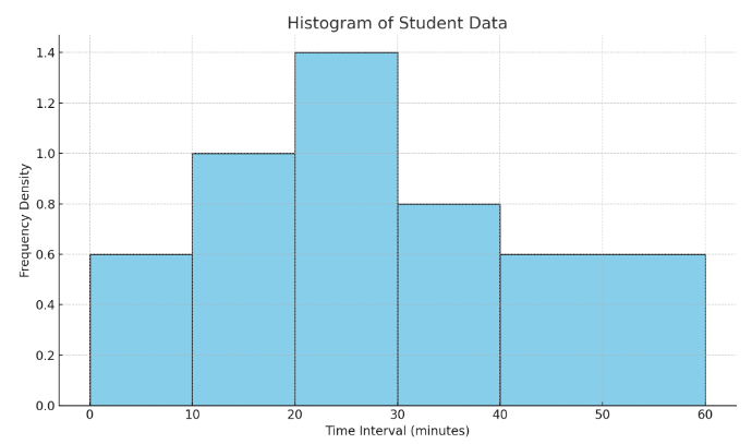
The table shows the time taken (in minutes) by a group of students to complete a task. Draw and Interpret the Histogram.
| Time (minutes) | Frequency |
|---|---|
| 0 < t ≤ 10 | 6 |
| 10 < t ≤ 20 | 10 |
| 20 < t ≤ 30 | 14 |
| 30 < t ≤ 40 | 8 |
| 40 < t ≤ 60 | 12 |
▶️ Answer/Explanation
Step 1: Find class widths and frequency densities.
- 0–10: width = 10, FD = 6 ÷ 10 = 0.6
- 10–20: width = 10, FD = 10 ÷ 10 = 1.0
- 20–30: width = 10, FD = 14 ÷ 10 = 1.4
- 30–40: width = 10, FD = 8 ÷ 10 = 0.8
- 40–60: width = 20, FD = 12 ÷ 20 = 0.6
Step 2: Plot histogram.
- X-axis: Time intervals (0–10, 10–20, etc.)
- Y-axis: Frequency density
- Draw bars with widths equal to the class widths and heights equal to the frequency density.
Step 3: Interpretation
- Modal class: 20–30 (tallest bar, highest FD = 1.4)
- Total frequency: 6 + 10 + 14 + 8 + 12 = 50 students
Example:
The table shows the distribution of the ages of people attending a seminar.Find the estimated mean and draw, Interpret the Histogram.
| Age (years) | Frequency |
|---|---|
| 0 < a ≤ 10 | 5 |
| 10 < a ≤ 20 | 8 |
| 20 < a ≤ 40 | 12 |
| 40 < a ≤ 60 | 10 |
| 60 < a ≤ 80 | 5 |
▶️ Answer/Explanation
Step 1: Find class widths and frequency densities
- 0–10: width = 10, FD = 5 ÷ 10 = 0.5
- 10–20: width = 10, FD = 8 ÷ 10 = 0.8
- 20–40: width = 20, FD = 12 ÷ 20 = 0.6
- 40–60: width = 20, FD = 10 ÷ 20 = 0.5
- 60–80: width = 20, FD = 5 ÷ 20 = 0.25
Step 2: Estimate the mean
Use midpoints:
- 0–10 → midpoint = 5
- 10–20 → midpoint = 15
- 20–40 → midpoint = 30
- 40–60 → midpoint = 50
- 60–80 → midpoint = 70
Now calculate \( \sum fx \):
- $5 × 5 = 25$
- $8 × 15 = 120$
- $12 × 30 = 360$
- $10 × 50 = 500$
- $5 × 70 = 350$
Total frequency $= 5 + 8 + 12 + 10 + 5 = 40$
Total \( fx = 25 + 120 + 360 + 500 + 350 = 1355 \)
Estimated Mean = \( \dfrac{1355}{40} = \boxed{33.88 \text{ years}} \)
Step 3: Plot histogram
- X-axis: Age intervals
- Y-axis: Frequency densities
- Use calculated FDs and widths to draw each bar.
